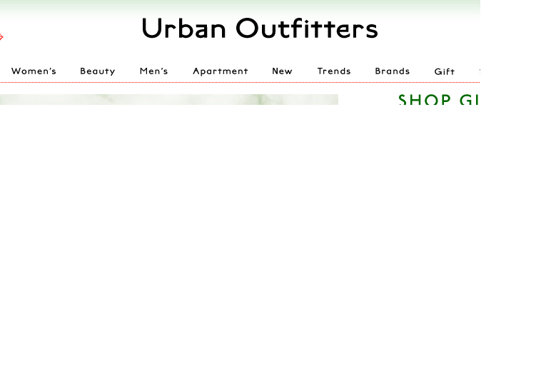
No, it’s not a faded shirt or a floppy hat that looks like it came from my grandmother’s attic. The ugliest thing you’ll find at Urban Outfitters is the new logo/look of the website. In a surprising move, Urban Outfitters has changed the color palette of its website and debuted a new logo that looks like it was created with Word Art.
Though the store is in good company–Gap and Belk have also unveiled new logos this year–the move doesn’t fit the Urban Outfitters brand. Urban Outfitters is all about being hip, cool and ahead of the curve. Refreshing its logo after so many “mainstream” stores have already done so makes Urban Outfitters look like a crowd follower, rather than a trendsetter. There is also nothing particularly unique, edgy or very cool about the new design or website. The font and color palette are fairly generic looking, even boring.
On the other hand, the new logo is pretty fitting for a store full of retro styles. It looks just like the cover my fourth grade book report.
UPDATE: Urban Outfitters changed the look of their site to something more streamlined less ridiculous.

