Today we are excited to have a guest blog from Senior Graphic Designer Dave Dixon!
Logos are inherently subjective. On the art-science spectrum, they seem to reside rather comfortably within the realm of art. However, the pursuit to discover the science of logo design is alive and well, with the latest effort coming from researchers at the University of California, Davis.
A series of social psychology experiments illustrated that logos (as well as flags and other group symbols) communicate unity and effectiveness, regardless of the group they represent. On the flip side, logos were also found to make groups seem more intimidating and less inclusive, whereas organizations without a logo came across as more friendly and welcoming.
While certain luxury or niche brands may embrace the concept of exclusivity, where does that leave companies and organizations that pride themselves on being open, helpful and friendly? The idea of forgoing a logo isn’t realistic, particularly when standing out in a crowded marketplace is a basic requirement for success. At the same time, coming across as intimidating or impersonal could be detrimental to the brand.
Is it possible to convey both competence and warmth in a logo? Unity and inclusion? Strength and kindness?
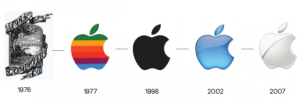
The answer to all of the above is yes and no. It’s certainly possible for a logo to convey any or all of those things – just not on its own. Logos, and the  brands they’re part of, are living, growing things; they’re inseparable from the products, services, employees and other aspects of what they represent. Even the most recognizable logos (and by extension, the most recognizable brands) have evolved considerably throughout their lifespans. You only need look as far as Apple to find an example of noticeable logo evolution. More recent examples, such as Hillary Clinton’s presidential campaign logo, prove that perception of a logo can change in as little as a few months.
Perhaps even more importantly, logos are part of a larger brand system. Left to fend for itself, a logo would quickly cease to stand for anything – or, more accurately, never come to stand for anything in the first place. And while the best asset for any brand is customer loyalty, additional visual branding elements can help bridge the gap between a newborn logo and a mature, fully realized brand.
Marketing and communication collateral can play an important role, as well. PowerPoint presentations, newsletters, website graphics – these elements provide an opportunity to create a strong visual impression in the hearts and minds of customers that connects the logo with more specific brand messaging, filling in the blanks and completing the brand picture.
More subtle visual brand elements, such as color, can play a significant role, as well. Think Home Depot orange or Coca-Cola red – reinforcing the brand color palette across a range of visual components will serve to cement the logo-to-color-to-brand connection in customers’ minds, and  potentially make that set of colors uniquely identifiable. Working either in conjunction with or as a replacement for color, typography can serve the same function. FedEx, for example, uses a variety of secondary colors across its service lines, but its distinctive typography and primary purple color scheme are instantly recognizable.
A logo is the central focus of visual branding, and rightly so – it’s the building block that provides a solid foundation for everything to come. But it’s important to remember that a logo is just the beginning, and that visual brand elements such as stationery, marketing collateral, color palette and typography breathe life into the logo, as well as providing additional touch points for your target audience to meet, get to know and, ultimately, fall in love with your brand.
