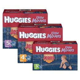
Jorts, Jeggings and Now... Jiapers?
......................................................................................................................................................................
So we've seen all jorts (jeans + shorts) and jeggings (jeans + leggings) but a jiaper?!? Jeepers! Must we subject our little ones to American's obsession with denim by putting them in a diaper disguised as a jean brief? According to Huggies (and 4 enthusiastic mothers' reviews on target.com) we should. Would you dress your child in Huggie's Little Movers Jeans? Have you contributed to the product's out of stock status on target.com? Would you?
Contributed by Allison Jobes
Branding on a Budget

......................................................................................................................................................................
With the economy slowing, many consumer brands are feeling the pressure to keep customers spending, which means better deals for us! Listed below are just a few brands that are attempting to leverage the recent economic crisis.
TARGET:
Target’s new TV ad campaign focuses on a more cost friendly approach to everyday life. The do-it-yourself spirit of the ad empowers customers to think about their everyday life differently. For example, riding a bike to work rather than worrying about expensive gas, cutting your children’s hair rather than taking them to the barbershop every 3 weeks and exercising at home rather than paying a costly gym membership. The ads encourage me to think about the necessities in my life and how I can find ways to simplify and reduce my spending.
Read more
Pink Branding for Breast Cancer Awareness

......................................................................................................................................................................
If you’ve been to Target or your local grocery store recently, you’ve probably noticed a lot of pink packages and displays. October is Breast Cancer Awareness Month and many brands are doing their part to support breast cancer research and raise awareness of the disease. Consumer product brands such as HP, KitchenAid, and One A Day® Women’s are just a few brands that are not only donating a percentage of their proceeds to The Breast Cancer Research Foundation but are also modifying their packaging over the next month or so to “advertise for the cure,” displaying a predominant use of pink in their package designs. In recent years, pink has become the official color of the cause and around this time of year, the increasing number of participating brands always impresses me. So next time you are doing your grocery shopping, take note of the products that support breast cancer awareness and research and do your part…buy them. Are there other brands that you know of who have gotten creative to support this cause?
Shop for products that support breast cancer research.
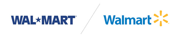
He Said She Said: Walmart's New Logo
......................................................................................................................................................................
He Said…
Walmart's old, stodgy logo needed a makeover...bad...The new typeface is more approachable, and friendly. Although I see the rationale behind the "spark" icon, its seems completely generic, and resembles a loading sign for a YouTube video...all and all the new logo is still a step ahead of the old. Eventually this logo will become so ubiquitous that people will start to say the opposite; "that loading sign looks like the Walmart logo."
She Said…
With change comes resistance and with resistance usually comes criticism. In my experience, the gut reaction to most logo evolutions/changes is primarily negative, especially when the previous brand has been around for a while. Me on the other hand, I am a bit of an optimist. I feel that the new Walmart logo is, at least, a statement of recognition that they must evolve and grow in order to create more positive associations in the mind of consumers. With a competitor like Target, who exudes modernity and eco-friendliness, it is imperative that Walmart regroup and find a way to reconnect with customers. The logo change, although conservative and somewhat generic, has its successes. The typeface is clean and modern with hints of customization and approachability, while the abstract mark could be representative of a plethora of symbols. A few that come to mind are a new idea, a spark or catalyst, the sun (friendly, warm, inviting) or a hub that connects you all your necessities in one place. Overall, I would say that this new logo is an improvement and a step in the right direction. Now let’s see if they implement a new brand strategy.
Check out Brand New by underconsideration.com for more commentary on the new Walmart brand.
He: Nick Irwin, Graphic Designer
She: Kristin Everidge, Graphic Designer
Nickname it!
I’m going to hop in my Beamer and grab some Mickey D’s for lunch!
I guarantee that you understood exactly what I meant when you read that sentence. In today’s world, we’ve become accustomed to using nicknames in place of brand names, but have you ever stopped to wonder HOW these brand names become nicknames? Sure, we all have a natural tendency to abbreviate, but do certain nicknames have a meaning?