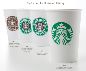
Starbucks Goes Bigger
On the heels of the new logo debut last week, Starbucks announced a new drink size for its iced beverages on Sunday. "Trenta" will be a 31oz size specifically for iced coffee, iced tea and iced tea lemonade drinks in the United States (read: Venti is still the largest you coffee addicts can get for your java fix).
In case you need a refresher, here's the lineup of current Starbucks sizes:
Four sizes for hot beverages:
* Short (8oz)
* Tall (12oz)
* Grande (16oz)
* Venti (20oz)
Four sizes for cold beverages:
* Tall (12oz)
* Grande (16oz)
* Venti (24oz)
* Trenta (31 oz)
(Notice that the actual ounces are different between the Venti size in hot and cold beverages.)
So with discrepancies in size continuities across product lines, it's a lesson in creating a strong brand strategy from the onset.
Customers have long questioned Starbucks' naming strategy when it comes to their beverage sizes. It's a challenge to retrain a population so familiar with "Small, Medium and Large." Even I have to remind myself that it's a TALL, not a SMALL, when ordering, but it's also a very distinctive strategy that mimicked the brand experience they were evoking.
From a continuity perspective though, I'm not sure it makes the most sense.
Dictionary.com posed a nice question on this as well: if the names were created to relate to the actual product size, why not simply use the actual size? Studying the etymology of Starbucks size names, you'll find that Grande is Italian for "large," Venti is Italian for "twenty," and Trenta means "thirty." Tall lacks the panache of the other size names, but it's still a part of their nomenclature. Venti translates nicely for a 20oz hot beverage, but not exactly for the cold beverages at 24oz, unless it means "twenty-ish."
What do you think? Is Starbucks doing its customers a disservice by not having a more "mainstream" naming strategy? Or is that too, just a part of the brand experience?
Starbucks Did What?!
Caffeine addicts across the world are in uproar over Starbucks' announcement this week that its logo would be changing to celebrate its 40th anniversary in March and the company’s larger focus.
On Starbucks’ site you can read comments from people upset over the change and even suggesting alternative designs. Interestingly, Starbucks partners (also known as employees) are posting positive comments and are expressing excitement for the change. Commenter Simplycatlin, a partner, says “You guys love the experience not the name and not the green lady...” Bingo.
A brand is so much more than a logo. (Repeat this phrase five times.) It’s about the emotional experience people have with your brand; the unique place your brand holds in people’s hearts and minds.
Maybe all the uproar is not really about the logo, it’s about the fear that people’s favorite brand may be changing and moving away from coffee and its delicious pumpkin cream cheese muffins. Maybe Starbucks brand fans are worried that this “third place” they’ve come to love escaping to could change. Of course, maybe they really just don’t like the new logo.
What do you think – is it the logo or is it more than that causing the controversy?
Please note: This blog entry was not biased in any way by my long-time respect for their brand and my adoration for Howard Schultz, who I affectionately refer to as Howard, like I’ve known him for years.
Brews and Booze

Starbucks recently announced it will serve regional wine and beer, starting in its home city of Seattle. In an experimental trial, the company renovated a store in Seattle's busy Capitol Hill area and stocked it with new beverage offerings as well as a selection of local cheeses. In addition to the new menu, the barista bar has been rebuilt to seat customers closer to the coffee.
USA TODAY mentioned that the revamped store looks less like a Starbucks and more like a cafe that's been part of the neighborhood for years. Muted color palettes, dim lighting and an overall low-key design seem to contradict the entire Starbucks brand.
From the bright green logo to the unique language spoken when ordering drinks, Starbucks has always distinguished itself from other coffee shops. Why then after years of standing out, would Starbucks want to fit in?
Scott Bedbury, marketing chief for both Starbucks and Nike in the 1990s, told USA TODAY that evolution is critical for Starbucks and that wine sales could bring in "latte-like" profits. "Brands have to evolve or die," he said. "It's a tall order. But if anyone can pull it off, it will be Starbucks."
Bedburry is not alone in thinking evolution is critical. Other brands such as Belk underwent major changes this year. For now caffeinated customers across the country will have to wait and see if Starbucks stores in other cities will get a makeover similar to Seattle. I wonder if wine will come in Tall, Grande and Venti sizes?
Back to Basics
More companies have recently returned to their roots to re-direct their focus on their product and the customer experience. Most people are aware of Howard Shultz’s return as CEO of Starbucks and his new initiatives to return the focus of the brand back to coffee. How many caffeine-thirsty customers were shocked when every single Starbucks location closed for a few hours so all employees could be trained?
Sign Language & Branding
......................................................................................................................................................................
As I was reading (and watching) more about The Gratitude Campaign, I noticed that the sign in the video for “Thank You” was different than the American Sign Language (ASL) one I knew.
That got me curious about how the Deaf community creates new signs. New words are introduced all the time, in all languages, by new inventions, new slang, and, our favorite, new brands.

