Brand Refreshment: Belk vs. Gap


………………………………………………………………………………………………………………………………………………….
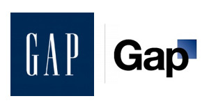
Much of October's design buzz was focused on the new Gap logo. With the change came die-hard Gap customers commenting on blogs, Facebook sites, and within the design community.
Marka Hansen, president of Gap North America, initially defended the logo, writing that the move brings Gap into the modern age. "We want our customers to take notice of Gap and see what it stands for today," she said. "We chose this design as it's more contemporary and current. It honors our heritage through the blue box while still taking it forward."
Hmm. The iconic blue box of Gap was actually diminished, rather than honored in the new design. Adding a gradient and moving it into a submission position does nothing in my mind to 'honor its heritage.' After only a week, Gap decided to revert back to the original logo.
Belk Department Store debuted its new image right around the same time, but was somewhat overshadowed in the media. Both Belk and Gap stated that they wanted to move their respective brands into a more updated space, and redesigned the logos to coincide with the modern feel of the apparel and the stores. So why was Belk's change more widely accepted (individual design critiques aside), and Gap's new image was met with such passionate disapproval?
A couple of ideas:
1. Regional awareness. Belk is a regional brand, with a smaller target audience than the global presence of Gap. While Belk isn't just "your Grandmother's store" anymore, the company hasn't been as active over the years in building and defining their brand image, so their change could be met with less resistance.
2. Belk is a collection of individual brands. Gap IS a brand.
3. Lack of connection to the audience. Belk had a plan for change and is systematically making the change market by market, and Gap introduced the logo to the entire world without so much as a hint that something new was coming. For such a devout target audience and such a large presence, you have to be prepared for the response - positive or negative. No market research to find out what customers think prior to launch?
4. Redefining the brand ... consistently. The Gap logo is/was classic. "Classic" is actually what their brand was all about. If they wanted to modernize or talk about their new modern jeans, they could update their collateral, or use social media in a new way to talk to their audience. Create a contest to have customers help design the new logo. The same can be argued about Belk: the iconic script was regarded as a logo with "class and character" that many argued should have been retained. However, Belk complemented their change with a tagline: "Modern. Southern. Style." which helps to reinforce the overall change.
What are your thoughts on refreshing a brand? Total re-definition through a new name or logo? Change the tagline? Update your social media efforts? Any other positive examples?
The Rebranding of the Y

......................................................................................................................................................................
Any given day, you’re sure to find an Addison Whitney employee at the Y running on a tredmill or perfecting Zumba moves. As a member of the YMCA of Greater Charlotte, I received an email last week from the President & CEO and Metropolitan Board Chair that blew my mind – in a good way.
By the time I’d received the email, I’d heard the news of the YMCA’s rebranding to the Y. I had seen the new logo and color palette. And I had read quite a few articles and blog entries cheering and jeering the change.
But this email was different because it was from my Y. The email, entitled “Still Your YMCA,” communicated the changes members can expect including a new brand strategy defining its cause of strengthening the foundations of community and a refreshed logo. But it also told members what would not change: the mission, core values and services members enjoy.
A key to successfully introducing a rebranding effort to your target audience is communication. As a member of the brand strategy team, we tell our clients going through rebranding efforts to do just what the Y did so well. Tell your target audience why you did it, how you did it and what they can expect. Change can be scary, so calm any fears by clearly stating what will not change.
The email from the YMCA of Greater Charlotte says it best: “As you can see, the Y isn't changing any of the great programs and services that we've always provided; we're just trying to do a better job of explaining why they matter.”
And you’re off to a great start.
Makeover for the King

......................................................................................................................................................................
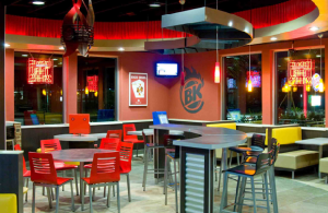
Recently, the fast-food chain restaurant Burger King has decided to undergo a restaurant makeover with a new store design called "20/20". This high priced renovation project was first unveiled at the Amsterdam Schiphol Airport location on October 7th, 2009. CEO John Chidsey had this to say about the recent changes; "As we continue to grow and strengthen the brand worldwide, this new restaurant design exemplifies our vision for the brand's future and reinforces our goal of delivering superior products and positive guest experiences." Burger King's recent sales have fallen well below top competitors McDonald's and Wendy's; the store re-design is a "top-tier global brand initiative" to increase Burger King's global reputation and boost sales.
How synonymous are the phrases, 'fast-food restaurant' and 'intimate dining experience'? According to an AP Report, this remodeling project will come with a heavy bill, approximately $300,000 to $600,000 per restaurant. Some consumers are worried that this may not be the best use of money for the franchise. Is Burger King trying to become something that it's not? How successful will this intimate dining experience be for the burger chain?
Burger King is well aware that their brand needs to make some changes in order to keep up with other fast-food chains in the market, but is this the right approach?
View the full article on Ad Age.
Contributed by: Carrie Friedrich
I'm Lovin It?

......................................................................................................................................................................
Every morning on my way to work I drive past McDonald's, and every morning I can’t help but ask myself… is it really possible? Is it possible that the days of Ronald McDonald, happy meals, and gigantic golden arches are really over?
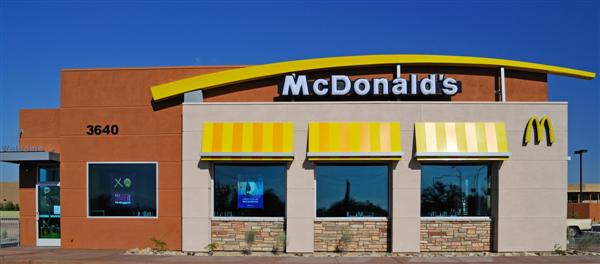
The McDonald's Company began raising eyebrows in 2003 when executives decided it best to drop their traditional kid-centric image in order to target an older more mature market. Six years and billions of dollars later, they have actually begun to achieve what most deemed impossible: change their brand image. To compete with coffee houses and café type restaurants, McDonalds has revamped both its menu and store layouts. McDonald’s restaurants now offer a variety of coffees, ranging from iced chocolate mochas to espressos. Additionally, most McDonald's include coffee bar tables, metal barstools, and free wireless internet access. CEO Charlie Bell says, “These changes are meant to offer consumers a better overall brand experience.”
I’m certainly going to miss the iconic child friendly McDonald's, but I’m pretty excited to see what the new McDonald's has to offer. Maybe one of these mornings, I'll stop to enjoy a cup of coffee and actually be able to say, "I'm lovin it."
By Kelley Blakewood
Source: EmeraldManagementFirst: Re-Branding: the Mcdonald's Stategy
A Brand New World

......................................................................................................................................................................
Out with the old, in with the new.
In order to keep up with our fast-paced marketplace, companies, products, and services are constantly exploring fresh ideas and new identities. Many of these rebranding efforts result from a number of needs including, but not limited to: ridding a company of negative connotations, entering a product into a new market segment, merging companies, or simple updating. Many notable entities have succeeded in rebranding efforts focused on the company itself (utilizing new logos, mottos, taglines, names, etc.), and have retained unwavering brand loyalty. And now, to turn the spotlight on one such company …
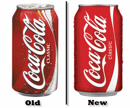
Coca-Cola. This exemplary brand has undergone a makeover to add a fresh new twist to their bottles and cans. Coke cans and Sprite cans are now donning new looks with clean and fresh features. Not to say the old cans were in desperate need of a change, but it is nice to keep consumers on their toes in order to truly appreciate the value of the brands they patronize.
On the Coke Classic can, the excess clutter of bubbles, stripe of yellow, and plentiful swirls have been eliminated to allow full attention to be focused on the red and white logo of Coca-Cola. In my opinion, this rebranding effort was a brilliant move for such an iconic company. Coca-Cola has established itself as a powerful brand and has earned its claim in the soft drink industry. This rebranding effort acknowledges the bold, confident, and trusted name of Coca-Cola that so many people worldwide know and love.
Sprite, a Coca-Cola product, has also received a can makeover. The new cans appear to be somewhat edgy and revolutionized. The colors are vibrant, edges are jagged, and logo is somewhat futuristic. The same basic color schemes and font have been incorporated into this updated new look. This rebranding effort reveals careful positioning and planning on behalf of Coca-Cola. With all the new soft drink variations entering the industry, something had to be done in order to keep Sprite on the leader board. The new look connects with the target market using a fresh, inventive, and confident approach.
These two examples of rebranding show the important impacts of staying one step ahead of the industry. With more creativity than ever before, companies are constantly competing for top-of-mind awareness amongst consumers. Researching, experimenting, updating, reinventing, and connecting; these terms are becoming the common vernacular of today’s companies.
As the saying goes, the only constant in the universe is change.
Don’t get left behind.
Contributed by Carrie Friedrich
Why SyFy?

By now you must have heard of the Sci Fi channel’s decision to re-brand. As of July 7th, 2009 the Sci Fi Channel will be named the SyFy Channel. In addition, the slogan “Imagine Greater” will be added to the new name and logo (shown above). Rebranding is most obviously done when companies merge or if a brand develops negative connotations. So why is the Sci Fi Channel rebranding? From what I can tell there are four reasons for the name change.
