Starbucks Did What?!
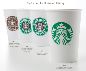
Caffeine addicts across the world are in uproar over Starbucks' announcement this week that its logo would be changing to celebrate its 40th anniversary in March and the company’s larger focus.
On Starbucks’ site you can read comments from people upset over the change and even suggesting alternative designs. Interestingly, Starbucks partners (also known as employees) are posting positive comments and are expressing excitement for the change. Commenter Simplycatlin, a partner, says “You guys love the experience not the name and not the green lady...” Bingo.
A brand is so much more than a logo. (Repeat this phrase five times.) It’s about the emotional experience people have with your brand; the unique place your brand holds in people’s hearts and minds.
Maybe all the uproar is not really about the logo, it’s about the fear that people’s favorite brand may be changing and moving away from coffee and its delicious pumpkin cream cheese muffins. Maybe Starbucks brand fans are worried that this “third place” they’ve come to love escaping to could change. Of course, maybe they really just don’t like the new logo.
What do you think – is it the logo or is it more than that causing the controversy?
Please note: This blog entry was not biased in any way by my long-time respect for their brand and my adoration for Howard Schultz, who I affectionately refer to as Howard, like I’ve known him for years.
The Ugliest Thing at Urban Outfitters

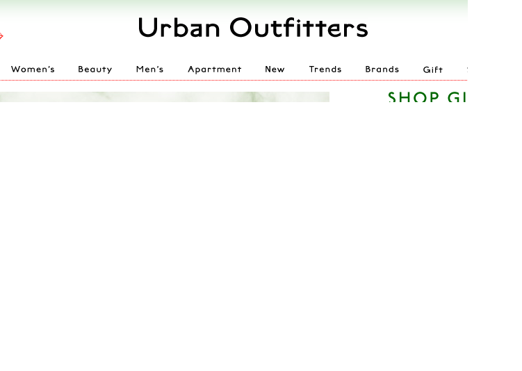
No, it's not a faded shirt or a floppy hat that looks like it came from my grandmother's attic. The ugliest thing you'll find at Urban Outfitters is the new logo/look of the website. In a surprising move, Urban Outfitters has changed the color palette of its website and debuted a new logo that looks like it was created with Word Art.
Though the store is in good company--Gap and Belk have also unveiled new logos this year--the move doesn't fit the Urban Outfitters brand. Urban Outfitters is all about being hip, cool and ahead of the curve. Refreshing its logo after so many "mainstream" stores have already done so makes Urban Outfitters look like a crowd follower, rather than a trendsetter. There is also nothing particularly unique, edgy or very cool about the new design or website. The font and color palette are fairly generic looking, even boring.
On the other hand, the new logo is pretty fitting for a store full of retro styles. It looks just like the cover my fourth grade book report.
UPDATE: Urban Outfitters changed the look of their site to something more streamlined less ridiculous.


