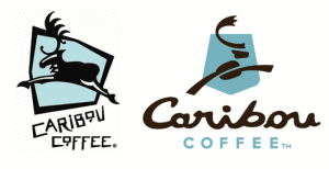
Caribou Coffee gets a New Logo

Caribou Coffee is undergoing a makeover! Moving away from the ski lodge atmosphere, the new look will be less regional and more contemporary, "a fresh variation of the same elements" according to the company's website. The new brand look includes a new logo, color palette and design elements. The caribou has been reworked and now features "C" shaped antlers and a coffee bean body. In addition, the caribou in the previous logo was leaping left, whereas the caribou now leaps right, signifying the company as it heads into the future. The shield element from the original logo has been updated to a new shape, which resembles national park signage, in honor of their founders' hike in Alaska's Denali National Park that inspired the company's foundation. The more stylized, upscale logo Read more
