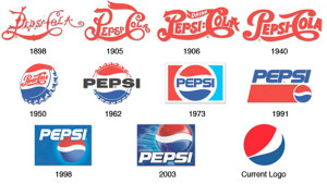
It’s a common misconception that a “rebrand” automatically means a brand new start – that when a rebrand occurs, the slate must be wiped clean and all subsequent branding elements must possess totally original characteristics.
In fact, the best rebrands take the opposite approach. They take the time beforehand to identify and research what brand aspects of the previous iteration carry the most weight and provide the most benefit, then find ways to incorporate or pay homage to these aspects in the new brand.
A recent example of this is the brand update from the Sacramento Kings of the NBA. As they were preparing to move to a new arena, they felt a need to update their brand, specifically their logo.
Throughout the redesign process, they looked at countless visual branding representations of the team name, many of which had little to no connection to the previous visual portfolio. However, what they kept coming back to was a design that touched on previous logos from the franchise’s long and storied past.
Ultimately, they chose a design that was a more modern version of the historical look, which immediately allowed fans, players, alumni, employees and the overall audience to connect the team’s future with its past, providing the new logo with instant brand equity.
This idea of building equity in a brand, especially within a specific element, is a difficult concept to strategize. Often it takes years to build up enough recognition, goodwill, historical weight, etc. to
sufficiently say that the brand carries its own weight with an audience. Therein likes one of the benefits of tapping into a brand’s history while strategizing its future. In this instance, those who connected with the team back when they were the Kansas City Kings or even when they were in Cincinnati, Ohio and known as the Cincinnati Royals could reconnect with the franchise through a familiar visual branding choice.
Or, as Alex Kramers of Kings.com says, “The powerful, all-encompassing symbol invoked a deep sense of nostalgia while reinvigorating a heritage that had long distinguished the historic franchise.”
This quote can resonate with brands across the spectrum as a reminder that rebranding and reinvigorating don’t have to be mutually exclusive. There’s a reason why the positive aspects of the past are so often imagined fondly, and why nostalgia is such a powerful emotional response, one that brands should be jumping at the opportunity to include.
Rebranding with an eye toward the past doesn’t have to stop at a redesigned logo. Every aspect of the brand is subject to holding nostalgic brand equity, and as such, should be included in the research process used to determine the best of the best of the old brand. It could be something as simple as a color choice that connects the branding eras, or it could go all the way up to the verbal branding and brand name that drives the association.
From start to finish, the big decisions to the smallest details, the top of the organization all the way down, a rebrand can be an overwhelming and challenging task. Why add more to the effort by starting from scratch? Use what your brand already possesses and give the new brand a ready-to-go foundation on which to build.
