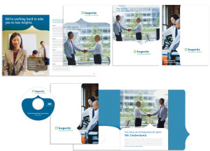
Once the final Insperity logo was decided, the next initiative was designing and creating the marketing materials. Luckily there wasn’t a strong visual tie to this element of the project as there was to the logo. A wide range of options was presented, but the option that resonated most with the project team was one that continued the story told by the logo.
The bracket (or speech bubble, depending on which way you look at it) subtly hints toward the wide range of offerings that the new Insperity provides, as well as suggesting the beginning of a new conversation. This element spans across a wide variety of materials, ranging from the business card to pocket folders. Its flexibility allows the bracket to be utilized both vertically and horizontally. Paired well with a italic slab serif and modern sans serif, the predominant use of the contemporary, approachable primary and secondary color palettes allows the Insperity team to tell a welcoming story without overwhelming the viewer.
Contributed by Nick Irwin

