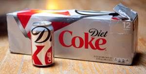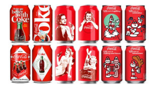
Keeping a brand fresh while still maintaining its integrity can be challenging. While an updated look could modernize your brand or help it stand out in a crowded marketplace, it is important not to lose sight of who you are and what your brand stands for. Imagine just how challenging refreshing your brand would be it were 125 years old. As Coca-Cola celebrates this milestone anniversary, Coca-Cola and Diet Coke cans are getting a fresh new look.
Rolling out in September, revamped Diet Coke cans feature a magnified segment of the Diet Coke logo where the “D” of Diet rests on top of the “k” of Coke. This mod design does not reveal the brand’s complete name. I guess when you’re the world’s best-selling diet soda you don’t have to worry about partial name recognition.

Not to be outshone by its calorie-free counterpart, design firms around the world have been creating special anniversary packaging for Coca-Cola’s flagship beverage. Check out ADWEEK’s collection of designs from Britain, Hong Kong and Serbia.
Coca-Cola found a nice balance with this campaign. One quintessential beverage got a sleek, edgy design and the company still embraces and celebrates its history in a fun and visually-appealing way.
What other brands have you seen celebrate milestones with special packaging?
