Caribou Coffee gets a New Logo
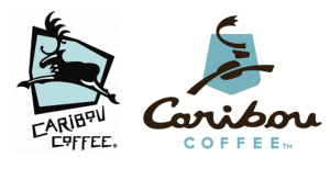
Caribou Coffee is undergoing a makeover! Moving away from the ski lodge atmosphere, the new look will be less regional and more contemporary, "a fresh variation of the same elements" according to the company's website. The new brand look includes a new logo, color palette and design elements. The caribou has been reworked and now features "C" shaped antlers and a coffee bean body. In addition, the caribou in the previous logo was leaping left, whereas the caribou now leaps right, signifying the company as it heads into the future. The shield element from the original logo has been updated to a new shape, which resembles national park signage, in honor of their founders' hike in Alaska's Denali National Park that inspired the company's foundation. The more stylized, upscale logo Read more
Optimism Pays Off?

......................................................................................................................................................................
If you’re a soft drink company what do you do to keep market share high in a down economy? Let the good times roll, and put on a happy face? Well, I’m not sure, but that certainly seems like the plan for mega giants PepsiCo and Coca-Cola.
According to Pepsi, 95% of their target market (individuals born between 1980 and 1990) prefer to maintain a positive outlook on life. Additionally, those born from 1980 to 1990 (individuals referred to as "Millenials,") are confident about the remainder of 2009. (Data according to StategyOne)
With those statistics in mind, Pepsi launched a new campaign which includes a redesigned logo that looks like a smile and welcoming greetings such as: Hi, Yo, or Howdy.
Coca-Cola on the other hand, is no stranger to marketing happiness (think their early 90’s polar bear campaigns). The company is at it again, with their newest slogans: Open Happiness and The Coke Side of Life, around billboards nationwide.
As for who has it right, I guess only time will tell. For now, let’s just hope the glass is half full for both Coke and Pepsi.
By Kelley Blakewood

Technology Brands Help Edge Out the Competition

......................................................................................................................................................................
Addison Whitney has two new names and logos to add to its portfolio in the running world: StabilicoreTM, which is a technology brand for New Balance shoes, and Aceba, a Dry Lubricant used in Asics Chafe FreeTM products.
For those who think that Nike is supreme when it comes to athletic footwear, runners will tell you a different story. Runners are very loyal to brands that work, and Asics and New Balance have emerged as trusted names for those who hit the pavement every day.
A quick poll of AW’s running group, “Brand, Sweat and Tears”, revealed the following insights about running brands:
- “I am more loyal to technologies than I am to master brands”
- “I don’t care if it’s popular- I care if it has got the specifics that I need! (e.g. high-arch support)”
- “If I find a technology that works for me, I am more likely to buy other items from that brand (the shoes fit, why not buy the matching shorts and tank!)”
A Brand New World
......................................................................................................................................................................
Out with the old, in with the new.
In order to keep up with our fast-paced marketplace, companies, products, and services are constantly exploring fresh ideas and new identities. Many of these rebranding efforts result from a number of needs including, but not limited to: ridding a company of negative connotations, entering a product into a new market segment, merging companies, or simple updating. Many notable entities have succeeded in rebranding efforts focused on the company itself (utilizing new logos, mottos, taglines, names, etc.), and have retained unwavering brand loyalty. And now, to turn the spotlight on one such company …
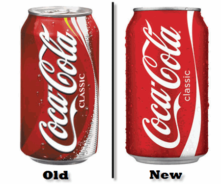
Coca-Cola. This exemplary brand has undergone a makeover to add a fresh new twist to their bottles and cans. Coke cans and Sprite cans are now donning new looks with clean and fresh features. Not to say the old cans were in desperate need of a change, but it is nice to keep consumers on their toes in order to truly appreciate the value of the brands they patronize.
On the Coke Classic can, the excess clutter of bubbles, stripe of yellow, and plentiful swirls have been eliminated to allow full attention to be focused on the red and white logo of Coca-Cola. In my opinion, this rebranding effort was a brilliant move for such an iconic company. Coca-Cola has established itself as a powerful brand and has earned its claim in the soft drink industry. This rebranding effort acknowledges the bold, confident, and trusted name of Coca-Cola that so many people worldwide know and love.
Sprite, a Coca-Cola product, has also received a can makeover. The new cans appear to be somewhat edgy and revolutionized. The colors are vibrant, edges are jagged, and logo is somewhat futuristic. The same basic color schemes and font have been incorporated into this updated new look. This rebranding effort reveals careful positioning and planning on behalf of Coca-Cola. With all the new soft drink variations entering the industry, something had to be done in order to keep Sprite on the leader board. The new look connects with the target market using a fresh, inventive, and confident approach.
These two examples of rebranding show the important impacts of staying one step ahead of the industry. With more creativity than ever before, companies are constantly competing for top-of-mind awareness amongst consumers. Researching, experimenting, updating, reinventing, and connecting; these terms are becoming the common vernacular of today’s companies.
As the saying goes, the only constant in the universe is change.
Don’t get left behind.
Contributed by Carrie Friedrich
Making a Mark with Brand Punctuation
Brand namers are constantly searching for new and innovative ways to utilize the 26 letters of the English alphabet. Perhaps the answer is beyond those letters. A punctuation mark in your brand name not only helps it stand out from the crowd, but, if it is truly distinctive, can even be registered and protected as part of your trademark.
Look at how these brands have used a little punctuation in a big way:
E*Trade
Consumer identification with the asterisk between E and Trade is so strong that the punctuation itself is part of E*Trades registered trademark. The asterisk has also been extended across E*Trade's marketing materials, serving as a calling card for the brand.
Yahoo!
If a name ever needed an exclamation point, Yahoo was it. Without added punctuation the word Yahoo was at risk for coming across as an insult or as sarcasm. The exclamation point forces audiences to read the name as it was intended, as a celebratory shout. The simple mark has become as much a part of the name as the letters themselves.
Häagen-Dazs
If you think that this name is simply using traditional diacritics to stay true to its foreign heritage, think again. The umlaut in Häagen-Dazs is as meaningless as the name itself. The brand simply uses two made up words with cleverly placed punctuation in order to appeal to upscale audiences seeking a super-premium ice cream import.
Contributed by Maghan Cook
He Said She Said: Memorex Logo
......................................................................................................................................................................
He Said:
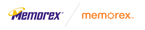
I must say that I never thought there was anything wrong with the previous Memorex logo. Sure the colors might have been a little dated (pre 2000), but I enjoyed the simplicity. That is why I believe this new logo is a nice transition into the modern era. Of course it has some clichéd trendy elements, ala an all-lowercase sans serif typeface, but I thoroughly enjoy the focus on simplicity. I am sure one of the biggest supporters to this new logo will be their printers. “HORRAY one color logo and no trapping on a light yellow!” However, I seem to gravitate towards the light gray execution of the logo on the packaging more than the burnt orange. The softer corners and clean lines allude to the shift in target audience, as they call the “savvy female shopper.” With this change in logo and packaging, it makes the brand feel more align with the Apple iPod / elitist crowd which has been a common movement these days. Although I don’t know if I completely agree with the rationale of the new logo, overall, the implementation of the new brand is obviously well planed out, and the renovated brand breathes fresh life into a new direction for Memorex.
She Said:
Memorex recently unveiled a new logo and brand position that attempts to attract more adult female consumers. The previous logo was certainly more masculine and high tech, with jagged edges within the typography and the obligatory technology logo dynamic ring to connote, you guessed it, speed! The new logo still communicates technology, but in a much more modern way, with open letter spacing and an overall clean, geometric design. The rounded letter forms (m,e,o) evoke a softer feeling and the color is more friendly, but I would argue that that is not necessarily enough to attract more women. When combined with the new positioning, advertising and packaging, it could work. I am definitely over the ever so popular sans serif Avenir-esque / Helvetica-esque typeface and icon within the “o” (so obvious), but overall, I would say this is an improvement. What do you think?
Color Psychology: The Relationship Between Color & Branding
![]()
![]()
......................................................................................................................................................................
How does color affect our everyday life? We are bombarded with brands from sunup to sundown, but have you ever thought about what role color plays?
First, color affects us on a subconscious level. Color psychologists have found that the brain subconsciously notices color before shape and wording!
Read more
The Business of Design
Joseph DeSetto, author of Flash MX. Rich Media for the Web was recently in Charlotte interviewing designers for his new book: The Business of Design, due out today.
The Business of Design will cover topics including legal and ethical issues, assets such as fonts and photography, and pricing and bidding on new jobs. DeSetto interviewed designers of various levels to glean opinions, advice, and words of wisdom. A great big kudos to Addison Whitney’s very own Visual Branding Department for being interviewed for this publication, specifically for inclusion as a supplemental DVD that will be packaged with the book.
Congrats to the Visual Branding team for their hard work which has earn them well-deserved recognition within the industry, and best wishes to DeSetto for this new venture. We’ll definitely have a copy or two on our shelves!
He Said She Said: Walmart's New Logo
......................................................................................................................................................................
He Said…
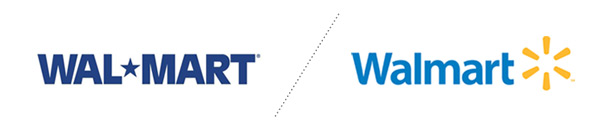
Walmart's old, stodgy logo needed a makeover...bad...The new typeface is more approachable, and friendly. Although I see the rationale behind the "spark" icon, its seems completely generic, and resembles a loading sign for a YouTube video...all and all the new logo is still a step ahead of the old. Eventually this logo will become so ubiquitous that people will start to say the opposite; "that loading sign looks like the Walmart logo."
She Said…
With change comes resistance and with resistance usually comes criticism. In my experience, the gut reaction to most logo evolutions/changes is primarily negative, especially when the previous brand has been around for a while. Me on the other hand, I am a bit of an optimist. I feel that the new Walmart logo is, at least, a statement of recognition that they must evolve and grow in order to create more positive associations in the mind of consumers. With a competitor like Target, who exudes modernity and eco-friendliness, it is imperative that Walmart regroup and find a way to reconnect with customers. The logo change, although conservative and somewhat generic, has its successes. The typeface is clean and modern with hints of customization and approachability, while the abstract mark could be representative of a plethora of symbols. A few that come to mind are a new idea, a spark or catalyst, the sun (friendly, warm, inviting) or a hub that connects you all your necessities in one place. Overall, I would say that this new logo is an improvement and a step in the right direction. Now let’s see if they implement a new brand strategy.
Check out Brand New by underconsideration.com for more commentary on the new Walmart brand.
He: Nick Irwin, Graphic Designer
She: Kristin Everidge, Graphic Designer