Insperity | What it Means to Their CEO
You may recall the posts in March about the Insperity launch. We did our best to sum up our engagement with the Administaff/ Insperity team, but it is a lot more exciting to hear about the transition directly from Insperity Chairman of the Board and CEO Paul Sarvadi. (He also happens to be one of the founders.) Take a look at the video below.
Carnival’s Magic has set sail on its Inaugural Voyage!!
From creating names to designing logos a number of Addison Whitney brands can be seen onboard the new ship. We had so much fun working with the Carnival team, and we want to continue that fun with a little interoffice competition.
To help us decide which Addison Whitney team member can claim bragging rights around the office check out the AW brands below and “Like” your favorite! And if you want to read more about our work with Carnival click on the logos below.




Insperity | Taking it to the streets
On March 3, 2011, the Administaff family gathered to celebrate 25 years of success and a new beginning as Insperity. Some members of the Addison Whitney-Insperity team were lucky enough to attend and witness this magical evening.
Picture this – Minute Maid Park home of the Houston Astros, deep in the heart of Texas, buzzing with the excitement of more than 3,000 people. As we all filed into seats along the third baseline, we were met with an incredible program. Hosted by new Insperity spokesman Jim Nantz, it featured a conversation with Steve Forbes and presentations by company leadership. Saying the presentation by Chairman and CEO Paul Sarvadi was inspiring and energizing just does not do it justice. He passionately talked about the company’s evolution over the past 25 years and his vision for the years to come. This new vision coupled with the new corporate identity was unveiled in 3D – yes, thousands of guests put on branded 3D glasses for the unveiling.
The night featured an amazing spread of food, dancing and festivities. As we headed out to left field to get our souvenir – an Insperity-branded box filled with mementos celebrating the company’s history – Michael McDonald took the stage to cap off the night.
Often times when our clients launch new brand strategies or corporate identities, we do not get to witness the excitement of the event. So being able to attend was very special for our team. Every detail of this event and the Sales Convention happening at the same time were so well thought-out and very impressive including the signs, stage lighting and the entire color palette – all of which changed overnight.
To borrow something we overheard employees saying that night: here’s to Insperity – cheers!
[portfolio_slideshow trans=scrollHorz]
Insperity | Sparking a New Visual Design

Administaff loved their octagon icon, from the shape of their receptionist desk to the rings made for the founders, the octagon was literally everywhere. This presented a huge challenge, not only logistically, but also in the ingrained passion behind the icon. Therefore, Addison Whitney's initial goal in the early stages of the visual branding development process was to show a wide range of options that presented several opportunities for the new Insperity brand to have an ode to the previous logo at some level. Throughout a couple of rounds, one concept kept on rising to the top and seemed to be a perfect transition from the previous Administaff logo.
The new logo features a web/spark/compass icon that highlights the idea of alignment. The different segments signify how the company offers several business performance solutions for a wide range of companies. The design branches outward to show continued growth and confidence. The color palette was perceived as refreshing and eye-catching. To balance out the more modern colors is a stable, traditional typeface that has several curves that match that of the icon. Overall, the new identity lays a foundation for a fresh, energetic visual brand that truly matches the devotion and passion for prospering businesses and communities found within each Insperity employee.
Contributed by Nick Irwin
Introducing Insperity
......................................................................................................................................................................
For those of you who have been following our recent tweases (Twitter teases) noted by our hashtag #AW3095, you already know the news. For everyone else, it’s our pleasure to introduce Insperity, formerly Administaff.
Addison Whitney has been working with the Insperity team since February 2009 and is so proud of its team’s hard work throughout the process, and especially at the launch some members of our team were lucky enough to attend.
We are excited to begin our Insperity series to highlight the key steps from throughout our more than two year relationship with the Insperity team. Throughout each post we will give you some insight into things we learned or just fun facts from each phase.
Here are some headlines to get you excited and coming back for a double dip of Brand Salsa.
- Market Research – gathering key insights from current and future customers
- Brand Strategy – who are we and what to do with all of these offerings and brands
- Verbal Branding – farewell Administaff, hello Insperity
- Visual Branding – Insperity’s new look and feel
- Brand Rollout – dancing in the streets of Houston
- What Makes a Great Project Team – we’ll tell you because we worked with a fantastic one at Insperity
Stay tuned!
Starbucks Did What?!
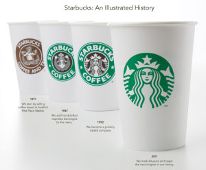
Caffeine addicts across the world are in uproar over Starbucks' announcement this week that its logo would be changing to celebrate its 40th anniversary in March and the company’s larger focus.
On Starbucks’ site you can read comments from people upset over the change and even suggesting alternative designs. Interestingly, Starbucks partners (also known as employees) are posting positive comments and are expressing excitement for the change. Commenter Simplycatlin, a partner, says “You guys love the experience not the name and not the green lady...” Bingo.
A brand is so much more than a logo. (Repeat this phrase five times.) It’s about the emotional experience people have with your brand; the unique place your brand holds in people’s hearts and minds.
Maybe all the uproar is not really about the logo, it’s about the fear that people’s favorite brand may be changing and moving away from coffee and its delicious pumpkin cream cheese muffins. Maybe Starbucks brand fans are worried that this “third place” they’ve come to love escaping to could change. Of course, maybe they really just don’t like the new logo.
What do you think – is it the logo or is it more than that causing the controversy?
Please note: This blog entry was not biased in any way by my long-time respect for their brand and my adoration for Howard Schultz, who I affectionately refer to as Howard, like I’ve known him for years.
Brand Refreshment: Belk vs. Gap

………………………………………………………………………………………………………………………………………………….
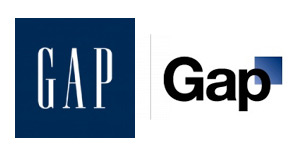
Much of October's design buzz was focused on the new Gap logo. With the change came die-hard Gap customers commenting on blogs, Facebook sites, and within the design community.
Marka Hansen, president of Gap North America, initially defended the logo, writing that the move brings Gap into the modern age. "We want our customers to take notice of Gap and see what it stands for today," she said. "We chose this design as it's more contemporary and current. It honors our heritage through the blue box while still taking it forward."
Hmm. The iconic blue box of Gap was actually diminished, rather than honored in the new design. Adding a gradient and moving it into a submission position does nothing in my mind to 'honor its heritage.' After only a week, Gap decided to revert back to the original logo.
Belk Department Store debuted its new image right around the same time, but was somewhat overshadowed in the media. Both Belk and Gap stated that they wanted to move their respective brands into a more updated space, and redesigned the logos to coincide with the modern feel of the apparel and the stores. So why was Belk's change more widely accepted (individual design critiques aside), and Gap's new image was met with such passionate disapproval?
A couple of ideas:
1. Regional awareness. Belk is a regional brand, with a smaller target audience than the global presence of Gap. While Belk isn't just "your Grandmother's store" anymore, the company hasn't been as active over the years in building and defining their brand image, so their change could be met with less resistance.
2. Belk is a collection of individual brands. Gap IS a brand.
3. Lack of connection to the audience. Belk had a plan for change and is systematically making the change market by market, and Gap introduced the logo to the entire world without so much as a hint that something new was coming. For such a devout target audience and such a large presence, you have to be prepared for the response - positive or negative. No market research to find out what customers think prior to launch?
4. Redefining the brand ... consistently. The Gap logo is/was classic. "Classic" is actually what their brand was all about. If they wanted to modernize or talk about their new modern jeans, they could update their collateral, or use social media in a new way to talk to their audience. Create a contest to have customers help design the new logo. The same can be argued about Belk: the iconic script was regarded as a logo with "class and character" that many argued should have been retained. However, Belk complemented their change with a tagline: "Modern. Southern. Style." which helps to reinforce the overall change.
What are your thoughts on refreshing a brand? Total re-definition through a new name or logo? Change the tagline? Update your social media efforts? Any other positive examples?
Confessions of a Name-Induced Shopper
 ......................................................................................................................................................................
Be honest - have you ever bought a product solely because of its name or packaging?
*whispers* I have.
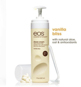
The bottle’s appearance sucked me in, the matte hot pink and matte yellow bottles at the end of a sea of glossy blue and purple cans. I moved in closer, seeing the name EOS emblazoned across the top. Instant adoration! I love the name because Eos is the ancient Greek goddess of the dawn, often signifying a new beginning. Double bonus verbal branding: they’ve made it an acronym apropos to their product line, the “Evolution of Smooth.” So, even if you didn’t know that Eos was the goddess of the dawn, they are telling you this is a new beginning, an innovation in shaving, a new era of smooth legs!
Thankfully, I have ended up loving the product, too. Vanilla Bliss, indeed.
Will I now buy their lotion, lip balm (smooth stick or smooth sphere) and other flavors of shave cream?
*shouts* Yes!
Maybe it’s not the smartest way to shop, but EOS sold me in five seconds flat. I wasn’t even looking to buy shaving cream that fateful day in Target.
I wasn’t even in the aisle.
Stirring Up Changes
Seattle's Best has joined the ranks of familiar companies updating their logo's look.
As with all new things, there are some pretty harsh words flying around about it. What's your opinion about the new design? Grab a cup of coffee, and tell us about it.
Contributed by: Jenna Wise
And the American Graphic Design Award goes to ...

......................................................................................................................................................................
Kudos to our Visual Design Department who recently was recognized for four brands by American Graphic Design and Advertising.
Carnival Cruise Lines: Drainpipe logo
Carnival Cruise Lines: Twister logo
FUJIFILM Medical Systems: Synapse logo
PPG: VIVATI Collection logo
Kristin Everidge, Manager of Visual Branding for Addison Whitney, commented, "It has been an honor to be a part of ADGA’s annual awards for the past 12 years. The 2010 winners represent a synergy between the core competencies of our organization, which include naming and design work for these clients. Because of our iterative and collaborative processes with these clients, we share the credit for these awards with Carnival Cruise Lines, FUJIFILM and PPG."

