7 Tips for Making Your Logo the Crown Jewel of Your Brand
“If, in the business of communication, image is king, the essence of this image, the logo, is the jewel in its crown”. – Paul Rand
As the saying goes, you never get a second chance to make a first impression. For brands, that first impression often comes when the audience initially sees its logo. Without a strong visual brand representation, any following movement toward branding success can be doomed to be an uphill climb. As Paul Rand points out, your brand’s image is a massive aspect of its brand, and your logo is the centerpiece.
So to help nail down a successful first impression, here are 7 tips to ensuring that your logo lives up to its place as the crown jewel of your brand’s image.
- Know who your logo will speak to and design to what you want it to say to them. Your design choices for a new soft drink logo should not also be your choices when creating a logo for an accounting firm. Your logo is often the first interaction an audience has with your brand, so their decisions about your brand will be largely based on the logo – make sure it speaks correctly of your overall brand.

- Connect the colors of your logo to what fits what emotions your brand represents. Simply put, color drives emotional responses. Certain colors are connected with specific emotions, and much like your overall design, color choices should fit with what your brand exemplifies. This is also another reason to begin the logo design process by identifying specific brand characteristics that will drive the ensuing branding decisions.
- Don’t let it become a one-trick pony. Keep in mind that logo versatility is vital. In today’s digitally-driven world, logos are called on to live on mediums that can vary from an embroidered shirt to a mobile app, and a great logo does so with equal success. Black and white, color, big, small, on a screen or in real life – these are just some of the boxes that good logos must check as areas in which they are compliant.
- Trends come and go. A good logo can last (close to) forever. There are some new design trends that provide a welcome update to traditional ways of thinking, and then there are some that are destined to be “blink and they’re gone” fads. Those logos that fall for the “next big thing” that turns out to be just the opposite are then left with an outdated-looking logo that is begging for a redesign, which can be costly and time consuming. Solid, quality, foundational design principles never go out of style, and those logos that can successfully walk the line between new and classic are destined to become timeless on their own.
- Confusion is never a good logo result – clarity in what your logo represents and how it ties back with your brand strategy can ensure long-term success. If a customer looks at your logo and doesn’t come away with at least a minimal understand of what the brand’s purpose is, then the logo is not doing its job. This is not to say that the logo has to scream out your brand’s offerings (no need to necessarily put food in a grocery store logo), but the link between the logo and the brand messaging shouldn’t look like a maze.
- It’s not what you say, it’s how you say it – your font choices speak almost as loud as the words themselves. Your font is a crucial piece of the overall logo design and can communicate your message just as much as any other visual element – take note of the variety of choices available and find one that can comfortably fit within your overall visual brand.
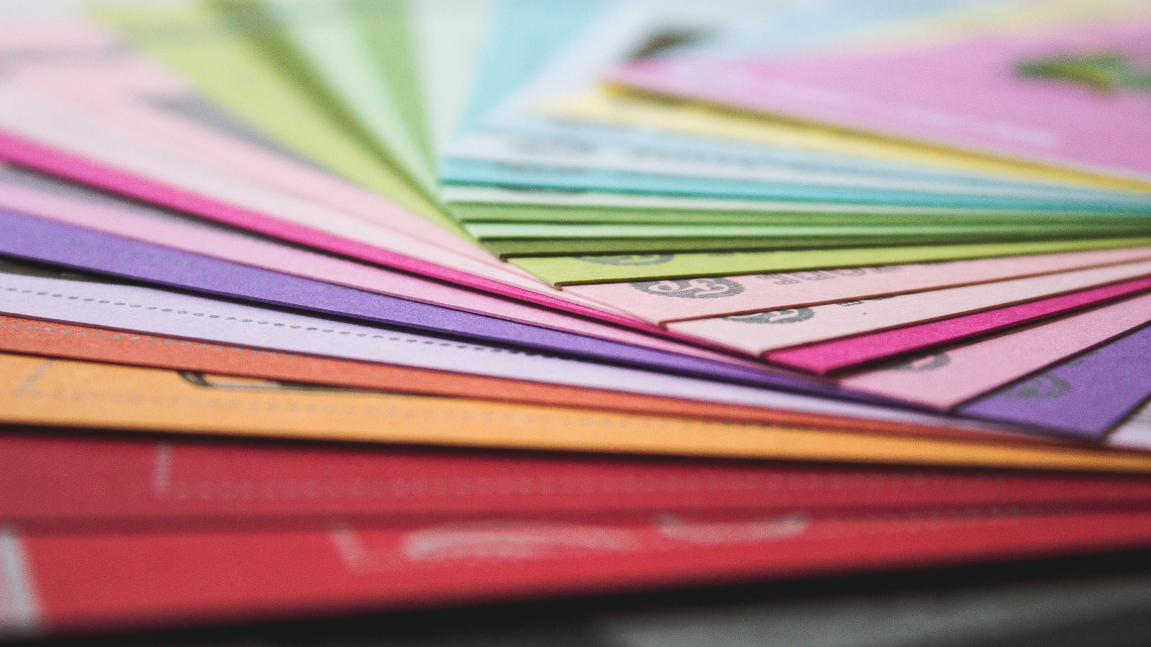
- Sometimes, simple is successful. In a recent study, it was discovered that 95% of the companies researched used only one or two colors total in their logos. Simplicity in color choices not only reinforces the aforementioned emotional connection with a color, but it also has become the trend as logos are being used in an increasing number of mediums and need to be easily reproduced.
Addison Whitney is a global branding firm with a passion for building strong brands.
To learn more about Addison Whitney, visit our website at AddisonWhitney.com, or contact us here.
Long Term vs. Short Term Benefits of Rebranding
Today we are excited to have a guest blog from Senior Graphic Designer Dave Dixon!
Studies like Logos Now, which we highlighted on brand salsa last October, have repeatedly shown that the strongest, most recognized brands are those of companies like Apple, Nike, and Coca-Cola. But that doesn’t mean those companies, or any companies in general, have a monopoly on branding, particularly when it comes to visual branding.
In fact, one of the most widely seen – yet often unnoticed – forms of visual branding comes from the government, in the form of highway traffic signs. While the purposely bland, utilitarian nature of traffic signs may seem like a form of anti-branding, the typography they employ offers several useful parallels to the efforts of corporate brands.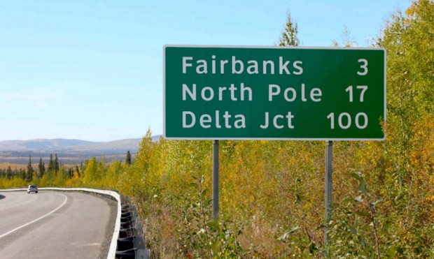
In 2004, the U.S. Federal Highways Administration (FHWA) approved the use of a new font for highway traffic signs. The font, called Clearview, was developed specifically to improve the legibility of highway signs. Tests showed that it was a success, with Clearview providing roughly 1.2 seconds of extra reading time over its typographic predecessor, Highway Gothic. However, on January 25, 2016, the FHWA announced that Clearview was no longer approved for use on American highways.
So after 12 years, why the change?
As it turns out, there are likely several factors at play, with the biggest being the fact that the FHWA never officially mandated the move from Highway Gothic to Clearview. Instead, they simply approved the new font for interim use, leaving it up to individual states to implement it (or not) as they saw fit.
One other factor that may have influenced the decision is cost. While Highway Gothic has been in use across the country for more than 60 years, state and local governments who adopt Clearview must purchase a font license, which can reach up to $795 for the full family of typefaces – for each individual user.
Unsurprisingly, implementation of the new font has been inconsistent. With no clear mandate and a financial obstacle in the way, only slightly more than half of U.S. states have adopted Clearview for their highways signs. Furthermore, inconsistencies remain even within individual states, as local governments have sometimes instituted the new font while the rest of the state officially
continues to use the old one.
It’s not difficult to see how consistency is an important characteristic for road signs. Regularly travelling at speeds as high as 70 or 80 miles per hour, drivers rely on being able to quickly and 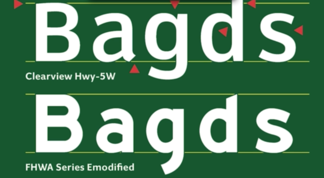 accurately gather information and make decisions. And while it may not be as readily apparent, this lesson applies equally to corporate branding. In a crowded marketplace, potential customers also rely on being able to easily find the information they need to make purchasing decisions. It becomes vital for companies to maintain a consistent look and feel not only for their typography, but also for their logo, color palette, and other visual signifiers that set their brand apart.
The FHWA’s decision also highlights another issue – the short-term vs. long-term benefits of rebranding. The cost for state and local governments to acquire Clearview may indeed be an immediate burden on already strained annual budgets. However, with the research indicating that the change provided drivers with valuable extra seconds, when does the benefit begin to outweigh that financial burden? A font license is, after all, a one-time cost.
In the same vein, corporate brand equity isn’t to be taken lightly or sacrificed on a whim. But if the current visual brand is holding a company back from reaching its full potential, introducing a new direction (and absorbing the initial financial cost that comes with it) may be well worth it. Regardless of the brand, consistency across the board is a vital component. Without it, much like the current state of highway signs, you may find yourself neither here nor there.
Image Sources:
https://www.citylab.com/commute/2016/01/official-united-states-highway-sign-font-clearview/427068/
https://qz.com/605695/font-designers-response-the-us-governments-has-decided-to-nix-clearview-from-all-highway-signs/
Addison Whitney is a global branding firm with a passion for building strong brands.
To learn more about Addison Whitney, visit our website at AddisonWhitney.com, or contact us here.
Can New Visual Branding Strategies Make McDonald’s a “Modern, Progressive Burger Company”?
Today we are excited to have a guest blog from Senior Graphic Designer Dave Dixon!
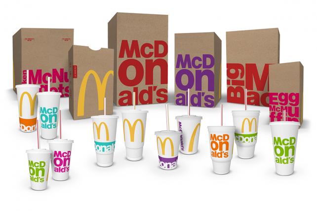
“Modern” and “progressive” may not be the first words you would associate with fast food titan McDonald’s, but company leadership is working to change that. Enter the latest packaging revamp, which will roll out during the course of 2016 and is intended to work hand-in-hand with restaurant design, digital marketing and other brand conduits to establish McDonald’s as “a modern, progressive burger company,” as CEO Steve Easterbrook described it.
Specifically, the new packaging introduces a bright, vibrant secondary color palette to pair with the traditional red and gold so closely associated with McDonald’s, in addition to simplifying and de-cluttering the overall look of the various bags, cups and containers.
However, in tandem with the iconic golden arches, it’s the typography that really takes center stage in this design. Whether it’s the “McDonald’s” name or specific menu items (Big Mac, Egg McMuffin, Chicken McNuggets, etc.), type is the focal point of the design, using a bold font and stacked composition to noticeably break from previous packaging styles.
Time (and, perhaps more importantly, updates to the actual food on the menu) will tell whether this new packaging and visual branding strategy can achieve the stated goal of looking modern and progressive, but for me it misses the mark. While I can’t disagree that it’s more modern than the previous packaging, I also can’t shake the feeling that this is 2010’s idea of progressive, like your parents throwing their first Ugly Sweater Party this past December.
Feedback indicated that consumers “wanted McDonald’s to be McDonald’s,” according to Matt Biespiel, McDonald’s Senior Director of Global Brand Development, and the new packaging clearly reflects an attempt at balancing that with the push towards something more forward-thinking. Ultimately, that balance just isn’t quite right.
I love the oversize, bleeding-off-the-edge golden arches, and the iconic yellow is a vibrant contrast against the brown bags, but with both the traditional yellow and red present, the new secondary  palette clashes instead of complements. And the secondary color palette itself seems to be trying too hard, especially when you read the names McDonald’s has assigned to them ¬– Magical Magenta, Ocean Fresh Blue, Optimistic Orange, Passionate Purple, and Zesty Lime. Consumers will likely never hear those names, but they (unfortunately, in my opinion) do match up with the colors themselves.
The typography, which as I mentioned is the focal point of the new design, also leaves a lot to be desired. The stacked configurations could have been interesting, but by using the established, corporate font found in the McDonald’s logo, they never really had a chance of looking truly progressive. Product names also seem to adapt to this style more easily than the company name, where the “on” in “McDonald’s” is overpowering and distracting.
Perhaps a more limited color palette and a purposeful juxtaposition between the big, bold golden arches and a more restrained, refined type treatment on the opposite side would have been more effective. It’s certainly understandable that companies like McDonald’s need to capitalize on their existing brand equity, but there has to be a better way to carry out the specifics.
Perhaps the most interesting aspect of this redesign from an industry insider’s perspective is the process that led to the new designs. Rather than working with one specific agency, McDonald’s brought together a team that included designers from each of its seven lead agency partners from across the globe. The team had just a week to brainstorm, and after receiving mid-week consumer feedback, narrowed things down to three finalists.
It’s impossible to say how McDonald’s new packaging would have looked had it been designed by a single agency, but in this case, the result seems to reflect the unorthodox process used to create it. In isolation, certain elements might have worked, but the whole ends up seeming somewhat less than the sum of its parts. In fact, by trying to be everything to everyone, McDonald’s just may end up being nothing to anyone.
Addison Whitney is a global branding firm with a passion for building strong brands.
To learn more about Addison Whitney, visit our website at AddisonWhitney.com, or contact us here.
Logo Design and Emotion - Know What Colors Say About Your Brand
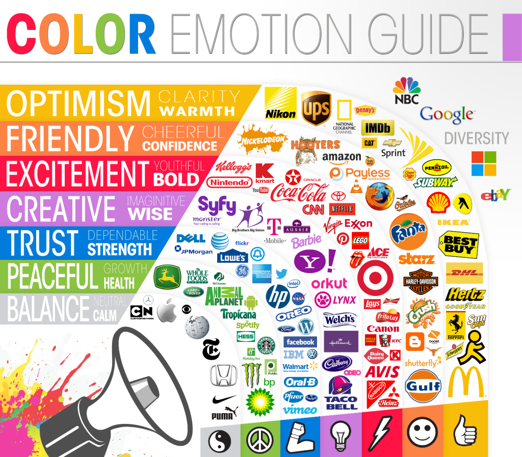
On The Logo Company blog, they designed an infographic showing how varying colors impacted emotions and how these emotions were tied with the dominant color of logos from around the world. These emotional impacts drive home the point that visual branding strategies begin with looking back - how identifying who the brand is, what they represent, and/or what they want to become is the first step in determining a successful color component the brand.
For instance, on the chart, green is associated with growth and health, and the logos that have green as the dominant color tend to rely on the portrayal of these two emotions/feelings to successfully market their brand, such as food-brand logos from Tropicana and Whole Foods, who obviously want to be seen as healthy brands.
An interesting emotional connection is show just to the outside of the "rings" of the main guide. The logos for NBC, Google, Microsoft and eBay are all listed next to "Diversity" and sit to the peripheral the guide due to the multicolored inclusions. All of these brands are known for (or hope to be known for) their wide-ranging brand portfolios. Their brands serves as umbrellas for a number of smaller sub-brands, many of which span the industrial spectrum. These logos are perfect examples for thinking outside the box when determining your brand color. Why settle for a monotone look that only partially describes your offerings? Instead, show the audience through your logo that you are multifaceted and have "earned" your rainbow of brand colors.
This can work against at brand, as well - you wouldn't want to begin your strategy for a brand that is a leader in the financial sector with a logo that conveys youthfulness and boldness, so it would be wise to consider how much red you'll include.
Once again, as we've seen in brand strategy discussions many times, knowing who and what your brand is can be just as important to success as having the perfect logo or name.
Addison Whitney is a global branding firm with a passion for building strong brands.
To learn more about Addison Whitney, visit our website at AddisonWhitney.com, or contact us here.
Why Your Brand Needs a Versatile Logo
When working on a brand strategy to develop a new brand or refresh an old one is to create the crucial visual branding element - the logo. A brand's logo is often its calling card, the first impression-maker with an audience and the centerpiece of its visual identity.
In today’s digitally-focused marketplace, a logo will live in and on more platforms that ever before. Logo designs that used to only need to look good on signage and business cards are now asked to translate into countless versions, including mobile websites, online ads, merchandise, etc.
“The more flexible a design is, the more places it can appear, the more people it can reach, and the more impact it has,” says Chris Cureton, Senior Graphic Designer at Addison Whitney.
Because of this, visual branding strategies have shifted to a place where logos must be adaptable to media and the placements to which it will live. As the visual representation of a brand, the logo has high standards for its appearance – the connection is inevitable of how the audience sees the quality of the logo and relates it to the quality of the brand.
Social Media and Digital Platforms are Major Factors
As has been discussed, social media has become one of the forefronts of any good brand strategy, especially in the development of a visual brand. This presents a unique case for designers, as they not only must accommodate the various sizes and shapes for the different social media platforms, but they also much take into consideration how the audience will be seeing the logo. Desktops, phones, tablets – these all present sizing and clarity issues unique to the others, but are necessary for a design to flawlessly adapt to.
“It doesn’t matter if it's on the big screen or on your watch, we want the brand to present a consistent experience,” says Cureton. Consistency is a key factor in building a strong brand, but also one that can be reconfigured in a way when it comes to visual branding and logo design. This is where the rise of secondary logos and partial marks come into play. If a logo just doesn’t look right on an application or medium, the designers must also keep in mind that possibility of using a logo variation, one that still captures the essential brand characteristics but gives a different perspective.
Big or Small, It Still Needs to Work
Not only does a logo need to be visually appealing in different variations, but it needs to look just as good whether it is on a watch face on the side of a billboard. Versatile logos just don't transfer well, but they scale well - big or small, the meaning and visual impact is not lost on these designs.
This has been one of the forces behind the trend to more simplistic logo designs and away from the heavy detail of previous logos. Simple design factors are easily scaled up or down and provide the consistent look that is desired by brands. In another nod to the strength a digitally-focused society, many of these smaller renditions are required due to the ever-shrinking size of the screens we use.
Don't Forget the Basics
An interesting aspect of this need for versatility is with all of the changes, the basic rules of good design have largely remained the same. Trends come and go, and tastes vary, but a quality logo design destined to have a long shelf life will carry many of the same elements today as it would 20 years ago. What has changed is the world around it.
“In a digital world, design must follow stoic principles. Control what you can control, and let go of what you can't,” Cureton summarizes. “There are so many variables to think about; you can't control it all. We have been forced to see that a strong logo design is also a flexible one.”
Addison Whitney is a global branding firm with a passion for building strong brands.
To learn more about Addison Whitney, visit our website at AddisonWhitney.com, or contact us here.
AW Employee Spotlight: Where Do You Find Your Inspiration?
At Addison Whitney, our people are our most valuable resource. We are lucky to have such a talented group working throughout our offices, and in our AW Spotlight series we wanted to spotlight our employees, finding out more about who they are, and their thoughts on working at Addison Whitney.
In this edition of the AW Spotlight, we wanted to get the insights of four of our amazing team members from our visual branding and verbal branding teams, finding out what gets their creative juices flowing, and asked them their thoughts on the question: Where do you find inspiration when starting your creative process?
Check out their answers below!
Cathleen Foley, Director of Visual Branding
"Whenever beginning the creative process, I start with research. I like to learn as much as I can about the subject matter and let the research spark inspiration.
The findings can manifest in different ways – a shape, a color, or even a font choice. It also helps to associate meaning to every decision in the creative process."
Brittany Scott – Manager, Verbal Branding
"My inspiration begins with brainstorming – I love to browse online and then write down everything I can think of related to a particular topic.
I explore specialized resources and research unique words/phrases related to my ideas. (For example, if I’m thinking about a company or product working strategically towards a goal, I may think about chess, which is a very strategic game. I’ll then research chess moves and other chess-specific phrases that might symbolize strategy and success.)"
Dave Dixon – Senior Graphic Designer
"For me, there’s no one go-to source for creative inspiration. Sometimes it’s the obvious answers, like a well-constructed logo or particularly inventive package design; other times it’s something a bit different, like the latest soccer gear or the navigation design in a video game.
Whatever the project at hand, I’ll look for something in the creative brief that catches my attention, a phrase or concept that might be unique to the project. From there, I try to extrapolate on that idea and follow the various pathways that inevitably branch off from that starting point."
Rachel Loucks – Junior Verbal Branding Associate
"Broadly speaking, I get inspiration from all kinds of places. When naming, I regularly borrow concepts from astronomy, mythology, architecture, chemistry & biology, music, famous figures, and the plant and animal kingdoms, as well as words from other languages.
More narrowly, I use a couple of resources regularly during my creative process. One of my preferred tools is OneLook - acts as a thesaurus, dictionary, and subject index, and is especially helpful in finding new ways to speak to classic concepts."
Addison Whitney is a global branding firm with a passion for building strong brands.
To learn more about Addison Whitney, visit our website at AddisonWhitney.com, or contact us here.
The Personalization of Branding
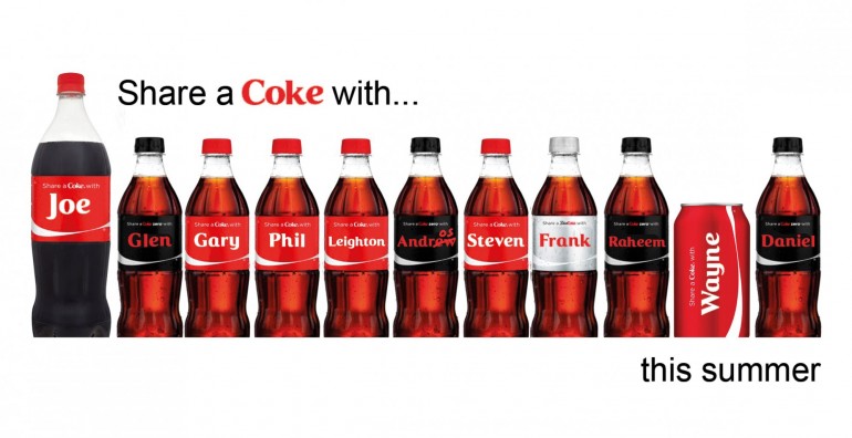
Coca-Cola personalized their bottles using the names of their audience in their "Share a Coke" campaign and made tattoo applicators out of their cans for their Latino-targeted "Celebrate Your Heritage" campaign. Snickers added mood indicators (grouchy, sleepy, whiny, etc.) to their packaging and Bud Light wrapped their cans in each NFL team’s logos and colors. Why are more and more companies using an increasingly personalized approach to packaging and branding?
For the consumer, this approach connects them to the brand on an individual level. It gives the brand a humanistic touch and turns the product into a part of life. It connects the product to something we already care about or feel; but why the tide of change now?
What about human behavior makes this approach relevant to today? The answer is in the behavior of sharing.
With the rise of our always-connected, social media-driven culture, consumers are choosing brands not just because of their prices or advertisements, but because those brands contain an aspect of their brand to which the consumer can connect – everything from a familiar logo or name to an emotional tie-in or, as is the case in this situation, the ability to “social media-ize” their purchase.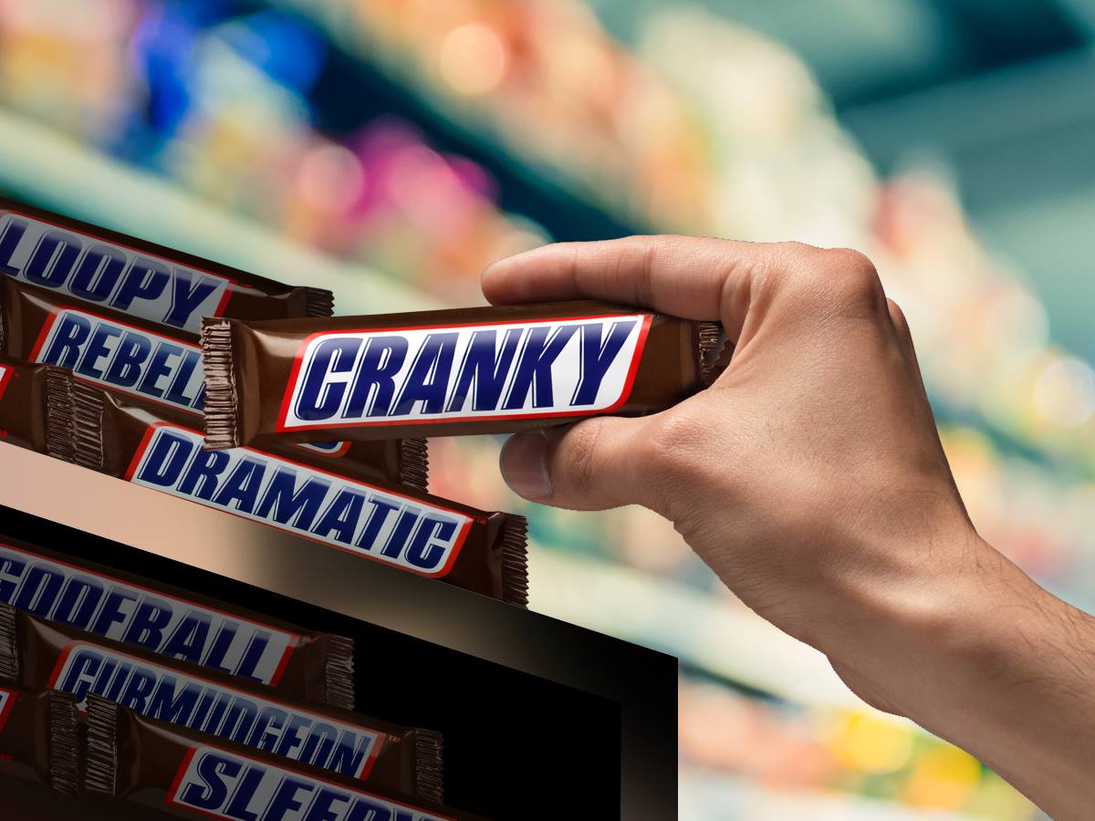
What is this made-up term and what does it mean for brands? To “social media-ize” a product is when it possesses characteristics that drive consumer actions to share and discuss it online. We’ve all seen the pictures from our Facebook friend of a coke bottle with their name on it, or the Instagram photo of your favorite team’s customized Bud Light can – and that is exactly the type of secondary action these brands want consumers to take.
The first action, of course, is to buy the product. But the search for second-level interaction and sharing is where true brand connections are made. If a consumer connects at a level with a brand to where they make the decision to publicize this connection online, it’s a sign of a developing brand loyalty or brand pride.
This brings us back to the trend of personalize packaging and branding. The main connection is along the lines of why people scream when a musician mentions their city in a concert, or why pictures are taken when you happen upon a road that bears your name – when we see outside objects (or in this case, brands) that we can personally connect with, it reaches a deeper level of care. In the case of personalized brand strategies, this care is a stepping stone to establishing brand loyalty.
Now if you’ll excuse me – I need to go find a Diet Coke can with “Matt” on it.
Image Sources:
https://www.facebook.com/snickers/photos/a.190457414461.156238.20645199461/10153550519214462/?type=3&theater
https://dailymail.com.ng/wp-content/uploads/2015/02/2086086_coke2_jpege59b8a3373855ccb169cfd02e45e9626.jpg
Addison Whitney is a global branding firm with a passion for building strong brands.
To learn more about Addison Whitney, visit our website at AddisonWhitney.com, or contact us here.
Keep It Simple: Timeless Advice for Great Logo Design
Today we are excited to have a guest blog from Senior Graphic Designer Dave Dixon!
Trusted. Reliable. Quality. Attributes that every company in the world would like to have consumers ascribe to their products and services. Or better yet, attributes that could be directly communicated to consumers via the company’s logo. But is it actually possible for a logo to convince the target audience of those things?
According to Logos Now, a report recently released by branding firm Siegel+Gale, the answer is almost certainly “no."
During the course of their research, the firm found that logos are significantly more likely to be described as “trusted,” “respected,” and “reliable” if the consumer is already familiar with the logo. On the other hand, unfamiliar logos received a higher rate of negative feedback, even in cases where a survey respondent wasn’t familiar with a logo that would otherwise be considered well-known.
So what exactly can a logo communicate to consumers?
Logos Now found that certain types of logos were more strongly associated with certain brand characteristics, such as “powerful,” “friendly,” or “sophisticated.” However, these descriptors can depend largely on current cultural factors and other outside influences; this is especially true for adjectives like “trendy” or “cool”. Other characteristics, like “traditional,” might be a bit easier to pin down – but that only works if a company wants to be seen as, well, traditional.
Perhaps not surprisingly, there is no easy shortcut on the road to positive public brand perception.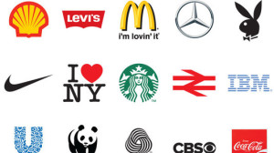
A company has to earn desirable associations, whether it be “trusted” and “reliable” or something more specific like “approachable” or “innovative.” When you boil it down, a logo is simply an identifier – a marker that successfully connects a company and its products with the (hopefully positive) attributes consumers have already assigned them. The more recognizable, the better.
Certain logos are undoubtedly better than others at creating a memorable and easily recognizable visual branding link in the minds of consumers. But what is it that makes them better at it?
Logos Now tells us the answer is, quite literally, to make them simple. That word was repeatedly and universally cited as an attribute of the logos that were also the most memorable. And while certain simple logos, like those for Apple and Nike, also represent some of the biggest and most well-known companies in the world, the formula of “simple = memorable” held true even among logos previously unfamiliar to survey respondents.
In turn, memorable logos were more likely to grab consumers’ attention, more likely to be described as unique in its category, and, perhaps most importantly, more likely to make consumers want to learn more about the brand.
All of that information may seem overwhelming, but it can ultimately be boiled down to a few straightforward points.
In fact, if this blog post had followed the advice laid out in the report, it might have dispensed with the previous 474 words, and instead just read: “Keep it simple."
Image Source:
https://www.creativebloq.com/50bestlogos
Addison Whitney is a global branding firm with a passion for building strong brands.
To learn more about Addison Whitney, visit our website at AddisonWhitney.com, or contact us here.
A Colorful Response
Today we are excited to have a guest blog from our Director of Visual Branding, Cathleen Foley!
"What’s your favorite color?" is a common question I get asked as a graphic designer. I usually respond with, “Well, what is the color being applied to?"
Colors can make you feel a certain way. For instance, I like soft neutrals when it comes to painting my walls because it makes me feel calm, but bright red for a dress because I feel fun and exciting.” That’s my nerdy design answer to someone who was probably looking for a one-word answer like, “blue.”
But it’s true. In the article, What the Color of Your Logo Says About Your Company, Catherine Clifford states, “different colors are associated with different feelings.” She cites that 93% of purchasing judgments are made on visual perceptions and 84.7% of consumers cite color as their main reason for buying a particular product.
Based on those facts, when it comes to building a brand, choosing the right color is so important. I frequently urge clients to step away from the “I like” mentality, as color is subjective.
For example, just because you like the colors blue and black as a Carolina Panthers fan, doesn’t mean those colors are appropriate for your brand. (Side note: biases can creep into blog examples too – go Panthers!) According to the psychology of colors, if your brand is imaginative and creative, purple might be the best color. However, if your brand is sophisticated, black is an appropriate choice.
I agree that when choosing the right color for your brand, color psychology should be evaluated. However, it doesn’t stop there.
When deciding on a color for a brand, you should also audit the competitive color landscape and make a business decision if your brand wants to fit in or stand out. A bright orange in the midst of a sea of blue could make the new brand pop. However, a blue color palette would be appropriate and help a new brand build off of existing brand equity in the space.
So whether you’re developing a new brand color palette or answering the what’s-your-favorite-color question, you can now explain the psychology behind your response!
Addison Whitney is a global branding firm with a passion for building strong brands.
To learn more about Addison Whitney, visit our website at AddisonWhitney.com, or contact us here.
AW Capabilities Month Visual Branding Week in Review
Welcome to Addison Whitney Capabilities Month!
Throughout the month of March, we will be designating one week where we will be highlighting one of Addison Whitney’s capabilities – visual branding, verbal branding, market research and brand strategy – via brand salsa and our social media channels.
This week, we focused on Visual Branding, which encompasses the visual aspects of your branding portfolio. In this special edition of the AW Rewind, we will take a look back at the visual branding-focused brand salsa posts from this week!
What is Visual Branding?
But what is Visual Branding? What does it mean to you? For all of us at Addison Whitney, it’s much more than just pretty pictures.
You only get one first impression; what is yours worth to you? A strong visual identity sets the tone for your brand, and at Addison Whitney, we specialize in understanding the impact and implications that design has on your business. Read more...
AW Capabilities Month Case Study Wednesday: Darden Restaurants
As one of the leading global branding firms, Addison Whitney is behind some of the world’s strongest and most iconic brands. We’re proud of the work we do for all of our clients and love sharing our stories, especially our visual branding experience. That’s why this week’s “Case Study Wednesday”, where we highlight one of our amazing clients and the work we have done with them, will focus on our visual branding work!
Our case study this week highlights Addison Whitney’s work with Darden Restaurants. Addison Whitney has had the privilege of an ongoing relationship with Darden Restaurants, owner of the Olive Garden Italian Restaurant and Bahama Breeze chains. Read More...
When is the Right Time to Change Your Logo?
When is the right time to change your logo? Or, should the question be, is there always a “right” time?
When it comes to branding, the visual aspect is crucial to success. It is the first thing that is seen, and as consumers and audience members to a brand message, a successful visual branding product can propel a brand to success. When a visual brand is successful, it acts as a foundation for the complete brand package. Read More...
Don’t forget, you can stay up-to-date with everything from Addison Whitney by joining the conversation with us on our social media channels – Twitter, Facebook, LinkedIn and Google+.
Want to get exposed to real projects and attain real-life knowledge and skills vital for success in visual branding? Click here for information about interning with the Addison Whitney visual branding team!