Teaching an Old Dog New Tricks – Why Branding Isn’t Just for New Businesses
When starting a new company, building your brand should be at the top of your to-do list. Having a strong brand in your arsenal is crucial to starting at the bottom and moving up the ladder. These new organizations seemingly live at the forefront of the brand development landscape, driving new best practices and rolling out new techniques all the time.![]()
But just because you’re an older organization that came to fruition before strategic brand building was commonplace doesn’t mean you’ve missed the boat. If your brand needs a refresh or a restart, don’t feel as if the latest and greatest branding techniques are only left to the upstarts and newcomers.
There’s no better time than the present to begin engage the appropriate parties and begin the process to bring your brand up to speed with your competition and maximize its ability to drive success.
Without going into too much detail on the brand development process, let’s explore three reasons why branding is important for the established organizations in the business world.
Brand? What’s a brand?
The first reason is that you may not actually have a “brand” in position for your organization. There are a number of reasons why this may be the case, but it’s quite possible your organization has been riding on the success of a particular product or two, making the strength of your organizational brand minimal.
But just because you’ve had success before doesn’t mean you can’t set yourself up for even more success in the future. Diving into building a strategic brand will almost assuredly answer questions you never even thought to ask and take your organizations you never thought you could go. It could be as simple as creating a visual brand that drives a new website design or, for the first time, defining who your target audience is and identifying how to best position your brand for them. No matter what, taking that leap will open new doors for your organization and give you a part of it that will work for you.
No matter when you started the game, everyone is still playing on the same field.
Having an established history and a long list of accomplishments are two things that every business would love to have. But in the day-to-day reality of the marketplace, the memory of today’s consumers can be short, often negating much of the historical advantage of an older brand. What matters is more of right in front of them in that moment – when brands are judged by “what have you done for me lately” and “what do I think of you right now.”
This “right now” mentality puts a heavy emphasis on ensuring that your brand, no matter its age, speaks to consumers as you’d like it to, getting your key differentiation messaging across right away. From names that make sense and connected directly to what your organization offers to logos and visual branding aspects that are aesthetically pleasing and in line with current trends, your brand needs to bring itself up-to-date.
What made sense before may not make sense today.
One of the biggest reasons why organizations are in need of an updated brand is that they’ve simply outgrown the old one, if they even had a “brand” to begin with. When your organization began, maybe you offered two main products, which dominated everything about who you were – your name only spoke to those two, your logo featured them both prominently, your target audience was the market for those two – but now, you’re leaving a lot on the table.
The best brand refreshes and rebrands are able to toe the line between old and new, artfully connecting what made the brand great before with what makes it great today. This is especially true for organizations whose newer offerings are now the star – when they weren’t acknowledged in the brand elements, too much weight was put on them succeeding on their own. They were lone wolves out on the market – quite possibly, the majority of their audience had no idea there was a connection between that product and your brand. So bring them in from the cold and let them bask in the warmth of the overall brand’s strength.
Has your company recently experienced change or growth? Due to changes in business strategies, acquisitions, internal organizational changes or the addition of new products to a portfolio, your brand strategy may need to evolve over time. Click here to download your free copy of “Your Brand’s Guide to Corporate Change” today, and learn how to align your brand and business strategy for success!
How We Answer the Question: "Why Branding?"
I was recently looking through AddisonWhitney.com, and when one of the sliding boxes popped up, what it included caught my eye, talking about who Addison Whitney is and what we do:
“…Helping companies envision their futures – through design, naming, research & brand strategy.”
This phrase stood out to me – and not just because it came from the AW site. The concept of a brand helping to shape a company’s future, along with its ability to put into motion the future they envision, shows the true impact of branding and brand development and drives the case to developing a strong brand.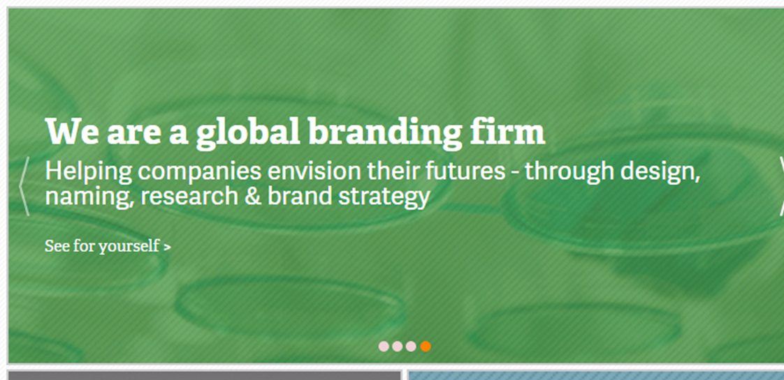
It’s a question we hear all of the time – “why do I need to create a brand? Why branding?”
To me, the best way to answer this question is with a new question “What is branding?”
Branding is... a researched, thought-out, creative name, one that encapsulates the essence of the brand in verbal form. It’s a name that speaks to the consumer and lets them into what the brand is about while also finding a place in their memory and in their willingness to speak it to others.
Branding is... a logo that jumps out from the competition, and is created with the due diligence required to work on whatever platform it sits. It’s a color palette that keeps your visual brand interesting while also keeping it consistent, building brand equity as consumers walk by and drawing them in with its aesthetically pleasing look.
Branding is... the research behind the decisions made throughout the process. Nothing great is created in a vacuum, and that includes brands. It’s speaking to your target audience to discover that a name candidate you thought would be a home run actually needs some refinement before it can reach its true potential, and finding out what the consumer wants your brand voice to say in order to make the emotional connection necessary to build brand ambassadors.
Branding is... the strategy decisions that drive these elements, creating the road map that will get the brand from nothing to something great. It’s the identification of the target audience, the analysis of the competitive landscape, the positioning and architecture of the brand name and any upcoming brand additions, the brand guidelines that are built to ensure that every usage and interaction of your brand is consistent and powerful.
These reasons, these aspects of branding are why its strong development is so important. Creating and growing any business is a process that can take large amounts of time and energy to achieve – that’s a given. So why not spend some of that time and energy to create something that will work for you even after it is launched?
So go ahead, envision your future. Envision the future you want your company to have – where you want it go and the success you want it to achieve. Then look at it through the lens of what a strong brand can provide. If you do this, then “why branding?” becomes an easy question to answer.
Has your company recently experienced change or growth? Due to changes in business strategies, acquisitions, internal organizational changes or the addition of new products to a portfolio, your brand strategy may need to evolve over time. Click here to download your free copy of “Your Brand’s Guide to Corporate Change” today, and learn how to align your brand and business strategy for success!
March Madness: When Even the Floor is Branded
This week, 68 teams from around the country will take the floor to battle for a national championship in the NCAA Men’s Basketball Tournament. “March Madness” as it’s known to millions of fans (some more casual than others), is one of the biggest sporting events in the country each year. And as any branding expert will tell you, that much attention brings an even bigger need for a strong branding production.
We’ve covered how the tournament can help the brand efforts of smaller schools who make a strong appearance, and the brand strength of the term “March Madness” is well-known, but the branding of this event literally and truly starts from the ground up.
The NCAA, although classified as a non-profit organization, knows the monetary value of all of those sets of eyes on their event from start to finish, with every game of the tournament broadcast on television and millions of brackets filled out, causing even more attention to be paid to even the earliest games.
They also know not to pass up a chance to brand every element of the tournament, from the “First Four” games where eight teams battle in Dayton, Ohio in what essentially count as play-in games to the main tournament, all the way to the NCAA logo sewn into every jersey of every player on every team participating.
What to learn more about how you can build your brand? Let's talk.
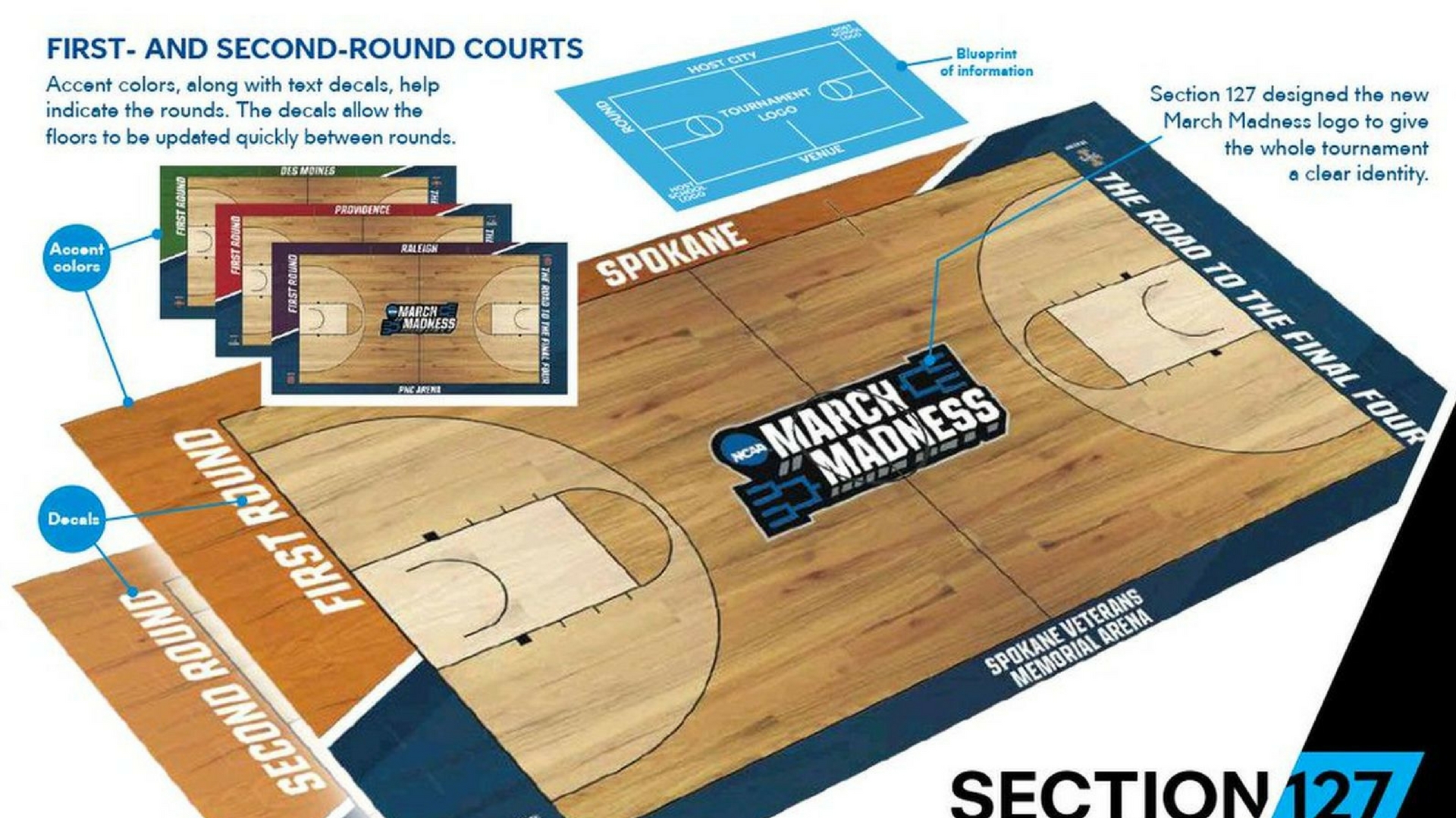
But there’s one branded element that may hold the title as the most watched and most overlooked branding of the entire event – the actual floors on which the games are played.
Yes, March Madness branding is so all-encompassing that even the very playing surfaces are incorporated into the overall brand profile and given a high level of attention to ensure they are both brand compliant but also provide their own unique addition to the visual branding.
The branding of the floor starts with at the middle, where each court is anchored by the logo of March Madness, stretching across almost from three-point-line to three-point-line and serving as the eye-catching visual branding element of the court.
Here's a sneak peek at what the #MarchMadness courts will look like this year! pic.twitter.com/CxAIAs4ALL
— NCAA March Madness (@marchmadness) March 2, 2017
Then, along the edge of the court, along the one baseline and both sidelines, the basic information is provided – where the game is being played, what round it is, and who is the host team/conference. The tournament tagline, “The Road to the Final Four” stretches across the other baseline, joining the halfcourt logo as the consistent brand aspect across each location.
Now, some have clamored for the return to the old way of doing things, where the floor of each venue stayed the same as it was the entire season for whomever played there, providing a kaleidoscope of colors, logos, designs and wood finishes whenever you switched from game to game. The only sign that you were watching a Tournament game was the NCAA logo decal placed somewhere on the court.
While it may have made things more visually interesting, the NCAA knew that it was the very opposite of what they needed to do to strengthen the brand. March Madness is one of their most prized events, one that brings in enough money and attention to drive the majority of the association’s work. And when you have an asset this strong, you do everything you can to tie it back to you.
Today, with the similar-but-not-identical designs and the focus on key elements of the overall March Madness and NCAA brands at the forefront, each court serves its purpose as both informational and branded – oh yea, it also is counted on to host the actual games.
Oh The Places Your Logo Will Go: Unexpected Mediums that Must be Considered in Visual Branding
When working through the visual branding process, especially in logo design, there are a few obvious places the logo will need to be displayed, such as office signage, business cards and websites/social media platforms. But it’s not enough to simply perform in the usual logo locations - in today’s increasingly diverse mediums in which logos will be deployed, logos must perform as they are needed, no matter the new and unexpected places they might be found.
The impacts of this shift can be seen in recent design trends, including the rise of “modernized” logo designs, which de-emphasize intricate details in favor of simplified, smoother logos. These new looks carry a value in their ability to be easily replicated across various platforms and sizes. Other design trends, including wordless, icon-only logos and the development of animated versions of a logo, also carry a valuable nimbleness that translates across mediums.
 Those overseeing these visual brand developments should be wary of committing a total focus to these logo applications at the expense of the overall visual brand experience. It can be easy to slip into the opposite mindset, putting so much focus on ensuring the logo looks great when scaled down to a website icon-sized replica that when scaled up and applied to the usual areas, the overall look is compromised. It is a fine line between a logo that is solid on all ends of the size spectrum and a logo that excels in one but lacks in another.
This isn’t to say that the strategy should be one logo only, no changes, no variations, no matter what. In this case, consistency leans more along the lines of keeping key elements the same, but allowing for leeway in full usage or secondary marks. Many of the most successful visual brands have secondary or alternate logos, most of which are made specifically for a type of application. For instance, if a logo is mostly vertical but is going to be applied to a horizontal-focused medium, it would be time for a variation that still holds onto some essential brand elements but doesn’t compromise in quality.
More places to have a logo means more opportunities to get your brand in front of consumers to build brand equity. But if the consumer can’t easily connect the smaller or alternate logo back to your overall brand, you are missing out. As such, design with key brand elements in mind. Do you have a dominant color scheme, like the UPS brown, or a unique shape, like the
McDonald’s arches? Put these at the forefront of your design. That way, no matter what version, size or application a consumer sees your logo in, there will be an inherent ease in connecting it back to your overall brand.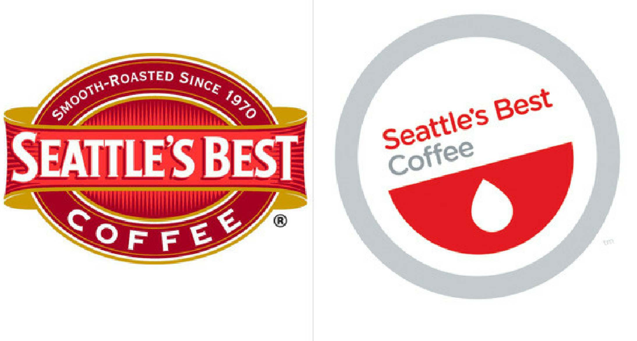
A bonus piece of advice when working on this type of logo design - strong brands in general all possess these standout elements, so if you’re struggling to identify which should be the driver in your logo design, it may be time to go back and look at your brand development strategy.
Visual branding will be somewhat driven by the evolving and ever-advancing ways in which we consume our brands, and as such, the cornerstone of the visual brand development – the logo – will be will be required to follow suit. These strategies and best practices will help ensure that your logo works for your brand as well as possible, no matter what platform it is given.
Has your company recently experienced change or growth? Due to changes in business strategies, acquisitions, internal organizational changes or the addition of new products to a portfolio, your brand strategy may need to evolve over time. Click here to download your free copy of “Your Brand’s Guide to Corporate Change” today, and learn how to align your brand and business strategy for success!
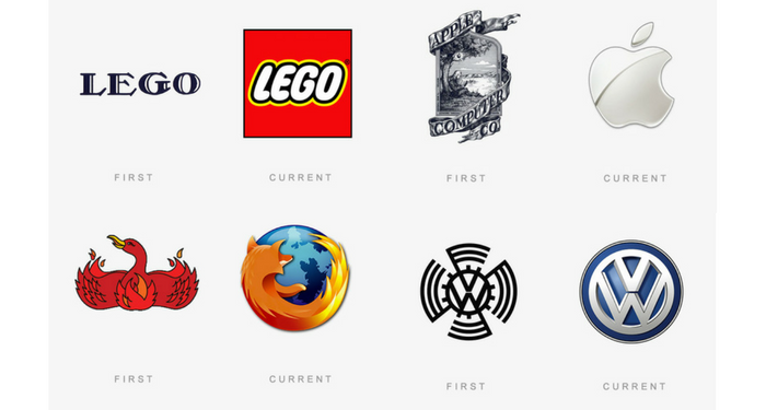
Iconic Logo Timeline Shows There's No One Way to Evolve
Logo evolution is a natural part of the branding process. In fact, the evolution of the overall brand is common, and often necessary, in order to keep up with the latest advancements in the marketplace and ever-changing consumer mindset. But how a logo "should" evolve is still up for debate.
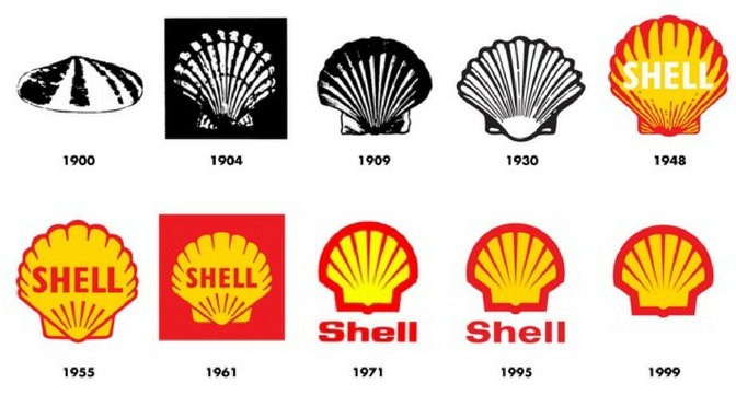
The below infographic by The Logo Company shows how a number of iconic brands have tweaked and shaped their logos over the years. And one thing is abundantly clear: the debate on whether there is a single definitive way to evolve a logo is over. The data overwhelmingly disputes the validity of one-size-fits-all logo evolution, driving home the point that each logo should keep the brand at top of mind and at the forefront of its evolution.
Dave Dixon, Senior Graphic Designer at Addison Whitney, sees a number of unique strategies within the logo evolution examples.
"A lot of these, like BMW, VW, and Shell, have really focused on using logo evolution to clean up and streamline their logos," he says. "To me, that indicates strong brand equity and a logo that illustrates the importance of brand building over communicating something extremely specific. The Shell logo, for example, doesn’t tell you that it’s a fuel/energy company or anything else about the business. But it’s unique and recognizable, so it does a better job than most other logos.
"The YMCA logo is probably the best example of an organization that felt they needed a new direction. The current logo is pretty clearly more youthful, energetic, and fun than the previous versions. It seems more friendly and accessible, which is a departure from the earlier logos."
He points out that the Windows logo is possibly the most interesting progression, mentioning how it has almost come full circle at this point - the current logo has far more in common with the original logo than with any of the iterations in between, speaking to the importance of simplicity and recognition over specificity and trendiness.
Full-circle logo design, new directions, specific communication vs. brand building efforts - the evolution of brands and logos has it all, and more. The one thing in common for them all is that they are all done within the premise of building a strong brand, and stressing the importance of continuity among the most recognizable brand elements. Whether it is a color scheme, a shape or a wordmark, a good logo evolution will build on the existing brand equity. Even if they all take use different blueprints in the building process.

When Less is More in Logo Design and Visual Branding
As brands and logos have evolved over the last several years, it’s become evident that simplicity and minimalistic design is a key new direction for modern brand marketing. Even the most iconic brands and logos are following the mindset of “less is more” when it comes to their designs. From less detailed images to geometrically-inspired outlines, brands are embracing a clutter less existence.
One of the most prominent features of this trend involves tweaking, or in some cases, totally removing, the typographic element of the logo. In a recent article, author Kalle Oskari Mattila examined this shift, highlighted by MasterCard’s recent rebranding, in which their new logo was de-emphasized with the state goal to do away with the text altogether within the logo.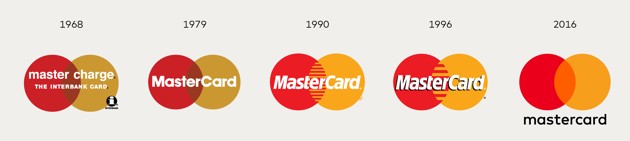
There are a number of good reasons to embrace “less is more” logo design. From a practical standpoint, cleaner and less-cluttered logos are more versatile and work much better on the myriad of platforms on which modern logos must perform. Logos are needed in smaller and smaller iterations, where the decrease in size must not impede the logo’s clarity or ability to represent the brand.
This is especially true when it comes to text – there is a reason why few app logos have any text – as the logo gets smaller, text can quickly turn into a jumbled blob that takes up space without providing real value.
Therefore, if you are a brand with a logo or a visual brand that has the equity to stand on its own and earns immediate recognition from consumers, the choice to “slim down” is a relatively easy one. Some of the biggest brands out there have gone this path – from the McDonald’s golden arches and Nike Swoosh to Starbucks and MasterCard with their own logos.
However, as a new or lesser-known brand, it would be advisable to proceed with caution in this aspect of brand development. It is logical that the removal of a brand name from a logo would decrease ease of recognition and connection between brand and logo, which is a step that is crucial in building a brand. Mattila deems the “debranding” strategy as one “based on paring down that can only be deployed by the most identifiable of brands.”
Additionally, Matilla explains that “Some marketers believe that debranding can make global brands appear ‘less corporate’ and ‘more personal to consumers.’” This personalized feel in corporations is a direct reflection of the way technology and new companies are headed. This is one way for larger, older brands to stay relevant and directly target younger generations with the goal of having them continue using products their grandparents and parents use.
Coca-Cola’s early success with debranding is one of the most prominent examples, namely the “Share a Coke” promotion, where the brand replaced the Coca-Cola name on its bottles for a massive variety of people’s first names, in addition to nicknames and monikers. The campaign was a massive hit with consumers, who sought out bottles which featured their names or the names of loved ones, and provided Coca-Cola with a personalized stamp on each of their products, by simply backing away from the branded aspect and replacing it with an element that connected deeper.
Going with a simpler visual brand and separating text from logos signifies confidence in brand familiarity and its consumers. Debranding takes this a step further by not only showing the consumer that you feel your logo has the equity to stand on its own, but also allowing for an expansion of personalized and authentic branding efforts, designed to strengthen the connection between consumer and brand.
A Cup of Sugar and Branding Advice - Two Things You Can Get From Your Neighborhood
What if I told you that organizations and products across the marketplace could take branding advice from a collection of neighborhoods in Nashville?
After the confused looks and wondering if I’ve lost my mind, I’d tell you that these neighborhoods have identified two of the main tenants in branding, and have put the full force of their efforts behind raising the bar within their market.
 Collectively, the geographic areas involved make up the city of Nashville. Which in of itself is a strong brand and a well-known place. People are proud to identify themselves with the city as a whole and everything it offers. But within Nashville resides a number of smaller, more geographically-focused neighborhoods, each offering its own unique elements and characteristics.
In line with a recent trend in demographic identity, the residents of these areas are beginning to attach their neighborhood with their own personal brand. In doing so, they have hit a sweet spot in branding, having achieved two foundational achievements in building a successful brand.
First, they’ve established strong brand identity, one that is built on its own characteristics while at the same time creating emotional connections with their audience. There is a natural, built-in connection with one’s home and local area, and to create a brand built on this gives the neighborhood instant brand ambassadors.
Willing to stake their own personal identity on their neighborhood brand, these residents boost its strength and increase the differentiation of the brand amongst its peers. As Nashville designer Tim Park said, “"I think the people here are so dang proud of their neighborhoods that they want to shout it to the rooftops.”
Brands everywhere can often only dream of possessing such loyalty and enthusiasm, where their audience not only relates internally, but invests their own effort to help spread the brand outside of its initial reach.
Additionally, these brands have eased the ability to spread the brand through well-thought-out, creative names and logos. In addition to all of the well-established reasons why a visual and verbal brand is vital for success, these elements serve as a resource for the aforementioned brand ambassadors. They may have all the enthusiasm in the world to spread the brand, but the addition of tangible brand elements makes it that much easier.
These neighborhood names and logos serve another purpose as well – they all highlight what makes the area unique. They serve as conversation starters and sources of information that further increase the presence of the brand.
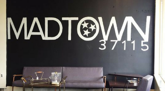
For instance, the logo for the Hillsboro-West End neighborhood in Nashville showcases well-known landmarks within its borders. Visitors viewing the logo for the first time are immediately 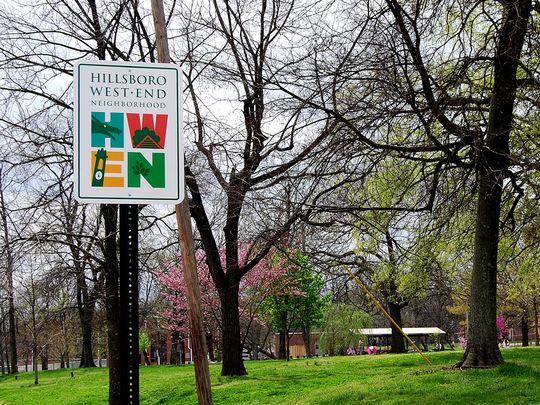 informed that the neighborhood boasts a number of famous places of interest, while also establishing where in the city the neighborhood resides, an important piece of information for any place.
This is a lesson that can be transferred into a number of branding spaces. When creating a new name or logo, look at what makes your brand stand out – how can these two elements tell the story of your brand? Don’t waste the opportunity and create a name or logo where the connection has to be explained to the audience.
So the next time someone says that their brand was influenced by a place called “Madtown” or a logo showcasing a prominent street sign, take their word for it. They might just be on to something.
Learn more about building your best brand portfolio strategy by downloading this FREE webinar, "Identifying The Opportunities In Your Brand Portfolio - Are You Capitalizing On Every Potential Business Opportunity Your Portfolio Provides?"
Looking toward the Branding Future with an Eye on the Past
It’s a common misconception that a “rebrand” automatically means a brand new start – that when a rebrand occurs, the slate must be wiped clean and all subsequent branding elements must possess totally original characteristics.
In fact, the best rebrands take the opposite approach. They take the time beforehand to identify and research what brand aspects of the previous iteration carry the most weight and provide the most benefit, then find ways to incorporate or pay homage to these aspects in the new brand.
A recent example of this is the brand update from the Sacramento Kings of the NBA. As they were preparing to move to a new arena, they felt a need to update their brand, specifically their logo.
Throughout the redesign process, they looked at countless visual branding representations of the team name, many of which had little to no connection to the previous visual portfolio. However, what they kept coming back to was a design that touched on previous logos from the franchise’s long and storied past.
Ultimately, they chose a design that was a more modern version of the historical look, which immediately allowed fans, players, alumni, employees and the overall audience to connect the team’s future with its past, providing the new logo with instant brand equity.
This idea of building equity in a brand, especially within a specific element, is a difficult concept to strategize. Often it takes years to build up enough recognition, goodwill, historical weight, etc. to
sufficiently say that the brand carries its own weight with an audience. Therein likes one of the benefits of tapping into a brand’s history while strategizing its future. In this instance, those who connected with the team back when they were the Kansas City Kings or even when they were in Cincinnati, Ohio and known as the Cincinnati Royals could reconnect with the franchise through a familiar visual branding choice.![]()
Or, as Alex Kramers of Kings.com says, “The powerful, all-encompassing symbol invoked a deep sense of nostalgia while reinvigorating a heritage that had long distinguished the historic franchise.”
This quote can resonate with brands across the spectrum as a reminder that rebranding and reinvigorating don’t have to be mutually exclusive. There’s a reason why the positive aspects of the past are so often imagined fondly, and why nostalgia is such a powerful emotional response, one that brands should be jumping at the opportunity to include.
Rebranding with an eye toward the past doesn’t have to stop at a redesigned logo. Every aspect of the brand is subject to holding nostalgic brand equity, and as such, should be included in the research process used to determine the best of the best of the old brand. It could be something as simple as a color choice that connects the branding eras, or it could go all the way up to the verbal branding and brand name that drives the association.
From start to finish, the big decisions to the smallest details, the top of the organization all the way down, a rebrand can be an overwhelming and challenging task. Why add more to the effort by starting from scratch? Use what your brand already possesses and give the new brand a ready-to-go foundation on which to build.
The Science of Logo Design: How Much Can a Logo Impact A Brand?
Today we are excited to have a guest blog from Senior Graphic Designer Dave Dixon!
Logos are inherently subjective. On the art-science spectrum, they seem to reside rather comfortably within the realm of art. However, the pursuit to discover the science of logo design is alive and well, with the latest effort coming from researchers at the University of California, Davis.
A series of social psychology experiments illustrated that logos (as well as flags and other group symbols) communicate unity and effectiveness, regardless of the group they represent. On the flip side, logos were also found to make groups seem more intimidating and less inclusive, whereas organizations without a logo came across as more friendly and welcoming.
While certain luxury or niche brands may embrace the concept of exclusivity, where does that leave companies and organizations that pride themselves on being open, helpful and friendly? The idea of forgoing a logo isn’t realistic, particularly when standing out in a crowded marketplace is a basic requirement for success. At the same time, coming across as intimidating or impersonal could be detrimental to the brand.
Is it possible to convey both competence and warmth in a logo? Unity and inclusion? Strength and kindness?
The answer to all of the above is yes and no. It’s certainly possible for a logo to convey any or all of those things – just not on its own. Logos, and the ![]() brands they’re part of, are living, growing things; they’re inseparable from the products, services, employees and other aspects of what they represent. Even the most recognizable logos (and by extension, the most recognizable brands) have evolved considerably throughout their lifespans. You only need look as far as Apple to find an example of noticeable logo evolution. More recent examples, such as Hillary Clinton’s presidential campaign logo, prove that perception of a logo can change in as little as a few months.
brands they’re part of, are living, growing things; they’re inseparable from the products, services, employees and other aspects of what they represent. Even the most recognizable logos (and by extension, the most recognizable brands) have evolved considerably throughout their lifespans. You only need look as far as Apple to find an example of noticeable logo evolution. More recent examples, such as Hillary Clinton’s presidential campaign logo, prove that perception of a logo can change in as little as a few months.
Perhaps even more importantly, logos are part of a larger brand system. Left to fend for itself, a logo would quickly cease to stand for anything - or, more accurately, never come to stand for anything in the first place. And while the best asset for any brand is customer loyalty, additional visual branding elements can help bridge the gap between a newborn logo and a mature, fully realized brand.
Marketing and communication collateral can play an important role, as well. PowerPoint presentations, newsletters, website graphics – these elements provide an opportunity to create a strong visual impression in the hearts and minds of customers that connects the logo with more specific brand messaging, filling in the blanks and completing the brand picture.
More subtle visual brand elements, such as color, can play a significant role, as well. Think Home Depot orange or Coca-Cola red – reinforcing the brand color palette across a range of visual components will serve to cement the logo-to-color-to-brand connection in customers’ minds, and  potentially make that set of colors uniquely identifiable. Working either in conjunction with or as a replacement for color, typography can serve the same function. FedEx, for example, uses a variety of secondary colors across its service lines, but its distinctive typography and primary purple color scheme are instantly recognizable.
A logo is the central focus of visual branding, and rightly so – it’s the building block that provides a solid foundation for everything to come. But it’s important to remember that a logo is just the beginning, and that visual brand elements such as stationery, marketing collateral, color palette and typography breathe life into the logo, as well as providing additional touch points for your target audience to meet, get to know and, ultimately, fall in love with your brand.
Why You Should Never Close the Story on Your Brand
"A great brand is a story that's never completely told." – Scott Bedbury
Adaptability. It’s a word that has been used on this very blog to describe how logo design needs to include versatile elements to adapt to a digitally-focused media world, but the same concept can (and should) be tied back to the entirety of a brand.
To me, there are few things more frustrating than hearing that the reasons something hasn’t changed is because “that’s the way it’s always been done.” Showing a deliberate avoidance of any sense of evolution without true reasoning is a first-class ticket to failure. Industries and marketplaces change constantly – and in order to stay relevant, so must your branding.
The above quote from Scott Bedbury perfectly in line with the concept of brand adaptability. A great brand is one who never really reaches the end of their story – they are an ongoing manuscript, ![]() adding new pages as the world around them moves forward, shifting their branding strategies not just to fit the new landscape, but to continuously find that area of differentiation that will set them apart from the competition and allow them to rise above the branding fray.
adding new pages as the world around them moves forward, shifting their branding strategies not just to fit the new landscape, but to continuously find that area of differentiation that will set them apart from the competition and allow them to rise above the branding fray.
These brands are self-aware about their place in the market and proactive in anticipating how that place can shift suddenly and without notice – they are the ones who always seem to be ahead of the curve, never caught flat-footed by the winds of change. That’s not an accident. That is the result of creating a brand that can evolve when needed without compromising the overall brand integrity.
But take note that an adaptive brand is not synonymous with multiple total rebrands. In fact, it falls more in line with brand shifts instead of brand refreshes. A rebrand or brand refresh takes time, money, effort both in the branding process and immediately following, when the new brand must be communicated and try to build brand equity.
The equity earned through time on the market can often be the most valuable commodity available to the brand, and to restart this process instead of using it to their advantage is a missed opportunity to ease the burden of adapting their strategy.
For instance, if there is a brand who has been on the market for 40 years with a logo that has become outdated, it would be unwise to group the rest of the brand elements in with an updated logo 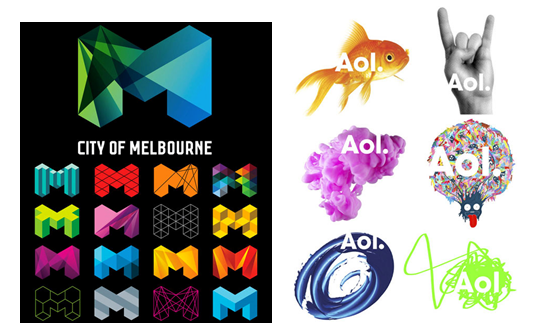 – instead, find the most recognizable and timeless elements of the logo and adapt them to fit your new direction, much like the logos shown to the right. That way, the new logo and any associate branding assets can be bolstered by the foundation laid throughout the brand’s previous history while simultaneously adding to the story as needed.
The brands who have found success in this area don’t rewrite their story, they simply add a new chapter, one connects their past with the needs of their future, and leaves the door open for what comes next.
Addison Whitney is a global branding firm with a passion for building strong brands.
To learn more about Addison Whitney, visit our website at AddisonWhitney.com, or contact us here.