Addison Whitney Brand Fanatics Recap and Analyze Brand Impacts from Super Bowl Ads
The Super Bowl. Not only the biggest football game of the year, it’s also the biggest game in the advertising world. Many millions of dollars are spent on the annual event, which puts even more pressure on the created ads to push the needle for their brands.
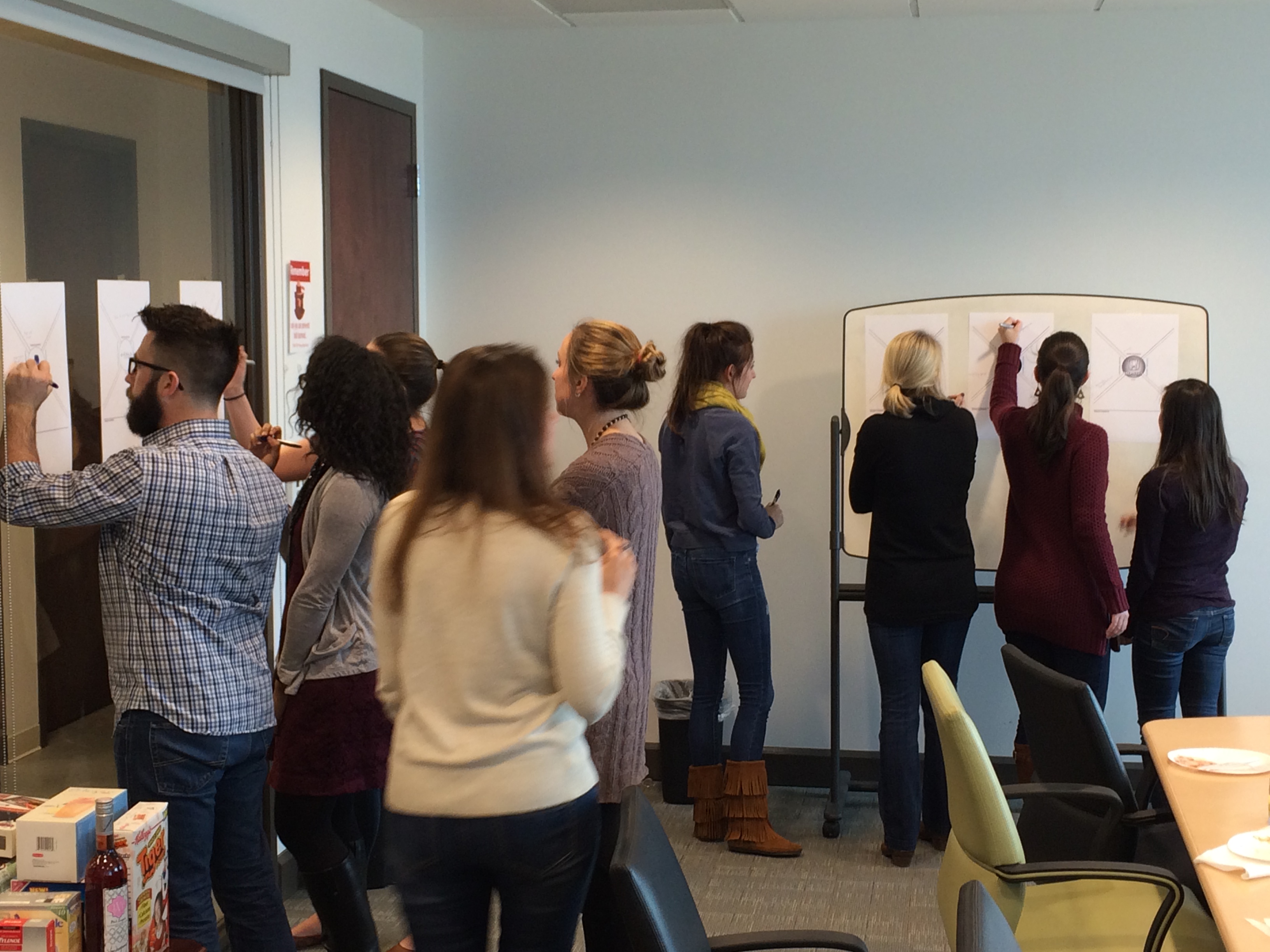
And with a night full of high-profile brand decisions, we knew that time needed to be spent analyzing the commercials and the brands behind them – so on the Monday following the big game, our Addison Whitney brand fanatics gathered to do just that.
Right off the bat, our brand fanatics examined what their pre-conceived notions are for the various brands – what do we feel about the brand prior to seeing the commercials? This brand conception exercise served as the foundation for discussions post-commercial, where we identified four areas of each brand’s perception – target audience, emotional benefits, functional benefits, brand elements and tone.
Once the commercials for the highlighted brands were watched one more time, the discussion switched to how they lined up with the aforementioned brand perspectives. Did they align with how our audience previously saw the brand? Or did they feature a departure, whether intentional or unintentional, that signals a change of how we see and think of the brand?
One of the themes that came out of this year’s Super Bowl advertising was the trend of brands to focus on specific sub-brand within their portfolio instead of the overarching brand story. The Honda commercials for the Ridgeline trucks were cited as a perfect of this, where the Ridgeline brand characteristics were highlighted, overriding previous Honda perceptions.
Those brands who stayed more on-target with their overall brand connotation seemed to show a strong sense of brand awareness and a strategy that has stood the test of time. Bud Light’s brand image has largely gone unchanged in past years, and their advertisements this time around looked to continue and strengthen these perceptions.
 They are the brands with a certain comfort level to what their brand perception is, and are using the Super Bowl platform to continue this brand instead of trying to break new ground with their strategy. Especially when their target audience is very well-defined and fits within what their brand represents, these organizations are more likely to use their ads to reinforce their traditional messaging for their audience.
Self-awareness is another desired characteristic when it comes to advertisement strategy and Super Bowl messaging – brands who are comfortable with where they stand in the market. With many advertisements focusing on brands taking a “new direction” with their strategy, those brands who stuck with who they are stood out among the crowd.
These brands were banking on their already established brand equity to carry some of the load in messaging, using their ad time to push a specific narrative that is buoyed by their brand equity that is assumed to be present.
Overall, it was another successful AW Super Bowl Ad recap – now we want to hear your thoughts! Leave a comment or reply to us on our social channels and let us know what your favorite ad was, and how you think the brands involved impacted their branding efforts!
Addison Whitney is a global branding firm with a passion for building strong brands.
To learn more about Addison Whitney, visit our website at AddisonWhitney.com, or contact us here.
NFL Brand Playoffs
In the upcoming round of the NFL playoffs, four teams will face off for a chance to play in the Super Bowl. But if it were a contest of brand strategy, which two teams would most deserve to compete on February 6th?

Names:
In the renaming of the New England Patriots in 1971 (originally the Boston Patriots), the Pats went from representing exclusively Massachusetts to encompassing New Hampshire, Vermont, Maine, Rhode Island, and Connecticut – a move that helped expand the brand’s fan base. The name ‘Patriots’ reflects back on the foundation of our country, when we valiantly defended our rights in a struggle for independence. By tying themselves to a national sentiment, the Patriots have a name that evokes emotion – fierce pride and loyalty – which can be felt from the entire nation. The name provides an avenue for traditions like The End Zone Militia (firing guns after a New England touchdown). The kind of traditions that develop loyalty and passion.
The Baltimore Ravens are named after the famous poem “The Raven” by Edgar Allen Poe, who spent his last few years in Baltimore. Personally, the poem doesn’t exactly bring to mind the ruggedness that a football game should carry. And ironically, Poe’s biography mentions the fact that he considered himself a “Bostonian”, not a Baltimore native. Nevertheless, a raven is not an animal to be messed with.
Logos:
The Patriot’s Logo is strong, simple and patriotic. It is recognizable and speaks to the dominance of their team by using bold colors and sharp lines. Using the colors of the American flag reinforces the national prominence of the team and reflects their strength and determination.
The Raven’s logo represents winning characteristics – bold and strong. While the logo may clearly be a raven, it lacks any personal or human connection. Alex Barrett, a writer for The Bleacher Report ranked the logo 26th in the NFL - “Despite the great purple / gold color scheme, we have a casual looking bird with a beak way too big and cheeks that look like they’re storing nuts for the winter.”
Winner:
With a stronger logo and a name that evokes pride and loyalty, the New England Patriots get my vote for the AFC Champions of branding.

Names:
The New York Giants, named after the baseball team formerly located in the Big Apple before their move to San Francisco in 1957, have one of the more abstract names in the NFL. While the name may have meant something to the baseball team, for the football team it is simply a hand-me-down. It may be seen as intimidating, but the name ‘Giants’ does not evoke any meaningful emotions on its own.
The 49ers, in a similar way to the Patriots, have history on their side. Their name brings to mind the glory days of the California gold rush, when there was nothing but hope of riches and a pioneer spirit. Again, this is something fans can reflect upon, which helps create a stronger connection to the team. However, the historical reference is not an obvious one, and without an understanding of the background you might wonder about the strange name.
Logos:
It’s difficult to illustrate an actual ‘giant’ in a logo, so New York leverages its initials in the design. But the lowercase letters and simplified design seem to contradict the message in the name. While “Giants” implies strength, intimidation and stature, the logo makes the team feel small and unassuming. Barrett argues that the team should have stuck with their old logo, “I didn’t much care for the logo from 1999 that looked exactly the same, but just spelled out ‘GIANTS,’ but looking back I think it was just a bit better.”
As with The Giants, making a logo for a name like 49ers is a challenge. To me, this logo doesn’t say “intimidating football team” - it could be a logo for anything. Barrett, however, finds merit in its simplicity, “I have always been a fan of the burgundy and gold color scheme. It is plain, yes; but it is also classy and one of the only good ‘oval’ logos left.”
Winner:
It was a close one, but the 49ers win by a margin for the historical significance of their name and for the bold simplicity of their logo.
Patriots vs. 49ers?
As far as the 2012 Super Bowl of branding goes, I have to go with the Patriots. I think the history behind their name and the boldness of their logo are unstoppable.
Did I mention that I'm a Pats fan?
Contributed by Christy O'Keefe