Branding The Hunger Games
Branding the Hunger Games
Harry Potter set the stage… The Twilight franchise built on Warner Bros.’ foundation… And now, it’s The Hunger Games’ time to shine.
We’ve touched on movie branding in the past, but as Lionsgate ramps up to the premiere of the latest Hunger Games movie, its branding efforts are, in a word, remarkable.
I’ll admit, I was not an early adopter of the Hunger Games series. Initially, the idea of a book/movie series based on a post-apocalyptic America and an annual, televised event where children fought to the death did not appeal to me. That said, after watching the first movie (several times), I’ve been sufficiently sucked in. So, in my excitement for the second movie, Catching Fire (due in theaters November 22), I’ve started to follow the film’s branding and marketing efforts.
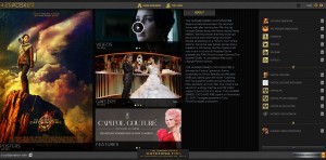
Somehow, in my daily news trolling last week, I stumbled across this website:
Apparently, it was started to promote the first movie, but re-launched this past May with a ton more content (for non-fans: The Capitol is the opulent metropolis and governing body of Panem, a nation in post-apocalyptic America [and the setting for the book]). This site has a Vogue-esque feel, complete with editorials and character profiles. Moreover, Lionsgate released couture images of cast members to further promote the movie’s heightened focus on costume design.
From there, I visited all the normal haunts for movie releases (websites, social media, etc.) and found an extensive network of storytelling and branding. The website is clean and beautiful, with easy navigation and just the right amount of content to get fans excited (even with the premiere still more than three months away).
Facebook features a whopping 14 individual pages, each with customized content: one for the movie franchise, one for The Capitol and one for each district within Panem (a total of 12 more pages). The Twitter campaign seems a bit more focused, with official Hunger Games and Capitol accounts. That said, two Capitol Couture journalists can also be found tweeting, @AthenClaithCC and @VelvetVeritas. The YouTube account builds on The Hunger Games series as a whole and the Google+ account seems to be an extension of the Facebook and Twitter efforts.
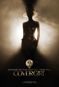
Also announced this past May is a partnership with COVERGIRL, marking the makeup corporation’s first movie partnership ever. Print and TV ads will help launch and promote the partnership this fall, but here’s a sneak peek.
Given the rise of smart movie and branding partnerships like The Great Gatsby and Tiffany & Co., I’m excited to see what else comes out of the woodwork in the months ahead.
“May the odds be ever in your favor…”
Sources
“‘The Hunger Games: Catching Fire’ Capitol Couture Portraits,” Hollywood.com, Michael Arbeiter, https://goo.gl/2R12yf
“CoverGirl Announces ‘The Hunger Games: Catching Fire’ Makeup Collection and Campaign!,” MTV.com, Liza Darwin, https://goo.gl/KWVeOe
“The Hunger Games: Catching Fire – Official Trailer,” YouTube.com, https://goo.gl/QsGGLb
Brands We Love: Publix
Plain and simple, I love Publix. It’s a love affair that‘s going on 20+ years, and with the Florida-based grocer now entering my adopted home state of North Carolina, it’s an affair I don’t see ending anytime soon.
There are so many reasons to love a grocer whose tagline is “where shopping is a pleasure,” but for today’s post, I’m going to discuss two things that make the Publix brand stand out: Its private label brand and its advertising, specifically its holiday commercials.
But first, a little history on Publix.
Publix is an employee-owned supermarket founded in 1930 by George W. Jenkins. According to My Private Label Buyer, George was managing a Piggly Wiggly grocery store in Winter Haven, Florida when hard times brought a drop in the store’s sales volume and staff pay cuts. When George learned the owner had sold his store to an Atlanta businessman, he looked forward to a visit from the new owner, but as time passed there was no meeting. So he took initiative and made his way to Atlanta to introduce himself. George never got the face-to-face meeting he hoped for and left Atlanta feeling a bit scorned, but also extremely motivated to start a store of his own, and that store was Publix.
Publix now operates over 1,000 stores in the Southeast. Publix brought in profits of $1.5 billion in 2012 and is ranked #106 on Forbes’ Fortune 500 list. Publix’s accolades don’t stop there though - it’s consistently ranked as one of Fortune’s top 100 Best Companies to work for, and according to a report compiled by Deloitte in 2010, Publix took the top spot on the most valuable retail brands list, even beating out big-time players such as Amazon, Ikea, and H&M.
To learn more about its history, check out this video that a Tampa news station produced for Publix’s 80th anniversary in 2010.
Publix Private Label:
The Publix Private Label brand has a loyal following, and with good reason. Those who regularly shop at Publix know that buying private label means they won’t have to sacrifice quality for price – something that most shoppers might take for granted - because you see, not every private label brand holds their goods to the same standard that Publix does. It’s this sort of standard that has propelled the Publix private label brand to account for 20 percent of all its sales. The Publix private label is projected to have sales of $6.6 billion by 2014.
And the packaging hasn’t hurt the brand’s success either. In 2003, Publix redesigned its private label packaging across all offerings, and now features a clean, simple and prominently white design that clearly separates it from big label brands.
Publix Commercials:
A standard branding “must do” is creating emotional connections with your customers. Do that and you’ll have a greater chance of bringing that customer back time and time again. This is something Publix does better than almost anyone. If you haven’t seen a Publix commercial, you might wonderhow a grocery store can do this? Publix is just another store to get the food I put on my table. That may be true, but you’d be hard pressed to find another brand – in any market – that capitalizes on human emotion more than Publix does. Liz Crawford, senior vice president, business and communications strategy with Mars, a shopper marketing agency, summed it up quite nicely when she said, “Publix conveys this image, particularly in its television advertising, of family and a good meal, it’s almost like love on the table.” There’s a warmth there that any national chain, even the really successful ones, just can’t seem to match. I get the sense that Publix really is lodged in the hearts of its shoppers.”
Grab your box of tissues and check out some the most memorable Publix commercials below.
As Publix begins to extend further north, so will the impact of its brand, and personally, I can't wait to see it in my backyard again.
For the Love of Moms
With Mother’s Day this weekend, we found it apropos to focus on how brands capitalize on this holiday to generate buzz and attention.
First off, a little history about Mother’s Day: 150 years ago, Anna Jarvis, an Appalachian homemaker, organized a day to raise awareness of the poor health conditions in her community, a cause she believed would be best advocated by moms. When she passed away, her daughter began a campaign to memorialize the work of her mom and lobbied prominent businessmen and politicians to create a special day to honor mothers. Nine years later, Woodrow Wilson signed a bill recognizing Mother’s Day as a national holiday.
From its humble beginnings, Mother’s Day has grown into a commercialized, branding free-for-all, and it has become the second most popular holiday for gift-giving, following Christmas. With 85 million moms in the U.S., this influx of gift-giving equals huge market potential and exposure for brands.
So, how are brands leveraging Mother’s Day? Well, most obviously, the sheer amount of promotions, giveaways, deals and sweepstakes being offered this week by florists, jewelers, greeting card companies and restaurants is staggering. But what’s really fun to see are brands joining the conversation in creative ways:
- Building on its recent kid-focused advertising campaign, AT&T has created a microsite allowing people to create a Mother’s Day video card.
- Coach has also introduced a card-making app on its Facebook page.
- Disney/Pixar has released an adorable, Mom-focused trailer for their upcoming “Monsters University” release.
- Planet Fitness is donating its enrollment fees to The Breast Cancer Research Foundation (May 8-15). They are also running a Best Mom on the Planet sweepstakes for a chance to win a year membership.
Finally, we love when companies effectively use nostalgia to tell a story – and Mother’s Day is the perfect occasion. These examples show exactly what we mean, and make us love their brands even more. Enjoy!
- Google: Here’s to the Moms
- Publix: Making Pinwheels
- Procter & Gamble: Thank You, Mom
- Johnson & Johnson: You’re Doing OK, Mom!
Sources
Hallmark, U.S. Census Bureau
Good Things Come in Great Packages
In a society driven by the importance of looks, package design is vital when it comes to brand image and is the best chance to make a sale based on looks alone. How many times have you been faced with a decision between two different products and let your decision fall on the design of the product or its packaging alone? I know I have been guilty of this more than once, which led me to consider just how important package design really is.
According to Marketing Week, up to 70% of purchase decisions are made in stores and are heavily influenced by package design and marketing. Product design involves form and can be used for a variety of functions. Some of these functions include differentiating your product from your competitors, giving a physical aspect to your brand’s personality, and to serve as a brand identity tool so that consumers are able to recognize it anywhere. Also, for many consumers bonding with package design marks the beginning of an experience with a brand and can spark product loyalty. The design of a product can be a very powerful marketing tool, argues Mike Smart, design strategist for Design Council. “Design gives form to the idea and the role of the designer is very much to understand and position themselves between the ideas world and the physical product on shelf. Designers have a focus on the craft of making something but maintain the integrity of the research behind that brand.”
One of the best examples of successful package design is Chanel No. 5 perfume. Now in its 90th year of production, Chanel No. 5 is the best-selling fragrance of all time all thanks to its classic and timeless bottle. The most important aspect of the perfume, the bottle, has remained largely unchanged since its conception in 1922. Back then the bottle was actually made of delicate crystal and featured a rounded top. But that container proved to be much too fragile for shipping. It was then that Coco Chanel made some modifications to the neck and stopper of the bottle. Her idea was to produce clean, simple lines and to feature the perfume itself with a translucent bottle. The simple white label with black type, which has also remained unchanged since 1922, it is a strong representative of simplicity and functionality.


Not all brands have been lucky enough to experience the same success as Chanel and are constantly on the lookout for new and exciting ways to get a leg up on their competition. Package designers have recently taken into account how popular social media has become and have started to integrate it into their packaging. In the United States you can now use an iPhone application to scan a special barcode on the packaging to receive information about the product. Previously brands were limited on what could be put on packaging by its size. Now, these barcodes will direct consumers to Facebook, Twitter, or others sites linking them directly to promotions, comments, reviews, as well as inviting real-time feedback.
Are you able to recognize your favorite products just by their packaging alone? Whether it’s the bright red and sliver of a can of Coca-Cola, the sleek and modern design of Apple products, or the distinctive styles of your favorite automotive brand, package design is among the first things that consumers notice about a potential purchase. For many brands package design is the deciding factor on whether or not their brand stands out or fades into the background.
Contributed By: Nicole Juliano
To Infinity, and Beyond... Your Average Branding
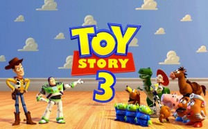
It's been almost a year since virtually every college kid wept openly at the conclusion of Toy Story 3 (myself included – I have no shame here). However, Disney doesn't plan on letting you forget Toy Story 3 anytime soon, because the loveable gang of toys is making a comeback — on the big screen.
Disney is trying a new method of brand strategy for the Toy Story franchise. Just when people — especially children — might be forgetting about Toy Story 3 a year after its release, Disney is bringing it to the public's attention again, in the hopes that Toy Story merchandise will enjoy an increase in sales.
Cars 2 hits theaters on June 24, and careful viewers might recognize something different about Pixar's animated short that debuts before the feature film. Instead of being the usual random, hilarious cartoon that has no connection to the actual film's story, movie-goers will be treated with Toy Story: Hawaiian Vacation, a short featuring several characters from Toy Story 3.
"Showing those shorts is a super-smart strategy for Disney," former president of Nickelodeon Film & Television Entertainment and founder of Worldwide Biggies Albie Hecht said in an interview with Businessweek. "It's a way to extend the characters and the brand without its fans waiting two or three years for a new movie."
The Toy Story franchise has much to be profited from. In 2010, the merchandise franchise ranked fourth-largest of all of Disney's merchandise lines, just behind Mickey Mouse, Winnie the Pooh, and the Princess doll collection. Given the comparative novelty of Toy Story alongside the decades-old frontrunners, it's an impressive feat.
Woody and Buzz Lightyear toys will no doubt sell for a long time, but for a quick jolt of energy to the merchandise sales, the brand consultants at Disney are making the right move. They've identified a problem — how can we enhance the Toy Story brand to maintain merchandise sales? — and they've implemented a solution in a unique way that won't be seen as an off-putting, generic commercial, but as Pixar fulfilling its animation duties. Without even realizing it, audiences of Cars 2 will endorse the Toy Story brand simply by choosing to see a film produced by the same animation studio.
But what Disney and Pixar will always have going for them is their own namesake brand. The Toy Story franchise is a compelling and heartwarming adventure, but would not have had the same lasting power if produced by a different company. Few can rival the powerful duo's filmmaking abilities, and that's where the true power of their branding lies.
Contributed by Allison Meeks
The Ugliest Thing at Urban Outfitters

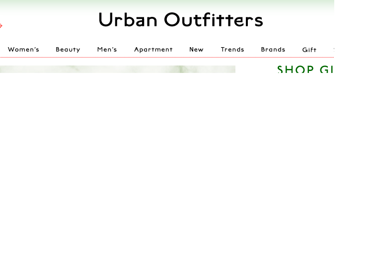
No, it's not a faded shirt or a floppy hat that looks like it came from my grandmother's attic. The ugliest thing you'll find at Urban Outfitters is the new logo/look of the website. In a surprising move, Urban Outfitters has changed the color palette of its website and debuted a new logo that looks like it was created with Word Art.
Though the store is in good company--Gap and Belk have also unveiled new logos this year--the move doesn't fit the Urban Outfitters brand. Urban Outfitters is all about being hip, cool and ahead of the curve. Refreshing its logo after so many "mainstream" stores have already done so makes Urban Outfitters look like a crowd follower, rather than a trendsetter. There is also nothing particularly unique, edgy or very cool about the new design or website. The font and color palette are fairly generic looking, even boring.
On the other hand, the new logo is pretty fitting for a store full of retro styles. It looks just like the cover my fourth grade book report.
UPDATE: Urban Outfitters changed the look of their site to something more streamlined less ridiculous.
Brand Refreshment: Belk vs. Gap

………………………………………………………………………………………………………………………………………………….
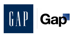
Much of October's design buzz was focused on the new Gap logo. With the change came die-hard Gap customers commenting on blogs, Facebook sites, and within the design community.
Marka Hansen, president of Gap North America, initially defended the logo, writing that the move brings Gap into the modern age. "We want our customers to take notice of Gap and see what it stands for today," she said. "We chose this design as it's more contemporary and current. It honors our heritage through the blue box while still taking it forward."
Hmm. The iconic blue box of Gap was actually diminished, rather than honored in the new design. Adding a gradient and moving it into a submission position does nothing in my mind to 'honor its heritage.' After only a week, Gap decided to revert back to the original logo.
Belk Department Store debuted its new image right around the same time, but was somewhat overshadowed in the media. Both Belk and Gap stated that they wanted to move their respective brands into a more updated space, and redesigned the logos to coincide with the modern feel of the apparel and the stores. So why was Belk's change more widely accepted (individual design critiques aside), and Gap's new image was met with such passionate disapproval?
A couple of ideas:
1. Regional awareness. Belk is a regional brand, with a smaller target audience than the global presence of Gap. While Belk isn't just "your Grandmother's store" anymore, the company hasn't been as active over the years in building and defining their brand image, so their change could be met with less resistance.
2. Belk is a collection of individual brands. Gap IS a brand.
3. Lack of connection to the audience. Belk had a plan for change and is systematically making the change market by market, and Gap introduced the logo to the entire world without so much as a hint that something new was coming. For such a devout target audience and such a large presence, you have to be prepared for the response - positive or negative. No market research to find out what customers think prior to launch?
4. Redefining the brand ... consistently. The Gap logo is/was classic. "Classic" is actually what their brand was all about. If they wanted to modernize or talk about their new modern jeans, they could update their collateral, or use social media in a new way to talk to their audience. Create a contest to have customers help design the new logo. The same can be argued about Belk: the iconic script was regarded as a logo with "class and character" that many argued should have been retained. However, Belk complemented their change with a tagline: "Modern. Southern. Style." which helps to reinforce the overall change.
What are your thoughts on refreshing a brand? Total re-definition through a new name or logo? Change the tagline? Update your social media efforts? Any other positive examples?
Farewell Grandma's Belk

......................................................................................................................................................................
Growing up in the South, Belk department stores have been a shopping staple. When I was young, I remember going to Belk with my grandmother and thinking it was so fancy. Just look at its logo. It’s cursive. That’s the ultimate in fancy to a seven-year-old. But I’m not seven anymore and while I love a good Belk sale, it seems too old for me.
But the traditional image of Belk is no more as it rebrands and gets ready to unveil its new, modern logo and tagline: "Modern. Southern. Style."
This new strategy is a big departure from the image of Belk many people my age have in my mind. And, it’s a great move. Major department stores like Macy’s have regularly updated its image through major advertising campaigns with high profile celebrities.
According to the Charlotte Observer, shoppers in key markets for Belk can expect to see changes as early as Nov. 1. The new look and feel will do a lot to refresh the image of this Charlotte-based chain. And if you’re reading this Belk, this is so exciting I think a month-long Customer Appreciation mega sale is in order, especially here in Charlotte.
Kelloggs Pops Up in Times Square
......................................................................................................................................................................
Times Square boasted a new store recently and the streets have been abuzz over the sweet addition. Promoters call it Pop-Tarts World and the 3200 square foot space contains an hourly light show, a café offering over 30 snacks and desserts including Pop-Tarts Sushi a as well as an interactive create-your-own-variety-pack vending machine. Though the 3200 square foot store has a lot to offer Pop-Tart fans, renting a space on Times Square is really more about brand marketing than it is about sales. “Our long-term hope is to strengthen the bonding between the brand and the consumer, and that has great benefits for the brand,” Senior Director at the Pop-Tarts brand, Etienne Patout, told the Wall Street Journal in a recent article. Averaging $1000 per square foot, Times Square presence comes at a cost but a 50-foot store front and a six-story billboard in view of 26 million annual visitors a year delivers priceless visibility.
Contributed by: Allison Jobes
Confessions of a Name-Induced Shopper
 ......................................................................................................................................................................
Be honest - have you ever bought a product solely because of its name or packaging?
*whispers* I have.
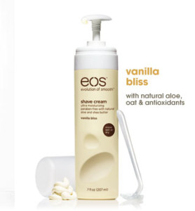
The bottle’s appearance sucked me in, the matte hot pink and matte yellow bottles at the end of a sea of glossy blue and purple cans. I moved in closer, seeing the name EOS emblazoned across the top. Instant adoration! I love the name because Eos is the ancient Greek goddess of the dawn, often signifying a new beginning. Double bonus verbal branding: they’ve made it an acronym apropos to their product line, the “Evolution of Smooth.” So, even if you didn’t know that Eos was the goddess of the dawn, they are telling you this is a new beginning, an innovation in shaving, a new era of smooth legs!
Thankfully, I have ended up loving the product, too. Vanilla Bliss, indeed.
Will I now buy their lotion, lip balm (smooth stick or smooth sphere) and other flavors of shave cream?
*shouts* Yes!
Maybe it’s not the smartest way to shop, but EOS sold me in five seconds flat. I wasn’t even looking to buy shaving cream that fateful day in Target.
I wasn’t even in the aisle.

