Teaching an Old Dog New Tricks – Why Branding Isn’t Just for New Businesses
When starting a new company, building your brand should be at the top of your to-do list. Having a strong brand in your arsenal is crucial to starting at the bottom and moving up the ladder. These new organizations seemingly live at the forefront of the brand development landscape, driving new best practices and rolling out new techniques all the time.![]()
But just because you’re an older organization that came to fruition before strategic brand building was commonplace doesn’t mean you’ve missed the boat. If your brand needs a refresh or a restart, don’t feel as if the latest and greatest branding techniques are only left to the upstarts and newcomers.
There’s no better time than the present to begin engage the appropriate parties and begin the process to bring your brand up to speed with your competition and maximize its ability to drive success.
Without going into too much detail on the brand development process, let’s explore three reasons why branding is important for the established organizations in the business world.
Brand? What’s a brand?
The first reason is that you may not actually have a “brand” in position for your organization. There are a number of reasons why this may be the case, but it’s quite possible your organization has been riding on the success of a particular product or two, making the strength of your organizational brand minimal.
But just because you’ve had success before doesn’t mean you can’t set yourself up for even more success in the future. Diving into building a strategic brand will almost assuredly answer questions you never even thought to ask and take your organizations you never thought you could go. It could be as simple as creating a visual brand that drives a new website design or, for the first time, defining who your target audience is and identifying how to best position your brand for them. No matter what, taking that leap will open new doors for your organization and give you a part of it that will work for you.
No matter when you started the game, everyone is still playing on the same field.
Having an established history and a long list of accomplishments are two things that every business would love to have. But in the day-to-day reality of the marketplace, the memory of today’s consumers can be short, often negating much of the historical advantage of an older brand. What matters is more of right in front of them in that moment – when brands are judged by “what have you done for me lately” and “what do I think of you right now.”
This “right now” mentality puts a heavy emphasis on ensuring that your brand, no matter its age, speaks to consumers as you’d like it to, getting your key differentiation messaging across right away. From names that make sense and connected directly to what your organization offers to logos and visual branding aspects that are aesthetically pleasing and in line with current trends, your brand needs to bring itself up-to-date.
What made sense before may not make sense today.
One of the biggest reasons why organizations are in need of an updated brand is that they’ve simply outgrown the old one, if they even had a “brand” to begin with. When your organization began, maybe you offered two main products, which dominated everything about who you were – your name only spoke to those two, your logo featured them both prominently, your target audience was the market for those two – but now, you’re leaving a lot on the table.
The best brand refreshes and rebrands are able to toe the line between old and new, artfully connecting what made the brand great before with what makes it great today. This is especially true for organizations whose newer offerings are now the star – when they weren’t acknowledged in the brand elements, too much weight was put on them succeeding on their own. They were lone wolves out on the market – quite possibly, the majority of their audience had no idea there was a connection between that product and your brand. So bring them in from the cold and let them bask in the warmth of the overall brand’s strength.
Has your company recently experienced change or growth? Due to changes in business strategies, acquisitions, internal organizational changes or the addition of new products to a portfolio, your brand strategy may need to evolve over time. Click here to download your free copy of “Your Brand’s Guide to Corporate Change” today, and learn how to align your brand and business strategy for success!
Looking toward the Branding Future with an Eye on the Past
It’s a common misconception that a “rebrand” automatically means a brand new start – that when a rebrand occurs, the slate must be wiped clean and all subsequent branding elements must possess totally original characteristics.
In fact, the best rebrands take the opposite approach. They take the time beforehand to identify and research what brand aspects of the previous iteration carry the most weight and provide the most benefit, then find ways to incorporate or pay homage to these aspects in the new brand.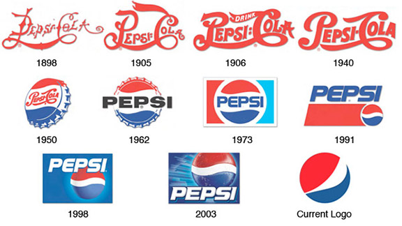
A recent example of this is the brand update from the Sacramento Kings of the NBA. As they were preparing to move to a new arena, they felt a need to update their brand, specifically their logo.
Throughout the redesign process, they looked at countless visual branding representations of the team name, many of which had little to no connection to the previous visual portfolio. However, what they kept coming back to was a design that touched on previous logos from the franchise’s long and storied past.
Ultimately, they chose a design that was a more modern version of the historical look, which immediately allowed fans, players, alumni, employees and the overall audience to connect the team’s future with its past, providing the new logo with instant brand equity.
This idea of building equity in a brand, especially within a specific element, is a difficult concept to strategize. Often it takes years to build up enough recognition, goodwill, historical weight, etc. to
sufficiently say that the brand carries its own weight with an audience. Therein likes one of the benefits of tapping into a brand’s history while strategizing its future. In this instance, those who connected with the team back when they were the Kansas City Kings or even when they were in Cincinnati, Ohio and known as the Cincinnati Royals could reconnect with the franchise through a familiar visual branding choice.![]()
Or, as Alex Kramers of Kings.com says, “The powerful, all-encompassing symbol invoked a deep sense of nostalgia while reinvigorating a heritage that had long distinguished the historic franchise.”
This quote can resonate with brands across the spectrum as a reminder that rebranding and reinvigorating don’t have to be mutually exclusive. There’s a reason why the positive aspects of the past are so often imagined fondly, and why nostalgia is such a powerful emotional response, one that brands should be jumping at the opportunity to include.
Rebranding with an eye toward the past doesn’t have to stop at a redesigned logo. Every aspect of the brand is subject to holding nostalgic brand equity, and as such, should be included in the research process used to determine the best of the best of the old brand. It could be something as simple as a color choice that connects the branding eras, or it could go all the way up to the verbal branding and brand name that drives the association.
From start to finish, the big decisions to the smallest details, the top of the organization all the way down, a rebrand can be an overwhelming and challenging task. Why add more to the effort by starting from scratch? Use what your brand already possesses and give the new brand a ready-to-go foundation on which to build.
Long Term vs. Short Term Benefits of Rebranding
Today we are excited to have a guest blog from Senior Graphic Designer Dave Dixon!
Studies like Logos Now, which we highlighted on brand salsa last October, have repeatedly shown that the strongest, most recognized brands are those of companies like Apple, Nike, and Coca-Cola. But that doesn’t mean those companies, or any companies in general, have a monopoly on branding, particularly when it comes to visual branding.
In fact, one of the most widely seen – yet often unnoticed – forms of visual branding comes from the government, in the form of highway traffic signs. While the purposely bland, utilitarian nature of traffic signs may seem like a form of anti-branding, the typography they employ offers several useful parallels to the efforts of corporate brands.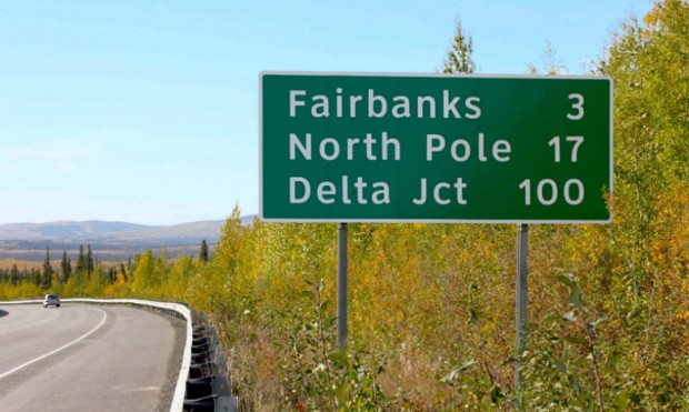
In 2004, the U.S. Federal Highways Administration (FHWA) approved the use of a new font for highway traffic signs. The font, called Clearview, was developed specifically to improve the legibility of highway signs. Tests showed that it was a success, with Clearview providing roughly 1.2 seconds of extra reading time over its typographic predecessor, Highway Gothic. However, on January 25, 2016, the FHWA announced that Clearview was no longer approved for use on American highways.
So after 12 years, why the change?
As it turns out, there are likely several factors at play, with the biggest being the fact that the FHWA never officially mandated the move from Highway Gothic to Clearview. Instead, they simply approved the new font for interim use, leaving it up to individual states to implement it (or not) as they saw fit.
One other factor that may have influenced the decision is cost. While Highway Gothic has been in use across the country for more than 60 years, state and local governments who adopt Clearview must purchase a font license, which can reach up to $795 for the full family of typefaces – for each individual user.
Unsurprisingly, implementation of the new font has been inconsistent. With no clear mandate and a financial obstacle in the way, only slightly more than half of U.S. states have adopted Clearview for their highways signs. Furthermore, inconsistencies remain even within individual states, as local governments have sometimes instituted the new font while the rest of the state officially
continues to use the old one.
It’s not difficult to see how consistency is an important characteristic for road signs. Regularly travelling at speeds as high as 70 or 80 miles per hour, drivers rely on being able to quickly and 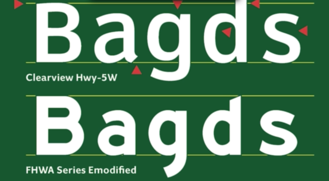 accurately gather information and make decisions. And while it may not be as readily apparent, this lesson applies equally to corporate branding. In a crowded marketplace, potential customers also rely on being able to easily find the information they need to make purchasing decisions. It becomes vital for companies to maintain a consistent look and feel not only for their typography, but also for their logo, color palette, and other visual signifiers that set their brand apart.
The FHWA’s decision also highlights another issue – the short-term vs. long-term benefits of rebranding. The cost for state and local governments to acquire Clearview may indeed be an immediate burden on already strained annual budgets. However, with the research indicating that the change provided drivers with valuable extra seconds, when does the benefit begin to outweigh that financial burden? A font license is, after all, a one-time cost.
In the same vein, corporate brand equity isn’t to be taken lightly or sacrificed on a whim. But if the current visual brand is holding a company back from reaching its full potential, introducing a new direction (and absorbing the initial financial cost that comes with it) may be well worth it. Regardless of the brand, consistency across the board is a vital component. Without it, much like the current state of highway signs, you may find yourself neither here nor there.
Image Sources:
https://www.citylab.com/commute/2016/01/official-united-states-highway-sign-font-clearview/427068/
https://qz.com/605695/font-designers-response-the-us-governments-has-decided-to-nix-clearview-from-all-highway-signs/
Addison Whitney is a global branding firm with a passion for building strong brands.
To learn more about Addison Whitney, visit our website at AddisonWhitney.com, or contact us here.
How to Keep your Brand Update from Falling Short
A brand refresh or a complete rebrand are events in an organization’s life cycle that call for big investments and big planning, as they can shape an entire brand for many years to come. Not to mention, the amount of money necessary for completing a full implementation of a new brand can greatly impact an organization’s budget, especially for the immediate launch.
The scale of a change like this requires an implementation plan. It is rare that a company has a whole team standing aside with their sole responsibility to implement a brand.
For instance, with the new Alaska Airlines rebranding efforts, the implementation included painting planes, sending out new credit cards to members, updating such brand touch points as signage in airports, plane interiors and uniforms, and much more. This doesn’t even take into account the time and money spent by their marketing and public relations teams in publicizing and notifying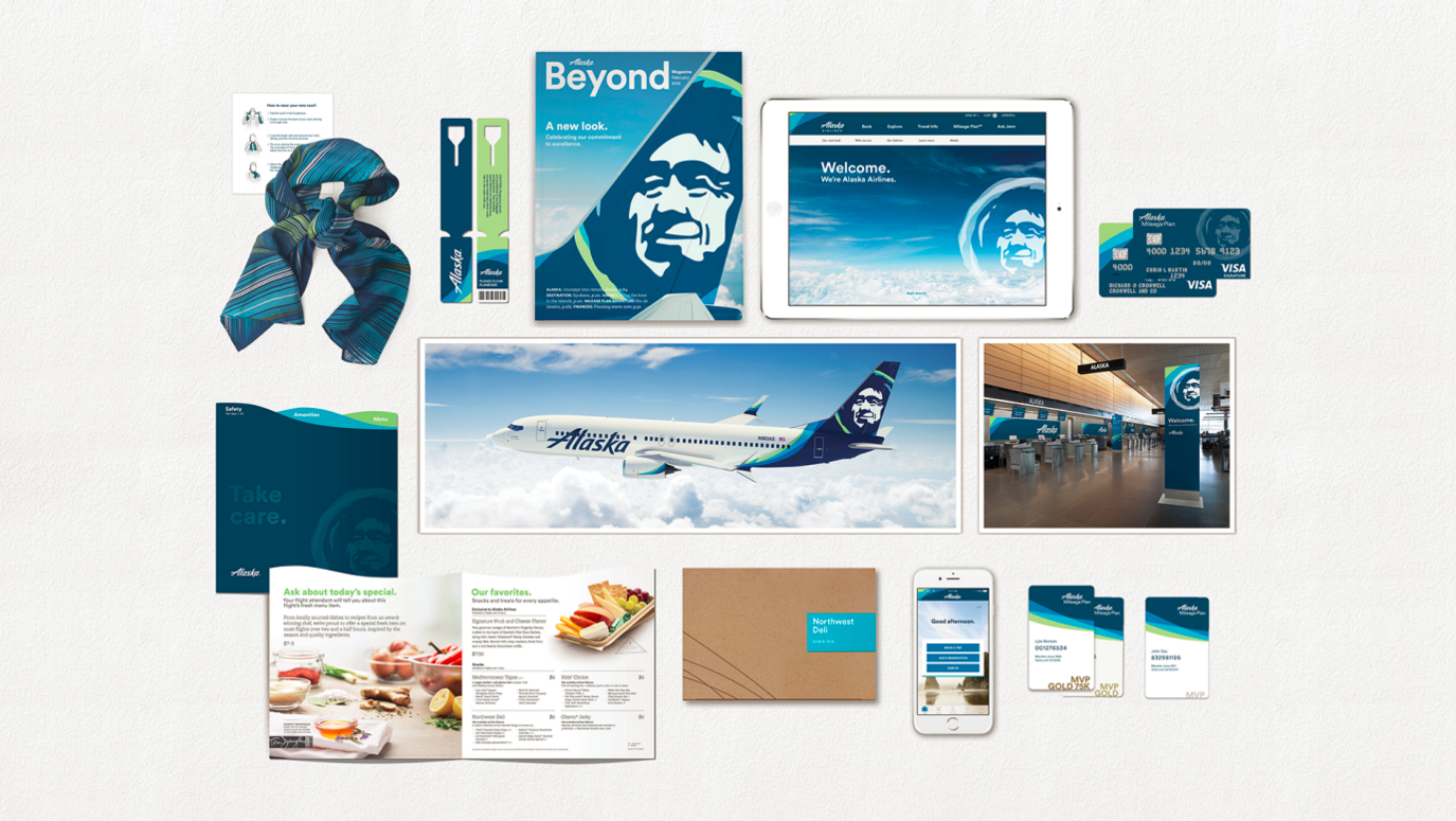 their audience about the changes.
This is one of the (many) reasons why a brand refresh or rebrand shouldn’t be taken lightly, and why it’s often best to leave much of the work to branding professionals, who can align the teams involved while creating a well-rounded strategy that successfully connects the new brand’s vision with the brand elements.
The real purpose of the rebrand can also get lost without a strong change factor to back it up. Alaska Airlines commented on the change by saying, “Our values stay the same, but it’s time for our brand to show up bigger.” They have long since expanded their reach outside of the Pacific Northwest, now reaching as far as Mexico and the east coast of the U.S. Their brand had such strong connotation to their original markets (which their brand name only helped to strengthen) that the organization felt a brand overhaul was necessary to break out of their market “bubble” and represent where they stand currently.
This is one of the most common reasons for a brand refresh or a rebrand – the old brand simply doesn’t accurately represent what the organization used to offer, and not what they offer now or what they want to stand for. Another brand following this strategy for a rebrand/brand refresh is Google, who created the Alphabet brand to better encompass the wider array of services outside of search that fall under the brand umbrella.
Evaluating Your Brand - Are You Due for a Refresh or a Rebrand?
However, with the Alaska Airlines brand update, the change was disproportional to the stated goal. In other words, the eskimo head did get bigger, but as for the brand itself… not much has really changed. Despite big statements about their brand “overhaul” and a new beginning for a new brand, when mostly the only rebranding that’s been done is kept the same brand image and added a splash of color, their audience may not be as inclined to believe 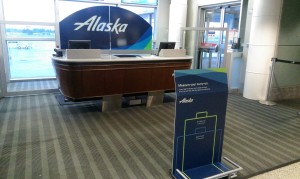 their rhetoric.
If the boxes are checked and the time is right, a brand refresh or rebrand could be just what your organization needs. However, the work doesn’t end when the new brand is rolled out. Your new brand elements and your brand story must align, or else it can seem like your big brand announcement is much ado about nothing.
Addison Whitney is a global branding firm with a passion for building strong brands.
To learn more about Addison Whitney, visit our website at AddisonWhitney.com, or contact us here.
10 Ways to Set Yourself Up for Rebrand and Brand Refresh Success
The end of the year is coming up, and looking back at your brand in 2015 you realize that something seems just a little… off. Sales weren’t what you wanted them to be, your brand awareness and public relations wins came few and far between, or maybe you’re seeing competitors in your space start to slowly take away market share.
As you take stock of all of the factors that go into an organization’s success, the strength of your brand may not be at the top of the list. But chances are, it should. Your brand is one of, if not the most powerful asset for your organization when it comes to presenting yourself to the consumer and staking your claim in the marketplace.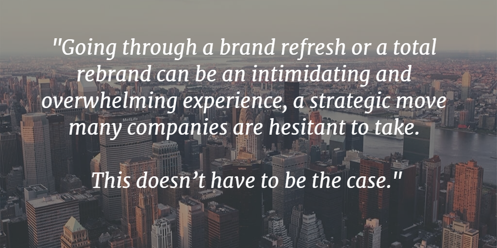
Going through a brand refresh or a total rebrand can be an intimidating and overwhelming experience, a strategic move many companies are hesitant to take. This doesn’t have to be the case. Here are 10 steps that will help ensure your brand refresh or rebrand will get off on the right foot:
1. Discuss plans and outline expected benefits with company leadership. Keeping the leadership teams involved early on in the process will help ease the transition, in addition to increasing buy-in from those in key decision-making positions.
2. Conduct market research to understand how the external audience perceives the brand. Your audience will be the primary guide to how the refresh/rebrand process will be received. Before you begin, find out where you stand with this group, providing a benchmark on where to begin.
3. Audit all sales and marketing materials to determine the scope and associated expense of a rebrand/refresh. Will your new brand need to be changed on everything from business cards to email signatures? Sometimes these lesser-known touch points can be overlooked and cause an inconsistent branding look, hindering your new brand’s success.
4. Identify the primary benefits associated with the brand. A rebrand/refresh doesn’t have to include changing every aspect of the brand. Find out what your audience feels are the areas that set your brand apart, and then determine which of these should be carried through and included in the new brand.
5. Identify all stakeholders and brand touch points to determine the appropriate timeline for a brand refresh/rebrand. Just like Rome, new brands aren’t built in a day. They take a process that must be calculated and depends on input from key stakeholders and the time necessary to ensure that all touch points are updated and are on brand.
6. Determine whether the changes are an evolution of the current strategy or a revolution calling for greater change. Rebranding or refreshing involves more than logo and name changes. It encompasses a brand strategy element as the driver of all subsequent moves. Is your new brand going to become an offshoot of your current brand strategy, or will it be taken to the next level and include a new outlook on what your brand strategy will be?
7. Set clear goals to measure the short- and long-term successes of the initiative. Before you start on the journey, set the markers to which you’ll measure the impact. Measurement is a vital part of determining whether the changes are putting your brand on the right path, or whether it’s time to alter the course.
8. Appoint focused, influential team members to a core project team to oversee the implementation process. The core project team will not only need to make decisions throughout the process, but will need to earn buy-in from across the company, especially from those on the leadership team.
9. Identify the ways in which the brand refresh/rebrand will impact each department. Some of the departmental impacts will come to light right away, but a truly successful new brand touches each area of business – make sure that they don’t come as a surprise, or have unexpected consequences on the brand or the business.
10. Create talking points outlining why the changes were necessary and the expected benefits to the company and customers. Especially if you have a lengthy history or have strong brand loyalists, there will be questions that come up in regards to the new brand. Be prepared to answer these with confidence and the ability to explain the positive benefits that will come from the rebrand/refresh.
Addison Whitney is a global branding firm with a passion for building strong brands.
To learn more about Addison Whitney, visit our website at AddisonWhitney.com, or contact us here.
Rebranding Job Titles: An Innovative Approach or a Goofy Gimmick?
Today we have a great guest post from Verbal Branding Associate Rachel Loucks!
Say you’re at a cocktail party and you introduce yourself to a fellow invitee. After a few minutes of pleasant conversation, you ask what he does for a living. He replies that he is the “Ambassador of Buzz” at his firm. What do you think in that moment?
Taylor Aldredge, who holds that very job title at a virtual phone company Grasshopper, says people are often intrigued.
“Just telling people my title gets a conversation going about Grasshopper and what we do,” he says.
And Grasshopper isn’t the only company cashing in on the intrigue generated. Job titles like these seem to be cropping up more and more, and not just in the tech startups that initiated the trend; more traditionally run organizations are now increasingly using titles such as Media Gurus, Sales Ninjas, Officers of First Impressions, Copy Crunchers, Directors of Spark, Marketing Rockstars 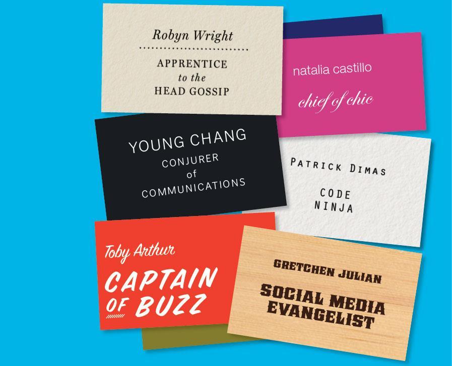 and Problem Wranglers.
From a branding perspective, a distinctive job label can be a fun way to make employees and their companies stand out, and give outsiders a snapshot of the organization’s values and sense of identity.
As Carlos Jimenez, President of the marketing solutions firm The Zella Company, asserts, "Funky job titles can serve as an extension of a company's brand and indicate that you are a company with a fun culture that doesn't take itself too seriously."
And who doesn’t want to be the fun, cool company?
Well, call me the Bearer of Bad News (ha!), but rebranding job titles is probably not the best move for your organization. Why, you ask? Here are a few reasons:
1. Whimsical job titles are often confusing and vague.
What does a Director of Spark actually do? How are the responsibilities of a Word Herder different from a Copy Cruncher? These are valid questions that are made all the more concerning when one remembers what a job title’s number one purpose is; to clearly and succinctly communicate the role’s function within the organization.
If we think of a company as the master brand, and job titles as sub brands, then it follows that there should be some sort of systematic brand architecture that denotes various positions and levels within the organization. Wacky job labels muddy up this branding architecture by obscuring the title’s place in the overall corporate structure. Monster.com’s Kathy O’Reilly cleverly muses, “Folks love trendy titles, but does it create a career path? Where do you go from ninja? To samurai? Not likely.”
2. They have the potential to limit, rather than enhance, your audience.
It’s true that an off-the-wall job label can help you stand out, but it can also make you hard to find. If applicants are searching for positions within your organization, they might not know to look up “Social Media Butler” instead of Communications Manager.
In the same vein, if the resume of your ideal employee has “Sales Rockstar” on it, but the position you’re looking to fill is a “Business Development Dynamo” the likelihood that your HR’s applicant tracking software will find it are much slimmer. Having fanciful titles may require a company to do more compensatory legwork via search engine optimization, recruiting, and marketing efforts, in order to maintain visibility. Moreover, a company should consider its client/customer base before moving to zany monikers.
Brand consultant Lisa Merriam points out, “Your team might think you're hip and edgy. Potential clients might think you are lame.” If the people or companies you’re trying to do business with won’t understand or appreciate the change, you may only succeed in alienating them.
3. They likely don’t fit with your company’s overall image.
There is a reason why job labels like Apple Genius, Starbucks Barista, and Best Buy Geek Squad member are compelling—they are both pertinent and intimately tied to their company’s persona. But not all company personas lend themselves to imaginative titling.
If your organization’s image is all about being serious, established, and professional, an eccentric job title will not only fail to convey that, but could undermine it. Another big mistake that companies make regarding trendy job titles is that they don’t actually create something new or unique to their brand. By having multiple organizations adopt the titles “Media Guru” or 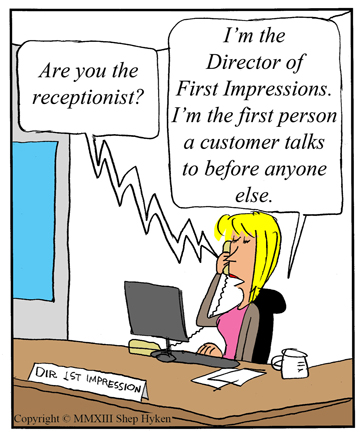
“Problem Wrangler,” for example, something that was innovative and fitting for one organization becomes trite and out-of-place for others. And while they may think they’re being cool or staying relevant, copycat companies are simply finding new ways to be cliché.
4. Rebranding job titles won’t magically rebrand your company.
Corporations in need of a brand makeover may think that handing out fun, fresh job titles is an easy way to become more progressive and cutting-edge, and to boost office creativity and morale. But these companies often fail to realize that unique job titles are often a symptom of a progressive corporate environment, rather than a catalyst for one. Even the most creative job titles will not solve the deeper, underlying issues a corporate brand might be struggling with, and slapping on a funky label will certainly not change an inherently bad company climate.
Business author Shep Hyken wisely states, “While these different and whimsical titles or labels are fun, they can’t change the culture. Sure, they can create a feeling, but there has to be a management style and system to support it. Otherwise, it’s just lip service.”
A company’s brand is so much more than the sum of its parts, and if the company wants to step up its job-title bark, it needs to have the bite to back it up.
So here’s the moral of the story: pulling off quirky job titles is difficult to do well, and for many of us, it simply may not be in our company’s DNA. And that’s okay! It’s more important to stay true to your corporate brand than join in on a trend that just doesn’t work for you.
Still convinced that your workplace would be better if everyone had a catchy title? Then just remember to be strategically creative. Craft job titles that are still descriptive and fit in with a larger brand architecture; make sure they widen rather than diminish your audience; and work to ensure that the designations are unique to your company and its ethos.
Would I have more fun telling fellow cocktail party-goers that I was a Strategic Neologist? Perhaps. But Verbal Branding Associate will work just fine.
Image Sources:
https://www.bostonglobe.com/lifestyle/style/2013/02/06/creative-job-titles-start-pop-traditional-companies-not-just-tech/BeCSRnSmOK8wPoq9bGHBdL/story.html
https://www.hyken.com/customer-experience-2/creative-job-titles-help-create-and-define-corporate-culture/
Addison Whitney is a global branding firm with a passion for building strong brands.
To learn more about Addison Whitney, visit our website at AddisonWhitney.com, or contact us here.
“Back to the Future” Branding
Sometimes, the best way to move forward is to take a look back. To look back at the best of what you have been in order to ensure the best that you will be.
For brands, this rings especially true when working through a rebrand or a brand refresh. Especially when the brand you have is one of the few “iconic” brands on the market, coming with a built-in nostalgia and fond memories of the branding of yesteryear.
However, this version of going back to the future comes with no worries of messing with the space-time continuum - in fact, tapping into a brand’s past can have positive impacts on its future.![]()
For instance, the Philadelphia 76ers basketball team has a two-pronged historic foundation to which it can build its brand refresh. Not only are they one of the oldest and most successful franchises in the NBA, but their home city also doubles as the birthplace of America.
So for their new branding efforts, they tapped into these two reservoirs of history and came up with a new brand that touches on both – for instance, their new uniforms are reminiscent of the ones the team wore in the mid-1970s, while they introduced a "dribbling Ben Franklin" alternate logo to go along with new television ads referencing the American Revolution – which was also the original influence for the team’s name.
Evolving a brand with a nod to its history is a great way to connect with your entire consumer audience – not only will you reach those who are excited about the rebranding efforts and the new aspects that come from it, but you’ll also have the automatic tie-in with those who remember fondly the “golden years” of your brand.
From a design standpoint, tapping into a well-regarded and well-received visual branding element from your past also prevents the chances of over-thinking a new design, where in an effort to develop something new and revolutionary comes out as off-base and not in line with your brand strategy. For these longtime brands, there’s a chance that the best design path is right there in the archives, and with a little touch-up, you can put forth a brand strategy and design that is both modern and historical.
Miller Lite, who had seen recent sales slides and was losing competitive share to its rivals in the U.S., looked to its past for what was originally meant to be a temporary brand shakeup, but has 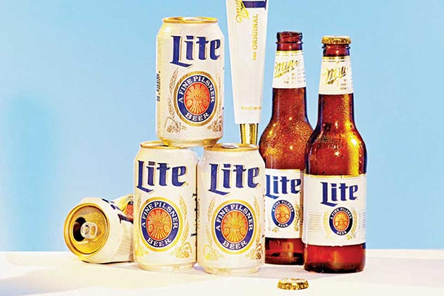 turned into a permanent new visual branding look. In conjunction with an advertising campaign centered around the release of the movie Anchorman 2 (set in the 1970s), the brand re-released its classic circa-1975 white Miller Lite can, complete with the retro logo design.
As for the result? Well, the numbers speak for themselves – the brand sold 32 million more cans during the campaign run compared to the same time the previous year, and has now expanded the nostalgic branding to its bottles and taps.
And don’t forget, just like every other aspect of branding, you have to follow the mantra of Tim McDermott, who is the 76ers CMO: “A brand isn’t just a TV spot. It is your soul, your DNA. It has to permeate through every fiber of the company.”
Image Sources:
https://espn.go.com/nba/story/_/id/12865822/sixers-score-ben-franklin-logo
https://www.bloomberg.com/bw/articles/2014-09-11/miller-lites-original-label-sales-boost
Addison Whitney is a global branding firm with a passion for building strong brands.
To learn more about Addison Whitney, visit our website at AddisonWhitney.com, or contact us here.