FDA Approval: Edarbi
FDA approves Edarbi to treat high blood pressure (source: FDA Press Announcement)
On Friday, February 25, 2011, The U.S. Food and Drug Administration approved Edarbi tablets (azilsartan medoxomil) to treat high blood pressure (hypertension) in adults.
Data from clinical studies showed Edarbi to be more effective in lowering 24-hour blood pressure compared with two other FDA-approved hypertension drugs, Diovan (valsartan) and Benicar (olmesartan).
“High blood pressure is often called the 'silent killer' because it usually has no symptoms until it causes damage to the body,” said Norman Stockbridge, M.D., Ph.D., director of the Division of Cardiovascular and Renal Drug Products in the FDA’s Center for Drug Evaluation and Research. “High blood pressure remains inadequately controlled in many people diagnosed with the condition, so having a variety of treatment options is important.”
Edarbi will be available in 80 milligram and 40 mg doses, with the recommended dose set at 80 mg once daily. The 40 mg dose will be available for patients who are treated with high-dose diuretics taken to reduce salt in the body.
Blood pressure is the force of blood pushing against the walls of the arteries as the heart pumps. If blood pressure rises and stays high over time, it can damage the body in many ways. Nearly 1 in 3 adults in the United States has high blood pressure, which increases the risks of stroke, heart failure, heart attack, kidney failure, and death.
Edarbi is an angiotensin II receptor blocker (ARB) that lowers blood pressure by blocking the action of angiotensin II, a vasopressor hormone.
Adverse reactions reported by patients taking Edarbi in clinical trials were similar to those reported by those taking an inactive drug (placebo).
Edarbi has a boxed warning that says the use of the drug should be avoided in pregnant women because use of the drug during the second or third trimester can cause injury and even death in the developing fetus. If a woman becomes pregnant while using the drug, it should be discontinued as soon as possible.
Edarbi is made by Takeda Pharmaceutical North America of Deerfield, Ill.
For more information on pharmaceutical naming, branding, research or submission documents, please contact Vince Budd at Addison Whitney via email or phone 704.697.4021.
FDA Approval: Ofirmev

PRNewswire via COMTEX News Network/ -- Cadence Pharmaceuticals, Inc. (Nasdaq: CADX) announced last week that the U.S. Food and Drug Administration (FDA) has granted marketing approval for OFIRMEV(TM) (acetaminophen) injection, the first and only intravenous (IV) formulation of acetaminophen to be approved in the United States. OFIRMEV is indicated for the management of mild to moderate pain, the management of moderate to severe pain with adjunctive opioid analgesics, and the reduction of fever.
"The approval of OFIRMEV is a significant milestone for Cadence as we advance our mission to improve the lives of hospitalized adults and children," said Ted Schroeder, President and CEO of Cadence. "IV acetaminophen is the unit market share leader among all injectable pain medications in Europe. With our planned launch early in the first quarter of 2011, we believe that OFIRMEV will fill a significant gap in the United States for the treatment of pain and fever in the hospital setting."
Acute pain, particularly postoperative pain, often requires a multi-modal approach in which two or more analgesics are used with the goal of providing better analgesic efficacy. U.S. physicians already prescribe acetaminophen frequently in combination with opioids for oral management of pain, where it is the most widely used non-opioid in fixed combination therapies. In clinical studies, OFIRMEV improved pain relief, reduced opioid consumption, and improved patient satisfaction when used as part of a multi-modal regimen.
"OFIRMEV is a long-awaited and much needed addition to postoperative pain management," said Eugene R. Viscusi, M.D., Director of Acute Pain Management at Thomas Jefferson University in Philadelphia. "With the approval of OFIRMEV, clinicians will now be better able to use a multi-modal approach to pain management in the hospital setting, when oral medication can't be used."
Brand Refreshment: Belk vs. Gap


………………………………………………………………………………………………………………………………………………….
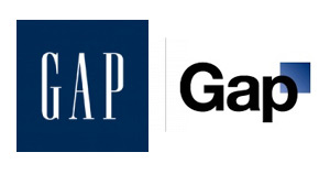
Much of October's design buzz was focused on the new Gap logo. With the change came die-hard Gap customers commenting on blogs, Facebook sites, and within the design community.
Marka Hansen, president of Gap North America, initially defended the logo, writing that the move brings Gap into the modern age. "We want our customers to take notice of Gap and see what it stands for today," she said. "We chose this design as it's more contemporary and current. It honors our heritage through the blue box while still taking it forward."
Hmm. The iconic blue box of Gap was actually diminished, rather than honored in the new design. Adding a gradient and moving it into a submission position does nothing in my mind to 'honor its heritage.' After only a week, Gap decided to revert back to the original logo.
Belk Department Store debuted its new image right around the same time, but was somewhat overshadowed in the media. Both Belk and Gap stated that they wanted to move their respective brands into a more updated space, and redesigned the logos to coincide with the modern feel of the apparel and the stores. So why was Belk's change more widely accepted (individual design critiques aside), and Gap's new image was met with such passionate disapproval?
A couple of ideas:
1. Regional awareness. Belk is a regional brand, with a smaller target audience than the global presence of Gap. While Belk isn't just "your Grandmother's store" anymore, the company hasn't been as active over the years in building and defining their brand image, so their change could be met with less resistance.
2. Belk is a collection of individual brands. Gap IS a brand.
3. Lack of connection to the audience. Belk had a plan for change and is systematically making the change market by market, and Gap introduced the logo to the entire world without so much as a hint that something new was coming. For such a devout target audience and such a large presence, you have to be prepared for the response - positive or negative. No market research to find out what customers think prior to launch?
4. Redefining the brand ... consistently. The Gap logo is/was classic. "Classic" is actually what their brand was all about. If they wanted to modernize or talk about their new modern jeans, they could update their collateral, or use social media in a new way to talk to their audience. Create a contest to have customers help design the new logo. The same can be argued about Belk: the iconic script was regarded as a logo with "class and character" that many argued should have been retained. However, Belk complemented their change with a tagline: "Modern. Southern. Style." which helps to reinforce the overall change.
What are your thoughts on refreshing a brand? Total re-definition through a new name or logo? Change the tagline? Update your social media efforts? Any other positive examples?
Welcome back Elizabeth!

....................................................................................................................................................
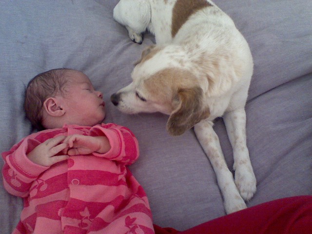
Just in case you've been under a rock for the past few months, on April 6th Zoey Elizabeth McGaha arrived a healthy 17.5 inches long and 6 lbs 9 oz. Congratulations Elizabeth! We are so happy for you and look forward to hearing all of your baby-mama stories. Plus I'm sure you'll have plenty of volunteers should you ever desire a baby sitter.
Contributed by Evelyn Chapin
