Oh The Places Your Logo Will Go: Unexpected Mediums that Must be Considered in Visual Branding
When working through the visual branding process, especially in logo design, there are a few obvious places the logo will need to be displayed, such as office signage, business cards and websites/social media platforms. But it’s not enough to simply perform in the usual logo locations - in today’s increasingly diverse mediums in which logos will be deployed, logos must perform as they are needed, no matter the new and unexpected places they might be found.
The impacts of this shift can be seen in recent design trends, including the rise of “modernized” logo designs, which de-emphasize intricate details in favor of simplified, smoother logos. These new looks carry a value in their ability to be easily replicated across various platforms and sizes. Other design trends, including wordless, icon-only logos and the development of animated versions of a logo, also carry a valuable nimbleness that translates across mediums.
 Those overseeing these visual brand developments should be wary of committing a total focus to these logo applications at the expense of the overall visual brand experience. It can be easy to slip into the opposite mindset, putting so much focus on ensuring the logo looks great when scaled down to a website icon-sized replica that when scaled up and applied to the usual areas, the overall look is compromised. It is a fine line between a logo that is solid on all ends of the size spectrum and a logo that excels in one but lacks in another.
This isn’t to say that the strategy should be one logo only, no changes, no variations, no matter what. In this case, consistency leans more along the lines of keeping key elements the same, but allowing for leeway in full usage or secondary marks. Many of the most successful visual brands have secondary or alternate logos, most of which are made specifically for a type of application. For instance, if a logo is mostly vertical but is going to be applied to a horizontal-focused medium, it would be time for a variation that still holds onto some essential brand elements but doesn’t compromise in quality.
More places to have a logo means more opportunities to get your brand in front of consumers to build brand equity. But if the consumer can’t easily connect the smaller or alternate logo back to your overall brand, you are missing out. As such, design with key brand elements in mind. Do you have a dominant color scheme, like the UPS brown, or a unique shape, like the
McDonald’s arches? Put these at the forefront of your design. That way, no matter what version, size or application a consumer sees your logo in, there will be an inherent ease in connecting it back to your overall brand.
A bonus piece of advice when working on this type of logo design - strong brands in general all possess these standout elements, so if you’re struggling to identify which should be the driver in your logo design, it may be time to go back and look at your brand development strategy.
Visual branding will be somewhat driven by the evolving and ever-advancing ways in which we consume our brands, and as such, the cornerstone of the visual brand development – the logo – will be will be required to follow suit. These strategies and best practices will help ensure that your logo works for your brand as well as possible, no matter what platform it is given.
Has your company recently experienced change or growth? Due to changes in business strategies, acquisitions, internal organizational changes or the addition of new products to a portfolio, your brand strategy may need to evolve over time. Click here to download your free copy of “Your Brand’s Guide to Corporate Change” today, and learn how to align your brand and business strategy for success!
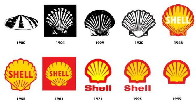
Iconic Logo Timeline Shows There's No One Way to Evolve
Logo evolution is a natural part of the branding process. In fact, the evolution of the overall brand is common, and often necessary, in order to keep up with the latest advancements in the marketplace and ever-changing consumer mindset. But how a logo "should" evolve is still up for debate.
The below infographic by The Logo Company shows how a number of iconic brands have tweaked and shaped their logos over the years. And one thing is abundantly clear: the debate on whether there is a single definitive way to evolve a logo is over. The data overwhelmingly disputes the validity of one-size-fits-all logo evolution, driving home the point that each logo should keep the brand at top of mind and at the forefront of its evolution.
Dave Dixon, Senior Graphic Designer at Addison Whitney, sees a number of unique strategies within the logo evolution examples.
"A lot of these, like BMW, VW, and Shell, have really focused on using logo evolution to clean up and streamline their logos," he says. "To me, that indicates strong brand equity and a logo that illustrates the importance of brand building over communicating something extremely specific. The Shell logo, for example, doesn’t tell you that it’s a fuel/energy company or anything else about the business. But it’s unique and recognizable, so it does a better job than most other logos.
"The YMCA logo is probably the best example of an organization that felt they needed a new direction. The current logo is pretty clearly more youthful, energetic, and fun than the previous versions. It seems more friendly and accessible, which is a departure from the earlier logos."
He points out that the Windows logo is possibly the most interesting progression, mentioning how it has almost come full circle at this point - the current logo has far more in common with the original logo than with any of the iterations in between, speaking to the importance of simplicity and recognition over specificity and trendiness.
Full-circle logo design, new directions, specific communication vs. brand building efforts - the evolution of brands and logos has it all, and more. The one thing in common for them all is that they are all done within the premise of building a strong brand, and stressing the importance of continuity among the most recognizable brand elements. Whether it is a color scheme, a shape or a wordmark, a good logo evolution will build on the existing brand equity. Even if they all take use different blueprints in the building process.

When Less is More in Logo Design and Visual Branding
As brands and logos have evolved over the last several years, it’s become evident that simplicity and minimalistic design is a key new direction for modern brand marketing. Even the most iconic brands and logos are following the mindset of “less is more” when it comes to their designs. From less detailed images to geometrically-inspired outlines, brands are embracing a clutter less existence.
One of the most prominent features of this trend involves tweaking, or in some cases, totally removing, the typographic element of the logo. In a recent article, author Kalle Oskari Mattila examined this shift, highlighted by MasterCard’s recent rebranding, in which their new logo was de-emphasized with the state goal to do away with the text altogether within the logo.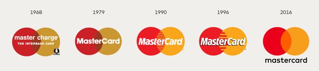
There are a number of good reasons to embrace “less is more” logo design. From a practical standpoint, cleaner and less-cluttered logos are more versatile and work much better on the myriad of platforms on which modern logos must perform. Logos are needed in smaller and smaller iterations, where the decrease in size must not impede the logo’s clarity or ability to represent the brand.
This is especially true when it comes to text – there is a reason why few app logos have any text – as the logo gets smaller, text can quickly turn into a jumbled blob that takes up space without providing real value.
Therefore, if you are a brand with a logo or a visual brand that has the equity to stand on its own and earns immediate recognition from consumers, the choice to “slim down” is a relatively easy one. Some of the biggest brands out there have gone this path – from the McDonald’s golden arches and Nike Swoosh to Starbucks and MasterCard with their own logos.
However, as a new or lesser-known brand, it would be advisable to proceed with caution in this aspect of brand development. It is logical that the removal of a brand name from a logo would decrease ease of recognition and connection between brand and logo, which is a step that is crucial in building a brand. Mattila deems the “debranding” strategy as one “based on paring down that can only be deployed by the most identifiable of brands.”
Additionally, Matilla explains that “Some marketers believe that debranding can make global brands appear ‘less corporate’ and ‘more personal to consumers.’” This personalized feel in corporations is a direct reflection of the way technology and new companies are headed. This is one way for larger, older brands to stay relevant and directly target younger generations with the goal of having them continue using products their grandparents and parents use.
Coca-Cola’s early success with debranding is one of the most prominent examples, namely the “Share a Coke” promotion, where the brand replaced the Coca-Cola name on its bottles for a massive variety of people’s first names, in addition to nicknames and monikers. The campaign was a massive hit with consumers, who sought out bottles which featured their names or the names of loved ones, and provided Coca-Cola with a personalized stamp on each of their products, by simply backing away from the branded aspect and replacing it with an element that connected deeper.
Going with a simpler visual brand and separating text from logos signifies confidence in brand familiarity and its consumers. Debranding takes this a step further by not only showing the consumer that you feel your logo has the equity to stand on its own, but also allowing for an expansion of personalized and authentic branding efforts, designed to strengthen the connection between consumer and brand.
The Science of Logo Design: How Much Can a Logo Impact A Brand?
Today we are excited to have a guest blog from Senior Graphic Designer Dave Dixon!
Logos are inherently subjective. On the art-science spectrum, they seem to reside rather comfortably within the realm of art. However, the pursuit to discover the science of logo design is alive and well, with the latest effort coming from researchers at the University of California, Davis.
A series of social psychology experiments illustrated that logos (as well as flags and other group symbols) communicate unity and effectiveness, regardless of the group they represent. On the flip side, logos were also found to make groups seem more intimidating and less inclusive, whereas organizations without a logo came across as more friendly and welcoming.
While certain luxury or niche brands may embrace the concept of exclusivity, where does that leave companies and organizations that pride themselves on being open, helpful and friendly? The idea of forgoing a logo isn’t realistic, particularly when standing out in a crowded marketplace is a basic requirement for success. At the same time, coming across as intimidating or impersonal could be detrimental to the brand.
Is it possible to convey both competence and warmth in a logo? Unity and inclusion? Strength and kindness?
The answer to all of the above is yes and no. It’s certainly possible for a logo to convey any or all of those things – just not on its own. Logos, and the ![]() brands they’re part of, are living, growing things; they’re inseparable from the products, services, employees and other aspects of what they represent. Even the most recognizable logos (and by extension, the most recognizable brands) have evolved considerably throughout their lifespans. You only need look as far as Apple to find an example of noticeable logo evolution. More recent examples, such as Hillary Clinton’s presidential campaign logo, prove that perception of a logo can change in as little as a few months.
brands they’re part of, are living, growing things; they’re inseparable from the products, services, employees and other aspects of what they represent. Even the most recognizable logos (and by extension, the most recognizable brands) have evolved considerably throughout their lifespans. You only need look as far as Apple to find an example of noticeable logo evolution. More recent examples, such as Hillary Clinton’s presidential campaign logo, prove that perception of a logo can change in as little as a few months.
Perhaps even more importantly, logos are part of a larger brand system. Left to fend for itself, a logo would quickly cease to stand for anything - or, more accurately, never come to stand for anything in the first place. And while the best asset for any brand is customer loyalty, additional visual branding elements can help bridge the gap between a newborn logo and a mature, fully realized brand.
Marketing and communication collateral can play an important role, as well. PowerPoint presentations, newsletters, website graphics – these elements provide an opportunity to create a strong visual impression in the hearts and minds of customers that connects the logo with more specific brand messaging, filling in the blanks and completing the brand picture.
More subtle visual brand elements, such as color, can play a significant role, as well. Think Home Depot orange or Coca-Cola red – reinforcing the brand color palette across a range of visual components will serve to cement the logo-to-color-to-brand connection in customers’ minds, and 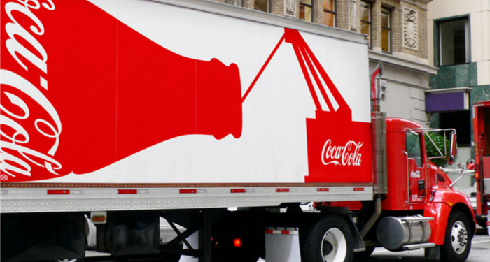 potentially make that set of colors uniquely identifiable. Working either in conjunction with or as a replacement for color, typography can serve the same function. FedEx, for example, uses a variety of secondary colors across its service lines, but its distinctive typography and primary purple color scheme are instantly recognizable.
A logo is the central focus of visual branding, and rightly so – it’s the building block that provides a solid foundation for everything to come. But it’s important to remember that a logo is just the beginning, and that visual brand elements such as stationery, marketing collateral, color palette and typography breathe life into the logo, as well as providing additional touch points for your target audience to meet, get to know and, ultimately, fall in love with your brand.
7 Tips for Making Your Logo the Crown Jewel of Your Brand
“If, in the business of communication, image is king, the essence of this image, the logo, is the jewel in its crown”. – Paul Rand
As the saying goes, you never get a second chance to make a first impression. For brands, that first impression often comes when the audience initially sees its logo. Without a strong visual brand representation, any following movement toward branding success can be doomed to be an uphill climb. As Paul Rand points out, your brand’s image is a massive aspect of its brand, and your logo is the centerpiece.
So to help nail down a successful first impression, here are 7 tips to ensuring that your logo lives up to its place as the crown jewel of your brand’s image.
- Know who your logo will speak to and design to what you want it to say to them. Your design choices for a new soft drink logo should not also be your choices when creating a logo for an accounting firm. Your logo is often the first interaction an audience has with your brand, so their decisions about your brand will be largely based on the logo – make sure it speaks correctly of your overall brand.

- Connect the colors of your logo to what fits what emotions your brand represents. Simply put, color drives emotional responses. Certain colors are connected with specific emotions, and much like your overall design, color choices should fit with what your brand exemplifies. This is also another reason to begin the logo design process by identifying specific brand characteristics that will drive the ensuing branding decisions.
- Don’t let it become a one-trick pony. Keep in mind that logo versatility is vital. In today’s digitally-driven world, logos are called on to live on mediums that can vary from an embroidered shirt to a mobile app, and a great logo does so with equal success. Black and white, color, big, small, on a screen or in real life – these are just some of the boxes that good logos must check as areas in which they are compliant.
- Trends come and go. A good logo can last (close to) forever. There are some new design trends that provide a welcome update to traditional ways of thinking, and then there are some that are destined to be “blink and they’re gone” fads. Those logos that fall for the “next big thing” that turns out to be just the opposite are then left with an outdated-looking logo that is begging for a redesign, which can be costly and time consuming. Solid, quality, foundational design principles never go out of style, and those logos that can successfully walk the line between new and classic are destined to become timeless on their own.
- Confusion is never a good logo result – clarity in what your logo represents and how it ties back with your brand strategy can ensure long-term success. If a customer looks at your logo and doesn’t come away with at least a minimal understand of what the brand’s purpose is, then the logo is not doing its job. This is not to say that the logo has to scream out your brand’s offerings (no need to necessarily put food in a grocery store logo), but the link between the logo and the brand messaging shouldn’t look like a maze.
- It’s not what you say, it’s how you say it – your font choices speak almost as loud as the words themselves. Your font is a crucial piece of the overall logo design and can communicate your message just as much as any other visual element – take note of the variety of choices available and find one that can comfortably fit within your overall visual brand.
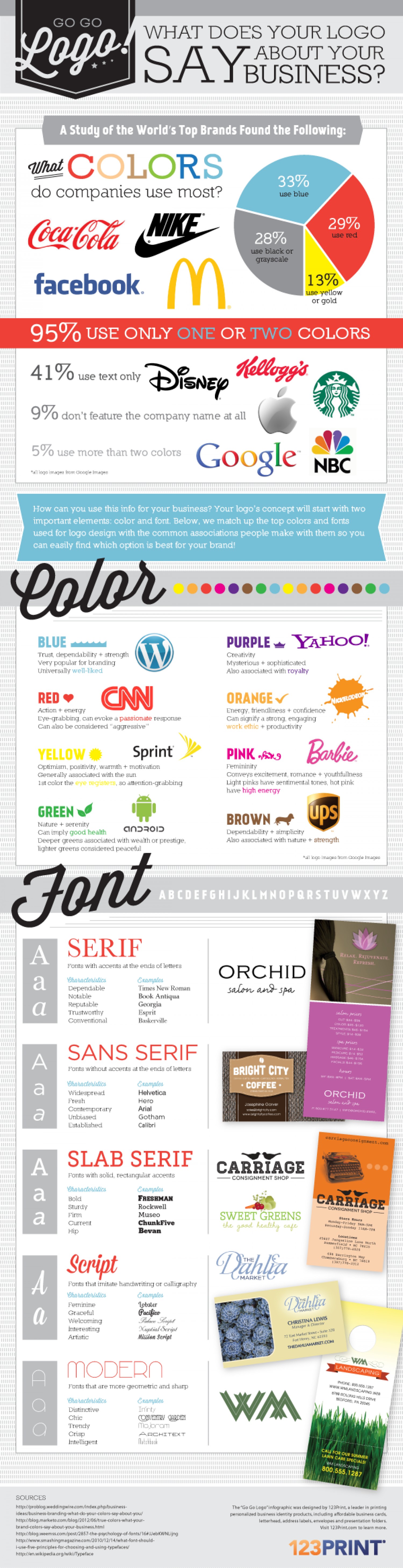
- Sometimes, simple is successful. In a recent study, it was discovered that 95% of the companies researched used only one or two colors total in their logos. Simplicity in color choices not only reinforces the aforementioned emotional connection with a color, but it also has become the trend as logos are being used in an increasing number of mediums and need to be easily reproduced.
Addison Whitney is a global branding firm with a passion for building strong brands.
To learn more about Addison Whitney, visit our website at AddisonWhitney.com, or contact us here.
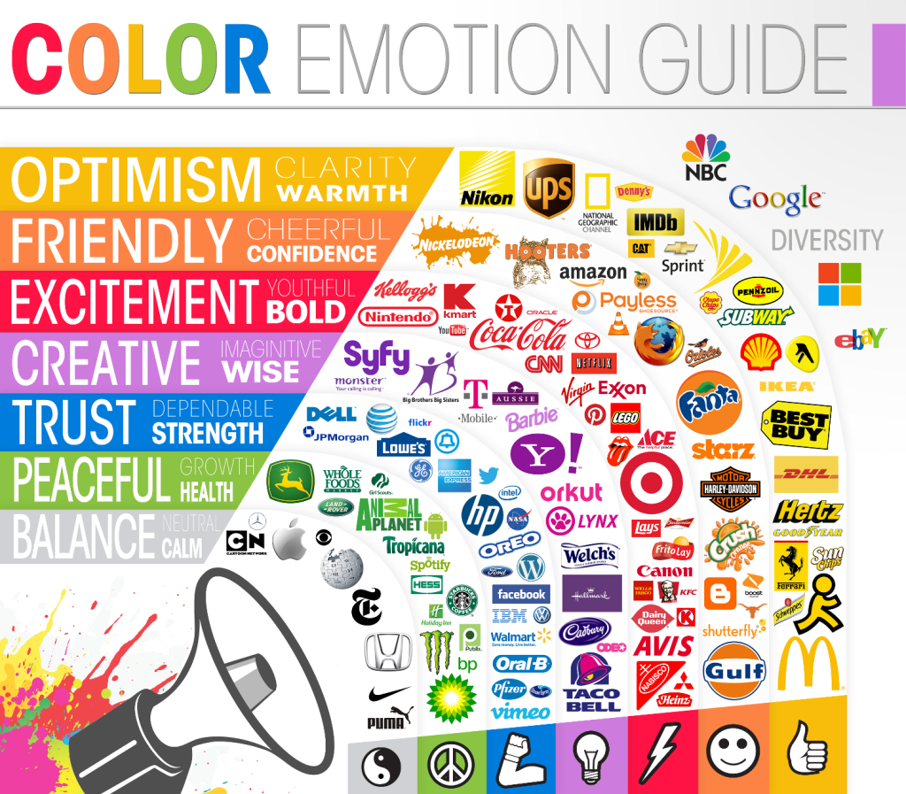
Logo Design and Emotion - Know What Colors Say About Your Brand
On The Logo Company blog, they designed an infographic showing how varying colors impacted emotions and how these emotions were tied with the dominant color of logos from around the world. These emotional impacts drive home the point that visual branding strategies begin with looking back - how identifying who the brand is, what they represent, and/or what they want to become is the first step in determining a successful color component the brand.
For instance, on the chart, green is associated with growth and health, and the logos that have green as the dominant color tend to rely on the portrayal of these two emotions/feelings to successfully market their brand, such as food-brand logos from Tropicana and Whole Foods, who obviously want to be seen as healthy brands.
An interesting emotional connection is show just to the outside of the "rings" of the main guide. The logos for NBC, Google, Microsoft and eBay are all listed next to "Diversity" and sit to the peripheral the guide due to the multicolored inclusions. All of these brands are known for (or hope to be known for) their wide-ranging brand portfolios. Their brands serves as umbrellas for a number of smaller sub-brands, many of which span the industrial spectrum. These logos are perfect examples for thinking outside the box when determining your brand color. Why settle for a monotone look that only partially describes your offerings? Instead, show the audience through your logo that you are multifaceted and have "earned" your rainbow of brand colors.
This can work against at brand, as well - you wouldn't want to begin your strategy for a brand that is a leader in the financial sector with a logo that conveys youthfulness and boldness, so it would be wise to consider how much red you'll include.
Once again, as we've seen in brand strategy discussions many times, knowing who and what your brand is can be just as important to success as having the perfect logo or name.
Addison Whitney is a global branding firm with a passion for building strong brands.
To learn more about Addison Whitney, visit our website at AddisonWhitney.com, or contact us here.

Why Your Brand Needs a Versatile Logo
When working on a brand strategy to develop a new brand or refresh an old one is to create the crucial visual branding element - the logo. A brand's logo is often its calling card, the first impression-maker with an audience and the centerpiece of its visual identity.
In today’s digitally-focused marketplace, a logo will live in and on more platforms that ever before. Logo designs that used to only need to look good on signage and business cards are now asked to translate into countless versions, including mobile websites, online ads, merchandise, etc.
“The more flexible a design is, the more places it can appear, the more people it can reach, and the more impact it has,” says Chris Cureton, Senior Graphic Designer at Addison Whitney.
Because of this, visual branding strategies have shifted to a place where logos must be adaptable to media and the placements to which it will live. As the visual representation of a brand, the logo has high standards for its appearance – the connection is inevitable of how the audience sees the quality of the logo and relates it to the quality of the brand.
Social Media and Digital Platforms are Major Factors
As has been discussed, social media has become one of the forefronts of any good brand strategy, especially in the development of a visual brand. This presents a unique case for designers, as they not only must accommodate the various sizes and shapes for the different social media platforms, but they also much take into consideration how the audience will be seeing the logo. Desktops, phones, tablets – these all present sizing and clarity issues unique to the others, but are necessary for a design to flawlessly adapt to.
“It doesn’t matter if it's on the big screen or on your watch, we want the brand to present a consistent experience,” says Cureton. Consistency is a key factor in building a strong brand, but also one that can be reconfigured in a way when it comes to visual branding and logo design. This is where the rise of secondary logos and partial marks come into play. If a logo just doesn’t look right on an application or medium, the designers must also keep in mind that possibility of using a logo variation, one that still captures the essential brand characteristics but gives a different perspective.
Big or Small, It Still Needs to Work
Not only does a logo need to be visually appealing in different variations, but it needs to look just as good whether it is on a watch face on the side of a billboard. Versatile logos just don't transfer well, but they scale well - big or small, the meaning and visual impact is not lost on these designs.
This has been one of the forces behind the trend to more simplistic logo designs and away from the heavy detail of previous logos. Simple design factors are easily scaled up or down and provide the consistent look that is desired by brands. In another nod to the strength a digitally-focused society, many of these smaller renditions are required due to the ever-shrinking size of the screens we use.
Don't Forget the Basics
An interesting aspect of this need for versatility is with all of the changes, the basic rules of good design have largely remained the same. Trends come and go, and tastes vary, but a quality logo design destined to have a long shelf life will carry many of the same elements today as it would 20 years ago. What has changed is the world around it.
“In a digital world, design must follow stoic principles. Control what you can control, and let go of what you can't,” Cureton summarizes. “There are so many variables to think about; you can't control it all. We have been forced to see that a strong logo design is also a flexible one.”
Addison Whitney is a global branding firm with a passion for building strong brands.
To learn more about Addison Whitney, visit our website at AddisonWhitney.com, or contact us here.

Keep It Simple: Timeless Advice for Great Logo Design
Today we are excited to have a guest blog from Senior Graphic Designer Dave Dixon!
Trusted. Reliable. Quality. Attributes that every company in the world would like to have consumers ascribe to their products and services. Or better yet, attributes that could be directly communicated to consumers via the company’s logo. But is it actually possible for a logo to convince the target audience of those things?
According to Logos Now, a report recently released by branding firm Siegel+Gale, the answer is almost certainly “no."
During the course of their research, the firm found that logos are significantly more likely to be described as “trusted,” “respected,” and “reliable” if the consumer is already familiar with the logo. On the other hand, unfamiliar logos received a higher rate of negative feedback, even in cases where a survey respondent wasn’t familiar with a logo that would otherwise be considered well-known.
So what exactly can a logo communicate to consumers?
Logos Now found that certain types of logos were more strongly associated with certain brand characteristics, such as “powerful,” “friendly,” or “sophisticated.” However, these descriptors can depend largely on current cultural factors and other outside influences; this is especially true for adjectives like “trendy” or “cool”. Other characteristics, like “traditional,” might be a bit easier to pin down – but that only works if a company wants to be seen as, well, traditional.
Perhaps not surprisingly, there is no easy shortcut on the road to positive public brand perception.
A company has to earn desirable associations, whether it be “trusted” and “reliable” or something more specific like “approachable” or “innovative.” When you boil it down, a logo is simply an identifier – a marker that successfully connects a company and its products with the (hopefully positive) attributes consumers have already assigned them. The more recognizable, the better.
Certain logos are undoubtedly better than others at creating a memorable and easily recognizable visual branding link in the minds of consumers. But what is it that makes them better at it?
Logos Now tells us the answer is, quite literally, to make them simple. That word was repeatedly and universally cited as an attribute of the logos that were also the most memorable. And while certain simple logos, like those for Apple and Nike, also represent some of the biggest and most well-known companies in the world, the formula of “simple = memorable” held true even among logos previously unfamiliar to survey respondents.
In turn, memorable logos were more likely to grab consumers’ attention, more likely to be described as unique in its category, and, perhaps most importantly, more likely to make consumers want to learn more about the brand.
All of that information may seem overwhelming, but it can ultimately be boiled down to a few straightforward points.
In fact, if this blog post had followed the advice laid out in the report, it might have dispensed with the previous 474 words, and instead just read: “Keep it simple."
Image Source:
https://www.creativebloq.com/50bestlogos
Addison Whitney is a global branding firm with a passion for building strong brands.
To learn more about Addison Whitney, visit our website at AddisonWhitney.com, or contact us here.
Logos: Making Your Brand Pop
Logos: Making Your Brand Pop
Guest Blogger: Ashley Wiederhold
Branding is a multi-faceted process that requires several components working in tandem to be successful. One of these elements is a logo.
Ultimately, a company’s logo is its brand’s visual representation. Your business can have several different forms of collateral that are visual in nature, but odds are the logo is going to be on all of them. For this reason, the design of an appropriate, engaging, and strategically developed logo is paramount to your brand’s identification. Kathy Savitt, chief marketing officer at Yahoo!, puts it best: “The logo is your calling card, identity, manifestation.”
Graphic designers are trained to create logos that meet the needs of businesses, but it’s critical that today’s business leaders understand why certain logo candidates are better than others. The design of a new logo hinges on numerous variables, including:
- The target audience
- The mission of the company
- The values that the company has adopted
- The attributes with which the company wants to be associated
- The manner in which the logo will be used
- The industry in which the company operates
Graphic designers gather these details before getting to work. Today’s top designers will take this information and translate it into a series of characteristics for the visual brand identity. A fantastic infographic that breaks down the various elements of a great logo, below , was designed by 123Print and has been making its way around the Internet. As the infographic explains, everything from the color to the font can make a difference in the values, attributes, etc. that your logo conveys.
- Color: The color of your company’s logo needs to be visually appealing, of course, but it also needs to set the tone of the brand message you are trying to convey. For example, if you are looking to create a bold, vibrant brand image, you may try to avoid using pastel colors in your logo.
- Font: The old phrase, “It’s not what you say, it’s how you say it,” is so true when it comes to your business’ logo. The right font will attract your target audience—and help you manage the expectations of potential new clients. For instance, a company that wants to instill a sense of dependability may want to stick with serif fonts.
A logo should, through its individual components, create a visual representation of your brand that pops. This is the first impression that many people will have of your company or product, so make it count!
Source
Entrepreneur article
Destination Branding: A Spotlight on Cities Around The World (Part Two)

On Tuesday, we started a series on destination branding by looking at Charlotte, Munich and New York. Let’s recap – Last year, more than one billion tourists travelled the world and five to six billion more were expected to have travelled within their own countries. With stats like that, a successful tourism brand could mean millions (or even billions) of dollars for a destination.
Now, let’s finish up our look at city branding…
Part Two: San Francisco, Seattle and Tokyo
First up: San Francisco, the City by the Bay. The San Francisco Travel Association promotes and maintains its tourism brand. In 2012, San Fran hosted more than 16.5 million visitors who spent more than $8.93 billion during their stay – that's more than $24.46 million a day. Needless to say, tourism is one of the city’s most important industries.
So, what about the brand?
![]()
I’ve never been to San Francisco, but it’s definitely on my bucket list. Having said that, I expected a lot from this tourism brand and I think there is definitely room for some tweaking. This destination seems incredibly diverse with such a unique personality and its tourism brand feels a little…vanilla.

Last year, Seattle welcomed more than 10 million visitors who spent $5.9 billion in the area. Visit Seattle has served as Seattle and King County’s official Destination Marketing Organization (DMO) for more than 50 years.
Seattle’s tourism brand (and its tagline) have certainly evolved over the years. Three decades ago, Seattle was dubbed the Emerald City via a public contest to come up with a new city nickname. Then, in the late ‘90s, the brand became a rebus that included the @ symbol, a nod to Microsoft’s headquarters in the area.
![]()
In 2006, Seattle became the “Metronatural” city. The firm who developed the slogan defined it as “…the fusion of city and nature. It is what makes Seattle unique.” The city went so far as to paint the logo on the roof of the Space Needle.
![]()

Earlier this year, Seattle’s DMO evolved from the Seattle-King County Convention and Visitors Bureau to simply, Visit Seattle. The upward slope of the logo evokes both the Space Needle and a mountain slope.
![]()
After each brand evolution, simple might be the smartest way to go for Seattle. The new tourism brand feels clean and modern and still manages to include some of Seattle’s personality. And, the website feels the same way.

Last but certainly not least is Tokyo, Japan. The Tokyo Convention & Visitors Bureau oversees its tourism brand. Tokyo has faced significant challenges over the past few years that greatly affected its tourism industry. In 2011, the area suffered a major earthquake and tsunami, followed by a nuclear disaster 160 miles outside of the city.
Despite an unthinkable series of events, Japan’s overall tourism numbers rebounded in 2012 and the hope is the trend continues into this year (specific statistics for Tokyo could not be found).
From looking at just its tourism website, Tokyo’s logo is pretty literal.
![]()
But, when browsing for this logo, I stumbled across two treatments for Olympic bids that offer a little more insight and flair into Tokyo’s culture.
![]()
![]()
Tokyo’s tourism site is pretty standard and does a decent job of highlight aspects of Tokyo people might not immediately think of.

Obviously, I looked at both Tokyo and Munich’s (featured Tuesday) tourism brands from a very western, U.S.-centric perspective. I’d be curious to speak with a native from each city to see what they think of each tourism brand.
That completes our spotlight on city branding. In the coming weeks, we’ll look at state and country branding and national tourism branding. Stay tuned!
# # #
Disclaimer: This post is purely subjective. My background is in brand strategy (positioning, messaging and portfolio organization), not design. Good visual branding can be challenging to achieve, and I whole-heartedly respect designers at Addison Whitney and beyond.
Sources
“UNWTO: Annual Report, 2012.” UNWTO.org, https://goo.gl/pp5a7g
“About the San Francisco Travel Association.” SanFrancisco.Travel, https://goo.gl/ZhCB1
“We’re Metronatural no more – but will “Visit Seattle” trip off your tongue?” Seattle Times, Brian J. Cantwell, https://goo.gl/oVtZox
“Seattle’s Convention and Visitors Bureau changes name to ‘Visit Seattle.’” Puget Sound Business Journal, Steven Goldsmith, https://goo.gl/t2WVUw
“Metronatural.” Wikipedia, https://goo.gl/uTTqrK
“Japan Tourism Rebounds in 2012: Hopefully 2013 will Witness a Further Increase.” Modern Tokyo Times, Tomoko Hara and Joachim de Villiers, https://goo.gl/S1AqgM