Introducing Insperity
......................................................................................................................................................................
For those of you who have been following our recent tweases (Twitter teases) noted by our hashtag #AW3095, you already know the news. For everyone else, it’s our pleasure to introduce Insperity, formerly Administaff.
Addison Whitney has been working with the Insperity team since February 2009 and is so proud of its team’s hard work throughout the process, and especially at the launch some members of our team were lucky enough to attend.
We are excited to begin our Insperity series to highlight the key steps from throughout our more than two year relationship with the Insperity team. Throughout each post we will give you some insight into things we learned or just fun facts from each phase.
Here are some headlines to get you excited and coming back for a double dip of Brand Salsa.
- Market Research – gathering key insights from current and future customers
- Brand Strategy – who are we and what to do with all of these offerings and brands
- Verbal Branding – farewell Administaff, hello Insperity
- Visual Branding – Insperity’s new look and feel
- Brand Rollout – dancing in the streets of Houston
- What Makes a Great Project Team – we’ll tell you because we worked with a fantastic one at Insperity
Stay tuned!
Starbucks Did What?!
![]()
Caffeine addicts across the world are in uproar over Starbucks' announcement this week that its logo would be changing to celebrate its 40th anniversary in March and the company’s larger focus.
On Starbucks’ site you can read comments from people upset over the change and even suggesting alternative designs. Interestingly, Starbucks partners (also known as employees) are posting positive comments and are expressing excitement for the change. Commenter Simplycatlin, a partner, says “You guys love the experience not the name and not the green lady...” Bingo.
A brand is so much more than a logo. (Repeat this phrase five times.) It’s about the emotional experience people have with your brand; the unique place your brand holds in people’s hearts and minds.
Maybe all the uproar is not really about the logo, it’s about the fear that people’s favorite brand may be changing and moving away from coffee and its delicious pumpkin cream cheese muffins. Maybe Starbucks brand fans are worried that this “third place” they’ve come to love escaping to could change. Of course, maybe they really just don’t like the new logo.
What do you think – is it the logo or is it more than that causing the controversy?
Please note: This blog entry was not biased in any way by my long-time respect for their brand and my adoration for Howard Schultz, who I affectionately refer to as Howard, like I’ve known him for years.
The Ugliest Thing at Urban Outfitters
![]()
No, it's not a faded shirt or a floppy hat that looks like it came from my grandmother's attic. The ugliest thing you'll find at Urban Outfitters is the new logo/look of the website. In a surprising move, Urban Outfitters has changed the color palette of its website and debuted a new logo that looks like it was created with Word Art.
Though the store is in good company--Gap and Belk have also unveiled new logos this year--the move doesn't fit the Urban Outfitters brand. Urban Outfitters is all about being hip, cool and ahead of the curve. Refreshing its logo after so many "mainstream" stores have already done so makes Urban Outfitters look like a crowd follower, rather than a trendsetter. There is also nothing particularly unique, edgy or very cool about the new design or website. The font and color palette are fairly generic looking, even boring.
On the other hand, the new logo is pretty fitting for a store full of retro styles. It looks just like the cover my fourth grade book report.
UPDATE: Urban Outfitters changed the look of their site to something more streamlined less ridiculous.
![]()
Brand Refreshment: Belk vs. Gap

![]()
………………………………………………………………………………………………………………………………………………….
Much of October's design buzz was focused on the new Gap logo. With the change came die-hard Gap customers commenting on blogs, Facebook sites, and within the design community.
Marka Hansen, president of Gap North America, initially defended the logo, writing that the move brings Gap into the modern age. "We want our customers to take notice of Gap and see what it stands for today," she said. "We chose this design as it's more contemporary and current. It honors our heritage through the blue box while still taking it forward."
Hmm. The iconic blue box of Gap was actually diminished, rather than honored in the new design. Adding a gradient and moving it into a submission position does nothing in my mind to 'honor its heritage.' After only a week, Gap decided to revert back to the original logo.
Belk Department Store debuted its new image right around the same time, but was somewhat overshadowed in the media. Both Belk and Gap stated that they wanted to move their respective brands into a more updated space, and redesigned the logos to coincide with the modern feel of the apparel and the stores. So why was Belk's change more widely accepted (individual design critiques aside), and Gap's new image was met with such passionate disapproval?
A couple of ideas:
1. Regional awareness. Belk is a regional brand, with a smaller target audience than the global presence of Gap. While Belk isn't just "your Grandmother's store" anymore, the company hasn't been as active over the years in building and defining their brand image, so their change could be met with less resistance.
2. Belk is a collection of individual brands. Gap IS a brand.
3. Lack of connection to the audience. Belk had a plan for change and is systematically making the change market by market, and Gap introduced the logo to the entire world without so much as a hint that something new was coming. For such a devout target audience and such a large presence, you have to be prepared for the response - positive or negative. No market research to find out what customers think prior to launch?
4. Redefining the brand ... consistently. The Gap logo is/was classic. "Classic" is actually what their brand was all about. If they wanted to modernize or talk about their new modern jeans, they could update their collateral, or use social media in a new way to talk to their audience. Create a contest to have customers help design the new logo. The same can be argued about Belk: the iconic script was regarded as a logo with "class and character" that many argued should have been retained. However, Belk complemented their change with a tagline: "Modern. Southern. Style." which helps to reinforce the overall change.
What are your thoughts on refreshing a brand? Total re-definition through a new name or logo? Change the tagline? Update your social media efforts? Any other positive examples?
Confessions of a Name-Induced Shopper
 ......................................................................................................................................................................
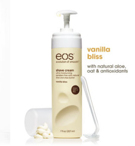
Be honest - have you ever bought a product solely because of its name or packaging?
*whispers* I have.
The bottle’s appearance sucked me in, the matte hot pink and matte yellow bottles at the end of a sea of glossy blue and purple cans. I moved in closer, seeing the name EOS emblazoned across the top. Instant adoration! I love the name because Eos is the ancient Greek goddess of the dawn, often signifying a new beginning. Double bonus verbal branding: they’ve made it an acronym apropos to their product line, the “Evolution of Smooth.” So, even if you didn’t know that Eos was the goddess of the dawn, they are telling you this is a new beginning, an innovation in shaving, a new era of smooth legs!
Thankfully, I have ended up loving the product, too. Vanilla Bliss, indeed.
Will I now buy their lotion, lip balm (smooth stick or smooth sphere) and other flavors of shave cream?
*shouts* Yes!
Maybe it’s not the smartest way to shop, but EOS sold me in five seconds flat. I wasn’t even looking to buy shaving cream that fateful day in Target.
I wasn’t even in the aisle.
The Rebranding of the Y
![]()
......................................................................................................................................................................
Any given day, you’re sure to find an Addison Whitney employee at the Y running on a tredmill or perfecting Zumba moves. As a member of the YMCA of Greater Charlotte, I received an email last week from the President & CEO and Metropolitan Board Chair that blew my mind – in a good way.
By the time I’d received the email, I’d heard the news of the YMCA’s rebranding to the Y. I had seen the new logo and color palette. And I had read quite a few articles and blog entries cheering and jeering the change.
But this email was different because it was from my Y. The email, entitled “Still Your YMCA,” communicated the changes members can expect including a new brand strategy defining its cause of strengthening the foundations of community and a refreshed logo. But it also told members what would not change: the mission, core values and services members enjoy.
A key to successfully introducing a rebranding effort to your target audience is communication. As a member of the brand strategy team, we tell our clients going through rebranding efforts to do just what the Y did so well. Tell your target audience why you did it, how you did it and what they can expect. Change can be scary, so calm any fears by clearly stating what will not change.
The email from the YMCA of Greater Charlotte says it best: “As you can see, the Y isn't changing any of the great programs and services that we've always provided; we're just trying to do a better job of explaining why they matter.”
And you’re off to a great start.
The Many Faces of Google
I don't know about you, but for some reason it always makes my day when Google features one of their custom logos. For those of you that have managed to miss this occurrence, don't worry. You're bound to catch one eventually. While usually these alternative logos are in celebration of holidays and historic events, Google also commemorates birthdays of famous artists and scientists. A special colorless logo has appeared in recognition of major tragedies, and on Earth Hour the site switched its background to black symbolize "turning out the lights". Google Custom Search even hosts a landing page called Blackle, that serves as encouragement to users to save energy. It displays a black background and uses grayish-white font color for search results. Considering the popularity of the search engine, these colors supposedly consume less energy. But, more importantly, the site is a reminder for people to take small steps in their everyday lives to save energy.
Among one of the most fun Google logo alternatives was the recent observance of the 30th birthday of Pac-Man. This interactive logo contained an accurate recreation of the Pac-Man game that could be played in a browser. Google later released a permanent Google Pac-Man site. Another geeky way to have fun with Google is by designing your own home page at Google My Way. Give it a try. I promise you won't be disappointed!
Stirring Up Changes
Seattle's Best has joined the ranks of familiar companies updating their logo's look.
As with all new things, there are some pretty harsh words flying around about it. What's your opinion about the new design? Grab a cup of coffee, and tell us about it.
Contributed by: Jenna Wise
And the American Graphic Design Award goes to ...

......................................................................................................................................................................
Kudos to our Visual Design Department who recently was recognized for four brands by American Graphic Design and Advertising.
Carnival Cruise Lines: Drainpipe logo
Carnival Cruise Lines: Twister logo
FUJIFILM Medical Systems: Synapse logo
PPG: VIVATI Collection logo
Kristin Everidge, Manager of Visual Branding for Addison Whitney, commented, "It has been an honor to be a part of ADGA’s annual awards for the past 12 years. The 2010 winners represent a synergy between the core competencies of our organization, which include naming and design work for these clients. Because of our iterative and collaborative processes with these clients, we share the credit for these awards with Carnival Cruise Lines, FUJIFILM and PPG."
Caribou Coffee gets a New Logo
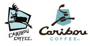
Caribou Coffee is undergoing a makeover! Moving away from the ski lodge atmosphere, the new look will be less regional and more contemporary, "a fresh variation of the same elements" according to the company's website. The new brand look includes a new logo, color palette and design elements. The caribou has been reworked and now features "C" shaped antlers and a coffee bean body. In addition, the caribou in the previous logo was leaping left, whereas the caribou now leaps right, signifying the company as it heads into the future. The shield element from the original logo has been updated to a new shape, which resembles national park signage, in honor of their founders' hike in Alaska's Denali National Park that inspired the company's foundation. The more stylized, upscale logo Read more