Cable Networks Rebrand to Stay Ahead of the Game
TV is a tough business, and the competition for both viewers and advertisers is cut throat. After all, they’re the two factors in keeping a station afloat. So with the ever-growing popularity of DVR, online programming, social media and an impressively long list of channels, the cable landscape is changing. And with that so too have the networks’ branding challenges.
Cable used to be defined by clear-cut niche programming and stations that replayed old movies, and syndicated sitcoms, but to keep up with each other the lines have blurred, and original (not to mention more diverse) content is starting to pop-up on cable networks at every click; which is exactly why networks are feeling the need to rebrand and reposition their brands more than ever before.
There is a growing list of channels overhauling their identities, but let’s take a deeper dive into these three examples below and see what they did to help set their networks apart from the competition.

In May 2012 TV Land the original station for those of us who love old sitcoms introduced an updated logo and new tagline “laugh more,” both of which were developed to broaden the TV Land brand and the programming it offered.
The logo speaks to the modernization of channel, and showcase that TV Land is about combining acquisitions and creating original sitcoms – all intended to make you, that’s right, laugh more.

E! Entertainment, one of the original purveyors of pop culture gossip (and everyone’s guilty pleasure) announced at their April 2012 upfront presentation that they would be introducing an updated logo and tagline. The new logo and tagline are intended to speak to the fact that E! has always been the epicenter of pop culture, and that the network’s next chapter is all about never letting anyone go a minute without their pop culture.
E! is also looking to rebrand itself on air by introducing scripted series and adding to its already existing reality and documentary series.

Of the three examples, Comedy Central’s rebrand is certainly the most drastic and has the best story to tell. Their old logo, the globe with buildings coming out of it, was hard to adjust into the digital age. One blogger wrote that the old Comedy Central logo was “like showing up in a Hawaiian shirt at a Fortune 500 company.” The old logo no longer fit the identity of the channel nor did it reach their younger audience.
The new logo, a “C” tucked inside an upside “C” bears a striking resemblance to the copyright symbol, which some have said shows the new Comedy Central logo subtly suggests that they’ve got a lock on laughs. Clever and funny, don’t you think? While at first glance this logo may not seem to capture what Comedy Central stands for, I bet now you might think differently.
Good Things Come in Great Packages
In a society driven by the importance of looks, package design is vital when it comes to brand image and is the best chance to make a sale based on looks alone. How many times have you been faced with a decision between two different products and let your decision fall on the design of the product or its packaging alone? I know I have been guilty of this more than once, which led me to consider just how important package design really is.
According to Marketing Week, up to 70% of purchase decisions are made in stores and are heavily influenced by package design and marketing. Product design involves form and can be used for a variety of functions. Some of these functions include differentiating your product from your competitors, giving a physical aspect to your brand’s personality, and to serve as a brand identity tool so that consumers are able to recognize it anywhere. Also, for many consumers bonding with package design marks the beginning of an experience with a brand and can spark product loyalty. The design of a product can be a very powerful marketing tool, argues Mike Smart, design strategist for Design Council. “Design gives form to the idea and the role of the designer is very much to understand and position themselves between the ideas world and the physical product on shelf. Designers have a focus on the craft of making something but maintain the integrity of the research behind that brand.”
One of the best examples of successful package design is Chanel No. 5 perfume. Now in its 90th year of production, Chanel No. 5 is the best-selling fragrance of all time all thanks to its classic and timeless bottle. The most important aspect of the perfume, the bottle, has remained largely unchanged since its conception in 1922. Back then the bottle was actually made of delicate crystal and featured a rounded top. But that container proved to be much too fragile for shipping. It was then that Coco Chanel made some modifications to the neck and stopper of the bottle. Her idea was to produce clean, simple lines and to feature the perfume itself with a translucent bottle. The simple white label with black type, which has also remained unchanged since 1922, it is a strong representative of simplicity and functionality.


Not all brands have been lucky enough to experience the same success as Chanel and are constantly on the lookout for new and exciting ways to get a leg up on their competition. Package designers have recently taken into account how popular social media has become and have started to integrate it into their packaging. In the United States you can now use an iPhone application to scan a special barcode on the packaging to receive information about the product. Previously brands were limited on what could be put on packaging by its size. Now, these barcodes will direct consumers to Facebook, Twitter, or others sites linking them directly to promotions, comments, reviews, as well as inviting real-time feedback.
Are you able to recognize your favorite products just by their packaging alone? Whether it’s the bright red and sliver of a can of Coca-Cola, the sleek and modern design of Apple products, or the distinctive styles of your favorite automotive brand, package design is among the first things that consumers notice about a potential purchase. For many brands package design is the deciding factor on whether or not their brand stands out or fades into the background.
Contributed By: Nicole Juliano
Nice Package: 5 Tips for a Great Package Design
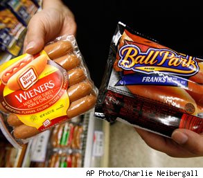
As "the hot dog wars" battle on between Sara Lee Corporation and Kraft Food Inc. in a Chicago courtroom over misleading package designs, I think it's time to take a deeper look into packaging and why it is important enough for these two companies to battle it out in court.
While a brand must employ a successful strategy throughout many different touch points including advertising, identity, and web presence, it is packaging that could most directly have an impact on a brand's sale. No longer is a product's package merely a means of protection during transport from point A to point B, but an increasingly important factor in product's success. A well-marked package will get a customer to pick up a product and take a closer look, which ultimately puts you one step closer to making that sale. This is why it is so important to have an interesting and compelling package design.
Kristin Everidge, Manager of Visual Branding at Addison Whitney, says "People are drawn to products with interesting packages because it suggests that what's inside is equally appealing or different." Package design can enhance a brand through unique structures, sustainable materials, cross promoting other products and building brand awareness through shelf displays and planograms that wow consumers during their weekly shopping trips.
Packaging is a vehicle that reflects the product's brand and image. To ignore the importance of packaging in today's market is your own product's death. Package design should be a continuous investment to evolve with the ever changing world that is packaging.
But what makes a great design? I asked Kristin and these are her top five elements of a great package design (in no particular order):
- 1. Shelf Presence/ability to grab attention quickly
2. Effective informational hierarchy
3. Inspiring materials and structure
4. Functionality
5. Clean & crisp design (images, typography, and functional information)
So do you think you're immune to the power of package design? I think the real answer would surprise you, next time you're shopping the aisles of your local Target, take note of the products you grab and how compelling their designs are compared to the products you left behind…
Cracking the Code on Package Design

From color scheme to font, companies place great importance on compelling package design for their brands. Now, one of the most overlooked parts of a package—the barcode—is getting an artful makeover.
Consumers are influenced by the entire experience of a product. That experience begins with packaging. A package is more than just a container. It is an asset that can motivate a purchase, making the outside just as important as what’s inside.
"Little clever barcodes seem to be all the rage across a variety of products in the consumer packaging world,” said Nick Irwin, Senior Graphic Designer at Addison Whitney. “Although, I do see it as a superfluous and trendy, it’s good to see these quaint design elements because each barcode is individualistic and can really fortify a brand message if done right."
Form meets function as traditional black and white lines and numbers are taking the shape of famous buildings, blades of wheat and bubbles. According to the Wall Street Journal, the trend is popular with smaller companies, but one of the world's largest food companies, Nestle SA, is even trying out vanity barcodes on some of its brands. For example, Nestle's Juicy Juice Sparkling Fruit Juice Beverage has bubbles rising up from its barcodes, and its Skinny Cow low-calorie dessert line features barcodes shaped like a cow's spot. Consumer-goods companies hope these vanity barcodes will better connect with customers and help their product stand out in a crowded marketplace.
Fast-Food, Version 2.0
Places like McDonald's and Burger King are generally considered classic fast-food giants. The die-hard Big Mac or Whopper fans will always keep them in business, but a new slew of pseudo-fast-food restaurants are giving them a run for their money – even forcing them to reconsider their branding strategies.
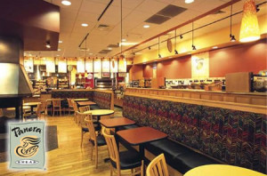
These days, Panera Bread has free wi-fi. Noodles and Co. has healthy pasta dishes for around $5. Even Starbucks sells prepackaged deli sandwiches alongside its specialty drinks. But food isn't the only allure of these new fast-food restaurants: their interiors are decorated with fresh, modern art, their staffs are comprised of enthusiastic young adults, and their customers often treat the establishments more as relaxing hang-out spots than eateries.
These brands accomplish what places like McDonald's and Burger King fall short of —associating themselves with a growing class of individuals that will pay a little more for an atmospheric, modern meal. They are able to exude sophistication that is affordable, healthy, wholesome, and accessible — and who doesn’t want to be a part of that?
Lately, the previous kings of fast-food are taking a hint from their newer competition's branding techniques and moving away from the catch-all, fast-food brand of cheap and greasy. McDonald's, for instance, has recently been implementing new restaurant designs with relaxing color palettes and flowing fonts, along with menu items like fruit smoothies and oatmeal. Burger King is said to be revamping its entire restaurant feel, getting rid of the king mascot as well as adding a new Asian chicken salad to their menu.
But ditching the burger brand that the two chains almost single-handedly created could be hard to do, and regular customers might not embrace the changes. These restaurants take a risky gamble on a new trend that might not outlive their own established brands.
Will McDonald's or Burger King reach the new standard of fast-food prestige? Share your thoughts!
Contributed by Allison Meeks
Polaroid gone Gaga!
Looks like Polaroid has been re-branded by none other than Lady Gaga. The pop-culture icon has a new vision for Polaroid—literally. Since January 2010, the Fame Monster has taken on the role as creative director for Polaroid, designing and branding their latest round of camera products. There is still Polaroid brand equity for Gaga to reclaim and reinvent as the "camera" evolves.
The new line, Polaroid Grey Label, will maintain the brand’s core values of simplicity, authenticity, and sharing, while targeting a new generation with the futuristic style of Lady Gaga. The Grey Label is coined from “greige goods” a fashion term for fabric in its purest form. The name expresses the simplicity of Polaroid and the style of Gaga.
The most intriguing product presented is the Polaroid GL20 Camera Sunglasses. The product was inspired by the idea to fuse the icon of instant photography, with the queen of fashionable eyewear. These glasses not only allow eye protection from the sun, but also have a built-in camera that takes pictures and video. The camera fits on the bridge of the nose and the display screens are just below eye level, not to interfere with one’s line of vision. Not only can you take pictures with these glasses, you can also play them back to the world as you live it.
Another Grey Label item is the Polaroid GL10 Instant Digital Camera. Don’t be deceived by the boxy, old-fashioned look. This camera prints digital images right into your hands! It comes with a modern LCD screen display, and brings back instant image printing, defining the Polaroid picture of the new age.
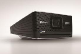
The final product is called the GL10 Instant Mobile Printer. It’s a mini machine for printing photos instantly from your phone or camera anywhere-- at a party, in the office, in the car—and it’s small enough to put in a purse. It acts as a functional tool as well as a fashion accessory. According to Lady Gaga, "This product will revolutionize how we see photos. Your images will no longer die a death on your cell phone or digital camera."
The Instant Mobile Printer, Instant Digital Camera and the Camera Glasses are a unique “look” at how to turn images into a fashion statement. The products are coming out this summer 2011, and there’s no question they will require a large chunk of change. However the price of a Polaroid in it's heyday of the 90s did not detract from the allure of the brand. Hopefully the Grey Label will provide the same appeal.
Contributed by: Emily Hassell
Happy Birthday Apple Stores!
A lot has changed since 2001. Back in yesteryear Mark Zuckerberg was not a household name, the word tweeting was the sound a bird made, and as of May 2001 Apple had yet to open any retail stores – the catalyst that helped Apple become the brand that it is today.
Today marks the 10th anniversary of Apple opening their first retail store in Tysons Corner, VA, a Washington, DC suburb. At the time many in the retail industry saw the move as risky, because "big box" technology stores had a stronghold on technology sales. Apple broke away from the norm with their stores by exclusively selling Apple products, instead of selling them alongside their competitors.
No doubt much of Apple's success has come from their innovative and industry changing products, but it is also impossible to ignore the fact that the brand's success has a lot to do with their brand image and seemingly flawless execution of brand standards.
Take a moment to think of each Apple store you've been in. It's hard to decipher which is which, and where each was located isn’t it? You can attribute that to the fact that Apple cuts no corners in controlling their retail environments. Each store has the same look and the same feel, when you step into an Apple store there is no second guessing your location. Isn't that something all brands desire to achieve, an all knowing awareness of their brand?
Whether its architectural design, package design, or product design, Apple uses a consistent brand image to maintain a familiarity amongst consumers, and in a world dominated by ever changing technology Apple's consistent design and image has no doubt helped the brand who was ranked as the world's 49th most valuable brand in 2001 skyrocket to the top of the list and land at #1 in May 2011.
So, Happy 10th Birthday Apple stores, I'm sure you'll have no problem getting friends to come to your birthday party.
McMakeover

McDonald's has introduced subtle changes over the past few years such as healthier menu options and new coffee drinks. Now, the fast food chain is undergoing a $1billion dollar makeover. According to USA TODAY, McDonald's hopes to have the majority of America's 14,000 locations revamped by 2015.
Expect to sit at wooden tables or on faux leather chairs. Bright red and yellow interiors are being traded for muted yellow, orange and green palettes. Though designs vary by location, recent makeovers of select stores have included: Flat-screen TVs, adding second drive-through windows and lounge areas for diners looking to stay a while.
Another new feature seen in some locations: the golden semi-swoosh. McDonald's calls it the yellow "brow" — or half of a golden arch. Maintaining the familiar yellow design, the brow might be a sleeker, more modern approach to the famous arches.
It is unclear how consumers will react to the renovation. The new look and feel will certainly be familiar to Panera or Starbucks customers, but many Americans grew up with the classic look and could feel alienated by the drastic changes. For now, all eyes are on McDonald's. America's largest chain restaurant is redefining itself which could mean big changes in the future for other fast, casual dining competitors.
Carnival’s Magic has set sail on its Inaugural Voyage!!
From creating names to designing logos a number of Addison Whitney brands can be seen onboard the new ship. We had so much fun working with the Carnival team, and we want to continue that fun with a little interoffice competition.
To help us decide which Addison Whitney team member can claim bragging rights around the office check out the AW brands below and “Like” your favorite! And if you want to read more about our work with Carnival click on the logos below.



Insperity | Taking it to the streets
On March 3, 2011, the Administaff family gathered to celebrate 25 years of success and a new beginning as Insperity. Some members of the Addison Whitney-Insperity team were lucky enough to attend and witness this magical evening.
Picture this – Minute Maid Park home of the Houston Astros, deep in the heart of Texas, buzzing with the excitement of more than 3,000 people. As we all filed into seats along the third baseline, we were met with an incredible program. Hosted by new Insperity spokesman Jim Nantz, it featured a conversation with Steve Forbes and presentations by company leadership. Saying the presentation by Chairman and CEO Paul Sarvadi was inspiring and energizing just does not do it justice. He passionately talked about the company’s evolution over the past 25 years and his vision for the years to come. This new vision coupled with the new corporate identity was unveiled in 3D – yes, thousands of guests put on branded 3D glasses for the unveiling.
The night featured an amazing spread of food, dancing and festivities. As we headed out to left field to get our souvenir – an Insperity-branded box filled with mementos celebrating the company’s history – Michael McDonald took the stage to cap off the night.
Often times when our clients launch new brand strategies or corporate identities, we do not get to witness the excitement of the event. So being able to attend was very special for our team. Every detail of this event and the Sales Convention happening at the same time were so well thought-out and very impressive including the signs, stage lighting and the entire color palette – all of which changed overnight.
To borrow something we overheard employees saying that night: here’s to Insperity – cheers!
[portfolio_slideshow trans=scrollHorz]

