A Thermostat to Rule Them All
A year ago, would anybody have thought that the product development we saw this year at CES would be inspired by an innovation to, of all things, a thermostat? Yes, a thermostat.
This thermostat was introduced by a brand called Nest, of which I am a big fan. I don’t own one, but I do look at them longingly on my trips to Home Depot. The brand’s first blog entry clearly explains why thermostats were the choice for innovation: heating and cooling costs make up about 50% of an energy bill, and therefore were a logical place to try and find solutions for homeowners. Also, it’s pretty.
At this year’s CES, there were a number of new innovations introduced that were related to the Nest thermostat idea. The Aurora Sleep System will tell your thermostat when you go to sleep and when you wake up, allowing the thermostat  to customize the temperature to fit your needs. Whirlpool introduced a dryer that can help keep your clothes fresh and wrinkle-free while you’re away, or even delay cycles during peak energy times. The Kevo Smart Lock can tell Nest who is entering the home and what temperature they like.
This is amazing. Think about it. A thermostat. Something that is present in nearly every consumer’s home, but often not given a second thought until it doesn't work. But Nest truly is more than just that. It is bringing the thermostat into the list of must-have for the latest and greatest technology, along the lines of the TV and computer industries. Additionally, it really was the first major entrant into the “smart home” accessible at the consumer level.
The smart home concept is a brand of the “Internet of Things” concept, focusing on how a variety of devices can increase connectivity of the “things.” A number of keynote speeches at this year’s CES  focused on Internet of Things-related topics, much like a few keynotes did last year. And while general consumers may still be learning this term, they do understand the value of connection. And a consumer understands the benefit of energy efficiency, especially when it affects monthly budgets. It will be interesting to see what other innovations come to market that work specifically with Nest, or whether there are other brands who take the lead in the space.
An interesting aspect of the Internet of Things perspective is that, in reality, it doesn't qualify as an innovative idea. It’s not a thought that is brand new, the cause of light-bulb moments for companies around the world.
In fact, from a B2B standpoint, the Internet of Things has impacted innovation leading to more efficient ways to gather data, and then leverage and use this data to make better decisions. Amazing case  studies about the London Underground or GE’s Industrial Internet used with locomotives can be found across the Web. From a consumer standpoint, the market has been trending toward the connectivity of devices big and small, from those for whom a connection seems obvious to devices you never thought should or would be connected (i.e., a bedside table light you can turn on with your smartphone – even when there is a chance you would be reaching PAST the light to grab your phone to turn on said light).
But connectivity is quickly shedding its “trend” status and showing that it will be a leading factor for a long time in product development. The consumer is becoming more and more reliant on a few products that will control their lives, whether it be a smartphone, tablet, or yes, a thermostat.
I do have one more question – How will Dads around the world react to this loss of control of the thermostat?!
Sources:
https://nest.com/blog/2011/10/25/thermostats-yes-thermostats/
https://www.fastcolabs.com/3030367/the-london-underground-has-its-own-internet-of-things
https://www.fastcompany.com/3031272/can-jeff-immelt-really-make-the-world-1-better
https://www.youtube.com/watch?v=1Pwwx1cF8NQ
Follow us on Twitter @AddisonWhitney or join the conversation on Facebook and Google+
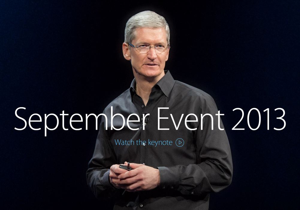
An Apple a Day...

So, it's no secret that we're fans of Apple at Addison Whitney, and today's keynote was no exception. There is something so intoxicating about the buzz surrounding these events, and we were very excited to see the latest news unfold.
Today's keynote had several announcements, but here are the highlights.
First up, two new iPhones (to completely replace the iPhone 5).


But, as impressive as the new products seem to be, I think we were most excited to learn when Apple's gorgeous new operating system, iOS 7 would be released to the public. Drum roll, please... next Wednesday, September 18!

In case you missed the keynote, feel free to watch it below.

What do you think about the new phones? And, their naming extensions (5C and 5S)? What do you think this means for Apple's brand moving forward/what impact do you think it has? We'd love to hear your thoughts!
Destination Branding: A Look at National and Regional Brands

Today, we’re concluding a multi-week look at destination branding. So far, we’ve looked at city, state and country branding. This post will round out our series by focusing on national and regional brands. Since we’ve been covering destinations where we have offices, today’s focus will be on the U.S., Europe and Asia (and the Asia Pacific region).
First, a quick recap on the impact of tourism: Last year, more than one billion tourists travelled the world and five to six billion more were expected to have travelled within their own countries. With stats like that, a successful tourism brand could mean millions (or even billions) of dollars for a destination.
America’s destination brand is run by the Corporation for Travel Promotion (formed in 2010), which does business as Brand USA. Brand USA was established by the Travel Promotion Act to spearhead the nation's first global marketing effort to promote the U.S. as a premier travel destination and to communicate entry/exit policies and procedures to worldwide travelers.
Personally, I was surprised to learn the U.S.’s official travel/tourism entity was so young; I assumed it had been around much longer than just three years. That said, a lot has been done to round out America’s travel brand. The destination’s mantra, Discover America, is succinct, but still tugs at the hearts of travelers.
The logo feels seems to allude to points on a map and the destination uses a variety of colors when it comes to execution. A few examples are below.
![]()
![]()
![]()
It has to be daunting to try to encompass an entire country in terms of destination branding; there are so many landmarks and events to consider. But, the site for U.S. tourism does a decent job of spotlighting different activities while also keeping the overall navigation simple. It would be easy to over-complicate or clutter a site like this, but it’s clean and easy to explore.

Established in 1948, the European Travel Commission (ETC) is responsible for the promotion of Europe as a tourist destination. The organization is comprised of 33 countries’ NTOs (National Tourism Organizations) and focuses on PR, advertising and trade promotion.
The logo for Europe feels whimsical and unlimited. The wing-like effect makes me think of an adventure taking flight, and even though that might feel a bit cheesy, with all you can see and experience in Europe, it feels right. Two different executions are below.
![]()
![]()
In addition to the logos above, there is an additional treatment of the word Europe used on the site, paired with a tagline-esque call to action (see below).
![]()
The website does its best to pack in as much information about the region as possible, while maintaining a simple navigation with a lot of different pathways to planning a vacation. That said, I would have loved to see more photography from each country’s famous landmarks and events.

Asia Pacific
The Asia Pacific region (or just Asia, for that matter) doesn’t seem to have any sort of overarching tourism entity. There are several different organizations that represent various aspects of tourism to the region, and we’ll briefly look at each below.
Pacific Asia Tourism is the first thing that comes up when you do a Google search for “Asia tourism,” but it’s an independent research, consultancy and education/training organization focused on the capacity of sustainable tourism in the region.
The Responsible Tourism Initiative also comes up in a Google search. This initiative focuses solely on Asian tourism operators, so it serves as more of a trade organization than something consumer-facing.
Along those same lines is the Pacific Asia Travel Association: another trade organization where I hoped to find a consumer site focused on tourism in Asia. Instead, it’s built by and for travel professionals in the region and doesn’t really speak to potential visitors.
Finally, I stumbled across this site, titled “Asian Tourism.” This site doesn’t seem to have any affiliation with an organization or tourism entity, but it does offer information on the various countries in the region.

So, after a lot of Google-ing, if I were planning a trip to the Asia Pacific region, I’d research sites like TripAdvisor, Fodors, Frommers and AAA for the best/most reliable information.
So, this concludes our series on destination branding. If you want to review any of the previous posts on destination branding, here are the links: city branding- part one, part two; state and country branding- part one and part two. Now go pack your suitcase and discover your wanderlust!
# # #
Disclaimer: This post is purely subjective. My background is in brand strategy (positioning, messaging and portfolio organization), not design. Good visual branding can be challenging to achieve, and I whole-heartedly respect designers at Addison Whitney and beyond.
Source
“UNWTO: Annual Report, 2012.” UNWTO.org, https://goo.gl/pp5a7g
“About Brand USA.” TheBrandUSA.com, https://goo.gl/tmsyNZ
“About ETC.” ETC-corporate.org, https://goo.gl/i22c
Destination Branding: A Look at States and Countries around the World (Part Two)

Last year, more than one billion tourists travelled the world and five to six billion more were expected to have travelled within their own countries. With stats like that, a successful tourism brand could mean millions (or even billions) of dollars for a destination.
On Tuesday, we continued our series on destination branding by looking at states and countries (specifically, North Carolina, Germany and New York). Today, we’ll cover the rest of the states and countries where we have offices…
Part Two: California, Washington and Japan
California is the third largest state by area, so you can imagine how much work goes into branding it as a travel destination. When searching for the tourism entity’s logo, I found two versions – the one being used on the website now and one from a few years back. The difference lies in the font treatment, where the current logo is more cartoon-y than the old.
Here’s the current logo:
![]()
And here’s one from a few years back:
![]()
Given the immense amount of information the website needs to cover, I think Visit California has done a good job of simplifying vacation options for potential visitors. And, it’s presented in a way that keeps it interesting and on-brand.

Washington seems to have had a somewhat tumultuous past when it comes to its tourism organizations. In February 2011, the Washington Tourism Alliance (WTA) was created following the announcement of the closure of the state tourism office. The WTA immediately worked to protect and preserve a number of ongoing state tourism programs and valuable marketing assets of great importance to the industry. In addition, the WTA began to create a long-term strategy for funding, development and marketing of a new, industry driven state destination tourism initiative.
Washington’s tourism logo emphasizes the natural resources of the state in much of the same way that North Carolina’s new logo does. What confused me a bit was the inclusion of “The State” under Washington. I’m sure there’s some initial confusion regarding whether someone is talking about Washington state or D.C., but I’m not sure tacking on “The State” to the logo is necessary.
![]()
![]()
And, since the website does such a beautiful job of highlighting what makes Washington a great place to visit, I feel “The State” is even less necessary.

Last up is Japan. Since 1964, the Japan National Tourism Organization (JNTO) has led a broad range of activities promoting travel to Japan through various activities overseas as well as tourism-promoting activities in the country itself. Interestingly enough, the country’s travel brand has two different identities: one for the NTO and another, more consumer-friendly tourism brand.
![]()
![]()
That said, the website follows a different approach. The landing page for Japan’s travel site features both logos, although neither is featured prominently.

Once I chose English, I found that the new site didn’t feature the consumer-friendly Japan travel logo at all, which I found a little strange. I feel like the “Endless Discovery” logo tells an intriguing story and could be used as a showpiece for Japan’s travel site.

So, that concludes our look at state and country branding. In two weeks, we’ll finish up this series by diving into how the U.S., Europe and Asia Pacific regions handle tourism branding. Stay tuned!
# # #
Disclaimer: This post is purely subjective. My background is in brand strategy (positioning, messaging and portfolio organization), not design. Good visual branding can be challenging to achieve, and I whole-heartedly respect designers at Addison Whitney and beyond.
Source
“UNWTO: Annual Report, 2012.” UNWTO.org, https://goo.gl/pp5a7g
“About WTA.” Washington Tourism Alliance, https://goo.gl/5GiRIn
“What is JNTO?” JNTO.org, https://goo.gl/o6J8NL
Destination Branding: A Look at States and Countries around the World (Part One)

Two weeks ago, we started a series on destination branding by looking at cities where we have offices worldwide (Charlotte, Munich, NYC, San Francisco, Seattle and Tokyo). A quick recap – Last year, more than one billion tourists travelled the world and five to six billion more were expected to have travelled within their own countries. With stats like that, a successful tourism brand could mean millions (or even billions) of dollars for a destination.
Now, let’s jump into state and country branding…
Part One: North Carolina, Germany and New York
Last month, the North Carolina Division of Tourism, Film and Sports Development launched a new look and feel to its travel-planning website, VisitNC.com. The overhaul was the first time the destination refreshed its identify since 2009.
The previous look was a simple typographic font treatment that referenced the website and the travel destination’s 800 number.
![]()
The new identity is much more visual and showcases the state’s natural resources along with a new tagline, “beauty amplified.” Two different applications are below.
![]()
![]()
The new website pays precise attention to the natural beauty of North Carolina and showcases it in a way that draws the potential visitor in. It’s easy to navigate and really delivers on the “beauty amplified” positioning.

Germany is up next. For more than 60 years, the German National Tourist Board has been promoting the country as a travel destination. Germany is a nation rich in history and culture, but the logo doesn’t seem to reflect much of that life. Sure, the colors connect to the country, but overall, the icon doesn’t tell a story.
![]()
The website feels a little dated. It’s nice that the destination chose to exhibit larger photos from around Germany, but they’re muddled by the center navigation. With images like these, you would imagine a site rich in visuals that easily and cleanly tells the story of Germany’s most well-known cities and lesser-known jewels.

To round out today’s state and country branding post, we’ll focus on the state of New York. New York’s logo is probably one of the most well recognized in the U.S. and it works. Two different executions of the logo are below.
![]()
![]()
Of course, New York has a lot to offer as a travel destination. That said, it feels like it’s trying too hard to fit all of that information on the home page. I guess I wish it told more of a story about the state of New York, especially since so many immediately think of Manhattan first.

So, that’s part one of our look at state and country branding. On Thursday, we’ll round out our observations by highlighting California, Washington and Japan. Stay tuned!
# # #
Disclaimer: This post is purely subjective. My background is in brand strategy (positioning, messaging and portfolio organization), not design. Good visual branding can be challenging to achieve, and I whole-heartedly respect designers at Addison Whitney and beyond.
Source
“UNWTO: Annual Report, 2012.” UNWTO.org, https://goo.gl/pp5a7g
Destination Branding: A Spotlight on Cities Around The World

Confession: I absolutely love to travel. When I discover a new place and am able to soak in its secrets and beauty, something in me awakens. Because of this, I’ve always been drawn to travel and tourism branding/marketing/PR. Studying how destinations differentiate themselves fascinates me.
2012 was a milestone year for tourism – For the first time in history, more than one billion tourists travelled the world and five to six billion more were expected to have travelled within their own countries. Those are staggering numbers when you consider that 60 years ago, the number of international tourists was a mere 25 million.
With stats like that, it’s no wonder cities, states and countries are doing everything they can to attract visitors. A successful brand could mean millions (or even billions) of dollars for a destination.
So, because of my love of travel, this will be the first post in a series on destination branding (all based on our global office locations). We’ll start off looking at city tourism brands, then state and country brands and finally national and international brands. To reign in this comparison a bit, we’ll focus primarily on each city’s tourism identity and the positioning we find on its website.
Let’s get started…
Part One: Charlotte, Munich and New York
The Charlotte Regional Visitors Authority (CRVA) is the area’s umbrella organization for six tourism entities: Visit Charlotte (Charlotte’s Destination Marketing Organization [DMO]), the Charlotte Convention Center, the NASCAR Hall of Fame museum, Ovens Auditorium, Bojangles Coliseum and Time Warner Cable Arena.

From a brand perspective, Visit Charlotte has several identities or presentations. The first, only a few of us have seen before.
![]()
The second was a campaign launched in 2008 that is still used today. The messaging is pretty straightforward: Charlotte has a lot to offer both business visitors and casual tourists.
![]()

And, in the past year or so, Visit Charlotte has redesigned its website to better visually depict the area’s tourism diversity.

Interestingly enough, Visit Charlotte doesn’t really have a standalone brand. The focus is on CRVA and its six area attractions (Visit Charlotte even uses a CRV-focused boilerplate in its news releases). With Charlotte’s impressive growth over the past decade (both in economic development and tourism), it could be really interesting to see a stronger city brand emerge – we’ll definitely keep our eyes peeled.
Alphabetically, Munich is up next. From what I could find, Munich’s tourism information is located on its larger city website – it doesn’t appear to have a standalone website for tourism. That said, here is its city brand (which obviously plays a huge part in its tourism branding):
![]()
And, after some serious digging, I was able to find its tourism logo.
![]()
There are two areas of the city’s website that seem to have tourism landing pages (below), so this particular destination’s branding feels a little disconnected.


So, Munich doesn’t seem to have a particularly prominent tourism brand, but with more than five million visitors a year and a huge emphasis on its annual (and infamous) Oktoberfest celebration, it’s interesting that the destination still manages to feel like somewhat of a secret. And, judging by the images I found while perusing the website, a gorgeous secret at that. I’d almost argue that a big, flashy tourism brand might even do the charm of Munich a disservice, so for that reason, I’m okay with its simplistic presentation.
What do you even say about New York?
NYC & Company is New York City’s official marketing, tourism and partnership organization. Last year, the Big Apple welcomed a staggering 52 million visitors. It’s almost unfair, as this city doesn’t really need strong tourism branding. But it does – and it’s bright, flashy and everything that makes NYC unique.
The primary logo has two prominent executions, horizontal and stacked.
![]()
![]()
The travel destination uses the horizontal execution to superimpose images from around NYC. Here are two examples:


With so many stories to tell, NYC & Company has its work cut out for it. It does its best to give visitors easy access to the information they want and need. That said, it is still a bit overwhelming – but in so many ways, so is the city itself, so it kind of works.

On Thursday, we’ll round out our look at city destination branding by focusing on San Francisco, Seattle and Tokyo. Stay tuned!
# # #
Disclaimer: This post is purely subjective. My background is in brand strategy (positioning, messaging and portfolio organization), not design. Good visual branding can be challenging to achieve, and I whole-heartedly respect designers at Addison Whitney and beyond.
Sources
“UNWTO: Annual Report, 2012.” UNWTO.org, https://goo.gl/pp5a7g
“Charlotte’s Got A Lot: New Ad Campaign Visuals Show Just How Much.” CharlottesGotALot.com, https://goo.gl/jUI6G8
“Munich Statistics.” MUNICHfound.com, https://goo.gl/mbVaIA.
“New York City Tourism: A Model for Success.” NYCGo.com, https://goo.gl/L4pYUF
Visual Branding 101: Terminology

Last month, we started a series of posts relating to branding terminology. Here’s the next installment in our series – this time, we’re defining visual branding terms we use most often.
Area of Isolation/Clearspace/Clearance Area
The required space around a logo to ensure proper readability and integrity
Ascender
The part of lowercase letters (such as k, b and d) that ascends above the x-height of the other lowercase letters in a typeface
Baseline
The imaginary line on which characters in a typeface rest
Bleed
Full ink coverage extending beyond the edge of the paper
Brand Identity
A brand identity is made up of one or more of these elements: brand name, typeface (logotype), color or graphic (logo)
Brand Elements
Brand elements are used to express and differentiate the brand. The brand name, logo, tagline, packaging and tone of voice are all examples of brand elements.
Cap Height
The height from the baseline to the top of the uppercase letters in a font. This may or may not be the same as the height of ascenders. Cap height is used in some systems to measure the type size.
CMYK
The abbreviation for cyan, magenta, yellow and black, which are the inks used in process printing. They represent the subtractive color model, where a combination of 100% of each component yields black and 0% of each yields white. Also referred to as four-color process.
Color Palette
A set of approved colors used throughout communications. This applies to color fields and type, not to photographic imagery.
Condensed Type
A typeface with a narrow, elongated appearance
Configuration
The arrangement of graphic elements. The size and position relationships of elements within an approved logo configuration are fixed, and must not be altered.
Contrast
The degree of difference between light and dark areas in an image
Crop
To trim outer portions of a photograph or illustration in order to focus on one portion of the image
Custom Type/Hand-Drawn Type
Describes text elements within a logo or design concept that have been created by hand or customized to have a distinct style
Logotype/Type Treatment
A designed word, and/or mark, not available in type. It’s always used as a complete unit and never altered in any form. The Coca-Cola logo is a logotype.
Monochromatic
The use of one color or shades of that color
Offset Lithography
A widely used printing method where the inked image is transferred from a plate to a rubber blanket, then to the printing surface
Pantone Matching System®
The worldwide color language for the selection, specification, communication and control of color
Point
Measurement commonly used in printing; approximately 72 points equal one inch
Positive
A term used to describe the appearance of a logotype, a mark or copy when it appears in a dark color on a light background
RAL
An internationally accepted color system used primarily for describing paint colors and coatings
Reverse/Negative/“Drop-Out”
A term opposite in meaning to “positive,” where the logotype, mark or copy appears light against a dark background
Resolution
The quality of an image based on the amount of pixel detail on screen and when printed (high resolution - 300 dpi; low resolution - 72 dpi)
RGB
Red, green and blue; the primary colors mixed to display the color of pixels on a computer monitor. Every color of emitted light can be created by combining these three colors in varying levels.
Sans Serif
A letter or typeface with no small projecting features, called serifs, at the end of the strokes. Arial is a sans serif typeface.
Separate Icon
A design element within a logo that can be pulled away from the type and used alone in certain applications; the Apple logo is a separate icon.
Serif
A short counterstroke stemming from a letterform’s main stroke; Times New Roman is a serif typeface.
Trim Marks
A guide for trimming the sheet during finishing or as register marks during printing
Typeface
A specific set of characters, numbers, punctuation and symbols having the same design and weight. A typeface family would include all the various weights and styles available for a particular design.
Typesetting
The process of converting text into a recognized font and producing it in a form suitable for printing
Typography
The method of displaying text; it covers font styles, sizes and colors
Visual Branding
Any design element or communication piece that relates to branding companies, products, services, technologies, places and experiences including but not limited to: logos, stationery, marketing materials, packaging, website design, brand standards, imagery and typography
And last, but not least…
Wordmark
The text within a logo design that may or may not be customized
So, that’s today’s vocabulary class. Hopefully, this has cleared up some of the nuances of visual branding terminology. We’ll continue these types of posts with each of our departments in the coming months!
Addison Whitney Designers Kick Off Summer with Sum Art Show

Art, design, music and beer. Is there a better combination to kick off summer? I didn’t think so, and that’s just how Addison Whitney’s designers spent the first day of summer last Friday, June 21st.
Organized by our very own designer, Chris Cureton, Sum Art was a celebration of art and Charlotte’s growing creative community. Our designers, along with other local artists, gathered at Birdsong Brewing Co. to showcase original pieces and celebrate the start of summer. It was a fantastic show, and all who attended had a great time! Take a look at what our designers had to say about the experience, and check out the video to learn more about each of their pieces.
In their words:
“Sum Art was a great opportunity to bring art and design to the Charlotte community. By putting the focus on consumer experience, much like the brands we help develop, the show appealed to a much broader audience. It was amazing how an art show became such a fun event for all parties involved.” – Chris Cureton, graphic designer
"Sum Art was the perfect way to kick off summer – enjoying art and beer with friends and fellow artists in the community. There was an array of styles and media which made for a great show. I was thrilled to participate and look forward to more events like this in Charlotte!" – Cathleen Foley, design manager
"What I loved about the Sum Art show is all the variations of one question, what summer meant to us. And, how the personalities of all the artists shined through their work. I was truly honored to be a part of the show this year and hope to participate in coming years as well!" – Nick Irwin, design director
“I had a great time at the show and really enjoyed talking with the other designers/artists. Each and every one of us has unique memories and experiences of summers past and that definitely came out in our work. I was really impressed by the array of work that was shown and found it so interesting to see how seven different people interpreted one word.” – Karlie Winchell, graphic designer

The Latest Apple Buzz

WWDC.
Worldwide Developers Conference.
Why in the world would I care about a developer’s conference if I’m not a developer?
Well, did I mention that it’s Apple’s Worldwide Developers Conference? And that the keynote address was yesterday? And they unveiled yet another major operating system improvement (among other things)?
Okay, I've gotten ahead of myself: first, a little background on the WWDC. The Apple Worldwide Developers Conference (WWDC) gives developers an in-depth look at the latest in iOS and OS X. Developers can learn from and be inspired by more than 100 sessions led by Apple engineers, get help from Apple experts through an extensive set of hands-on labs, and connect with fellow developers from around the world, giving them the opportunity to create the best apps ever. The first WWDC is debatable – some say it was in 1983, others say it was later – but regardless of its origins, the WWDC has evolved into a buzz-worthy, tech-focused event.
And, you don’t have to be an Apple fanboy to appreciate it. A coworker and I tuned in to yesterday’s keynote while working on a project- we were most curious about the latest iOS, and what it would mean for our iPhones and iPads. Sure enough, and hour or so into the keynote, iOS 7 was unveiled.
Talk about building Apple’s brand.
At first, we were frustrated; after all, it took 76 minutes and 13 seconds to talk about an operating system used by so many more than Apple’s laptops and desktops. And, to be honest, we had our preconceptions. Both of us had done a little background research before watching. Rumors swirled around Apple’s iconography and color palette and we both were skeptical. No one likes change, and what we were reading was putting us off.
But, in true Apple fashion, we were wooed. The videos, the demos, the absolutely unbelievable attention to detail. By the end of the keynote, we were dying to know what devices would be able to upgrade, and most importantly, when.
There’s absolutely no doubt that the world misses Steve Jobs. There was something so poetic about him being on that stage- his passion, his excitement, his intellect, his charisma. And, there are some noticeable differences in Apple since his death – inconsistencies, a few branding missteps and a little less mojo.
But, most of us are still fascinated- curious about what’s to come and ready to be awed. Sure, we might notice the missteps and of course, we miss Steve, but also we know that Apple was and is his heart and soul, and the brand is strong because of the legacy of his passion.
In the end, Apple is a fantastic example of a brand that continues to evolve and grow, despite naysayers and challenges. The company captures our collective imagination and builds a technological world that pushes us forward.
So, just because I’m feeling nostalgic, the essence of Apple can still be best summed up in a famous narration from an old ad:
“Here's to the crazy ones. The misfits. The rebels. The troublemakers. The round pegs in the square holes. The ones who see things differently. They're not fond of rules and they have no respect for the status quo. You can quote them, disagree with them, glorify or vilify them. About the only thing you can't do is ignore them, because they change things. They push the human race forward, and while some may see them as the crazy ones, we see genius. Because the people who are crazy enough to think that they can change the world, are the ones who do.”
[Listen to Steve narrate the ad here. Fun fact: the original narration was Richard Dreyfuss.]
Anyway, I’m giddy about updating my iPhone to iOS 7 in the fall, and even more so, I can’t wait to see what’s next. Feel like watching yesterday’s keynote? Check it out here.
Sources
“WWDC in detail.” Developer.Apple.com, https://goo.gl/MpJbe.
The Truth About the Uninvited Redesign

“The 'uninvited redesign' has become a fixture on the Internet over the past few years. It perpetuates the perfect symbiotic relationship between designer and audience: People love seeing what Wikipedia or Microsoft might look like in the hands of a genius, and designers love stretching their legs without the burden of a real client or brief.” – FastCo Design, August 2012
The uninvited redesign is something you could say we all do on some level. Those of us with any interest in branding and/or design pick apart almost any brand we encounter and think about all of the things we’d do differently to make it just a little bit better. And that’s where it ends, for most of us that is.
But the uninvited redesign has become a trend in the design and branding community that some of the most recognizable brands have become the subject of. An uninvited redesign occurs when a designer takes a brand and completely redesigns it to their liking without any contracts, financial obligations, and lastly, no solicitation from the client for the redesign. These are the greatest aspects of an uninvited redesign; there is essentially no pressure and input from the client; so designers are able to simply focus on the design and aesthetics of the brand without much regard to anything else. And what you end up with is a beautiful representation of all of the “could be’s and should be’s” for the brand. And boy, some of the uninvited redesigns that have been spread throughout the design community (Wikipedia, Microsoft, and American Airlines for example) are really pretty and have caused a clamoring for these brands to change.
So, before we go any farther let’s do a quick recap of an uninvited redesign: non-binding, zero cost, unsolicited, no pressure, and no client feedback. Sounds great if you’re a designer, doesn’t it? But what if you’re one of these brands that have now been subjected to seeing idealistic designs of your brand plastered all over the internet? You probably feel very differently than the designers that are knocking at your door to make all of their beautifully crafted changes.
If you’re a designer you’re taking a look at these brands through rose colored glasses so it’s relatively easy for you to say it should look this way or that way, but one really important thing that is missing is strategy behind those designs. Designers are critiquing existing brands without consideration to brand equity, strategy, longevity of the design, or solid research to warrant drastic changes. But if you’re someone who is responsible for said brands you don’t wear rose colored glasses, you’re faced with reality. Unfortunately for brands they have to navigate through all of the calls-for-changes that are near constant on the internet and make decisions for their brands not from an idealistic standpoint but from a business conscious point of view. Going through a complete redesign, especially for major brands, takes a lot of time and money and must have a sound business reason behind it – and no, because it looks pretty is not a sound business reason.
Making a decision about a complete redesign requires research and a proper strategy. It is easy to hear critics from all sorts of outlets calling for a redesign of your brand, but make sure you take the time to perform the necessary steps and have the foundation for both a proper and successful redesign. Once you’ve laid that foundation and have decided that a redesign will best position your brand for long-term success it will then be time to make it all come together through a well-defined and planned design strategy.