Top Three Tips for Internal Branding
One of the keys to building a successful brand externally is to build your brand internally. Not only do your employees live and breathe the brand each day, but they are the ones communicating it to your current and future customers. So how do you develop a successful internal branding campaign? Here are a few tips.
- Provide easy to understand and easy to access tools. These tools could be as simple as a rack card at each employee’s desk or educational pages on your company’s intranet.
- Engage team members from multiple departments. Ask department leaders to highlight employees who are enthusiastic and willing to carry the brand flag within the team. Then educate these brand ambassadors on the brand and how to talk to their coworkers about the value of the organization’s brand.
- Do it once, twice, three times and don’t stop. Internal branding is not something that can be done once and be considered successful. If it is just done once, employees may just see it as a campaign. Regularly communicating about the brand will help engrain it in your organization’s culture. Consider highlighting a different organization benefit or value each month, explaining its value and showing examples of how the brand is lived each day by employees.
When your employees believe it, your customers and future customers will notice. By tapping into your greatest brand implementation tool – your workforce – your organization will not only be singing from the same hymn book (pardon my Southern phrasing), but so will your customers.
What's in an Arch?
…McDonald’s Golden Arch of course! This familiar logo was designed in 1953 when Richard and Maurice McDonald built their first franchised outlet. It was originally used to symbolize the “M” for McDonald’s, but how little did we know that this simple Golden Arch would evolve into something much more.
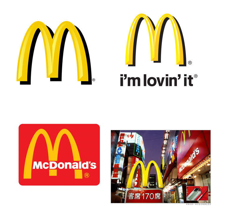
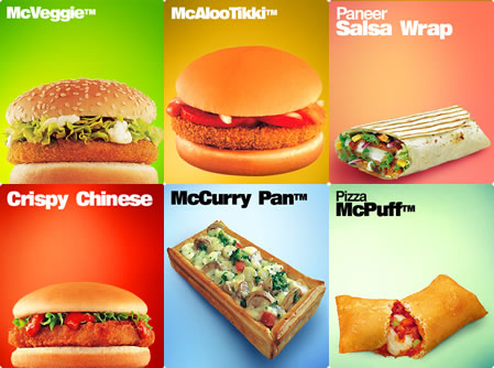
McDonald’s has opened franchises in 123 countries around the world. In these 123 franchises, they may serve different items on the menu. Take a look at India:
They may even have different Ronald McDonald figures. Take a look at Thailand:

Again, this figure would only make sense in certain parts of the world. The food may change, the figures may change, even the portion sizes may change, but one thing will remain the same: the Golden Arches. That’s the power of a brand, of a logo, of a simple two looped symbol- it may be small, it may seem insignificant, but don’t underestimate its ability to reach and touch people all across world. I guess….that is what’s in an Arch.
Contributed by Tiffany Lan
Here's to Steve

"Here’s to the crazy ones. The misfits. The rebels. The troublemakers. The round pegs in the square holes. The ones who see things differently. They’re not fond of rules. And they have no respect for the status quo. You can quote them, disagree with them, glorify or vilify them. About the only thing you can’t do is ignore them. Because they change things. They push the human race forward.
And while some may see them as the crazy ones, we see genius.
Because the people who are crazy enough to think they can change the world, are the ones who do."
- Apple "Think Different" Campaign
Photo credit: AP Photo/Paul Sakuma
Sibling rivalry: iPods vs. iPhones
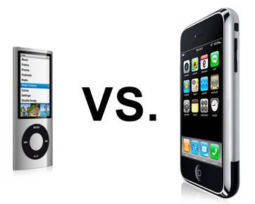
My mother is obsessed with her iPhone. While she taps away on her touchscreen all day, she asks me why I don’t trade in my "clearly less superior" iPod nano (5th generation) for Apple's newer flagship device. My typical response is that my iPod is my music device and nothing more, and that's the way I like it, thank you very much.
But then people started using Facebook from their iPhones. Then Angry Birds became popular to play on-the-go. Now, all of my friends have started playing Words with Friends (appropriately).
But me? I'm still here with my iPod. And I'm starting to think my mom has a point.
We are approaching an age of the all-or-nothing device. Phones aren't appealing to consumers unless they can offer Internet access, Skype capabilities, a slew of apps, e-mail, a GPS, video players, and music, just to name a few features. The basic iPod, which is only a music (and sometimes video) player, simply can't compete anymore, and so its brand is suffering a slow demise.
The iPhone, on the other hand, is so adept at meeting every technological need that Apple is willing to let the iPod brand be exceedingly eclipsed by the iPhone brand. Why would Apple invest time and money to revive an increasingly irrelevant iPod brand, when it can minimally advertise the lucrative iPhone and garner massive earnings?
By choosing to essentially leave its iPod brand strategy alone, Apple's sales are starting to reflect iPhone domination. Where iPod sales superseded those of iPhones by $13 million in 2010, that amount shrunk to only a $3 million difference in the first quarter of 2011. If the sales gap diminished that much in just one year, the outlook seems very favorable for iPhones.
The iPod brand's last saving grace could be its highly established brand image. Like it or not, iPhones will always have their roots from the iPod brand, both in name and in likeness – and many people will always refer collectively to the products as "iPod" devices. Even so, it will be difficult for iPods to hold their own in the coming years against their all-encompassing, digital successors.
Contributed by Allison Meeks
More than Just Java: Starbucks Follow-Up

From new sizes to a new logo, the Starbucks brand has seen many changes in the last year. Following the introduction of wine and beer to its menu options, Starbucks has also extended its food offerings.
Starbucks is introducing a line of " bistro boxes," in snack and entree sizes, priced from $4.95 to $6.95 and all under 500 calories. The initial entrees are chipotle chicken wraps, sesame noodles, chicken lettuce wraps and salumi and cheese. The new menu items reflect a ramped-up emphasis on food at Starbucks, which has generally focused on breakfast sandwiches and pastries.
From booze to bistro boxes, Starbucks has moved far beyond the classic cup of joe. The Starbucks brand started with a focus on coffee. Baristas were trained in coffee knowledge and served high quality coffee due the strict control over the quality and processing of the beans. Aroma, atmosphere, flavor and store design stimulated all five senses and contributed to an overall "Starbucks Experience."
Though food items are nothing new, previously served pastries acted as complements to the coffee. As the menu at Starbucks keeps growing, edible items are standing out on their own. I don't want to wash down my chipotle chicken with a vanilla latte. Add other innovations such as books and music to the mix and it's no surprise Starbucks dropped the word "coffee" from its name and logo.
New ideas and expanded menus don't appear to be a problem for Starbucks loyalists. With corporate restructuring plans in place and new stores opening in India and Vietnam, expansion of the Starbucks brand doesn't seem to be slowing any time soon.
Cracking the Code on Package Design

From color scheme to font, companies place great importance on compelling package design for their brands. Now, one of the most overlooked parts of a package—the barcode—is getting an artful makeover.
Consumers are influenced by the entire experience of a product. That experience begins with packaging. A package is more than just a container. It is an asset that can motivate a purchase, making the outside just as important as what’s inside.
"Little clever barcodes seem to be all the rage across a variety of products in the consumer packaging world,” said Nick Irwin, Senior Graphic Designer at Addison Whitney. “Although, I do see it as a superfluous and trendy, it’s good to see these quaint design elements because each barcode is individualistic and can really fortify a brand message if done right."
Form meets function as traditional black and white lines and numbers are taking the shape of famous buildings, blades of wheat and bubbles. According to the Wall Street Journal, the trend is popular with smaller companies, but one of the world's largest food companies, Nestle SA, is even trying out vanity barcodes on some of its brands. For example, Nestle's Juicy Juice Sparkling Fruit Juice Beverage has bubbles rising up from its barcodes, and its Skinny Cow low-calorie dessert line features barcodes shaped like a cow's spot. Consumer-goods companies hope these vanity barcodes will better connect with customers and help their product stand out in a crowded marketplace.
Tobacco Gets Graphic

If you plan to purchase cigarette packs after September 2012 you may be surprised, or even disturbed by what you see. The Food and Drug Administration is requiring graphic warning labels with images ranging from a man exhaling smoke through a tracheotomy hole in his neck to a diseased lung to be placed prominently on cigarette packs. Cigarette marketers also will be required to place 1-800-QUIT-NOW numbers on new packaging.
The vivid images are the biggest change to cigarette warning labels since the mid 1980s, when the government began requiring tobacco companies to put health warnings on cigarette packs and tobacco ads. Targeting the cigarette packages themselves shows that the FDA understands the importance of compelling package design. Consumers are influenced by the entire experience of a product. The design of the outside of a package is just as important as what’s inside. A package is more than just a container; it is an asset that can motivate a purchase. Having an effective package design in a crowded marketplace is essential to making a product stand out.
So where does a tobacco company go from here? How does one market a product with packaging designed to shock consumers and discourage them from using the product? “The cigarette companies are in an environment where their product is seen as dangerous,” Brannon Cashion, president of Addison Whitney, told USA TODAY. He points out that tobacco marketers have done a good job dealing with growing anti-smoking efforts. What they need to do is stress innovation, such as developing low nicotine and electronic cigarettes.
“In order to continue to manufacture the product, they have to continue to put innovations in place that can do everything possible to make as safe an environment as possible for those who smoke and the people most affected with their smoking.”
For more information on the new FDA cigarette health warnings, click here.
To Infinity, and Beyond... Your Average Branding
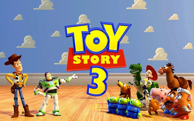
It's been almost a year since virtually every college kid wept openly at the conclusion of Toy Story 3 (myself included – I have no shame here). However, Disney doesn't plan on letting you forget Toy Story 3 anytime soon, because the loveable gang of toys is making a comeback — on the big screen.
Disney is trying a new method of brand strategy for the Toy Story franchise. Just when people — especially children — might be forgetting about Toy Story 3 a year after its release, Disney is bringing it to the public's attention again, in the hopes that Toy Story merchandise will enjoy an increase in sales.
Cars 2 hits theaters on June 24, and careful viewers might recognize something different about Pixar's animated short that debuts before the feature film. Instead of being the usual random, hilarious cartoon that has no connection to the actual film's story, movie-goers will be treated with Toy Story: Hawaiian Vacation, a short featuring several characters from Toy Story 3.
"Showing those shorts is a super-smart strategy for Disney," former president of Nickelodeon Film & Television Entertainment and founder of Worldwide Biggies Albie Hecht said in an interview with Businessweek. "It's a way to extend the characters and the brand without its fans waiting two or three years for a new movie."
The Toy Story franchise has much to be profited from. In 2010, the merchandise franchise ranked fourth-largest of all of Disney's merchandise lines, just behind Mickey Mouse, Winnie the Pooh, and the Princess doll collection. Given the comparative novelty of Toy Story alongside the decades-old frontrunners, it's an impressive feat.
Woody and Buzz Lightyear toys will no doubt sell for a long time, but for a quick jolt of energy to the merchandise sales, the brand consultants at Disney are making the right move. They've identified a problem — how can we enhance the Toy Story brand to maintain merchandise sales? — and they've implemented a solution in a unique way that won't be seen as an off-putting, generic commercial, but as Pixar fulfilling its animation duties. Without even realizing it, audiences of Cars 2 will endorse the Toy Story brand simply by choosing to see a film produced by the same animation studio.
But what Disney and Pixar will always have going for them is their own namesake brand. The Toy Story franchise is a compelling and heartwarming adventure, but would not have had the same lasting power if produced by a different company. Few can rival the powerful duo's filmmaking abilities, and that's where the true power of their branding lies.
Contributed by Allison Meeks
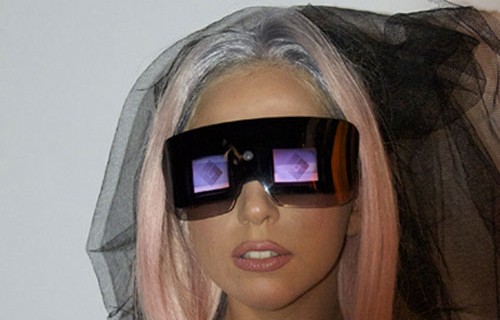
Polaroid gone Gaga!
Looks like Polaroid has been re-branded by none other than Lady Gaga. The pop-culture icon has a new vision for Polaroid—literally. Since January 2010, the Fame Monster has taken on the role as creative director for Polaroid, designing and branding their latest round of camera products. There is still Polaroid brand equity for Gaga to reclaim and reinvent as the "camera" evolves.
The new line, Polaroid Grey Label, will maintain the brand’s core values of simplicity, authenticity, and sharing, while targeting a new generation with the futuristic style of Lady Gaga. The Grey Label is coined from “greige goods” a fashion term for fabric in its purest form. The name expresses the simplicity of Polaroid and the style of Gaga.
The most intriguing product presented is the Polaroid GL20 Camera Sunglasses. The product was inspired by the idea to fuse the icon of instant photography, with the queen of fashionable eyewear. These glasses not only allow eye protection from the sun, but also have a built-in camera that takes pictures and video. The camera fits on the bridge of the nose and the display screens are just below eye level, not to interfere with one’s line of vision. Not only can you take pictures with these glasses, you can also play them back to the world as you live it.
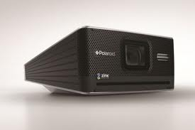
Another Grey Label item is the Polaroid GL10 Instant Digital Camera. Don’t be deceived by the boxy, old-fashioned look. This camera prints digital images right into your hands! It comes with a modern LCD screen display, and brings back instant image printing, defining the Polaroid picture of the new age.
The final product is called the GL10 Instant Mobile Printer. It’s a mini machine for printing photos instantly from your phone or camera anywhere-- at a party, in the office, in the car—and it’s small enough to put in a purse. It acts as a functional tool as well as a fashion accessory. According to Lady Gaga, "This product will revolutionize how we see photos. Your images will no longer die a death on your cell phone or digital camera."
The Instant Mobile Printer, Instant Digital Camera and the Camera Glasses are a unique “look” at how to turn images into a fashion statement. The products are coming out this summer 2011, and there’s no question they will require a large chunk of change. However the price of a Polaroid in it's heyday of the 90s did not detract from the allure of the brand. Hopefully the Grey Label will provide the same appeal.
Contributed by: Emily Hassell
Broadway, Rebranded
What's the first thing you think of when you hear the word "Broadway"? New York City, musicals, The Phantom of the Opera, theater, and Fred Astaire might come to mind. These associations most likely exist because of the way in which Broadway has traditionally been branded for years – as expensive, prestigious entertainment.
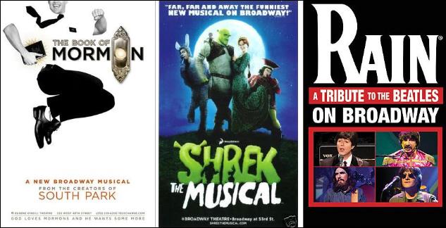
Lately, as seen at the Tony Awards last night, Broadway has been undergoing a branding transformation. Dramas and white-bread musical comedies make way for new shows that target children, minorities, and even those who enjoy raunchy religious mockery (look up The Book of Mormon, winner of Best Musical from the creators of South Park).
Even so, Broadway walks a thin line between experimental target audiences and the musical purists of days gone. Many newer consumers are often reluctant to see shows because of the limited availability and expense of tickets. That's why revivals of classics, like South Pacific and Gypsy, do well the second time around as older audiences remain steadfast in their support.
This puts Broadway at a complicated branding juncture. How can shows attract younger audiences with smaller wallets while still maintaining a reputation that's made them star attractions for years?
For one thing, the quality of shows remains relatively unchanged. Performers are still top-notch, often putting commercial pop-stars to shame (sorry, Justin Bieber). These actors, plus costume designers, technician crews, and so many others, go into the making of one high-quality product — much in the way that a designer handbag à la Gucci is created — instead of cheaply manufacturing several low-quality items at a time.
Instead, what seems to matter most in Broadway's rebranding is making shows accessible to everyone. Productions want the college undergraduate student or working suburban mom to see the latest show on tour in their hometown, not be intimidated by it. Maybe that's why newer shows are increasingly turning to audience interaction; The 25th Annual Putnam County Spelling Bee used audience members as spelling bee participants alongside cast members, and the revival of Hair invited audience members to dance onstage in a psychedelic encore of "Let the Sun Shine In." These experiences catapult audience members into the grandeur of the theater world, but in a way that is both comfortable and accepting for the participants.
Broadway is making progress on the road to rebranding; shows in the vein of Shrek the Musical and Rain: A Tribute to the Beatles are becoming more common, and overall show grosses have increased in recent years. In fact, Broadway theaters earned a cumulative $943 million between 2008 and 2009, the most ever in a single season. However, there's still a long way to go before seeing a show is as common as going to the movies.
Which leaves the question: could a rebranding of Broadway ever really make it accessible to broader audiences? And, more importantly, is that what's best for Broadway?
Contributed by Allison Meeks