AW Capabilities Month Case Study Wednesday: Sonoco
Welcome to Addison Whitney Capabilities Month! Throughout the month of March, we will be designating one week where we will be highlighting one of Addison Whitney’s capabilities – visual branding, verbal branding, market research and brand strategy - via brand salsa and our social media channels.
This week, we are focusing on Brand Strategy, which encompasses the balance of business planning with creative thinking to create clear road maps to where you want your brand to be in the future!
As one of the leading global branding firms, Addison Whitney is behind some of the world’s strongest and most iconic brands. We’re proud of the work we do for all of our clients and love sharing our stories, especially our brand strategy experience. That’s why this week's “Case Study Wednesday”, where we highlight one of our amazing clients and the work we have done with them, will focus on our brand strategy work!
Our case study this week highlights Addison Whitney's work with Sonoco: 
When Sonoco acquired Tegrant Corporation, it created a leading multi-material protective packaging business unit within one of the largest diversified global packaging companies in the world. While Sonoco had a small protective packaging presence, it was not as well known as Tegrant and its three primary business units – Protexic, ThermoSafe and Alloyd – all leading brands in their individual spaces.
Following the Tegrant acquisition, Sonoco sought to create a new brand architecture that would integrate Tegrant's three businesses into Sonoco's primarily master branded strategy in a way that would effectively communicate the brands and product offerings while minimizing any loss to brand equity and sales. In addition, it was important that the new structure help tell the Sonoco protective packaging story to existing and potential customers.
Addison Whitney conducted a number of internal interviews with leaders of both organizations as well as brand owners, and multiple workshops in order to gain a comprehensive understanding of overall business and marketing strategies as they relate to the current and potential brand architecture strategies.
Based on the research, we recommended Sonoco change the name of its protective packaging division to Sonoco Protective Solutions to better communicate the division's broad offerings. We also recommended the Alloyd and ThermoSafe brands be maintained in the short term in order to introduce the Sonoco name alongside the existing brands to key audiences; in the long-term, the brands would be transitioned to Sonoco product brand names.
Leveraging the Sonoco brand as soon as possible was important as it signaled strength, stability, and more global capabilities to the target audience. Additionally, it helps internal audiences more quickly adopt the new brand identity.
Addison Whitney is a global branding firm with a passion for building strong brands.
To learn more about Addison Whitney, visit our website at AddisonWhitney.com, or contact us here.
Want to get exposed to real projects and attain real-life knowledge and skills vital for success in brand strategy? Click here for information about interning with the Addison Whitney brand strategy team!
AW Capabilities Month Case Study Wednesday: Goodyear
Welcome to Addison Whitney Capabilities Month! Throughout the month of March, we will be designating one week where we will be highlighting one of Addison Whitney’s capabilities – visual branding, verbal branding, market research and brand strategy - via brand salsa and our social media channels.
This week, we are focusing on Verbal Branding, which encompasses the verbal aspects of your branding portfolio, such as brand name development, tagline creation, and much more!
As one of the leading global branding firms, Addison Whitney is behind some of the world’s strongest and most iconic brands. We’re proud of the work we do for all of our clients and love sharing our stories, especially our visual branding experience. That’s why this week's “Case Study Wednesday”, where we highlight one of our amazing clients and the work we have done with them, will focus on our verbal branding work!
Our case study this week highlights Addison Whitney's work with Goodyear:![]()
Addison Whitney has worked with Goodyear on a number of projects, including the brand development of three tire lines.
Fierce
We were hired to develop and validate a brand name for Goodyear’s new performance tire line that would stand alone and not be directly associated with Goodyear in the eyes of the consumer.
We created the name Fierce, suggesting competitiveness, intensity and power. Name validation was a key component in the brand development process, ensuring that Fierce would be an appropriate name in a variety of language markets.
SilentArmor
Next, we developed a brand name for Goodyear’s new premium on-/off-road tire for its Wrangler truck and Fortera SUV lines.
The objective was to create a name that spoke to the product’s ability to deliver great traction and ruggedness while providing a smooth, quiet ride. To communicate the desired positioning we developed the name SilentArmor.
Assurance
For the third project, Goodyear wanted a brand name for its new family of passenger tires for mid-priced and luxury vehicles. The new name needed to fit with Goodyear’s leadership and innovation legacy while representing the company’s very best tire offering.
We created the name Assurance to communicate safety, reliability and protection. Research found that Assurance scored high marks for conveying the functional and emotional benefits that drivers look for in tires, and consumers equated the word assurance with dependability, confidence and trust.
Addison Whitney is a global branding firm with a passion for building strong brands.
To learn more about Addison Whitney, visit our website at AddisonWhitney.com, or contact us here.
Want to get exposed to real projects and attain real-life knowledge and skills vital for success in verbal branding? Click here for information about interning with the Addison Whitney verbal branding team!
AW Capabilities Month Case Study Wednesday: Darden Restaurants
Welcome to Addison Whitney Capabilities Month! Throughout the month of March, we will be designating one week where we will be highlighting one of Addison Whitney’s capabilities – visual branding, verbal branding, market research and brand strategy - via brand salsa and our social media channels.
This week, we are focusing on Visual Branding, which encompasses the visual aspects of your branding portfolio.
As one of the leading global branding firms, Addison Whitney is behind some of the world’s strongest and most iconic brands. We’re proud of the work we do for all of our clients and love sharing our stories, especially our visual branding experience. That’s why this week's “Case Study Wednesday”, where we highlight one of our amazing clients and the work we have done with them, will focus on our visual branding work!
Our case study this week highlights Addison Whitney's work with Darden Restaurants:![]()
Addison Whitney has had the privilege of an ongoing relationship with Darden Restaurants, owner of the Olive Garden Italian Restaurant and Bahama Breeze chains.
Olive Garden
The Olive Garden project presented the challenge of updating its corporate image to be reflective of its new positioning as an authentic, rustic, family-oriented restaurant. Consumer research revealed that the current corporate identity projected an outdated feel. To overcome this challenge, we leveraged the Olive Garden name equity and created more sophisticated script lettering in a modern font.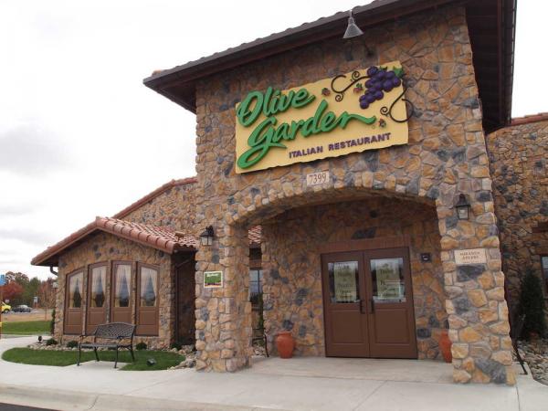
Several icons to complement the new Olive Garden look were tested; however, the warm feel and vibrant colors of the grapes were a consistent favorite. The distinctive grape icon was implemented on signage, menus, place mats, take-out items and promotional materials, and it serves as a memorable, stand-alone symbol for the restaurant chain.
We also developed and implemented a corporate standards program for Olive Garden.
Bahama Breeze
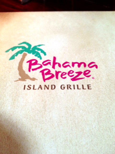 Our work with Bahama Breeze was a little different. Because the restaurant experienced extraordinary growth and success in such a short time, inconsistencies arose in its corporate identity.
We evaluated the corporate visual brand identity, including the logo, color, image, interior decor and collateral usage in order to appropriately recommend strategic options for a visual brand consolidation. We recommended a logo evolution to provide the opportunity to establish a stronger corporate identity portfolio while still maintaining the positive aspects of the logo. We also established the graphic standards content for the Bahama Breeze Brand Visualization Guide.
Addison Whitney is a global branding firm with a passion for building strong brands.
To learn more about Addison Whitney, visit our website at AddisonWhitney.com, or contact us here.
Want to get exposed to real projects and attain real-life knowledge and skills vital for success in visual branding? Click here for information about interning with the Addison Whitney visual branding team!
Case Study Wednesday: Pilgrim's
As one of the leading global branding firms, Addison Whitney is behind some of the world’s strongest and most iconic brands. We’re proud of the work we do for all of our clients and love sharing our stories.
That's why we've launched "Case Study Wednesday", where we highlight one of our amazing clients and the work we have done with them. To learn more about our work, click here.
This week, we will be featuring our work with the Pilgrim's Pride Corporation:![]()
Pilgrim's Pride Corporation is a Fortune 500 company and one of the largest chicken producers in the United States and Mexico. Even though the company has a long tradition of producing healthy, high-quality food products, there was a disconnect between the visual identity and the company's goal to redefine its retail brand to be more consumer-focused.
Before work on the visual side could begin, our brand strategy team took the lead and initiated an external assessment of the Pilgrim's Pride perceptions relative to competitors. We surveyed consumers to identify which factors were important to them when purchasing chicken and how well Pilgrim's Pride delivered on those attributes. These findings drove the brand strategy and positioning development 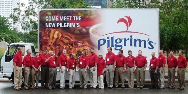 and laid the foundation for the visual components of the project.
The Pilgrim's Pride brand received a complete visual overhaul that included: a new corporate logo, a logo exclusive to packaging applications, a new corporate stationary system, and an updated brand packaging design. To ensure the visual identity direction resonated with Pilgrim's Pride's target audiences, a validation study was done for both the logo and package designs following development.
Teams Involved:
Brand Strategy
Visual Branding
Follow us on Twitter @AddisonWhitney or join the conversation on Facebook and Google+
Case Study Wednesday: Procter & Gamble
Case Study Wednesday:
Procter & Gamble
As one of the leading global branding firms, Addison Whitney is behind some of the world’s strongest and most iconic brands. We’re proud of the work we do for all of our clients and love sharing our stories.
That's why we've launched "Case Study Wednesday", where we highlight one of our amazing clients and the work we have done with them. To learn more about our work, click here.
This week, we are featuring our work with Procter & Gamble:
Addison Whitney has been a naming and strategy resource for Procter & Gamble (P&G) for more than 15 years, and we've built a strong relationship with multiple divisions within the organization.![]()
We have worked on for a number of P&G's most iconic brands, and here's a snapshot of a few of the brands we've created.
Deep Sweep
Oral-B, owned by P&G, developed a product that brought new technology to the power brushing category. The primary objective of its new technology was to significantly broaden the appeal of power brushing among current manual brush  users. Oral-B sought a naming strategy for this new technology that was intuitive and ownable.
Using information discussed in a creative strategy workshop, we developed the name Deep Sweep. The new name captured what deep cleaning users would get from the new product and spoke not only to the benefit, but also to the method of the action as well.
UnderJams
For older children, bedwetting can be an emotional and uncomfortable situation, which is why P&G developed a new line of absorbent disposable underwear for children aged 5 to 12 years. The new product looks 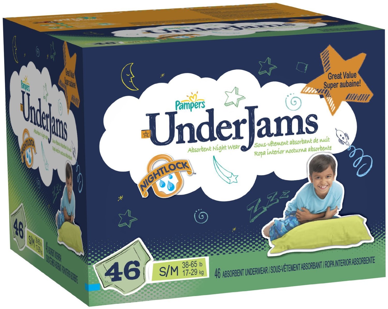 and fits like ordinary underwear, but provides the protection a child might need at home or during a sleepover. It was very important that the new product's name communicate discretion so that children would feel included and normal.
The name UnderJams was developed to convey both function and inclusion. "Under" suggests discretion and is descriptive of the underwear-like fit. "Jams" sounds exciting and captures the personality of the target audience.
Teams Involved:
Follow us on Twitter @AddisonWhitney or join the conversation on Facebook and Google+
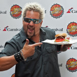
Case Study Wednesday: Carnival Cruise Lines
Case Study Wednesday:
Carnival Cruise Lines
Addison Whitney’s ongoing relationship with Carnival Cruise Lines is a testament to our client-first mentality. We’ve supported the cruise line with projects ranging from bar and restaurant identities to social and recreational brands. These branded experiences can be found on several Carnival ships.
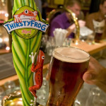
RedFrog Pub and ThirstyFrog Red Lager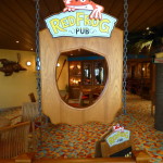
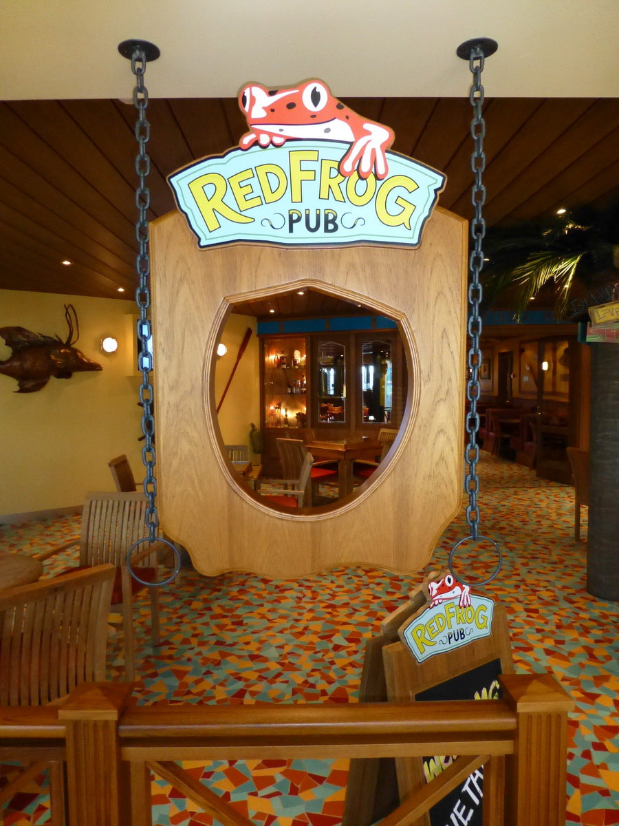
Our verbal team named a Carnival restaurant RedFrog Pub to evoke a fun, island feel. Our visual team then created logos for both RedFrog Pub and ThirstyFrog Red Lager, the restaurant’s private label beer. To ensure a consistent look and feel throughout the venue, we also designed the restaurant’s menus.
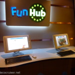 FunHub
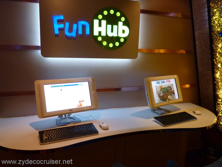
Not only did we create the exciting name FunHub for Carnival’s exclusive state-of-the-art shipboard intranet portal, we also designed its colorful logo. Both were incorporated into the website, netbook rentals and various other collateral materials.
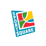
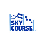
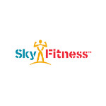
SportSquare
Our verbal team also created the name SportSquare for the energetic, physical and social area of the ship. Our designers created a bright, vivid logo to bring the name to life and reflect the positive atmosphere of the area. Carnival subsequently asked us to brand the elements within the recreational area, resulting in the name and logo for Sky Course and the logo for Sky Fitness.
Teams Involved:
Visual Branding Verbal Branding
Follow us on Twitter @AddisonWhitney or join the conversation on Facebook and Google+