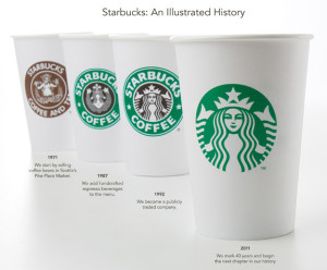
Starbucks Did What?!
Caffeine addicts across the world are in uproar over Starbucks' announcement this week that its logo would be changing to celebrate its 40th anniversary in March and the company’s larger focus.
On Starbucks’ site you can read comments from people upset over the change and even suggesting alternative designs. Interestingly, Starbucks partners (also known as employees) are posting positive comments and are expressing excitement for the change. Commenter Simplycatlin, a partner, says “You guys love the experience not the name and not the green lady...” Bingo.
A brand is so much more than a logo. (Repeat this phrase five times.) It’s about the emotional experience people have with your brand; the unique place your brand holds in people’s hearts and minds.
Maybe all the uproar is not really about the logo, it’s about the fear that people’s favorite brand may be changing and moving away from coffee and its delicious pumpkin cream cheese muffins. Maybe Starbucks brand fans are worried that this “third place” they’ve come to love escaping to could change. Of course, maybe they really just don’t like the new logo.
What do you think – is it the logo or is it more than that causing the controversy?
Please note: This blog entry was not biased in any way by my long-time respect for their brand and my adoration for Howard Schultz, who I affectionately refer to as Howard, like I’ve known him for years.
Brand Refreshment: Belk vs. Gap

………………………………………………………………………………………………………………………………………………….
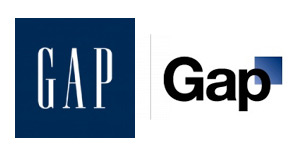
Much of October's design buzz was focused on the new Gap logo. With the change came die-hard Gap customers commenting on blogs, Facebook sites, and within the design community.
Marka Hansen, president of Gap North America, initially defended the logo, writing that the move brings Gap into the modern age. "We want our customers to take notice of Gap and see what it stands for today," she said. "We chose this design as it's more contemporary and current. It honors our heritage through the blue box while still taking it forward."
Hmm. The iconic blue box of Gap was actually diminished, rather than honored in the new design. Adding a gradient and moving it into a submission position does nothing in my mind to 'honor its heritage.' After only a week, Gap decided to revert back to the original logo.
Belk Department Store debuted its new image right around the same time, but was somewhat overshadowed in the media. Both Belk and Gap stated that they wanted to move their respective brands into a more updated space, and redesigned the logos to coincide with the modern feel of the apparel and the stores. So why was Belk's change more widely accepted (individual design critiques aside), and Gap's new image was met with such passionate disapproval?
A couple of ideas:
1. Regional awareness. Belk is a regional brand, with a smaller target audience than the global presence of Gap. While Belk isn't just "your Grandmother's store" anymore, the company hasn't been as active over the years in building and defining their brand image, so their change could be met with less resistance.
2. Belk is a collection of individual brands. Gap IS a brand.
3. Lack of connection to the audience. Belk had a plan for change and is systematically making the change market by market, and Gap introduced the logo to the entire world without so much as a hint that something new was coming. For such a devout target audience and such a large presence, you have to be prepared for the response - positive or negative. No market research to find out what customers think prior to launch?
4. Redefining the brand ... consistently. The Gap logo is/was classic. "Classic" is actually what their brand was all about. If they wanted to modernize or talk about their new modern jeans, they could update their collateral, or use social media in a new way to talk to their audience. Create a contest to have customers help design the new logo. The same can be argued about Belk: the iconic script was regarded as a logo with "class and character" that many argued should have been retained. However, Belk complemented their change with a tagline: "Modern. Southern. Style." which helps to reinforce the overall change.
What are your thoughts on refreshing a brand? Total re-definition through a new name or logo? Change the tagline? Update your social media efforts? Any other positive examples?
The Big "O"

......................................................................................................................................................................
Picture this. It's been 69 days since the accident. TV viewers are waiting patiently to see the first rescued miner’s face. He reaches the surface. The rescue capsule is opened. Audiences worldwide look to see his expression and can’t escape the “O.”
If you’ve missed the story on the Chile Miners rescue, check out the details here. This story and the facts about the rescue are remarkable, but what’s really fascinating from a brander’s perspective is the opportunity that Oakley took to illustrated product placement at its finest.
After being underground for such an unimaginably long period of time, the miners needed protection from ultraviolet light when they reached the surface. Conveniently, a Chilean journalist recommended Oakley to the Chilean private health insurer, and the rest is history.
Oakley donated 35 pairs of sunglasses (listed for $180 each on Oakley’s website) to the Chile miners. As a result of their strategic generosity, CNBC reported that the company has received $41 million in equivalent advertising time through the news media coverage of the rescue... Talk about a return on investment.
Oakley has hit gold for their brand image. It’s a win-win. To consumers, the brand comes off as charitable for donating and dependable for being a brand that Chile officials trusted to fully protect the miners. For Oakley, the amount of exposure and revenue from this perfectly positioned helping hand effort will be immeasurable.
Contributed by: Ashley Hollingsworth
Farewell Grandma's Belk

......................................................................................................................................................................
Growing up in the South, Belk department stores have been a shopping staple. When I was young, I remember going to Belk with my grandmother and thinking it was so fancy. Just look at its logo. It’s cursive. That’s the ultimate in fancy to a seven-year-old. But I’m not seven anymore and while I love a good Belk sale, it seems too old for me.
But the traditional image of Belk is no more as it rebrands and gets ready to unveil its new, modern logo and tagline: "Modern. Southern. Style."
This new strategy is a big departure from the image of Belk many people my age have in my mind. And, it’s a great move. Major department stores like Macy’s have regularly updated its image through major advertising campaigns with high profile celebrities.
According to the Charlotte Observer, shoppers in key markets for Belk can expect to see changes as early as Nov. 1. The new look and feel will do a lot to refresh the image of this Charlotte-based chain. And if you’re reading this Belk, this is so exciting I think a month-long Customer Appreciation mega sale is in order, especially here in Charlotte.
Confessions of a Name-Induced Shopper
 ......................................................................................................................................................................
Be honest - have you ever bought a product solely because of its name or packaging?
*whispers* I have.
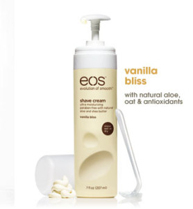
The bottle’s appearance sucked me in, the matte hot pink and matte yellow bottles at the end of a sea of glossy blue and purple cans. I moved in closer, seeing the name EOS emblazoned across the top. Instant adoration! I love the name because Eos is the ancient Greek goddess of the dawn, often signifying a new beginning. Double bonus verbal branding: they’ve made it an acronym apropos to their product line, the “Evolution of Smooth.” So, even if you didn’t know that Eos was the goddess of the dawn, they are telling you this is a new beginning, an innovation in shaving, a new era of smooth legs!
Thankfully, I have ended up loving the product, too. Vanilla Bliss, indeed.
Will I now buy their lotion, lip balm (smooth stick or smooth sphere) and other flavors of shave cream?
*shouts* Yes!
Maybe it’s not the smartest way to shop, but EOS sold me in five seconds flat. I wasn’t even looking to buy shaving cream that fateful day in Target.
I wasn’t even in the aisle.
The 6th Food Group: Crayons
cray·on / [krey-on, -uhn]
–noun
1. a pointed stick or pencil of colored clay, chalk, wax, etc., used for drawing or coloring.
2. a drawing in crayons.
–verb (used with object)
3. to draw or color with a crayon or crayons.
–verb (used without object)
4. to make a drawing with crayons.
When I hear the word crayon, my mind immediately goes to the iconic art supply and the brand I grew up with ... the Crayola crayon and its magnificent box of 64 with a built-in sharpener. I remember holding them with little hands, learning how to use the different shades together, and even melting them for cool grade-school art projects.
So this new beverage line has me puzzled. You want me to 'drink crayons?' I've been taught all my life to keep the markers, paintbrushes and crayons out of mouth, and now there is an imperative to do so?
As a mom, I can appreciate the premise behind the beverage: a drink with no high fructose corn syrup, less sugar and more juice than leading drinks for kids. As a verbal branding associate, I see a great opportunity for a fun, new name that can appeal to kids in its tonality, and to moms in its approach to nutrition.
Using an arbitrary word for a brand can work, if it's executed well. Apple built its brand off ease and the approachability of something as simple as a piece of fruit. Is Crayons trying a similar approach? Capitalizing on our childhood nostalgia and hoping that translates into a mental shift? That now, it's ok to 'drink our crayons?'
As for kids, will this product be confusing in real-life scenarios? "Mom, can I have Crayons with dinner tonight?" Or, "Kate, you can drink these Crayons, but don't eat those in your art supplies." For some reason, I can't reconcile the idea of now consuming or drinking something that has been a part of my life for so long, and used in a very different way. What do you think? Are you ready to 'drink your crayons?'
The Rebranding of the Y
......................................................................................................................................................................
Any given day, you’re sure to find an Addison Whitney employee at the Y running on a tredmill or perfecting Zumba moves. As a member of the YMCA of Greater Charlotte, I received an email last week from the President & CEO and Metropolitan Board Chair that blew my mind – in a good way.
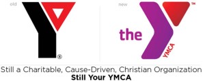
By the time I’d received the email, I’d heard the news of the YMCA’s rebranding to the Y. I had seen the new logo and color palette. And I had read quite a few articles and blog entries cheering and jeering the change.
But this email was different because it was from my Y. The email, entitled “Still Your YMCA,” communicated the changes members can expect including a new brand strategy defining its cause of strengthening the foundations of community and a refreshed logo. But it also told members what would not change: the mission, core values and services members enjoy.
A key to successfully introducing a rebranding effort to your target audience is communication. As a member of the brand strategy team, we tell our clients going through rebranding efforts to do just what the Y did so well. Tell your target audience why you did it, how you did it and what they can expect. Change can be scary, so calm any fears by clearly stating what will not change.
The email from the YMCA of Greater Charlotte says it best: “As you can see, the Y isn't changing any of the great programs and services that we've always provided; we're just trying to do a better job of explaining why they matter.”
And you’re off to a great start.
A Plethora of Product Placement
......................................................................................................................................................................
Did you know that Rock Hudson's character in the 1964 movie Man's Favorite Sport worked at Abercrombie & Fitch? Did you even know that A&F has been around since 1964?! Well, I didn't and was surprised to research that it was founded in 1892. But I digress.
I'm talking about product placement. Or "brand integration". Or blatant advertisments for products that show up during my favorite tv show that in no way seems to be just happenstance. I wonder if A&F's sales were boosted because of Rock's employment? Does any product placement actually boost the brand's sales or is it just a way for the entertainment industry to pay expenses? I cannot speak for all, but I did have a hankering for the peanut buttery, chocolatey goodness that is Reese's Pieces after watching E.T. Another oldie is Back to the Future 2. Pepsi, Nike & the DeLorean all had call outs throughout the entire movie. What about Castaway? I mean, Wilson was a main character without really being a character! I hear there is a game that Bond enthusiasts play while viewing any James Bond movie where they try to count as many product placement ads as possible; Aston Martin, Rolex, Omega & Coke Zero to name a few.
Music lyrics and videos aren't immune either. Lady Gaga receives calls from Beyonce on her Virgin Mobile LG Rumor2 in the "Telephone" video. Run DMC didn't just wear all things Adidas, they weren't about to trade their Adidas "for no beat up Bally's" in their song "My Adidas". And I will never be able to stretch during the 7th inning and not wonder if Jack Norworth got paid to give a shout out to Cracker Jacks when he penned "Take Me Out to the Ballgame" in 1908.
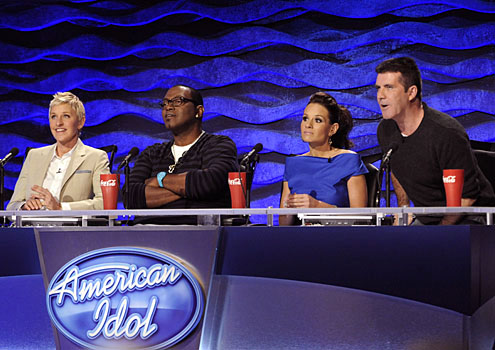
And still more in prime time television! Who hasn't watched "American Idol" and seen the judges with their ginormous red cups emblazened with the Coke logo? Jack Bauer of "24" fame drives a Ford Expedition. Who could forget KITT, the sleek Pontiac Trans Am partner to Michael Knight? Even the "good ol' boy" Duke cousins of Hazzard County, GA drove a custom 1969 Dodge Charger.
Alas, there are lots of examples of artists, movies or t.v. shows that feature product placement but receive no compensation. There was a recent episode of "Modern Family" that was based solely around the search for an Apple iPad. Producers and Apple alike state that no money exchanged hands for the use of the Apple brand. And I'm almost positive Janis Joplin didn't get a car when she co-wrote and sang "Mercedes Benz". Correct me if I'm wrong.
Are featured brands getting more business by product placement or are they just sponsors for your favorite movies, t.v. shows, musical artists and video games? Is it brand integration or celebrity endorsement? Would you ever NOT purchase a brand because of its product placement in the entertainment industry? Does it help the overall brand marketing? What other examples have you seen and heard?
Excuse me. I have a call coming in on my Sprint HTC EVO.
Contributed by: Jennifer Rodden
Strawberry Who?
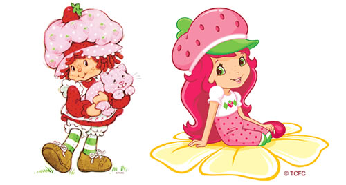
My mom is a total pack rat. This is the woman who finally threw out maternity clothes upon the arrival of her first grandchild, my daughter. I was 30 at the time. And until very recently, I was embarrassed by this little quirk of hers. I made fun of her until my three year old daughter found out that her Mommy's cherished Strawberry Shortcake dolls had been carefully preserved in their little strawberry shaped carrying case for the last 20 odd years. The trick was to locate them among all the other assorted toys, books, dolls and clothing stored in the attic. And frankly, we've had a heat wave and I just didn't feel like stirring around in a hot attic.Read more
How Much Is YOUR Facebook Page Worth?
A question Social Media Management Company, Vitrue, raised by creating a Social Page Evaluator, a tool designed to “provide an assessment of a brand's Facebook Page value and the effectiveness of its social media efforts.” According to Vitrue, Starbuck’s has an annual page value of $20.7 million. The basic calculation starts by assigning a value (a conservative default of $5) to each “like”, but also takes into account the number of posts and the number of interactions. A smaller fan base can earn more than a larger one if the brand uses Facebook to its full potential. Skittles pot of gold, for example, has 1 million fewer connections than beverage giant Coke but is valued higher because of a greater frequency of posts. Can a Brand go too far? Absolutely. With 147 posts in the last month, ESPN has maxed out their page value at $4.8 million. To maximize page value, Vitrue suggests brands post up to twice per day, post photos and videos, and use Facebook tools like the "share" button.
So who do you “like”? What brands have you “shared” recently? Are you doing your part to contribute to the how much your favorite brand is worth?
Contributed by: Allison Jobes

