Google's New Alphabet
Today's post comes from guest blogger John Lineberger, Brand Strategy Associate at Addison Whitney
Seventeen years ago the world was introduced to an internet search engine with a funny name.
Between then and now that search engine would become one of the largest companies in the world, spawning a number of household software names, a movie, and that funny name would change from a noun to a verb. Nowadays, what started as the most intuitive internet search engine to date has begun to execute on ideas previously seen only in The Jetsons and Star Trek—from self-driving cars and internet drones, to cancer-detecting bracelets and lifespan advancement technology.
This week, Google (which is, of course, the aforementioned company) announced that it will make another step forward. Google will still be Google, albeit a slimmed down version; but its former subsidiaries will become its brothers and sisters, and there for the first time, Google will be under the umbrella of another brand. The overarching parent role previously held by the Google brand is being transitioned to a newly created brand called Alphabet, a reference to all of the companies within it being “the letters” in the greater structure.
Former functions of the Google name such as Fiber, Google Ventures, and Calico will now be mentioned alongside the former master brand, rather than under it. Management teams and new CEOs will have direct control over these companies that used to be under the direct influence of Google. This change is coming for one big reason: the founders of Google, now CEO and President of Alphabet, understand the value of brand architecture.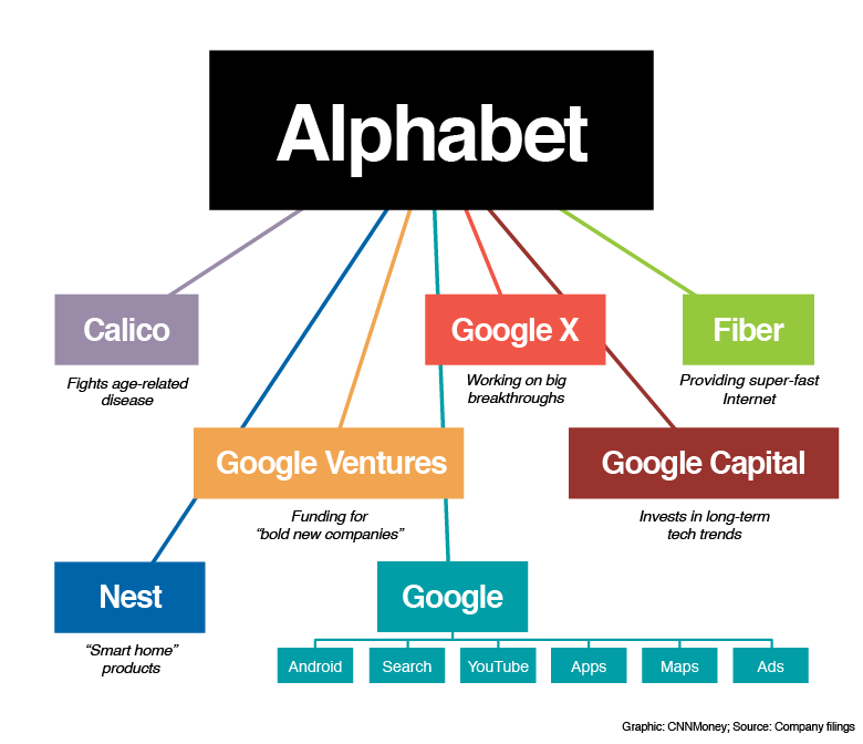
Restructuring the portfolio may seem risky. We all know these subsidiaries of Google as exactly that—subsidiaries of Google. With such prominent brand awareness, what if cutting ties hurts the credibility of these products? What if some faith is lost in the efficacy of these companies as new executive teams are put in place and each has more autonomy? This is a move never seen before within the major market powers.
However, the benefits far outweigh the risks. Some still solely associate Google with its first innovation, the search engine. Over the years it has grown and evolved into so much more. The brand equity of every company in the Alphabet umbrella is strong. By making them independent under a holding company, their individual brands can only breathe and grow. The diversity of the companies sprouting under the Google name was such that it didn’t make sense to keep an automated drone company or a digital contact lens company tied up in the Google name. By allowing these companies room for separation, they are now able to grow into unique, effective brands independent of Google and its connotations.
In a more concrete sense, the move allows investors to see all of the different companies in a more disparate lens. Google will still be the largest and most profitable company in the Alphabet portfolio, but investors can now look and understand where revenue is coming from and recognize the fact that some of the newer companies will not be profitable for a few years. The move also allows for easier new company acquisition and spin-off.
Staying conscious of the architecture of one’s company can be crucial to its success. As with all aspects of branding, it can be an overlooked process in the course of a company’s development; and can be even more overlooked than such devices as naming, positioning and messaging due to its tendency to be a little less sexy. Initially, much of the coverage was centered on the name, and less so around the strategic decision. However, we see here how brand architecture can be a beneficial and proactive step.
And for those a little bit uncomfortable with seeing such a change from an old standby to this new Alphabet, just remember: G is for Google.
Image Source: https://money.cnn.com/2015/08/10/technology/alphabet-google/
Addison Whitney is a global branding firm with a passion for building strong brands.
To learn more about Addison Whitney, visit our website at AddisonWhitney.com, or contact us here.
Find Your Trench Coat: Branding Success and Focusing on What You Do Best
When Burberry appointed Angela Ahrendts, an American from the Midwest, as their CEO in 2006 many scoffed at the choice. With production facilities in different countries, no two shops with the same mix of merchandise, and trench coats that varied in price not just from country to country but from store to store, Burberry was in the midst of a brand crisis.
The diversified merchandise, much of it small, random goods such as hats, key chains, and even kilts made the brand not only less cohesive but much more accessible to a broad audience. Angela pointed out the brand’s main issue in an interview with Harvard Business Review when she said, “a luxury brand turned ubiquitous is anything but luxurious.” But while she had successfully identified the problem, many were worried that she wasn’t the right person to solve it.
They were wrong.
Ahrendts’ strategy was very simple: focus on trench coats. This may seem obvious, but it is a concept many brands fail to grasp.
A great brand usually begins with one thing it does very well. Louis Vuitton’s specialty is luggage. Christian Louboutin’s is shoes. Burberry’s had been the trench coat. However, often when a company achieves success, it begins to feel as if it can do anything and forgets what had made it so successful in the first place.
 Ahrendts wanted to reverse this trend and return to Burberry’s roots. When a brand’s strategy is to focus on what they do best, it creates an instant framework for each subsequent decision made about the brand. In addition to this, basing a rebrand or a marketing campaign on an attribute of the brand that has already been proven successful, desirable, or iconic leaves less room for potential disaster. Finally, a singular focus, especially one that harkens back to the roots of a company, clarifies the brand for consumers, and a clear, intelligible brand is always more desirable to the customer.
Burberry was able to return to their original brand position of premium outerwear supplier by making sure each strategic move of the company, whether it be in supply chain management, design, advertising, or social media was primarily focused on the trench coat. Burberry launched a social media movement promoting their new website, www.ArtOfTheTrench.com, which not only featured the many new styles of trench coat they had available but a look at the elite history that surrounded this most prestigious of coats.
As a result, they were the first luxury brand to reach ten million likes on Facebook. Burberry then chose Emma Watson as the face of its new advertising campaign. Emma Watson, authentically English yet still relevant internationally, wore a trench coat in every ad.
Since this massive overhaul, Burberry was named by Interbrand as the fastest growing brand and no longer will you see every person (and their dog) walking down the street in a random assortment of brown checkered products. Burberry is once more a luxury, and it should be a lesson to the many once-luxury brands that seem to be slipping down the path to overdiversifiction and ubiquity.
Every company needs to find their own trench coat and stick to it.
Image Source:
https://my.asiatatler.com/fashion-beauty/fashion/100-years-of-burberry-trench-coats-world-war-i-casablanca-art-of-the-trench
Addison Whitney is a global branding firm with a passion for building strong brands.
To learn more about Addison Whitney, visit our website at AddisonWhitney.com, or contact us here.
Behind the Brand: How Morveau Watches Built its Brand
All brands, big or small, all have a starting point.
When Luke Francis decided to build a company based on an innovative watch idea, he knew brand needed to be a strong asset in order to compete. He was entering a category flooded with mega-brands like Rolex, Fossil, Timex and thousands of others at the luxury, mid-market and economy levels, so he had his work cut out for him.
Luke’s idea was to create a watch from reclaimed aircraft-grade aluminum. The business strategy was focused on entering into a more premium watch category where, because of higher gross margin and market opportunity, he needed to elevate consumer perception of his product. Brand was key to making this leap: taking a product made with a durable, basic material, creating a minimalist design and infusing the brand with a cool, luxurious lifestyle. The consumer lifestyle had to be at the center of the brand and drive brand communication, design and media choices.
This strategy stemmed from a goal to find a higher class consumer who didn’t want to break the bank or didn’t fall into the mindset that a watch is merely another piece of jewelry. He wanted to connect to the man who has good taste and appreciates good functionality.
With this direction, the Morveau (pronounced “more-vo”) brand was established. The Morveau name, aside from sounding sophisticated and established, harkens back to the innovative material used in the watch design. Named after Louis-Bernard Guyton de Morveau, the chemist credited with producing the first systematic method of chemical nomenclature, which included the naming of Aluminum, the brand name establishes a clever connection with the product material, a key differentiator.
The brand connects to a male target audience obsessed with his lifestyle. The watch’s design adds to his overall style aesthetic, is flexible for casual and corporate settings, and fits into multiple facets of his daily life. The watch’s quality and design come together seamlessly with the brand personality to authentically communicate with its target audience. The connection of these aspects ties back to how well Morveau understands the audience and their wants and needs. Whatever their personal style may be, whether they are going to a boardroom or a beach, the Morveau’s brand message speaks to and inspires this lifestyle.
The connection of these aspects ties back how well Morveau understands its target audience and how it built a brand around their wants and needs. Whatever their personal style may be, and whether they are going from the boardroom to the beach, Morveau’s brand message speaks to and inspires that lifestyle.
In order to stand out, Morveau has unique signatures that make the product and brand distinct. The simple, sleek design, a strong cobalt blue accent color on the watch hands and fabric stitching, excellent lifestyle photography and an engaging and inspiring tone of voice create the feeling of a strong, established brand from day one.
In the same way that the material of this watch has a backstory, Morveau inspires its wearers to live a history worth retelling.
Where to find Morveau:
Website: https://www.morveau.com/
Facebook: https://www.facebook.com/morveauwatches
Indigogo: https://www.indiegogo.com/projects/first-ever-aircraft-grade-aluminum-watch#/story
Addison Whitney is a global branding firm with a passion for building strong brands.
To learn more about Addison Whitney, visit our website at AddisonWhitney.com, or contact us here.
Brands with Long Histories Opt for Short Names
In recent years large and well-established brands that have long been able to rely on their long-standing history as the primary source of their brand equity have realized that, in a changing world, their past reputation may not be enough to propel them forward. In some cases, it is their impressive past which is the very thing holding them back. Companies which date back to the 1800s and early 1900s run the risk of seeming outdated and/or stuffy, especially among millennials.
Several large brands in industries as varied as banking, real estate, and even phone books, have made it their goal to change this perception through branding.
Ernst & Young, a financial institution which specializes in accounting, began in 1903. The name Ernst & Young probably brings to mind the phrase “Big Four Accounting Firms.” Thus, Ernst & Young’s 2013 rebrand accomplished the two-fold goal of both revitalizing an entrenched brand, while also redefining what their company can offer the customer beyond accounting services.
Ernst & Young rebranded themselves as EY, incorporated a new logo, website, and slogan -“Building a Better Working World,”- into their comprehensive rebranding strategy. Their previous logo and motto, “Quality in Everything We Do,” had been vague, reflecting the average consumer’s vague understanding of what exactly an accounting firm does. Now, with a yellow icon signifying upward progress and a motto that is a concise definition of their function, EY has positioned their brand better for the new generation.
Sometimes, the changes don’t have to involve an entire rebrand, but can include tweaks to the current branding elements that help bring the brand and company up to speed in the current market environment.
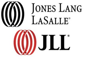 Jones Lang LaSalle is a great example of this “tweaking” strategy. Begun in 1773, this commercial real estate firm was struggling to adapt their brand to the increasingly international real estate market of today. However, in 2014 they rebranded as JLL. This rebrand was accompanied by the same icon as their original logo but with a change towards a new, brighter red. JLL announced that this new name was intended to increase pronunciation and recognition ease in international markets.
Both EY and JLL used visual and verbal branding changes to re-position their brand for the new generation, but, in some instances, companies may find it necessary to extend their rebrand even beyond those two categories and make larger brand strategy changes that physically change the way the company acts, not just how it looks or sounds.
Yellow Pages, a company which was born in 1886, and had used the “walking fingers” logo since 1962, was perhaps even more in need of a brand resuscitation than either EY or JLL; not only was The Yellow Pages brand perceived as antiquated but their entire business concept was quickly becoming obsolete.
Thus, rebranding Yellow Pages to YP involved not just creating a new name, but ensuring that the functioning of the company reflected the modern, convenient connotations of that 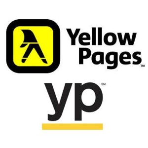 name. Yellow Pages thus focused on the creation of a new app with GPS features that allow easy access to Nearby Coupons, Popular Business Listing, and more. YP is no longer an unwieldy book of largely unhelpful information but, in fact, the complete opposite; YP is, as their slogan says, “the shortest path from to-do…to done.”
The demands of convenience, simplicity, and innovation are not new, but with each new generation, it is important for brands to reevaluate what those words mean to the consumer, because the definitions are ever-changing.
Addison Whitney is a global branding firm with a passion for building strong brands.
To learn more about Addison Whitney, visit our website at AddisonWhitney.com, or contact us here.
Diet Coke: A Case for Individualized Branding
Recently The Coca-Cola Company has revealed their plans to market all of their Coca-Cola related brands - Coca-Cola, Coca-Cola Life, Coca-Cola Zero, and Diet Coke - as a cohesive team of products, rather than individually.
Market research has shown that there is some confusion about what differentiates these four products, and the Coca-Cola Company hopes that marketing them as variations of one larger product, Coca-Cola, will help not only to clear up this confusion, but also to strengthen the overall brand to the great benefit of each individual product.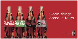
As seen to the right, an associated magazine ad emblazoned with the slogan “Good things come in fours,” shows a clear example of what the company’s new strategy will entail. I think bringing brands closer to a larger corporate brand, especially one as powerful and recognizable as Coca-Cola, is great strategy for three of these four brands.
However, Diet Coke, a soda which doesn’t even share the Coca-Cola name like the other three drinks in this branding strategy, has developed such a strong brand identity unique from its corporate company that this homogenization will, in my opinion, fundamentally change Diet Coke.
So what it is that makes Diet Coke so different from other Coca-Cola brands? A Diet Coke, like the Starbucks Cup, has become the handheld beverage accessory of the fashionable, endorsed by celebrities like Ariana Grande and Lady Gaga.
Most recently Diet Coke has launched an extensive and emblematic ad campaign featuring the fashionable and famous Taylor Swift. The red words spelled out on a Diet Coke can coordinate perfectly with Taylor’s well-known red lips. Even beyond this, Taylor aligns perfectly with the brand image of Diet Coke because she has recently become a fashion icon, not just in elite circles of Hollywood, but to the average young woman, a group which Diet Coke has always prioritized  in their marketing. Recently, Taylor’s fashion choices have become very bold, without sacrificing the stylish class she has always been known for. Thus, Diet Coke, a classic but still immensely popular and always innovating, is Taylor’s beverage equivalent.
Diet Coke’s brand isn’t just approved and endorsed by fashionable celebrities. It has even earned the backing of fashion designers themselves. Over the past decade Diet Coke has rolled out a tremendous number of limited edition designer bottles and cans. Comm De Garcons, Diane Von Furstenberg, and Marc Jacobs are just a few of the many designers who have jumped at the chance to have their designs featured on a Diet Coke bottle.
Diet Coke even hosts an annual “Red” fashion show to support women’s heart health and also to remind the world of their preeminence as a stylish soda. Diet Coke, when it was created thirty three years ago, was made with an entirely different recipe than Coca-Cola.
Unlike Coca-Cola Zero, Diet Coke isn’t just Coca-Cola without the calories; it is its own uniquely flavored drink, and just as Diet Coke’s physical ingredients are different from Coca-Cola, so too are the ingredients that make up their branding and marketing strategy.
The day after Labor Day, Diet Coke tweeted “you shouldn’t wear white after Labor Day, but no one said anything about silver and red.” Rather than just wishing its followers a happy Labor Day, the Diet Coke brand took the opportunity of using the day after this holiday to remind the Twitter world of their brand’s role as a versatile fashion accessory.
In my opinion, this really sums up the image of Diet Coke. Not only is it deliciously addicting, but it carries connotations of style that no other soda can match, connotations which risk being lost if Diet Coke becomes only another option in the homogenous Coca-Cola lineup.
Image sources:
https://www.marketingweek.com/2015/03/06/5-things-you-need-to-know-this-week-5/
https://blog.acmebrooklyn.com/post/62999727300/acme-taylor-swift-and-a-diet-coke
Addison Whitney is a global branding firm with a passion for building strong brands.
To learn more about Addison Whitney, visit our website at AddisonWhitney.com, or contact us here.
AW Capabilities Month Brand Strategy Week in Review
Welcome to Addison Whitney Capabilities Month!
Throughout the month of March, we will be designating one week where we will be highlighting one of Addison Whitney’s capabilities – visual branding, verbal branding, market research and brand strategy – via brand salsa and our social media channels.Make sure to join the conversation on social media using the hashtag #AWCapabilitiesMonth.
This week, we focused on Brand Strategy, which encompasses the strategic and planning aspects of your branding portfolio. In this special edition of the AW Rewind, we will take a look back at the brand strategy-focused brand salsa posts from this week!
What is Brand Strategy?
 At Addison Whitney, we feel brand strategy is important because success is a strong marriage of business and brand strategies.
Successful brands are built on a foundation of meaningful brand strategy. And, that strategy provides the framework for what your brands mean and how they should be organized.
Oftentimes, making decisions about the future of a brand can be politically charged and challenging for an internal team to confront on its own. It’s difficult for a company to be objective about themselves – tenure and passion have a tendency to cloud constructive decision-making. That’s where we come in. Read more...
AW Capabilities Month Case Study Wednesday: Sonoco
As one of the leading global branding firms, Addison Whitney is behind some of the world’s strongest and most iconic brands. We’re proud of the work we do for all of our clients and love sharing our stories, especially our brand strategy experience. That’s why this week’s “Case Study Wednesday”, where we highlight one of our amazing clients and the work we have done with them, will focus on our brand strategy work!
Following its Tegrant acquisition, Sonoco sought to create a new brand architecture that would integrate Tegrant’s three businesses into Sonoco’s primarily master branded strategy in a way that would effectively communicate the brands and product offerings while minimizing any loss to brand equity and sales. In addition, it was important that the new structure help tell the Sonoco protective packaging story to existing and potential customers. Read More...
The Two Pillars of Efficient Brand Strategy
Managing a brand efficiently has both time and monetary implications. Both are valuable, but often limited resources that are essential to developing and maintaining successful brands.
This is especially important for organizations working to establish meaning and purpose for multiple brands in their portfolio. However, this is not always the case, and when brands don’t have a well-defined meaning or purpose, organizations run the risk of missing an opportunity to capitalize on the value of their resources. But there also must be an efficient use of time and resources from the parent company in order to ensure success across their portfolio.
There are two main pillars that address these components, and that strongly impact the ability to commit time and financial support to brand strategies – Prioritization and Organization. Read More...
Don’t forget, you can stay up-to-date with everything from Addison Whitney by joining the conversation with us on our social media channels – Twitter, Facebook, LinkedIn and Google+.
Want to get exposed to real projects and attain real-life knowledge and skills vital for success in brand strategy? Click here for information about interning with the Addison Whitney brand strategy team!
The Two Pillars of Efficient Brand Strategy
Welcome to Addison Whitney Capabilities Month! Throughout the month of March, we will be designating one week where we will be highlighting one of Addison Whitney’s capabilities – visual branding, verbal branding, market research and brand strategy - via brand salsa and our social media channels.
This week, we are focusing on Brand Strategy, which encompasses the strategic and planning aspects of your branding portfolio. Make sure to join the conversation on social media using the hashtag #AWCapabilitiesMonth.
Managing a brand efficiently has both time and monetary implications. Both are valuable, but often limited resources that are essential to developing and maintaining successful brands.
This is especially important for organizations working to establish meaning and purpose for multiple brands in their portfolio. However, this is not always the case, and when brands don’t have a well-defined meaning or purpose,  organizations run the risk of missing an opportunity to capitalize on the value of their resources. But there also must be an efficient use of time and resources from the parent company in order to ensure success across their portfolio.
There are two main pillars that address these components, and that strongly impact the ability to commit time and financial support to brand strategies - Prioritization and Organization.
Prioritization:
The key word associated with prioritizing a brand portfolio is “opportunity.” Prioritizing can be made up of a number of actions, including identifying and evaluating the opportunity, then looking at whether a brand is poised to capitalize on the opportunity.
The importance of prioritizing and working through these actions can contribute to taking advantage of these opportunities and providing target audiences with what they need.
Prioritization takes an integrated approach, a holistic strategy, and dedicated investment to build a brand. If you choose to spread resources equally across all the brands in the portfolio, often times your company won’t hit critical mass for any of your brands.
Organization:
Organization of brands can also be seen as a “definition” of the portfolio. In order to successfully organize, there needs to be a definition of around the brand strategy, such as defining who the brand’s audience is and defining the brand’s positioning.
Taking a look at the brand portfolio as a whole, and define where it stands and what the strongest brand position is that maximizes their impact. If there are multiple strong brands, the main goal will be to organize where they fit within the portfolio.
The order in which these pillars can be acted upon depends on the organization, its business vision and long-term goals. One of the valuable characteristics of the pillars is their ability to be tailored and to fit within the organization’s needs.
For instance, if a brand has a portfolio with unknown brand strength, where there isn’t a clear-cut “hero” brand, it may be most efficient for them to begin with Prioritization. Performing a brand assessment will help find the opportunities within the portfolio and identify which brand is the strongest. Then, the company can prioritize the rest of its portfolio and use this information to assess where to be allocate resources for the brands going down the list.
On the other hand, if an organization has gone through a recent merger or acquisition and finds itself with brand overlap, where multiple brands fit within similar industries or lines of business, Organization might be a strategic first step. Organizing the portfolio will allow for more efficient recognition ofthe brand that will represent the company moving forward, and will also make more clear the identification of next steps for the other members of the portfolio.
The outcome for all of these actions, as it is with the majority of strong brand strategy, is to find the best use of time and resources for the sake of strong business results. When managing a number of brands, having a well-defined and focused strategic awareness and acting within the strategy allow for the organization to achieve the goal of an efficient brand portfolio.
Addison Whitney is a global branding firm with a passion for building strong brands.
To learn more about Addison Whitney, visit our website at AddisonWhitney.com, or contact us here.
Want to get exposed to real projects and attain real-life knowledge and skills vital for success in brand strategy? Click here for information about interning with the Addison Whitney brand strategy team!
AW Capabilities Month Case Study Wednesday: Sonoco
Welcome to Addison Whitney Capabilities Month! Throughout the month of March, we will be designating one week where we will be highlighting one of Addison Whitney’s capabilities – visual branding, verbal branding, market research and brand strategy - via brand salsa and our social media channels.
This week, we are focusing on Brand Strategy, which encompasses the balance of business planning with creative thinking to create clear road maps to where you want your brand to be in the future!
As one of the leading global branding firms, Addison Whitney is behind some of the world’s strongest and most iconic brands. We’re proud of the work we do for all of our clients and love sharing our stories, especially our brand strategy experience. That’s why this week's “Case Study Wednesday”, where we highlight one of our amazing clients and the work we have done with them, will focus on our brand strategy work!
Our case study this week highlights Addison Whitney's work with Sonoco: 
When Sonoco acquired Tegrant Corporation, it created a leading multi-material protective packaging business unit within one of the largest diversified global packaging companies in the world. While Sonoco had a small protective packaging presence, it was not as well known as Tegrant and its three primary business units – Protexic, ThermoSafe and Alloyd – all leading brands in their individual spaces.
Following the Tegrant acquisition, Sonoco sought to create a new brand architecture that would integrate Tegrant's three businesses into Sonoco's primarily master branded strategy in a way that would effectively communicate the brands and product offerings while minimizing any loss to brand equity and sales. In addition, it was important that the new structure help tell the Sonoco protective packaging story to existing and potential customers.
Addison Whitney conducted a number of internal interviews with leaders of both organizations as well as brand owners, and multiple workshops in order to gain a comprehensive understanding of overall business and marketing strategies as they relate to the current and potential brand architecture strategies.
Based on the research, we recommended Sonoco change the name of its protective packaging division to Sonoco Protective Solutions to better communicate the division's broad offerings. We also recommended the Alloyd and ThermoSafe brands be maintained in the short term in order to introduce the Sonoco name alongside the existing brands to key audiences; in the long-term, the brands would be transitioned to Sonoco product brand names.
Leveraging the Sonoco brand as soon as possible was important as it signaled strength, stability, and more global capabilities to the target audience. Additionally, it helps internal audiences more quickly adopt the new brand identity.
Addison Whitney is a global branding firm with a passion for building strong brands.
To learn more about Addison Whitney, visit our website at AddisonWhitney.com, or contact us here.
Want to get exposed to real projects and attain real-life knowledge and skills vital for success in brand strategy? Click here for information about interning with the Addison Whitney brand strategy team!
AW Capabilities Month: What is Brand Strategy?
Welcome to Addison Whitney Capabilities Month! Throughout the month of March, we will be designating one week where we will be highlighting one of Addison Whitney’s capabilities – visual branding, verbal branding, market research and brand strategy - via brand salsa and our social media channels.
This week, we are focusing on Brand Strategy, which encompasses the strategic and planning aspects of your branding portfolio.
But what is Brand Strategy? What does it mean to you? Make sure to join the conversation on social media using the hashtag #AWCapabilitiesMonth.
At Addison Whitney, we feel brand strategy is important because success is a strong marriage of business and brand strategies.
Successful brands are built on a foundation of meaningful brand strategy. And, that strategy provides the framework for what your brands mean and how they should be organized.
Oftentimes, making decisions about the future of a brand can be politically charged and challenging for an internal team to confront on its own. It’s difficult for a company to be objective about themselves – tenure and passion have a tendency to cloud constructive decision-making.
That’s where we come in. In our collaborative strategy process, we balance business planning with creative thinking to create a clear roadmap for where you want your brand to be in the future. But it doesn’t end there – we also design effective brand strategy tools to help you stay on the path to success.
Here’s what our brand strategy team can do for you:
- Brand Assessment
- Brand Positioning
- Brand Messaging
- Brand Architecture
- Portfolio Nomenclature
- Rebranding
Click here for a sampling of our brand strategy case study stories, and here for our comprehensive brand strategy client list.
Addison Whitney is a global branding firm with a passion for building strong brands.
To learn more about Addison Whitney, visit our website at AddisonWhitney.com, or contact us here.
Want to get exposed to real projects and attain real-life knowledge and skills vital for success in brand strategy? Click here for information about interning with the Addison Whitney brand strategy team!
Lowe’s Enters Connected Home Market with New Brand
Looking to make a considerable mark in the smart/connected home market, Lowe’s has begun leveraging Iris, its new brand that offers a range of connected home products, as outlined in a new article from Warc, an advertising best practices, evidence and insights website.
The article, “Lowe’s Builds Smart Home Brand,” looks into how this new brand leverages Lowe’s experience in retail experience and product development in establishing a brand establishing a brand that is designed to go toe-to-toe with some of the top brands in the technology space in the race to the top of the smart home portfolio.
The Iris smart home management brand products allow consumers to connect all of their smart home devices across a platform of suppliers. From starter kits that provide a shortcut to starting the connected home process to accessories that supplement what the consumer already may have in their home, it is a brand that not only connects the home, but connects the products involved.
Prior to Iris, consumers looking to connect their home ran the risk of products not “talking” to one another if they came from different brands. But with Iris (and in turn, Lowe’s branding), products across platforms can be united in the home.
“Lowe’s moving into the connected home can position itself as the tech-savvy homeowner’s or contractor’s store of choice,” says Beth Anne McPheeters, Director of Brand Strategy at Addison Whitney. “It’s brilliant, considering that connected homes were a major feature of this year’s CES and are a top trend for home modifications that provide the best return on investment for homeowners now and in the future.”
The brand, Iris, is not only a way for Lowe’s to diversity its product offering, it is a way to tap into a growing general consumer market, expanding past that of home owners and professionals. Lowe’s is bringing its brand into a new space as an unexpected player. Lowe’s strategy behind Iris also extends to its impact on the overall brand attitude and perception, says McPheeters.
“Iris presents Lowe’s with an interesting way to evolve its brand,” she says. “When looking at Lowe’s and Home Depot, Lowe’s offers homeowners, particularly female shoppers, an easy-to-navigate experience with an emphasis on stylistic décor, not just home improvement/building products. This move can push Lowe’s into a gender-neutral technology leadership position, providing it with an opportunity to own Smart Home Improvement, even if only for the short term.”
Sources and Links:
https://www.warc.com/News/Default.aspx?ID=34244
https://www.lowes.com/cd_Products_1337707661000_
https://www.lowes.com/cd_Iris+Solutions+Center_1377803835565_
Addison Whitney is a global branding firm with a passion for building strong brands. We specialize in verbal and visual branding, brand strategy and market research.
To learn more about Addison Whitney, visit our website at AddisonWhitney.com, or contact us here.


