Introducing Insperity
......................................................................................................................................................................
For those of you who have been following our recent tweases (Twitter teases) noted by our hashtag #AW3095, you already know the news. For everyone else, it’s our pleasure to introduce Insperity, formerly Administaff.
Addison Whitney has been working with the Insperity team since February 2009 and is so proud of its team’s hard work throughout the process, and especially at the launch some members of our team were lucky enough to attend.
We are excited to begin our Insperity series to highlight the key steps from throughout our more than two year relationship with the Insperity team. Throughout each post we will give you some insight into things we learned or just fun facts from each phase.
Here are some headlines to get you excited and coming back for a double dip of Brand Salsa.
- Market Research – gathering key insights from current and future customers
- Brand Strategy – who are we and what to do with all of these offerings and brands
- Verbal Branding – farewell Administaff, hello Insperity
- Visual Branding – Insperity’s new look and feel
- Brand Rollout – dancing in the streets of Houston
- What Makes a Great Project Team – we’ll tell you because we worked with a fantastic one at Insperity
Stay tuned!
Starbucks Did What?!
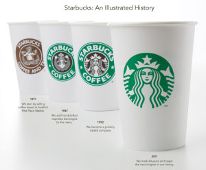
Caffeine addicts across the world are in uproar over Starbucks' announcement this week that its logo would be changing to celebrate its 40th anniversary in March and the company’s larger focus.
On Starbucks’ site you can read comments from people upset over the change and even suggesting alternative designs. Interestingly, Starbucks partners (also known as employees) are posting positive comments and are expressing excitement for the change. Commenter Simplycatlin, a partner, says “You guys love the experience not the name and not the green lady...” Bingo.
A brand is so much more than a logo. (Repeat this phrase five times.) It’s about the emotional experience people have with your brand; the unique place your brand holds in people’s hearts and minds.
Maybe all the uproar is not really about the logo, it’s about the fear that people’s favorite brand may be changing and moving away from coffee and its delicious pumpkin cream cheese muffins. Maybe Starbucks brand fans are worried that this “third place” they’ve come to love escaping to could change. Of course, maybe they really just don’t like the new logo.
What do you think – is it the logo or is it more than that causing the controversy?
Please note: This blog entry was not biased in any way by my long-time respect for their brand and my adoration for Howard Schultz, who I affectionately refer to as Howard, like I’ve known him for years.
Brand Equity to the Highest Bidder
These days, everything old seems new again: Disney has resurrected Tron from 1982, and Hello Kitty is just hitting her stride at 35 years old. It may seem like a great time to dig up and polish off a few forgotten brands.
On December 8, Brands USA Holdings will auction approximately 150 “priceless” and forgotten brand names for those who might want to cash in on the latest nostalgia trend. Names like Handi-Wrap, General Instrument, Lucky Whip and Meister Brau will be up for grabs to the highest bidder.
With awareness as the first building block of brand equity, it might seem like brand resurrection would provide an immediate head start in the market. As tempting as it may seem to claim the identity of an abandoned trademark, investors should beware that the residual value of the brand is also its risk.
Abandoned, orphaned or zombie trademarks live in a legal gray zone, as explained in the article The Zombie Trademark: A Windfall and A Pitfall, in the law journal of the International Trademark Association. But consumers of Brand 2.0 would most certainly be confused and disappointed if they are allowed to think that the original product is back on shelves. As with any relationship, I would recommend honesty. Telling consumers that you are recycling another company’s brand is a much better strategy than trying to backpedal from consumers who feel duped.
Brand Refreshment: Belk vs. Gap

………………………………………………………………………………………………………………………………………………….
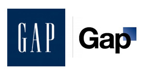
Much of October's design buzz was focused on the new Gap logo. With the change came die-hard Gap customers commenting on blogs, Facebook sites, and within the design community.
Marka Hansen, president of Gap North America, initially defended the logo, writing that the move brings Gap into the modern age. "We want our customers to take notice of Gap and see what it stands for today," she said. "We chose this design as it's more contemporary and current. It honors our heritage through the blue box while still taking it forward."
Hmm. The iconic blue box of Gap was actually diminished, rather than honored in the new design. Adding a gradient and moving it into a submission position does nothing in my mind to 'honor its heritage.' After only a week, Gap decided to revert back to the original logo.
Belk Department Store debuted its new image right around the same time, but was somewhat overshadowed in the media. Both Belk and Gap stated that they wanted to move their respective brands into a more updated space, and redesigned the logos to coincide with the modern feel of the apparel and the stores. So why was Belk's change more widely accepted (individual design critiques aside), and Gap's new image was met with such passionate disapproval?
A couple of ideas:
1. Regional awareness. Belk is a regional brand, with a smaller target audience than the global presence of Gap. While Belk isn't just "your Grandmother's store" anymore, the company hasn't been as active over the years in building and defining their brand image, so their change could be met with less resistance.
2. Belk is a collection of individual brands. Gap IS a brand.
3. Lack of connection to the audience. Belk had a plan for change and is systematically making the change market by market, and Gap introduced the logo to the entire world without so much as a hint that something new was coming. For such a devout target audience and such a large presence, you have to be prepared for the response - positive or negative. No market research to find out what customers think prior to launch?
4. Redefining the brand ... consistently. The Gap logo is/was classic. "Classic" is actually what their brand was all about. If they wanted to modernize or talk about their new modern jeans, they could update their collateral, or use social media in a new way to talk to their audience. Create a contest to have customers help design the new logo. The same can be argued about Belk: the iconic script was regarded as a logo with "class and character" that many argued should have been retained. However, Belk complemented their change with a tagline: "Modern. Southern. Style." which helps to reinforce the overall change.
What are your thoughts on refreshing a brand? Total re-definition through a new name or logo? Change the tagline? Update your social media efforts? Any other positive examples?
The Rebranding of the Y
......................................................................................................................................................................
Any given day, you’re sure to find an Addison Whitney employee at the Y running on a tredmill or perfecting Zumba moves. As a member of the YMCA of Greater Charlotte, I received an email last week from the President & CEO and Metropolitan Board Chair that blew my mind – in a good way.
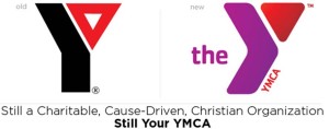
By the time I’d received the email, I’d heard the news of the YMCA’s rebranding to the Y. I had seen the new logo and color palette. And I had read quite a few articles and blog entries cheering and jeering the change.
But this email was different because it was from my Y. The email, entitled “Still Your YMCA,” communicated the changes members can expect including a new brand strategy defining its cause of strengthening the foundations of community and a refreshed logo. But it also told members what would not change: the mission, core values and services members enjoy.
A key to successfully introducing a rebranding effort to your target audience is communication. As a member of the brand strategy team, we tell our clients going through rebranding efforts to do just what the Y did so well. Tell your target audience why you did it, how you did it and what they can expect. Change can be scary, so calm any fears by clearly stating what will not change.
The email from the YMCA of Greater Charlotte says it best: “As you can see, the Y isn't changing any of the great programs and services that we've always provided; we're just trying to do a better job of explaining why they matter.”
And you’re off to a great start.
A Plethora of Product Placement
......................................................................................................................................................................
Did you know that Rock Hudson's character in the 1964 movie Man's Favorite Sport worked at Abercrombie & Fitch? Did you even know that A&F has been around since 1964?! Well, I didn't and was surprised to research that it was founded in 1892. But I digress.
I'm talking about product placement. Or "brand integration". Or blatant advertisments for products that show up during my favorite tv show that in no way seems to be just happenstance. I wonder if A&F's sales were boosted because of Rock's employment? Does any product placement actually boost the brand's sales or is it just a way for the entertainment industry to pay expenses? I cannot speak for all, but I did have a hankering for the peanut buttery, chocolatey goodness that is Reese's Pieces after watching E.T. Another oldie is Back to the Future 2. Pepsi, Nike & the DeLorean all had call outs throughout the entire movie. What about Castaway? I mean, Wilson was a main character without really being a character! I hear there is a game that Bond enthusiasts play while viewing any James Bond movie where they try to count as many product placement ads as possible; Aston Martin, Rolex, Omega & Coke Zero to name a few.
Music lyrics and videos aren't immune either. Lady Gaga receives calls from Beyonce on her Virgin Mobile LG Rumor2 in the "Telephone" video. Run DMC didn't just wear all things Adidas, they weren't about to trade their Adidas "for no beat up Bally's" in their song "My Adidas". And I will never be able to stretch during the 7th inning and not wonder if Jack Norworth got paid to give a shout out to Cracker Jacks when he penned "Take Me Out to the Ballgame" in 1908.
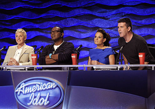
And still more in prime time television! Who hasn't watched "American Idol" and seen the judges with their ginormous red cups emblazened with the Coke logo? Jack Bauer of "24" fame drives a Ford Expedition. Who could forget KITT, the sleek Pontiac Trans Am partner to Michael Knight? Even the "good ol' boy" Duke cousins of Hazzard County, GA drove a custom 1969 Dodge Charger.
Alas, there are lots of examples of artists, movies or t.v. shows that feature product placement but receive no compensation. There was a recent episode of "Modern Family" that was based solely around the search for an Apple iPad. Producers and Apple alike state that no money exchanged hands for the use of the Apple brand. And I'm almost positive Janis Joplin didn't get a car when she co-wrote and sang "Mercedes Benz". Correct me if I'm wrong.
Are featured brands getting more business by product placement or are they just sponsors for your favorite movies, t.v. shows, musical artists and video games? Is it brand integration or celebrity endorsement? Would you ever NOT purchase a brand because of its product placement in the entertainment industry? Does it help the overall brand marketing? What other examples have you seen and heard?
Excuse me. I have a call coming in on my Sprint HTC EVO.
Contributed by: Jennifer Rodden
An app by any other name is the same
According to The American Marketing Association (AMA), a brand is defined as a "name, term, sign, symbol or design, or a combination of them intended to identify the goods and services of one seller or group of sellers and to differentiate them from those of other sellers." Key word here = differentiation.
My job entails creating new identities for companies ... products, services, new corporations. In doing so I strive to create a moniker that stands out from the competition; a name that effectively positions the offering in a way that offers distinction and memorability.
So why is it that iPhone apps don't appear to operate under the same guidelines? I was searching for a calorie counter app the other day - type in anything related to calories, exercise or fitness and you are inundated with apps that promise to trim your waistline and increase your cardio stamina. Problem is, aside from the price and the star-based feedback, how do you tell them apart? At first glance alone, how do you differentiate?
Here are the results of my app search for 'calorie': Read more
Brand Survival
......................................................................................................................................................................
We’ve all heard about the hundreds of Toyota cars that have been recalled due to sticking accelerators and the pedal entrapment issues (or the "big boo boo"). While Toyota has to gone to great measures to fix these issues, an even bigger question remains. Will the Toyota brand survive this tremendous hit and how have they responded to this crisis? This is a touchy topic, for many reasons. How do you put trust back into a brand that’s caused so many tragedies by way of a seemingly easily fixable flaw? Read more
A Refreshing New Offering from Intuit
......................................................................................................................................................................
Like any good American, I was doing my taxes recently. I’m a TurboTax gal. I’ve used it for the past 6 years and it’s pretty easy. As I got closer to the end, fingers and toes crossed hoping for a refund (it didn’t work), I came to a screen with an ad for Mint.com. Well this is new, I thought. Those smart folks at Intuit – you know, the makers of TurboTax, Quicken, and QuickBooks – have a new product.
The name, Mint, might make you think refreshment like the plant or may make you think of making money. I like both so I checked it out. The site aggregates all of your bills, accounts and debts into one site so you can budget and easily keep an eye on your accounts. I like budgets (she says with a smirk).
But the reason I really like it? It is endorsed by Intuit. Intuit has established itself as a financial software resource and immediately I trusted my information would be secure and accurate on Mint.com as well. It turns out Intuit acquired Mint.com late last year. Before the acquisition, I wouldn’t have given the site a second look. Tying Mint.com to Intuit gives it immediate credibility and positive associations.
I tried Mint.com out and it was very easy to use. The problem is that I’m a little paranoid when it comes to giving my information out online despite Intuit’s stellar reputation for security. So, for the moment, the only mint in my life is in my green tea.
"Nattyisms"
......................................................................................................................................................................
Coining new words and phrases as a branding strategy seems to be rising in popularity among today’s advertising campaigns. Natural Light, who primarily focuses on a target audience of drinkers aged 21 – 35, has created an entire advertising campaign focused on coined words and humor to give their brand a fresh new edge. During recent times, beer drinkers have been shifting towards cheaper beers. In accordance with this shift, Natural Light Beer, a division of Anheuser-Busch, has revealed its first television advertising campaign in Read more


