Diet Coke: A Case for Individualized Branding
Recently The Coca-Cola Company has revealed their plans to market all of their Coca-Cola related brands - Coca-Cola, Coca-Cola Life, Coca-Cola Zero, and Diet Coke - as a cohesive team of products, rather than individually.
Market research has shown that there is some confusion about what differentiates these four products, and the Coca-Cola Company hopes that marketing them as variations of one larger product, Coca-Cola, will help not only to clear up this confusion, but also to strengthen the overall brand to the great benefit of each individual product.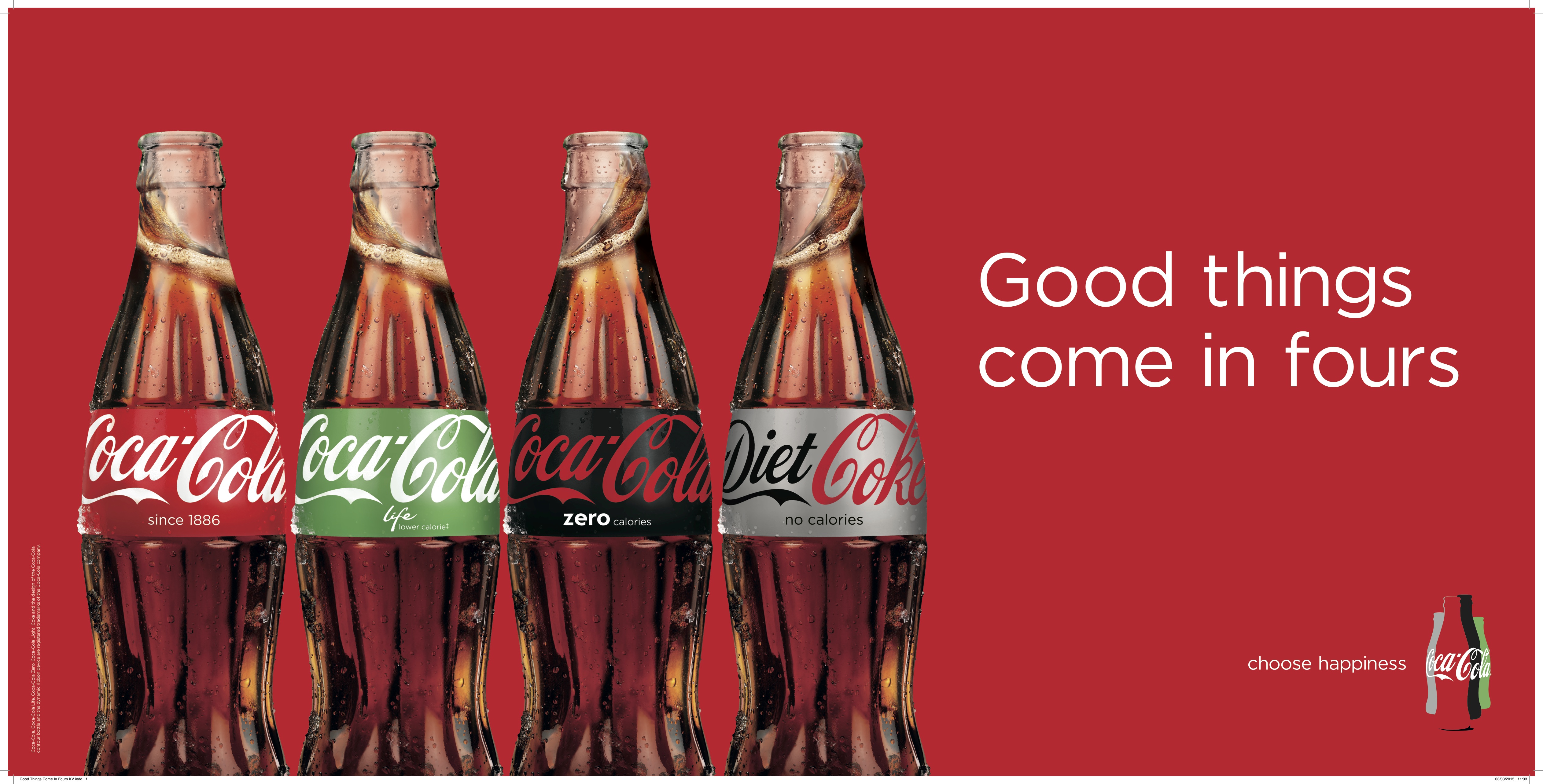
As seen to the right, an associated magazine ad emblazoned with the slogan “Good things come in fours,” shows a clear example of what the company’s new strategy will entail. I think bringing brands closer to a larger corporate brand, especially one as powerful and recognizable as Coca-Cola, is great strategy for three of these four brands.
However, Diet Coke, a soda which doesn’t even share the Coca-Cola name like the other three drinks in this branding strategy, has developed such a strong brand identity unique from its corporate company that this homogenization will, in my opinion, fundamentally change Diet Coke.
So what it is that makes Diet Coke so different from other Coca-Cola brands? A Diet Coke, like the Starbucks Cup, has become the handheld beverage accessory of the fashionable, endorsed by celebrities like Ariana Grande and Lady Gaga.
Most recently Diet Coke has launched an extensive and emblematic ad campaign featuring the fashionable and famous Taylor Swift. The red words spelled out on a Diet Coke can coordinate perfectly with Taylor’s well-known red lips. Even beyond this, Taylor aligns perfectly with the brand image of Diet Coke because she has recently become a fashion icon, not just in elite circles of Hollywood, but to the average young woman, a group which Diet Coke has always prioritized 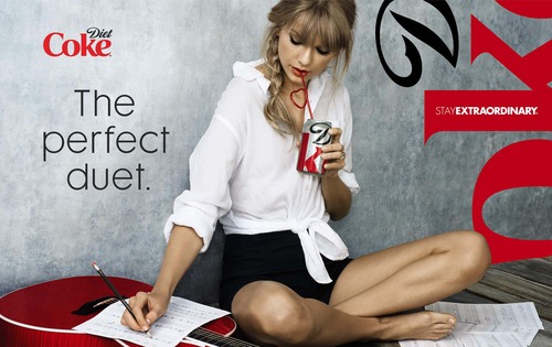 in their marketing. Recently, Taylor’s fashion choices have become very bold, without sacrificing the stylish class she has always been known for. Thus, Diet Coke, a classic but still immensely popular and always innovating, is Taylor’s beverage equivalent.
Diet Coke’s brand isn’t just approved and endorsed by fashionable celebrities. It has even earned the backing of fashion designers themselves. Over the past decade Diet Coke has rolled out a tremendous number of limited edition designer bottles and cans. Comm De Garcons, Diane Von Furstenberg, and Marc Jacobs are just a few of the many designers who have jumped at the chance to have their designs featured on a Diet Coke bottle.
Diet Coke even hosts an annual “Red” fashion show to support women’s heart health and also to remind the world of their preeminence as a stylish soda. Diet Coke, when it was created thirty three years ago, was made with an entirely different recipe than Coca-Cola.
Unlike Coca-Cola Zero, Diet Coke isn’t just Coca-Cola without the calories; it is its own uniquely flavored drink, and just as Diet Coke’s physical ingredients are different from Coca-Cola, so too are the ingredients that make up their branding and marketing strategy.
The day after Labor Day, Diet Coke tweeted “you shouldn’t wear white after Labor Day, but no one said anything about silver and red.” Rather than just wishing its followers a happy Labor Day, the Diet Coke brand took the opportunity of using the day after this holiday to remind the Twitter world of their brand’s role as a versatile fashion accessory.
In my opinion, this really sums up the image of Diet Coke. Not only is it deliciously addicting, but it carries connotations of style that no other soda can match, connotations which risk being lost if Diet Coke becomes only another option in the homogenous Coca-Cola lineup.
Image sources:
https://www.marketingweek.com/2015/03/06/5-things-you-need-to-know-this-week-5/
https://blog.acmebrooklyn.com/post/62999727300/acme-taylor-swift-and-a-diet-coke
Addison Whitney is a global branding firm with a passion for building strong brands.
To learn more about Addison Whitney, visit our website at AddisonWhitney.com, or contact us here.
New Look, Classic Taste: Coca-Cola Follow Up

Keeping a brand fresh while still maintaining its integrity can be challenging. While an updated look could modernize your brand or help it stand out in a crowded marketplace, it is important not to lose sight of who you are and what your brand stands for. Imagine just how challenging refreshing your brand would be it were 125 years old. As Coca-Cola celebrates this milestone anniversary, Coca-Cola and Diet Coke cans are getting a fresh new look.
Rolling out in September, revamped Diet Coke cans feature a magnified segment of the Diet Coke logo where the “D” of Diet rests on top of the “k” of Coke. This mod design does not reveal the brand’s complete name. I guess when you’re the world’s best-selling diet soda you don’t have to worry about partial name recognition.

Not to be outshone by its calorie-free counterpart, design firms around the world have been creating special anniversary packaging for Coca-Cola’s flagship beverage. Check out ADWEEK’s collection of designs from Britain, Hong Kong and Serbia.
Coca-Cola found a nice balance with this campaign. One quintessential beverage got a sleek, edgy design and the company still embraces and celebrates its history in a fun and visually-appealing way.
What other brands have you seen celebrate milestones with special packaging?
More than Just Java: Starbucks Follow-Up

From new sizes to a new logo, the Starbucks brand has seen many changes in the last year. Following the introduction of wine and beer to its menu options, Starbucks has also extended its food offerings.
Starbucks is introducing a line of " bistro boxes," in snack and entree sizes, priced from $4.95 to $6.95 and all under 500 calories. The initial entrees are chipotle chicken wraps, sesame noodles, chicken lettuce wraps and salumi and cheese. The new menu items reflect a ramped-up emphasis on food at Starbucks, which has generally focused on breakfast sandwiches and pastries.
From booze to bistro boxes, Starbucks has moved far beyond the classic cup of joe. The Starbucks brand started with a focus on coffee. Baristas were trained in coffee knowledge and served high quality coffee due the strict control over the quality and processing of the beans. Aroma, atmosphere, flavor and store design stimulated all five senses and contributed to an overall "Starbucks Experience."
Though food items are nothing new, previously served pastries acted as complements to the coffee. As the menu at Starbucks keeps growing, edible items are standing out on their own. I don't want to wash down my chipotle chicken with a vanilla latte. Add other innovations such as books and music to the mix and it's no surprise Starbucks dropped the word "coffee" from its name and logo.
New ideas and expanded menus don't appear to be a problem for Starbucks loyalists. With corporate restructuring plans in place and new stores opening in India and Vietnam, expansion of the Starbucks brand doesn't seem to be slowing any time soon.
Amelie's Bakery, Ah Oui!
There is little to assume from an ordinary brick warehouse in NoDa, but upon entering Amelie’s French bakery & cafe, one is immediately transported into an artfully eclectic atmosphere with Parisian flair. Not only does the bakery keep its doors open 24/7, but the owners also pay careful attention to supporting the city’s resources. The Amelie brand is tied specifically to Charlotte, a refreshing distinction from the mainstream coffeeshops. They brew locally roasted Dilworth coffee, and employ pastry chefs from Johnson & Wales University, the culinary school in downtown Charlotte. It doesn’t hurt that one of the owners is a native of France, adding an authentic French vibe to the brand.
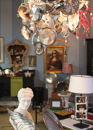
The cafe offers an atmosphere like no other in the area. The “shabby-chic” interior with handmade chandeliers, maps of old Paris, French music, and bejeweled statues inspire a world of imagination. The quaint ambience draws a diverse crowd for friendly conversation, study, relaxation, and refreshment. It's a place where you could spend hours and not realize it. Amelie's sets itself apart by creating a unique brand experience that satisfies the senses of sound (music), sight (decor), and taste (cuisine). As a result, the hustle & bustle is a testament to the cafe's popularity and brand loyalty among locals.
The food and drink constitutes an array of handmade pastries, sandwiches, soups, drinks and espresso made in the European tradition. In February they offered “éclair your love,” an opportunity to personalize an éclair for that special someone. In a nutshell, Amelie’s is kind of like Starbuck’s foreign exchange student. It's a brand that embodies French culture, and emits an unassuming amount of charm.
In my opinion, this is one of the best places to hit the Queen City- great food and atmosphere with a successful brand presence. I vote Amelie’s as my favorite spot in Charlotte. Don’t miss out on this gem of a bakery! Located on the corner of 28th St. in NoDa, or a mini-version on Tryon St in uptown. https://www.ameliesfrenchbakery.com/
Amelie’s French Bakery & Café
2424 N. Davidson St.
Charlotte, NC 28205
Contributed by: Emily Hassell
A Refreshing Taste

Coca-Cola is the most valuable brand in the world, and this month the company is celebrating its 125th birthday. Throughout its history Coca-Cola has extended its brand portfolio many times to include brands such as Coke Zero, Powerade, and Vitamin Water, but it was their original brand extension that has become nearly as strong and recognizable as the original brand itself. Yes, Diet Coke.
In 2011 Diet Coke surpassed Pepsi as the #2 soda in the U.S., and it was right behind, you guessed it, the original Coca-Cola. Having Diet Coke holding the #2 spot is more than a victory for the original Coca-Cola brand, but for the Diet Coke brand as well. It goes to show what most people have known for some time, that Diet Coke is no longer merely a brand extension of Coca-Cola, as it was when it launched in 1982, but a powerful brand on its own.
It was through a strong brand strategy from the start that propelled the brand to be the #3 soft drink in the U.S. by 1984, a spot it held until this year's move up in the ranks. For the majority of the brand's history it has been targeted to woman, originally by spotlighting fashionable woman and good looking men; and more recently by targeting the independent and working woman.
So, just for the fun of it, take a look at some of Diet Coke's most memorable commercials, starting with its very first that aired in 1983:


McMakeover

McDonald's has introduced subtle changes over the past few years such as healthier menu options and new coffee drinks. Now, the fast food chain is undergoing a $1billion dollar makeover. According to USA TODAY, McDonald's hopes to have the majority of America's 14,000 locations revamped by 2015.
Expect to sit at wooden tables or on faux leather chairs. Bright red and yellow interiors are being traded for muted yellow, orange and green palettes. Though designs vary by location, recent makeovers of select stores have included: Flat-screen TVs, adding second drive-through windows and lounge areas for diners looking to stay a while.
Another new feature seen in some locations: the golden semi-swoosh. McDonald's calls it the yellow "brow" — or half of a golden arch. Maintaining the familiar yellow design, the brow might be a sleeker, more modern approach to the famous arches.
It is unclear how consumers will react to the renovation. The new look and feel will certainly be familiar to Panera or Starbucks customers, but many Americans grew up with the classic look and could feel alienated by the drastic changes. For now, all eyes are on McDonald's. America's largest chain restaurant is redefining itself which could mean big changes in the future for other fast, casual dining competitors.
Starbucks Goes Bigger
On the heels of the new logo debut last week, Starbucks announced a new drink size for its iced beverages on Sunday. "Trenta" will be a 31oz size specifically for iced coffee, iced tea and iced tea lemonade drinks in the United States (read: Venti is still the largest you coffee addicts can get for your java fix).
In case you need a refresher, here's the lineup of current Starbucks sizes:
Four sizes for hot beverages:
* Short (8oz)
* Tall (12oz)
* Grande (16oz)
* Venti (20oz)
Four sizes for cold beverages:
* Tall (12oz)
* Grande (16oz)
* Venti (24oz)
* Trenta (31 oz)
(Notice that the actual ounces are different between the Venti size in hot and cold beverages.)
So with discrepancies in size continuities across product lines, it's a lesson in creating a strong brand strategy from the onset.
Customers have long questioned Starbucks' naming strategy when it comes to their beverage sizes. It's a challenge to retrain a population so familiar with "Small, Medium and Large." Even I have to remind myself that it's a TALL, not a SMALL, when ordering, but it's also a very distinctive strategy that mimicked the brand experience they were evoking.
From a continuity perspective though, I'm not sure it makes the most sense.
Dictionary.com posed a nice question on this as well: if the names were created to relate to the actual product size, why not simply use the actual size? Studying the etymology of Starbucks size names, you'll find that Grande is Italian for "large," Venti is Italian for "twenty," and Trenta means "thirty." Tall lacks the panache of the other size names, but it's still a part of their nomenclature. Venti translates nicely for a 20oz hot beverage, but not exactly for the cold beverages at 24oz, unless it means "twenty-ish."
What do you think? Is Starbucks doing its customers a disservice by not having a more "mainstream" naming strategy? Or is that too, just a part of the brand experience?
Starbucks Did What?!
![]()
Caffeine addicts across the world are in uproar over Starbucks' announcement this week that its logo would be changing to celebrate its 40th anniversary in March and the company’s larger focus.
On Starbucks’ site you can read comments from people upset over the change and even suggesting alternative designs. Interestingly, Starbucks partners (also known as employees) are posting positive comments and are expressing excitement for the change. Commenter Simplycatlin, a partner, says “You guys love the experience not the name and not the green lady...” Bingo.
A brand is so much more than a logo. (Repeat this phrase five times.) It’s about the emotional experience people have with your brand; the unique place your brand holds in people’s hearts and minds.
Maybe all the uproar is not really about the logo, it’s about the fear that people’s favorite brand may be changing and moving away from coffee and its delicious pumpkin cream cheese muffins. Maybe Starbucks brand fans are worried that this “third place” they’ve come to love escaping to could change. Of course, maybe they really just don’t like the new logo.
What do you think – is it the logo or is it more than that causing the controversy?
Please note: This blog entry was not biased in any way by my long-time respect for their brand and my adoration for Howard Schultz, who I affectionately refer to as Howard, like I’ve known him for years.
Know & Love
 ......................................................................................................................................................................
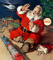
Is there any Christmas character more iconic than Santa Claus? The belly o’ jelly, the tress-dressed face and the bright red suit with snowy fur all wrap up to create the jolliest man we know.
While you can buy Coke anytime and almost anywhere, my favorite holiday brand is Santa himself. We can thank Coca-Cola for Mr. Claus as we know and love him today. In 1931, artist Haddon Sundblom introduced us, via The Saturday Evening Post, to who has become our quintessential image of St. Nick.
Coke’s website explains, "For inspiration, Sundblom turned to Clement Clark Moore's 1822 poem "A Visit from St. Nicholas" (commonly called "'Twas the Night Before Christmas"). Moore's description of St. Nick led to an image of Santa that was warm, friendly, pleasantly plump and human. For the next 33 years, Sundblom painted portraits of Santa that helped to create the modern image of Santa -- an interpretation that today lives on in the minds of people of all ages, all over the world.”
So this year, instead of leaving milk out with your cookies this Friday night, you might leave a bottle of Coca-Cola. Santa is sure to appreciate the caffeine kick; he’s got a lot of houses to hit, you know.
You can read all about Santa’s image and other Coke lore on Coca-Cola's website.
Merry Christmas, y'all!
The 6th Food Group: Crayons
cray·on / [krey-on, -uhn]
–noun
1. a pointed stick or pencil of colored clay, chalk, wax, etc., used for drawing or coloring.
2. a drawing in crayons.
–verb (used with object)
3. to draw or color with a crayon or crayons.
–verb (used without object)
4. to make a drawing with crayons.
When I hear the word crayon, my mind immediately goes to the iconic art supply and the brand I grew up with ... the Crayola crayon and its magnificent box of 64 with a built-in sharpener. I remember holding them with little hands, learning how to use the different shades together, and even melting them for cool grade-school art projects.
So this new beverage line has me puzzled. You want me to 'drink crayons?' I've been taught all my life to keep the markers, paintbrushes and crayons out of mouth, and now there is an imperative to do so?
As a mom, I can appreciate the premise behind the beverage: a drink with no high fructose corn syrup, less sugar and more juice than leading drinks for kids. As a verbal branding associate, I see a great opportunity for a fun, new name that can appeal to kids in its tonality, and to moms in its approach to nutrition.
Using an arbitrary word for a brand can work, if it's executed well. Apple built its brand off ease and the approachability of something as simple as a piece of fruit. Is Crayons trying a similar approach? Capitalizing on our childhood nostalgia and hoping that translates into a mental shift? That now, it's ok to 'drink our crayons?'
As for kids, will this product be confusing in real-life scenarios? "Mom, can I have Crayons with dinner tonight?" Or, "Kate, you can drink these Crayons, but don't eat those in your art supplies." For some reason, I can't reconcile the idea of now consuming or drinking something that has been a part of my life for so long, and used in a very different way. What do you think? Are you ready to 'drink your crayons?'