AW in Review – Addison Whitney Brand Salsa Recap 1.29.16
Welcome to another outstanding edition of the AW in Review! This is our roundup of our latest brand salsa and Addison Whitney news and posts!
Don’t forget, you can stay up-to-date with everything from Addison Whitney by joining the conversation with us on our social media channels – Twitter, Facebook, LinkedIn and Google+.
Building Your Branding Road Map – The Importance of Finding Your Brand Niche
Given the high prices for Super Bowl ad spots and the highly selective process that comes with such advertising, many brands are unable (or unwilling) to try and make the jump to this realm of  brands – but just because you aren’t playing on the biggest stage, doesn’t mean you can’t be successful.
This is where the importance of finding your brand niche becomes apparent. Chances are, there’s an audience out there who will connect with your brand. But if the brand strategy is either intentionally or unintentionally oblivious of this audience, their efforts to try and settle outside of their ideal spot on the market will be met with failure. Instead, the strategy should center around becoming the biggest dog on your block – putting in the time and effort to identify to whom your brand will be most relevant and how you can efficiently strategize your branding efforts to speak to this audience. Read More...
Branding Lessons from Brand Giants
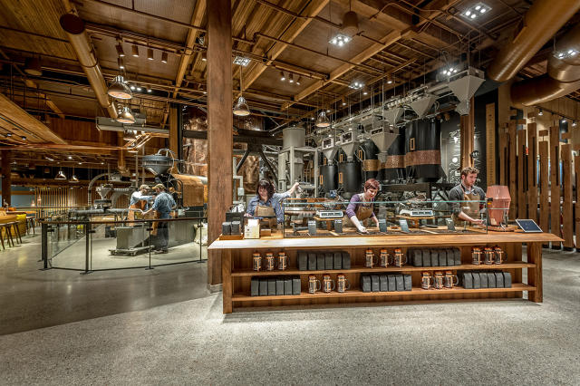 Two of the leading brands on the marketplace today – Apple and Starbucks – didn’t get to where they are by chance. Building (and maybe more important, maintaining) brands with their level of success requires firing on all brand cylinders and recognizing the importance of nailing the visual, verbal, research and strategy aspects of the brand.
In a recent article for Fast Company, brand and marketing specialist Alessandra Ghini shared a pair of branding lessons she learned during her time with both Starbucks and Apple. These two pieces of advice provide both insight and a hint of explanation to the successes of these brands. Read More...
Keeping Your Brand Consistently Consistent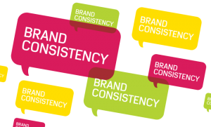

Brand consistency is exactly what it implies – constant and unchanging branding throughout your brand’s reach. Your brand can be top of the line, but if nobody knows exactly what it is or how it looks/sounds, then your efforts to promote the brand are facing an uphill battle.
Getting your brand in front of your crucial audiences is the only way to continue to grow, and guaranteeing that each exposure reinforces the single brand is the best way to do this. Consistent branding encompasses and is driven by all other brand building efforts, and holds a vital place in the success of your brand. Read More...
Addison Whitney is a global branding firm with a passion for building strong brands.
To learn more about Addison Whitney, visit our website at AddisonWhitney.com, or contact us here.
Building Your Branding Road Map - The Importance of Finding Your Brand Niche
The Super Bowl will be soon upon us, and with it comes the biggest advertising day of the year. Brands around the world will spend millions of dollars for the chance to showcase themselves to a massive global audience. Some brands are regulars in this space – advertising during the Super Bowl is just another part of their year – while others hope to use the platform as a launching point to put their brand in the national discussion and boost their overall brand awareness.
Given the high prices for these spots and the highly selective process that comes with Super Bowl advertising, many brands are unable (or unwilling) to try and make the jump to this realm of brands – but just because you aren’t playing on the biggest stage, doesn’t mean you can’t be successful.
This is where the importance of finding your brand niche becomes apparent. Chances are, there’s an audience out there who will connect with your brand. But if the brand strategy is either intentionally or unintentionally oblivious of this audience, their efforts to try and settle outside of their ideal spot on the market will be met with failure. Instead, the strategy should center around becoming the biggest dog on your block – putting in the time and effort to identify to whom your brand will be most relevant and how you can efficiently strategize your branding efforts to speak to this audience.
The first step to any good communications strategy is to understand your audience, and this rule applies to branding as well. The previous “shotgun strategy” mentality of branding, where the goal was to cover the most ground with the hope of some level of success in the randomness has gone away, replaced by the mindset that spending the time/effort/money at the very start to define where the brand should live will give it a step ahead when the rest of the branding process begins.
No longer will branding emulate a meandering excursion across the country, where the start point is known but the final destination only relatively set, and therefore journey itself is largely unplanned. Just the opposite – chart your brand course with the end in mind and work backward, taking in each step in careful consideration to ensure that the trip is as much of a success as the destination.
Two key pieces to a successful brand are the verbal and visual aspects, which include the brand name and logo. Tailoring these to your target audiences are especially crucial, as they serve as the first impression many of those potential consumers will have with your brand.
Speak to your audience with your brand name, providing a unique connection with their wants and needs. For instance, if you are branding a new line of automotive parts, look for names that highlight the specialized interests and knowledge of the target audience – which can also extend to the logo, allowing for both the verbal and visual branding pieces you create a built-in audience.
When you know exactly where your brand should end up and live long-term, who your brand should target will also make itself known. To extend the metaphorical connection, the idea of being a big fish in a small pond scares away many organizations, who pine to move to bigger ponds no matter what the outcome.
What they fail to realize is that a “small” pond in branding doesn’t necessarily mean that they are limiting their ceiling of success. In fact, I interpret the phrase to represent being the biggest and best fish in your specific pond – instead of looking for what’s next, focusing on what’s now and where your brand will have its biggest chance to speak to its true audience.
Image Sources:
https://contentmarketinginstitute.com/2013/03/content-marketing-riches-niches/
https://www.chrisducker.com/profitable-niche-affiliate-marketing/
Addison Whitney is a global branding firm with a passion for building strong brands.
To learn more about Addison Whitney, visit our website at AddisonWhitney.com, or contact us here.
AW in Review – Addison Whitney Brand Salsa Recap 1.15.16
Welcome to the first “AW in Review“ of 2016! This is our roundup of our latest brand salsa and Addison Whitney news and posts!
Don’t forget, you can stay up-to-date with everything from Addison Whitney by joining the conversation with us on our social media channels – Twitter, Facebook, LinkedIn and Google+.
Welcome to Brands We Love Week 2015!

Welcome to the second edition of Brands We Love Week! All week, we will be revealing what brands our resident brand fanatics thought stood out this year.
Whether it was because of something they did, or a great experience they had with a brand, Brands We Love Week is a chance to tell our favorite brand stories! Read More...
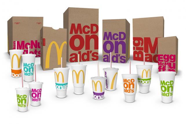
Can New Visual Branding Strategies Make McDonald’s a “Modern, Progressive Burger Company”?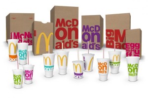
“Modern” and “progressive” may not be the first words you would associate with fast food titan McDonald’s, but company leadership is working to change that. Enter the latest packaging revamp, which will roll out during the course of 2016 and is intended to work hand-in-hand with restaurant design, digital marketing and other brand conduits to establish McDonald’s as “a modern, progressive burger company,” as CEO Steve Easterbrook described it.
Specifically, the new packaging introduces a bright, vibrant secondary color palette to pair with the traditional red and gold so closely associated with McDonald’s, in addition to simplifying and de-cluttering the overall look of the various bags, cups and containers. Read More...
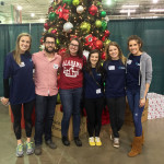
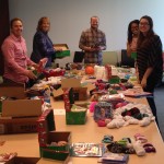
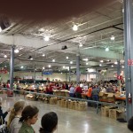
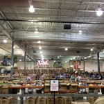
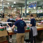
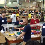
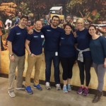
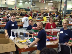 Addison Whitney Volunteers with Operation Christmas Child 2015
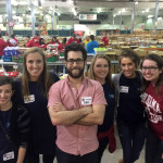
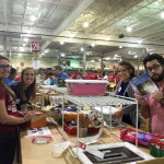
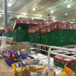
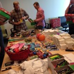
Members of the Addison Whitney Charlotte office, as a part of the “AW Helping Hands” philanthropy efforts, volunteered their time with Operation Christmas Child, helping sort, inspect, pack and ship thousands of shoe boxes filled with toys and gifts for children in need around the world.
Their efforts helped Operation Christmas Child move closer to their goal of sending out 2.4 million shoe boxes from just the Charlotte center alone, and made a dent in the 11.2 million shoe boxes that will be shipped from around the world, with processing centers across the United States and Canada, in addition to locations in Europe and Australia. The boxes packed by the AW teams were then sent to children in Ghana, the Bahamas and Haiti. Read More...
Addison Whitney is a global branding firm with a passion for building strong brands.
To learn more about Addison Whitney, visit our website at AddisonWhitney.com, or contact us here.
Can New Visual Branding Strategies Make McDonald’s a “Modern, Progressive Burger Company”?
Today we are excited to have a guest blog from Senior Graphic Designer Dave Dixon!
“Modern” and “progressive” may not be the first words you would associate with fast food titan McDonald’s, but company leadership is working to change that. Enter the latest packaging revamp, which will roll out during the course of 2016 and is intended to work hand-in-hand with restaurant design, digital marketing and other brand conduits to establish McDonald’s as “a modern, progressive burger company,” as CEO Steve Easterbrook described it.
Specifically, the new packaging introduces a bright, vibrant secondary color palette to pair with the traditional red and gold so closely associated with McDonald’s, in addition to simplifying and de-cluttering the overall look of the various bags, cups and containers.
However, in tandem with the iconic golden arches, it’s the typography that really takes center stage in this design. Whether it’s the “McDonald’s” name or specific menu items (Big Mac, Egg McMuffin, Chicken McNuggets, etc.), type is the focal point of the design, using a bold font and stacked composition to noticeably break from previous packaging styles.
Time (and, perhaps more importantly, updates to the actual food on the menu) will tell whether this new packaging and visual branding strategy can achieve the stated goal of looking modern and progressive, but for me it misses the mark. While I can’t disagree that it’s more modern than the previous packaging, I also can’t shake the feeling that this is 2010’s idea of progressive, like your parents throwing their first Ugly Sweater Party this past December.
Feedback indicated that consumers “wanted McDonald’s to be McDonald’s,” according to Matt Biespiel, McDonald’s Senior Director of Global Brand Development, and the new packaging clearly reflects an attempt at balancing that with the push towards something more forward-thinking. Ultimately, that balance just isn’t quite right.
I love the oversize, bleeding-off-the-edge golden arches, and the iconic yellow is a vibrant contrast against the brown bags, but with both the traditional yellow and red present, the new secondary 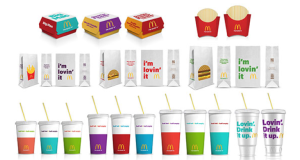 palette clashes instead of complements. And the secondary color palette itself seems to be trying too hard, especially when you read the names McDonald’s has assigned to them ¬– Magical Magenta, Ocean Fresh Blue, Optimistic Orange, Passionate Purple, and Zesty Lime. Consumers will likely never hear those names, but they (unfortunately, in my opinion) do match up with the colors themselves.
The typography, which as I mentioned is the focal point of the new design, also leaves a lot to be desired. The stacked configurations could have been interesting, but by using the established, corporate font found in the McDonald’s logo, they never really had a chance of looking truly progressive. Product names also seem to adapt to this style more easily than the company name, where the “on” in “McDonald’s” is overpowering and distracting.
Perhaps a more limited color palette and a purposeful juxtaposition between the big, bold golden arches and a more restrained, refined type treatment on the opposite side would have been more effective. It’s certainly understandable that companies like McDonald’s need to capitalize on their existing brand equity, but there has to be a better way to carry out the specifics.
Perhaps the most interesting aspect of this redesign from an industry insider’s perspective is the process that led to the new designs. Rather than working with one specific agency, McDonald’s brought together a team that included designers from each of its seven lead agency partners from across the globe. The team had just a week to brainstorm, and after receiving mid-week consumer feedback, narrowed things down to three finalists.
It’s impossible to say how McDonald’s new packaging would have looked had it been designed by a single agency, but in this case, the result seems to reflect the unorthodox process used to create it. In isolation, certain elements might have worked, but the whole ends up seeming somewhat less than the sum of its parts. In fact, by trying to be everything to everyone, McDonald’s just may end up being nothing to anyone.
Addison Whitney is a global branding firm with a passion for building strong brands.
To learn more about Addison Whitney, visit our website at AddisonWhitney.com, or contact us here.
Welcome to Brands We Love Week 2015!
Welcome to the second edition of Brands We Love Week! All week, we will be revealing what brands our resident brand fanatics thought stood out this year. Whether it was because of something they did, or a great experience they had with a brand, Brands We Love Week is a chance to tell our favorite brand stories! If you missed the inaugural series from last year, you can catch up here.
Additionally, we want to hear who you'd add to the list! Let us know what brands you loved in 2015, using the hashtag #BrandsWeLove, or let us know directly on Twitter @AddisonWhitney.
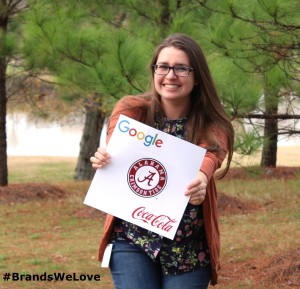
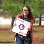
Up first is Ashley, who chose a trio of brands she loved in 2015 - Google, Coca-Cola and the University of Alabama!
"I love these brands because they play a big role in my life – I use Google every day, grew up drinking Coca-Cola, and spent four great years at the University of Alabama.
I also love them because they are brands that have remained relatively unchanged over time, which has created strong brand equity for all three."
Our second brand fanatic of the week is the Qdoba-loving Kat!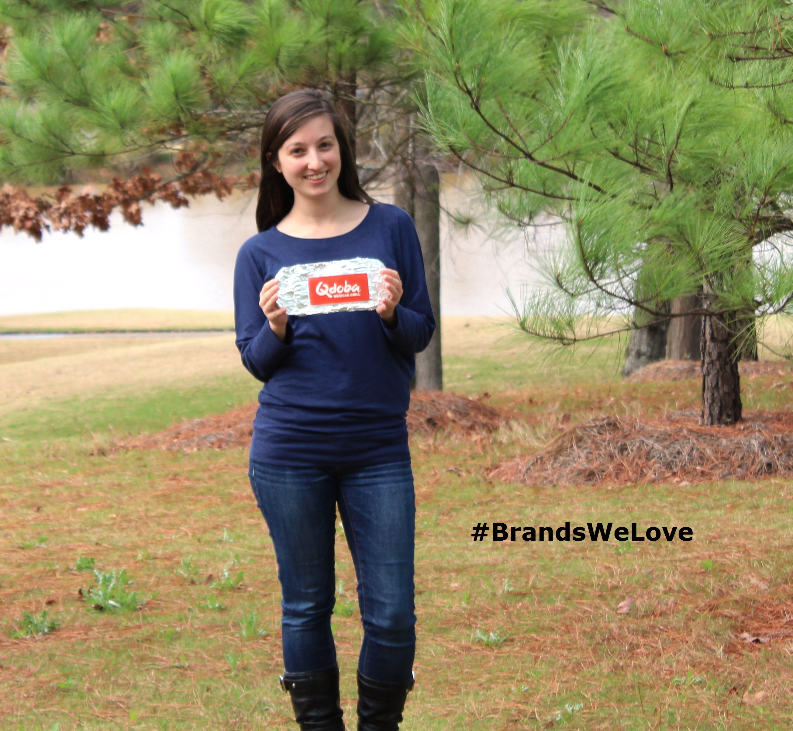
"I’ve been going to Qdoba since high school, but have become an even bigger fan now that they have rebranded!
Qdoba embraces flavor and customization; they also have one thing Chipotle doesn’t - their amazing, spicy queso. The environment and employees are always pleasant, so going there always brightens my mood (especially the queso though)."
We wrap up the first day of Brands We Love Week with Ashley and her three favorite brands of the year - Kate Spade, May Designs and Rifle Paper Co., who all have something very important in common!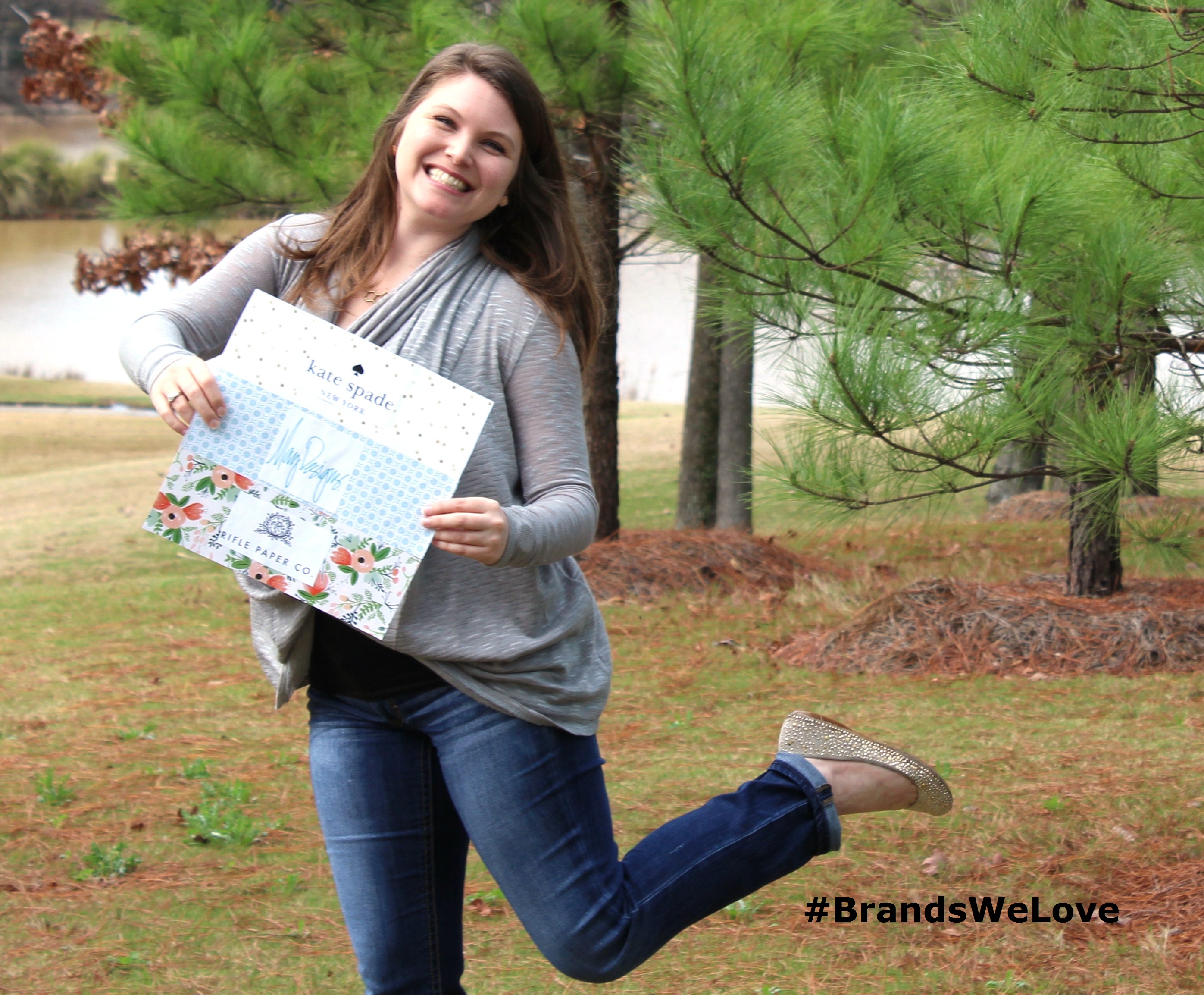
"I love to be surrounded by pretty things, and Kate Spade, May Designs, and Rifle Paper Co. all make beautiful yet functional products that are backed by the highest of quality and some of the strongest brands I’ve run across.
Each of these companies has developed very specific branding strategies that appeal to an impressively wide range of women and they all offer products that make both home and work warmer and more welcoming—and who doesn’t want that?"
Kicking off day two of Brands We Love Week is Sarah, who is on board with her favorite brand, BMW!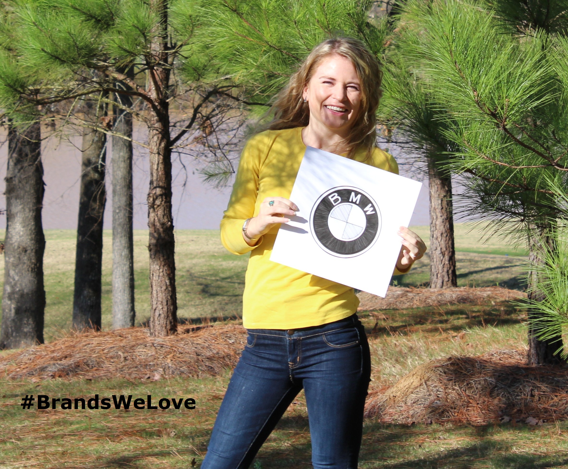
"BMW has been one of my all time favorite brands since childhood. My brother introduced me to the Need for Speed games when we were kids and my favorite car to race was the blue Z3!
I love that the company has carried the history of their name to the designs and products we see today, vividly expressing the components of successful branding. From aircraft engines to luxury european automobiles, BMW really does it all."
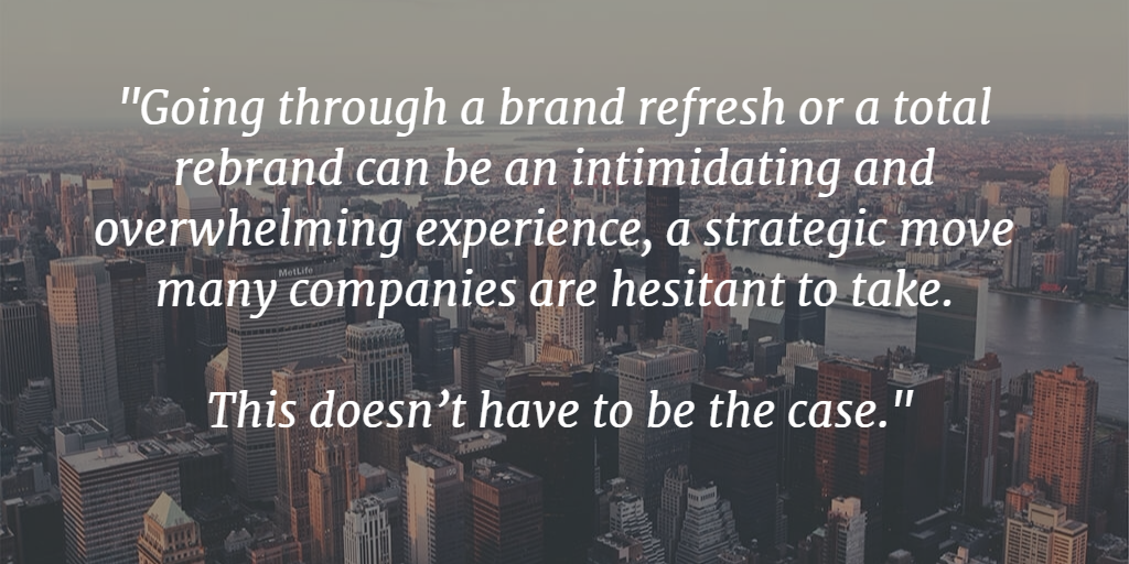
We had to search high and low to find our next brand fanatic RJ, but turns out he was just exploring the great outdoors for his favorite brands, REI and Adele (who, appropriately, is singing "Hello from the outside" in her REI hat)!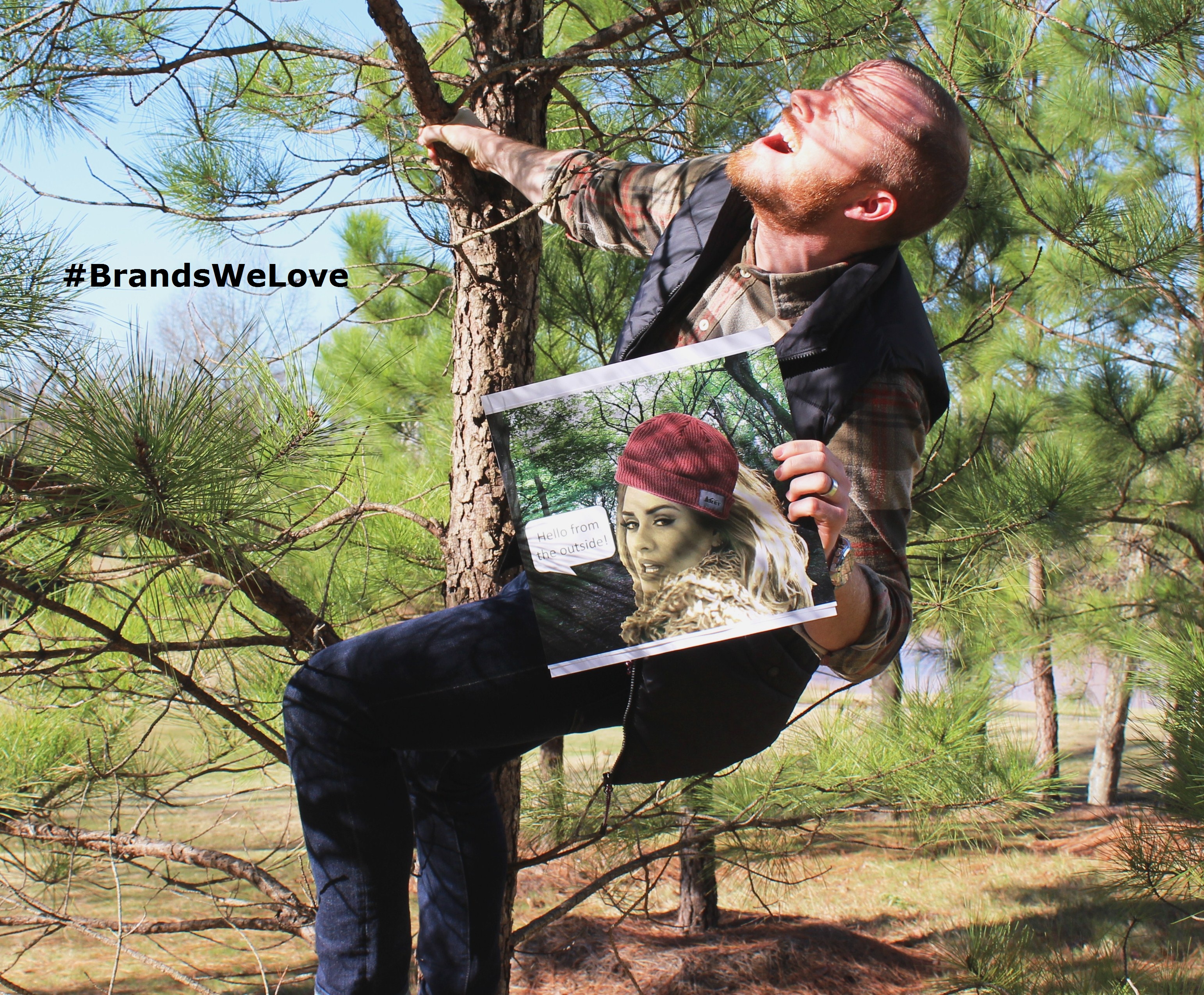
"More and more, I find myself less influenced by stuff. I don't like the idea of wanting things. When REI came out before Black Friday and said "no thank you," it was the most inspired I'd been by brand marketing communication in years. It was fresh, bold, on-brand and authentic. It captured exactly what I was looking for this holiday season.
Adele's brand is consistent, classy, heart-felt, down-to-earth, and I can't get enough. Adele broke the first week album record no one thought would ever be broken with music now available online. She has sung multiple songs live from her album, not just the top single, to build her brand as a full-album artist - not just a chart-topping single writer. Side note: her album title strategy rivals Apple in its simplicity, just stating her age at album release."
Rounding out day two of Brands We Love Week is Joshira, who didn't have to search too hard for her favorite brands in 2015, Google, Pandora, Buzzfeed and ASOS! 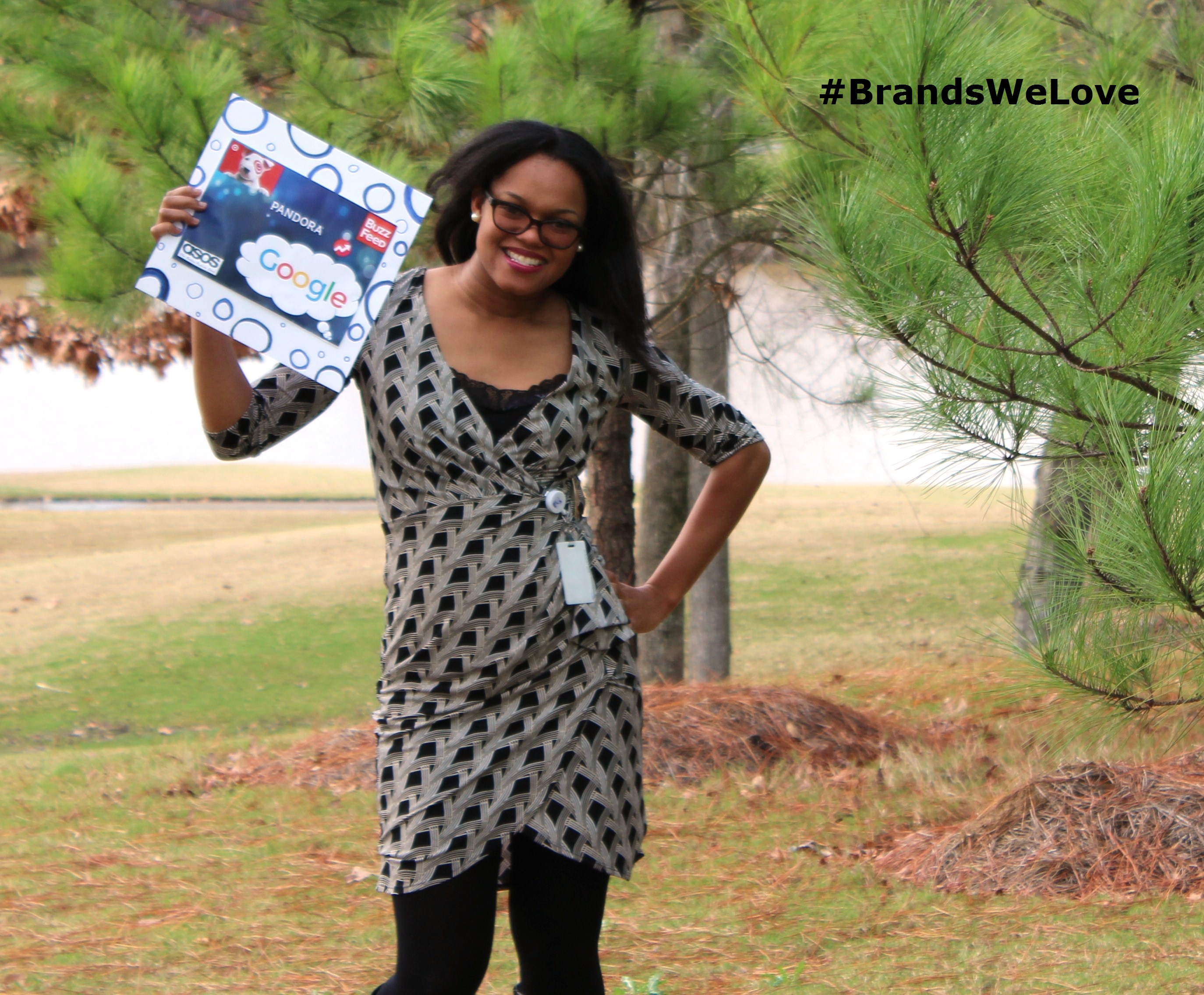
"Google is consistently innovative, from improving their search engine to creating a self-driving car. I refuse to use another search engine, as I always "Google" whatever I need to find on the internet.
Pandora - I love the name of this music app and have used it a lot this year to discover new music.
I really enjoy Buzzfeed because it provides news and entertainment in every aspect of life. It has such a wide range so there is an article/story for everyone!
I know I can always rely on ASOS.com to get unique styles of clothing and they have range from outlet to high end styles and prices. I like that they give 10% off on the anniversary of the first day you place an order and that they provide free two-way standard shipping!"
Day three opens up with Rachel, who is jumping for joy over how the brands she selected - Netflix, Luvs, Capital One, Barnes & Noble and Snickers - make her feel!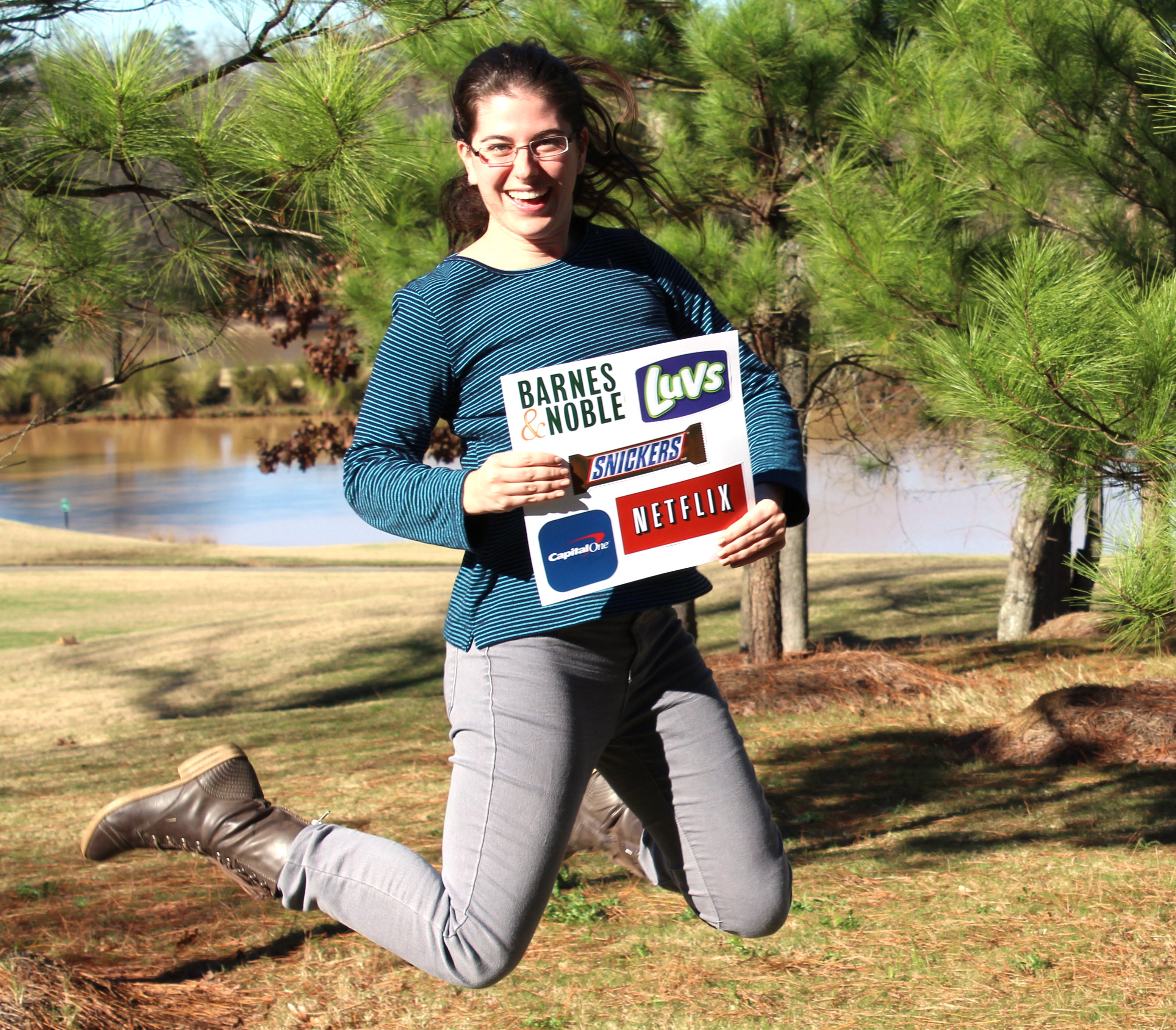
"One thing that is guaranteed to get me excited about a brand is a great ad campaign. I love Netflix’s recent advertisements; they are hilariously honest, and include references to binge-watching, asking shamelessly for an ex’s Netflix password, and bragging about finishing a series to friends—things all users can relate to on some level. The same goes for Luvs; I don’t even use their products, but their commercials comparing parents’ behavior with their first child versus their second child are so funny and heartwarming, I can’t help but feel an affinity for the brand!
The other brands are on this list for the feeling they give me. I recently got a travel rewards credit card from Capital One, and its sleek design is enough to make me feel powerful and worldly whenever I take it out. And whenever I’m in a Barnes & Noble, I immediately feel happy and at ease, surrounded by beautiful displays and the inviting smell of books.
But perhaps the best example of a positive brand association for me is Snickers. Not only do they have great commercials and attractive packaging, they are so good that I have an almost Pavlovian response to them, and start to salivate whenever I eat one! I have also been known to vehemently argue their superiority with Twix fans, and attempt to garner more supporters for the Snickers side; if that’s not brand loyalty, I don’t know what is!"
Don't believe the picture - Ben is excited about his favorite brand of 2015, The School of Life!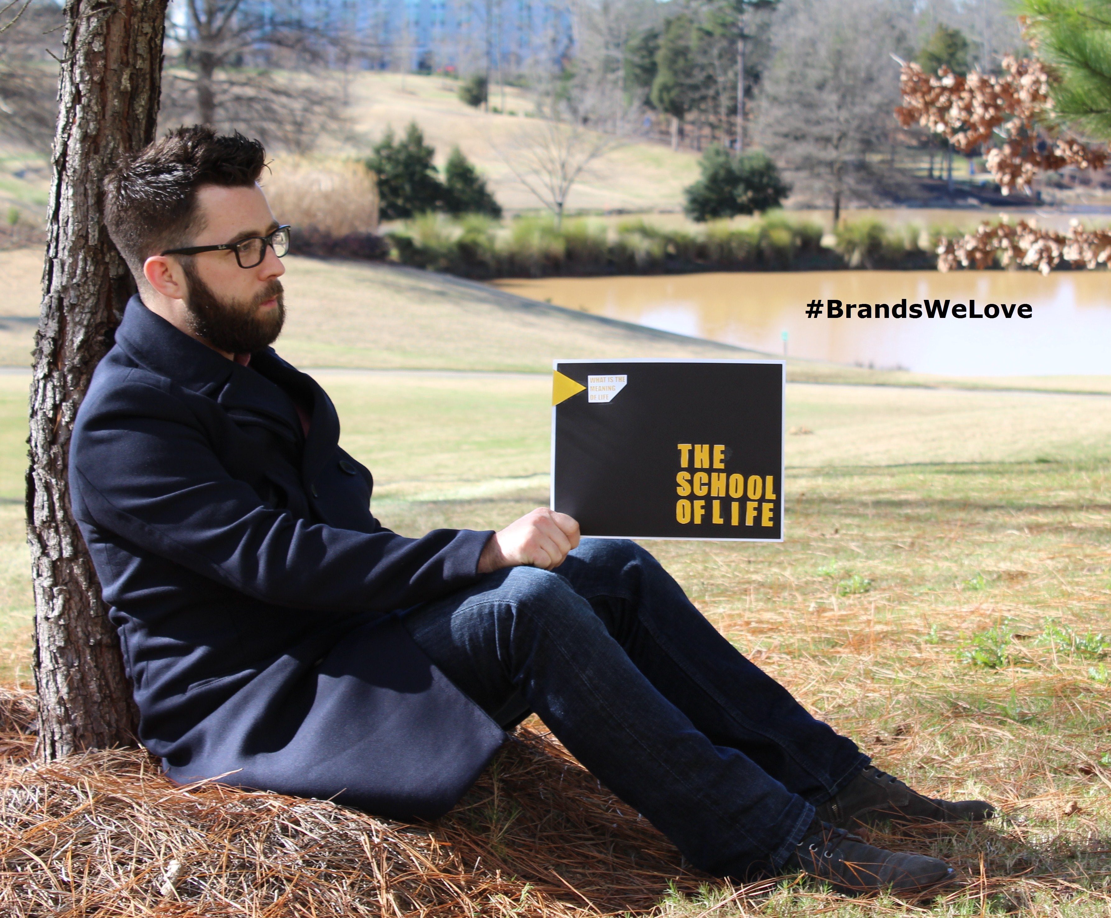
"An utterly fantastic YouTube channel dedicated to educating its viewers on historical philosopher, modern philosophers, and a plethora of other extremely fascinating topics.
If you take their well written and incredibly informative videos coupled with their aesthetic website that's littered with a healthy amount of brainwashing nick-knacks without a doubt makes this brand not only one of my favorite brands of the year, but a brand with a strong cult like following sure to insight and excite. Drink the Kool-aid. It's delicious."
Kathryn can't wait to run and talk about her favorite brand of the year, Amazon!
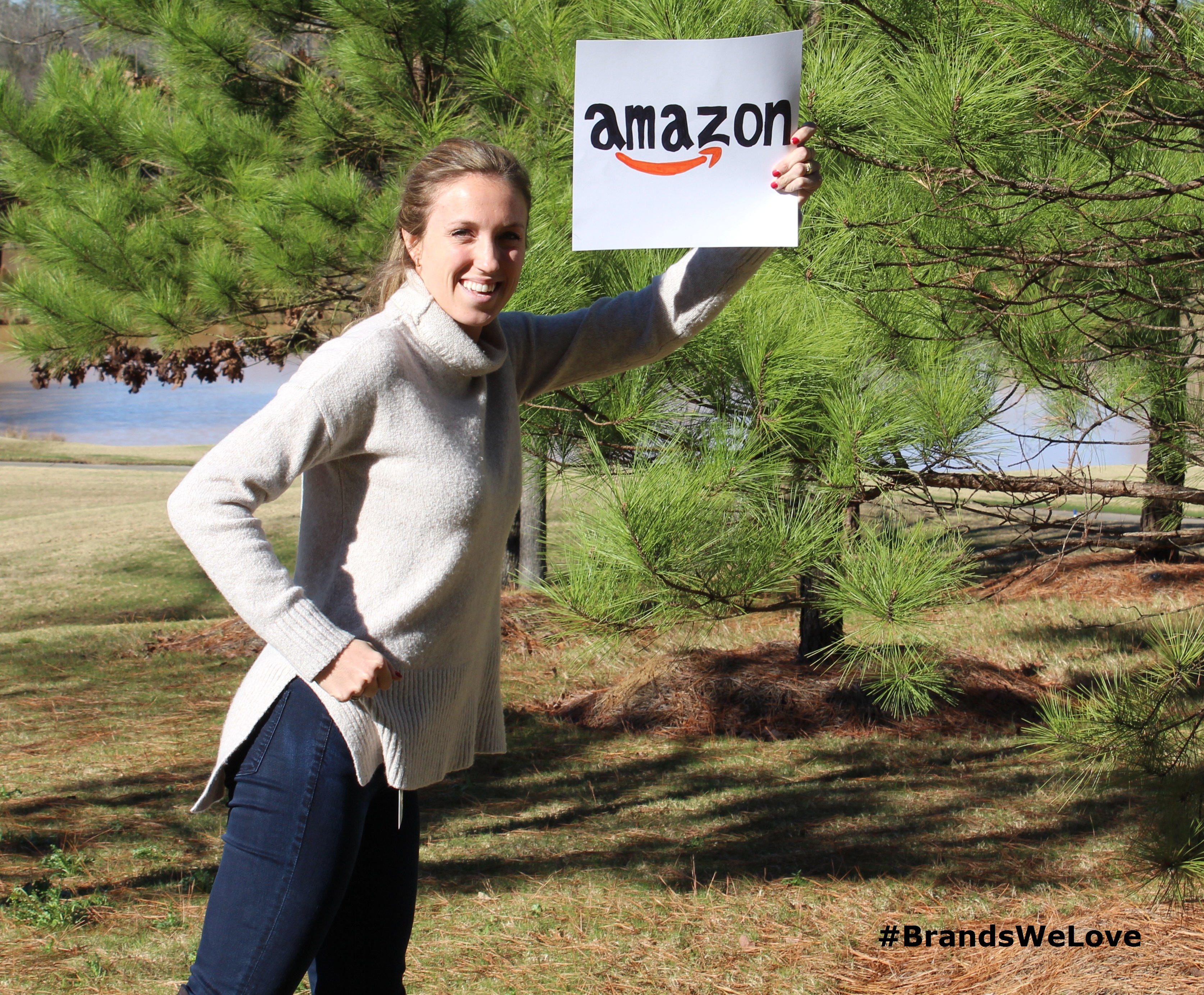
"One of the main reasons that I like the Amazon brand so much is that they are constantly sacrificing short term profit in the interest of their customers.
Amazon is also a brand that is very trustworthy, they have exceptional product accessibility and customer service that create this strong brand that consumers can trust. Through their customer reviews and recommendations based on passed purchases, I know that when I go to Amazon that I am going to find exactly what I am looking for."
The start of day four is a perfect time to showcase the tasty, thirst-quenching and life-altering La Croix, the favorite brand for Lizzy!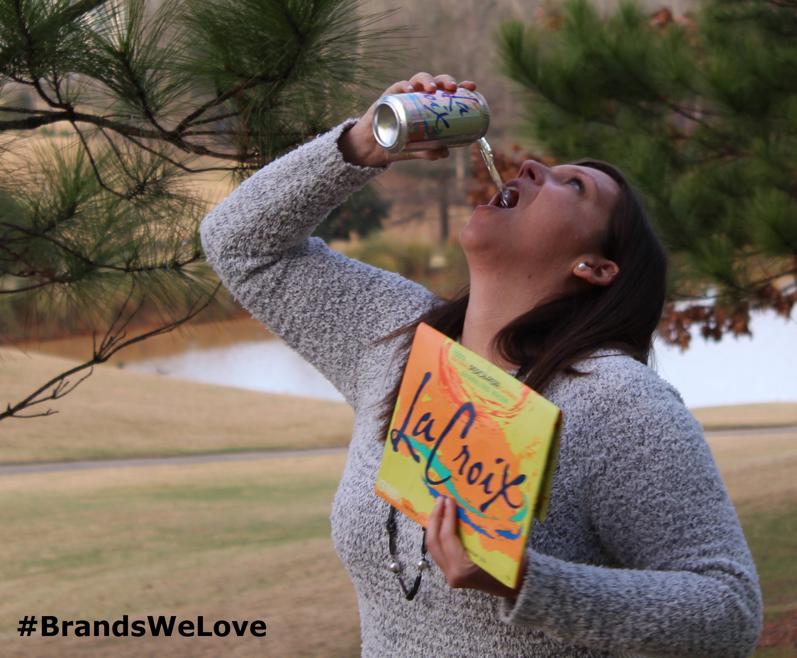
"Dare I say this tasty beverage changed my life? Ok that might be a little dramatic but it has kicked my soda habit and that is pretty life-changing. I'll admit i was very skeptical of the brand and the sparkly beverage, i had tried it on a few occasions and just wasn't sold.
But that all changed this year after I tried the Peach-Pear over ice. I was hooked and now I am a guilt-free La Croix addict of all flavors. In addition to enjoying the product I love their social media presence. It is fun, engaging and all about enjoying life while enjoying their product. It resonates very well with me, and I can't wait to see this brand continue to grow. Maybe in 2016 we'll start to see La Croix vending machines pop up. One can dream, right?"
Dan continues day two with a great way to keep your cool with the brand he loves, YETI Coolers!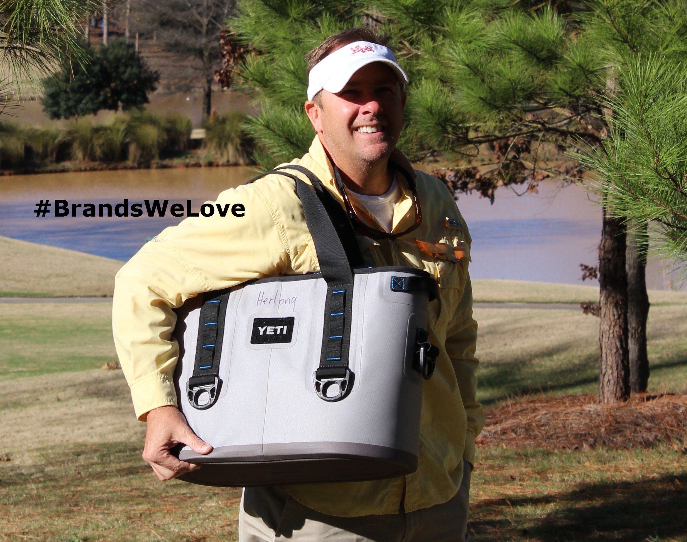
"Because of the marketing "geniusrey" they have pulled off. The company opened in 2006, and most of us have heard of them. But other companies have been making the same coolers for 40 years, many of which are very similar and almost look exactly the same as a YETI cooler.
Now many people even buy the mugs, Tervis products and other accessories, making them everyday tools instead of coolers for outdoor adventures, as they were originally designed for."
Jennifer is showing off some awesome home-state pride with her favorite brands of 2015, the Tar Heel State-based inkWELL Press and 704 Shop!
"When you say you “love” a brand – what does that mean? For me, when I find myself engaging others in conversation about a particular brand (sometimes more times than they want to hear), that brand has reached the “love” status with me. As is the case with inkWELL Press and 704 Shop. As a native North Carolinian, it’s a bonus that both of these brands are based out of my home state!
As a project manager, mom, wife and daughter, it is paramount that I am organized. Before I found the right planner I did a lot of research, comparisons, listening to recommendations and watching YouTube reviews. I’m not sure how I stumbled upon the gem that is inkWELL Press and their liveWELL Planner – but my life has forever been changed! Tonya Dalton, IWP founder, and her team of expert organizers have successfully built the brand on empowering women to break the superwoman myth and doing what matters for the way we want to live. My liveWELL is the perfect mix of form and function – with beautiful fonts and color palettes for each month. The 2016 planners were released in November and it’s been sitting on my desk, beautiful in its soft wood chevron pattern, just waiting for a fresh start in 2016. I love that every aspect of this brand is personal; it’s simple and functional design allows me to organize the planner for how I want to run my life, not messily squeeze tasks in or leave things out altogether.
704 Shop was founded by three UNC Charlotte graduates, with an undying passion for their hometown. I found them through a friend’s Instagram account, quickly made my first purchase, recommended them to friends and have given a few of their shirts as gifts. These guys are making a name for themselves by filling a void in the current market by building a brand that represents Charlotte – for those native or transplanted to the 704 area code. When searching for unique Carolina Panthers gear that I’m not going to see on every corner before a home game, 704 Shop surprised me with its #LUUUKKE shirt. The shipping was lightning fast and the communication and service was astoundingly personal when I had to return for a smaller size. They bent over backwards to make sure I was happy with my purchase. I love shopping local and 704 Shop’s #stayclosetohome is one I am proud to support."
Sadly, it's the final day of Brands We Love Week, but definitely not sadly is that we have Wendy to kick off the day with her favorite brand, Microsoft!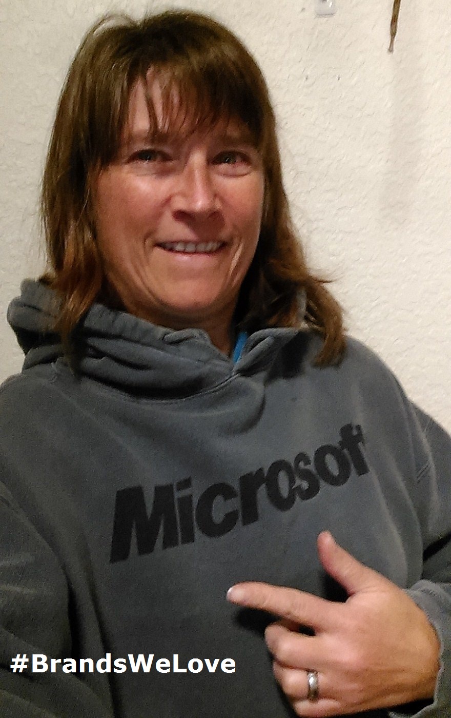
"Microsoft is a brand I admire for several reasons. It is ubiquitous in your life if you use a computer. Behind the scenes in the B2B world, Microsoft software is in the cloud, on servers, and as an embedded operating system, and prominent on many connected devices from ATMs to automobiles. They have built a brand that stands for the same values whether targeting a CEO of a trillion dollar company or a high-school gamer.
All without needing to neutralize their meaning in an attempt to be everything to everyone. They have found a way to blend the “branded house” and “house of brands” architecture models to create stand-alone sub-brands that can be competitive in their respective marketplace (think X-box or Bing) and yet still accrue value to the Microsoft master brand. And the culture of philanthropy thrives within Microsoft."
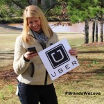
Betsy keeps the day rolling as she catches a ride with Uber, the brand she loved in 2015!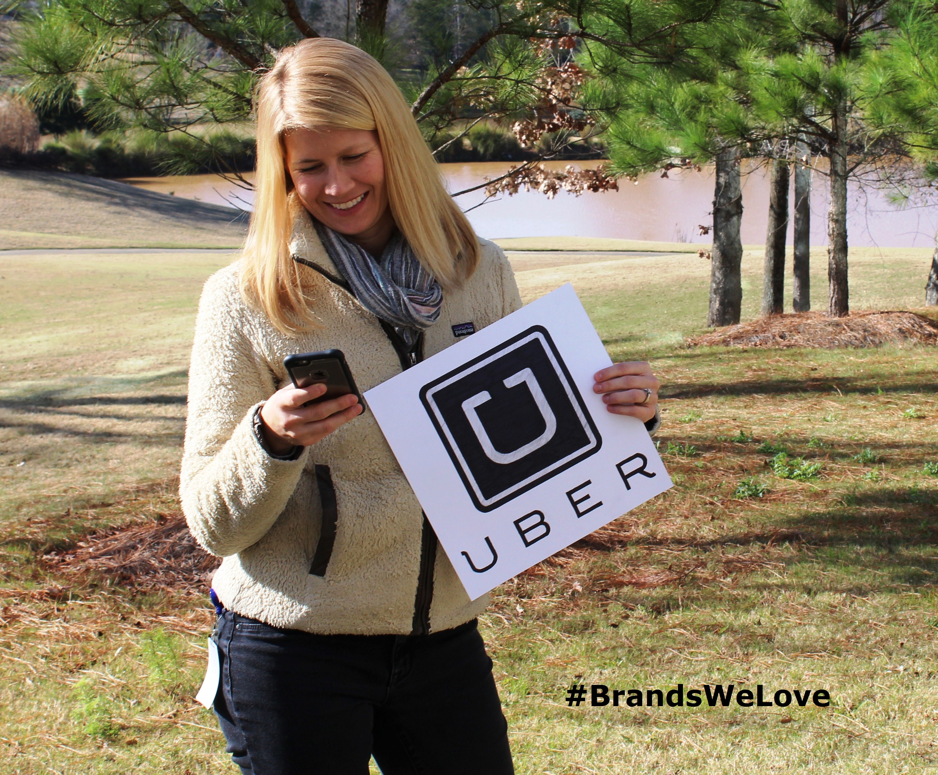
"I used it for the first time in November (I KNOW, I'm way behind the curve.) and it was such a great experience and made me excited about arriving at my destination!
I loved the interactive nature of the app and how easy it was to quickly feel "part" of the Uber club."
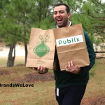
Last but not least, Matt is here to help close out Brands We Love Week with his favorite brand of the year, Publix!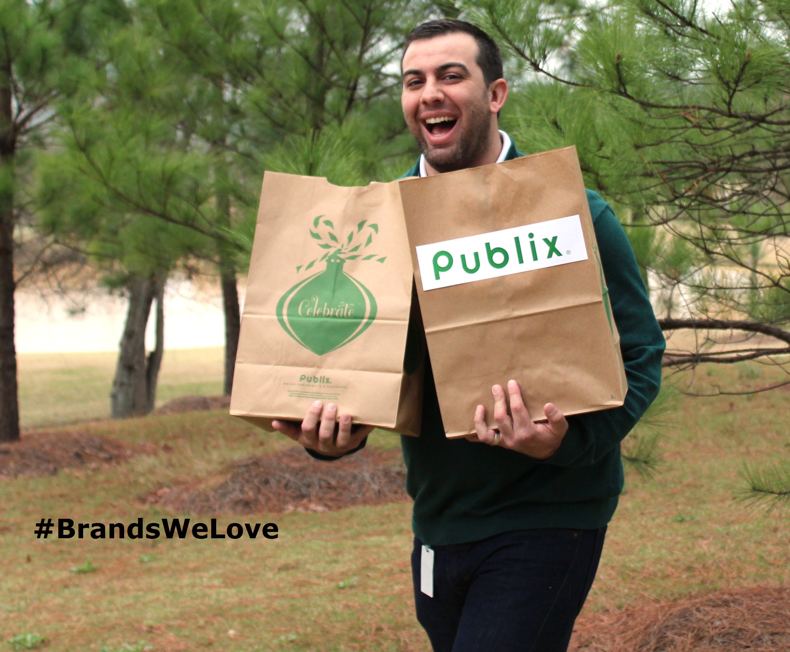
"I had little exposure to the Publix brand prior to this year, but I am definitely on board now!
From the quality of the products to the extra effort that is made to ensure that each experience in the store is a great one, Publix has entered the Charlotte market with a confidence and strategy that proves why it's so popular everywhere it's been so far. Not to mention, their subs and green tea are second to none and a regular on my lunch rotation!"
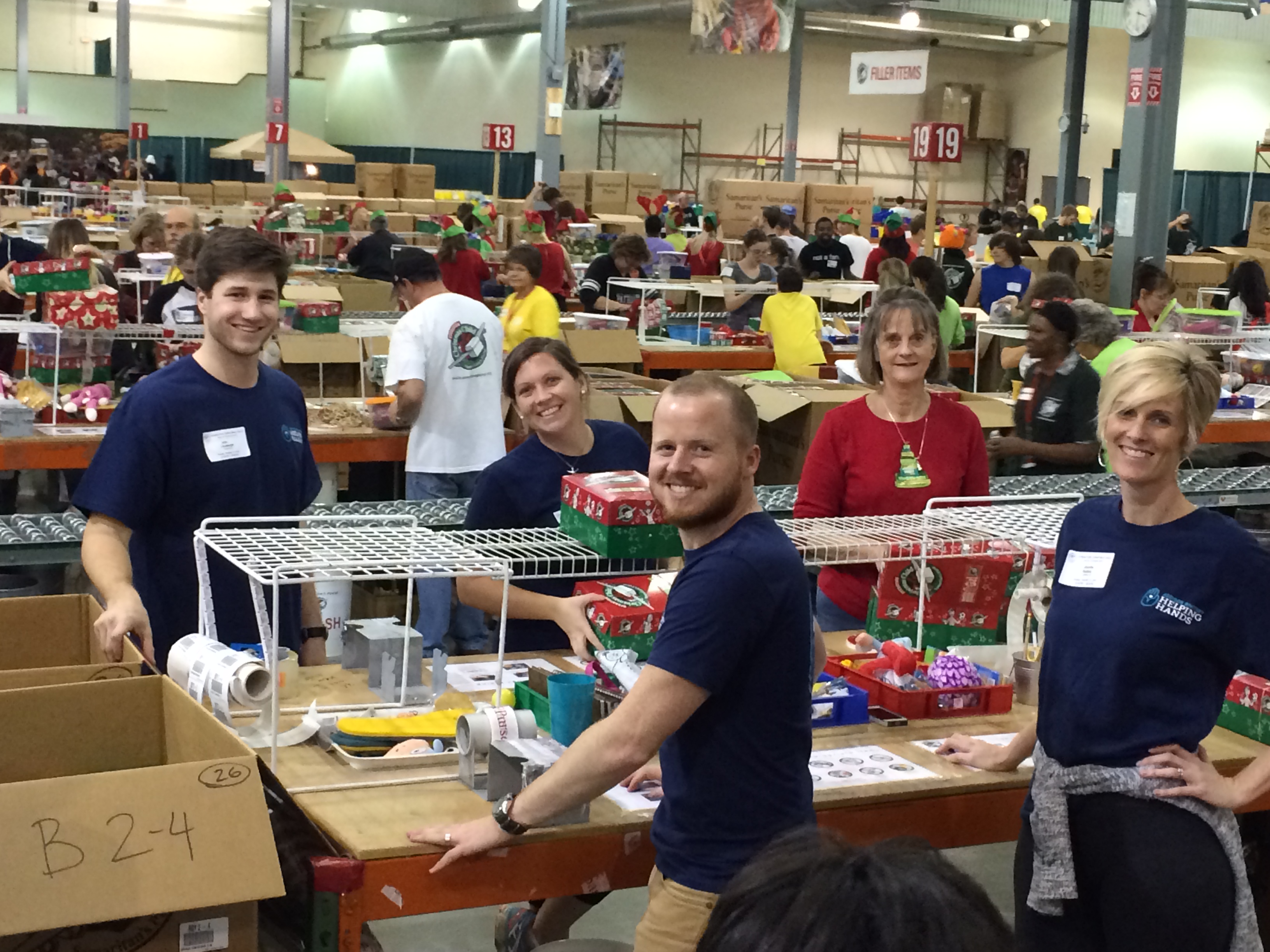
Addison Whitney Volunteers with Operation Christmas Child 2015
This past week, members of the Addison Whitney Charlotte office, as a part of the "AW Helping Hands" philanthropy efforts, volunteered their time with Operation Christmas Child, helping sort, inspect, pack and ship thousands of shoe boxes filled with toys and gifts for children in need around the world.
Their efforts helped Operation Christmas Child move closer to their goal of sending out 2.4 million shoe boxes from just the Charlotte center alone, and made a dent in the 11.2 million shoe boxes that will be shipped from around the world, with processing centers across the United States and Canada, in addition to locations in Europe and Australia. The boxes packed by the AW teams were then sent to children in Ghana, the Bahamas and Haiti.
Prior to volunteering at the processing center, AW team members collected donations and put together full boxes of their own to contribute to the efforts of Operation Christmas Child. These boxes were delivered and have been shipped to their destinations in some of the 150 nations served by the organization.
Thanks to all of the AWers who volunteered their time and efforts for this great cause!
Check out all of the pictures below:

Addison Whitney is a global branding firm with a passion for building strong brands.
To learn more about Addison Whitney, visit our website at AddisonWhitney.com, or contact us here.
Addison Whitney President Brannon Cashion Featured in "Brand Slam" Article in Latest PM360 Magazine
Addison Whitney’s Global President Brannon Cashion is featured in the December edition of PM360 Magazine, with the final 2015 edition of his of his series of "Brand Slam" articles.
This month’s edition of the “Brand Slam” article series is titled “Seize the Innovative Moments - Branding Today”![]()
A brief passage from the article is below, and if you’d like to read the entire post, you can find it here.
Seize the Innovative Moments - Branding Today
Today, we are seeing breakthroughs—decades in the making—that offer life-altering possibilities. The question is, would you risk that breakthrough never making it to market and never living up to potential by trying to go too far outside of the box when it comes to branding?
The importance of foundational brand strategy practices is a proven crucial aspect in pharmaceutical and healthcare branding. A great brand allows these innovative products to quickly and effectively reach those for which it can have a significant impact.
The foundation for a good brand is built on covering all of the bases. Not only does it meet the required elements for regulatory approval, but it also connects in some way to the product for which it is branding. This is not a one-step process, as it includes buy-in from a number of different areas, including market research, brand strategy and a quality verbal and visual branding team.
Addison Whitney is a global branding firm with a passion for building strong brands.
To learn more about Addison Whitney, visit our website at AddisonWhitney.com, or contact us here.
AW in Review – Addison Whitney Brand Salsa Recap 12.11.15
Welcome to the first “AW in Review“ of December! This is our roundup of our latest brand salsa and Addison Whitney news and posts!
Don’t forget, you can stay up-to-date with everything from Addison Whitney by joining the conversation with us on our social media channels – Twitter, Facebook, LinkedIn and Google+.
Why Your Brand Needs a Versatile Logo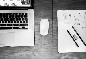
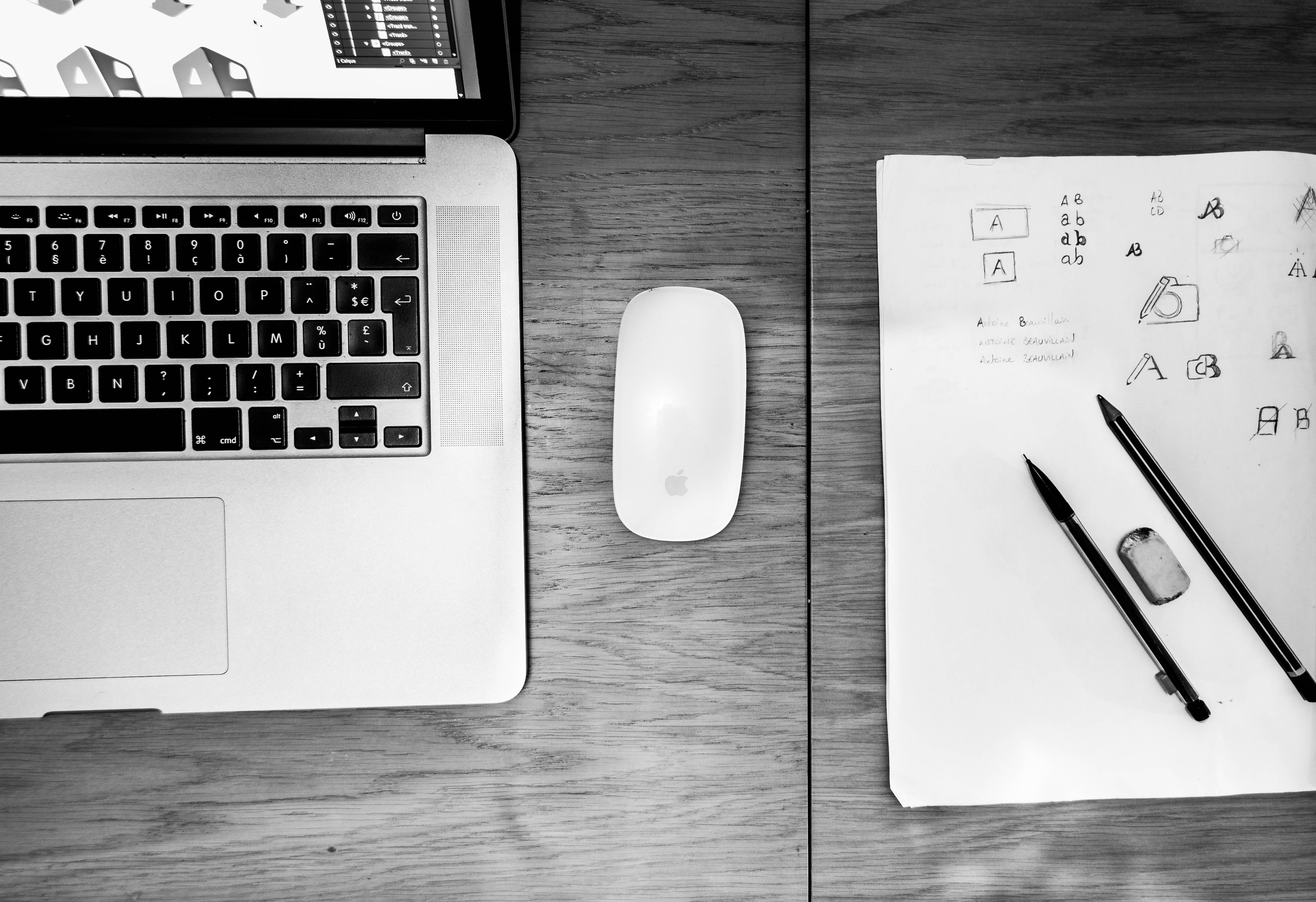
When working on a brand strategy to develop a new brand or refresh an old one is to create the crucial visual branding element – the logo.
A brand’s logo is often its calling card, the first impression-maker with an audience and the centerpiece of its visual identity.
Because of this, visual branding strategies have shifted to a place where logos must be adaptable to media and the placements to which it will live. Read More...
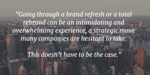 10 Ways to Set Yourself Up for Rebrand and Brand Refresh Success
As you take stock of all of the factors that go into an organization’s success, the strength of your brand may not be at the top of the list. But chances are, it should.
Your brand is one of, if not the most powerful asset for your organization when it comes to presenting yourself to the consumer and staking your claim in the marketplace. Here are 10 steps that will help ensure your brand refresh or rebrand will get off on the right foot. Read More...
Making Brand Decisions That Help Your Branding
REI took the holiday weekend to make a big statement about their brand– closing their doors on both Thanksgiving Day and Black Friday.
Even better, they developed a brand strategy to tie the decision back to their brand attributes made it stand out. Read More...
 Logo Design and Emotion - Know What Your Colors Say About You
The emotional impacts of various colors drive home the point that visual branding strategies begin with looking back.
Identifying who the brand is, what they represent, and/or what they want to become is the first step in determining a successful color component the brand. Read More...
Branding Your Space: How Your Office Can Be an Extension of Your Brand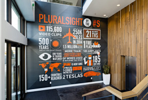
A good, successful brand is a living, breathing aspect of your organization. Your office space can (and should) become an extension of your brand. It should embody the characteristics to which your brand relates.
In short, your employees should see the brand all around them – from where the office is located, to what they see when they walk in the building, to how their lives are shaped by the brand they work for. Read More...
Addison Whitney is a global branding firm with a passion for building strong brands.
To learn more about Addison Whitney, visit our website at AddisonWhitney.com, or contact us here.
Branding Your Space: How Your Office Can be an Extension of Your Brand
A good, successful brand is a living, breathing aspect of your organization. Encompassing what your brand represents at its core, and directly impacting those with whom it interacts.
Your office space can (and should) become an extension of your brand. It should embody the characteristics to which your brand relates. In short, your employees should see the brand all around them – from where the office is located, to what they see when they walk in the building, to how their lives are shaped by the brand they work for.
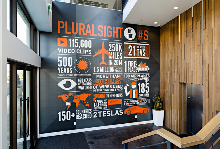
Seems like a simple concept, right? Not so fast. A CoreNet/Steelcase research article that had some pretty amazing statistics with regard to branding, including this graphic:
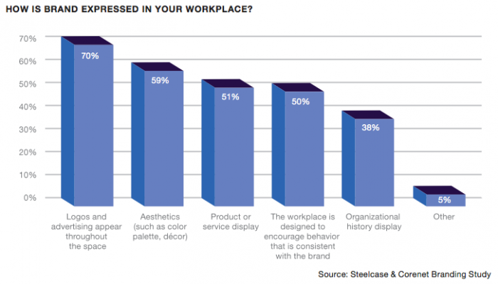
Interestingly, just 50 percent of respondents felt that their office design was brand consistent – way below more on the surface branding efforts like the appearance of logos, advertising and products. These branding elements are important, yes, but do they accomplish much in the way of turning your employees into brand advocates by bringing your branding to life? I doubt it. This is one of the reasons why branding and your office design/features should work hand-in-hand.
Here are a few tips on how to bring your brand to life around (and outside) the office:
Talk to your employees about what the brand means to them.
Find out what characteristics they can most relate to, and work to include elements in the design that capture the essence of how your employees see your brand. Again, they are the most important audience in this area of your branding. Additionally, they may show you a side of your brand that you never thought would be at the top of their priority list, but you find out it should be, helping drive your strategy.
Say your employees keep coming back to how your brand promotes collaboration and interaction - two characteristics that are difficult to communicate through a logo, but can easily be translated into a working space that is open, free from traditional office walls and barriers, that allows for coworkers to easily communicate throughout the day.
Your branding can extend outside your walls. 
When brand engagement firm Sullivan relocated their New York City offices to the High Line building in Manhattan, they looked to their new neighborhood as an inspiration for the design of their new digs. They saw how the area’s personality matched with what they felt their brand represented, and knew that the energy all around them would translate with the energy their employees felt when going to work.
They also incorporated design elements take straight from their surroundings, including vintage furniture and naming their breakout tables and pods by a different cut of meat (such as “brisket,” “sirloin” and “ribeye”), to invoke the history Meatpacking District they call home.
Don’t just walk the walk – talk the talk.
Gaming company Zynga, known for such games as Words with Friends and FarmVille, recently moved into a new space and wanted to design it in a way the encompassed what they felt the brand represented. So, they focused on bringing their culture to life. CEO Mark Pincus put the strategy in motion early on, when he knew that an active, healthy culture was an important area for Zynga to represent, so their new headquarters needed to include a state-of-the-art gym for employees to use. This is a good example of taking something that is often discussed but rarely acted upon – how your brand can improve the lives of your employees – and taking action.
Image Sources:
https://workdesign.com/2012/06/how-one-branding-firm-branded-its-own-space/
https://360.steelcase.com/wp-content/uploads/2011/02/Whitepaper-Brand-and-Culture-V1.4.pdf
https://workdesign.com/2015/02/pluralsight-encourages-working-playing-winning-together/
Addison Whitney is a global branding firm with a passion for building strong brands.
To learn more about Addison Whitney, visit our website at AddisonWhitney.com, or contact us here.
Logo Design and Emotion - Know What Colors Say About Your Brand
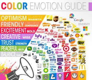
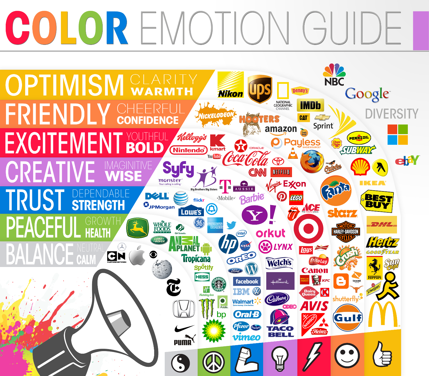
On The Logo Company blog, they designed an infographic showing how varying colors impacted emotions and how these emotions were tied with the dominant color of logos from around the world. These emotional impacts drive home the point that visual branding strategies begin with looking back - how identifying who the brand is, what they represent, and/or what they want to become is the first step in determining a successful color component the brand.
For instance, on the chart, green is associated with growth and health, and the logos that have green as the dominant color tend to rely on the portrayal of these two emotions/feelings to successfully market their brand, such as food-brand logos from Tropicana and Whole Foods, who obviously want to be seen as healthy brands.
An interesting emotional connection is show just to the outside of the "rings" of the main guide. The logos for NBC, Google, Microsoft and eBay are all listed next to "Diversity" and sit to the peripheral the guide due to the multicolored inclusions. All of these brands are known for (or hope to be known for) their wide-ranging brand portfolios. Their brands serves as umbrellas for a number of smaller sub-brands, many of which span the industrial spectrum. These logos are perfect examples for thinking outside the box when determining your brand color. Why settle for a monotone look that only partially describes your offerings? Instead, show the audience through your logo that you are multifaceted and have "earned" your rainbow of brand colors.
This can work against at brand, as well - you wouldn't want to begin your strategy for a brand that is a leader in the financial sector with a logo that conveys youthfulness and boldness, so it would be wise to consider how much red you'll include.
Once again, as we've seen in brand strategy discussions many times, knowing who and what your brand is can be just as important to success as having the perfect logo or name.

Addison Whitney is a global branding firm with a passion for building strong brands.
To learn more about Addison Whitney, visit our website at AddisonWhitney.com, or contact us here.