5 Ways to Ease Social Media Branding Worries
The question whether or not to have a presence on at least one social media platform has become an easy one for brands – without any social media existence, a brand will be left out of one of the fastest-growing and increasingly vital aspect of a branding experience.
But now that it’s rightfully assumed that your brand will be a player in the social space, it’s also rightfully assumed there will be some trepidation. A brand, especially those newly formed or refreshed, is a delicate entity, still finding its way and looking for anything solid and safe to hold onto – and social media can be anything but those two.
One way to reassure those with worries that your brand will begin to spiral out of control the moment that first tweet is sent is to go in with a plan. Treat social media strategically, as you would any other aspect of your brand.
Social media strategies that are well-planned and well-executed can elevate your brand, exposing it to a wide audience at little to no monetary cost. It can spread your brand story in new ways and through new mediums that go beyond traditionally advertising, marketing and/or public relations.
What does a good brand social media strategy entail? Here are five key points to include in your plan to help ease the worries when taking your brand into the social media realm:
Find your brand voice.
The best brands on social media have identified their unique brand personality and voice, and incorporated that into all of their messaging. As you prepare your social media strategy, decide where your brand’s personality lies – are you witty and funny, serious and informative or somewhere in the middle? Once you have personified your brand, consistently follow that personality in your social work.
Establish a quality team.
Social media should not be considered a tertiary responsibility, destined to live on the edges of job descriptions and day-to-day priorities. As the brand is being built and the brand strategy developed, consideration should be given to those who will be tasked with social media management. Whether it’s a single person or a team of people, they are the first line of defense when easing social media worries.
Be aware.
At the end of each year, there are countless brand social media “fail” lists that are inevitably populated by brands that were unaware of their surroundings and showing their obliviousness to the world to disastrous results. Don’t find yourself on one of these lists – ensure that those in charge of your social media outlets know what is happening around them – whether it be current events, unexpected tragedies or sensitive topics – and that they know how to keep your messaging tasteful and on brand.
Stay in touch.
Hopefully, your brand will quickly gain or grow fans and followers, some of whom will want to interact. This can be a tenuous line to walk, as your brand must seem accessible and engaging while also knowing when it’s best to step away. This is likely one of the points that come up in the nightmares of brands as they are beginning in social media, but it is one that can be easily managed and have great benefit.
Don’t forget the visuals.
Social media isn’t just a verbal branding opportunity, but one for your visual brand as well. As it is with most verbal brand aspects, consistency is key – logos should be brand standards-compliant across any platforms where your brand has a presence, in addition to any pictures or videos posted. As it is with visual branding overall, it is often the first impression the audience gets of your brand, and this is especially true in the quick-glance world of social media.
Addison Whitney is a global branding firm with a passion for building strong brands.
To learn more about Addison Whitney, visit our website at AddisonWhitney.com, or contact us here.
Live Long and Prosper: The Secret to Brand Longevity
Everyone wants a brand that will live on for many years, basking in long-lasting success. But few brands actually reach old age, and those that do definitely have something going for them.
Recently, Unum, a financial insurance company, put together an infographic of some of the world’s oldest brands, highlighting those who all can boast founding years prior to 1890.
As can be expected, a list of brands from across the industry spectrum seem to have little in common on the surface, but throughout the infographic a common theme emerges. Each of these enduring and successful brands have long-ago identified how they can differentiate themselves from the competition, and put that quality (or qualities) as the centerpiece of their branding.
This is a lesson that can be applied to newly formed startups still finding their way, as well as brands that have an extensive history. In either situation, the key is finding out where you brand will fit into the landscape of your marketplace – for instance, does your brand have a highly recognizable visual branding element like Cadbury’s unique purple color scheme and “glass and a half” logo? Then establish your branding around maximizing this element and connecting the rest of your brand strategy to its focus.
Your unique characteristic doesn’t have to just be a physical part of your brand – it can also emanate from your audiences’ view of what the brand represents. This is especially beneficial for older brands, as they have a wealth of history to search and find their outstanding characteristic.
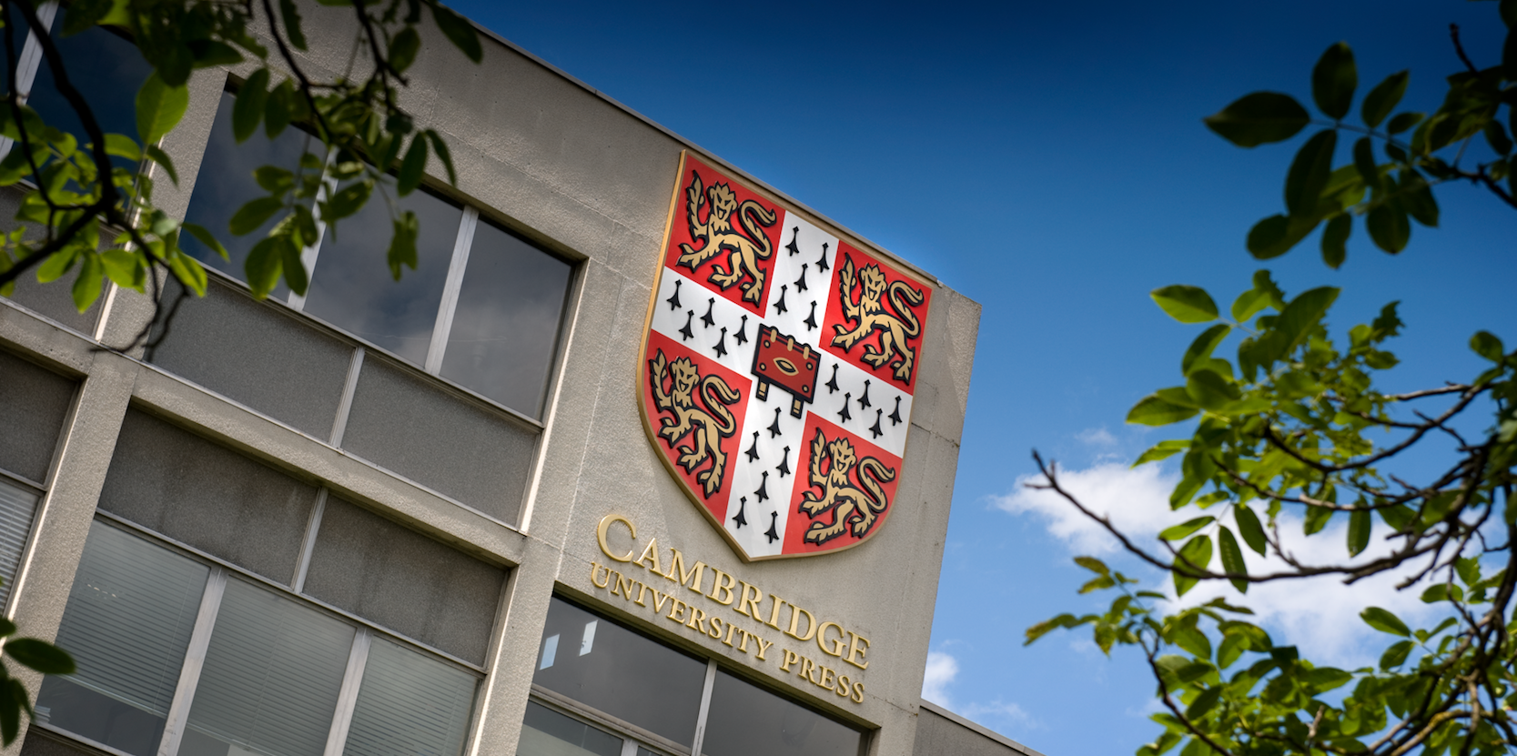
The oldest brand on this list, the Cambridge University Press, was founded in 1534 (given their charter by Henry VII and holding the title of the world’s oldest publishing house) and is arguably the benchmark for brand longevity.
So what’s their secret? Well, their success can partly be attributed to their gleaming reputation. Know around the world as one of the preeminent publishing brands, they have endured throughout nearly half of a millennium of literary trends and publishing evolution, growing the Press around the world and being the home of some of the greatest titles in history.
But the job doesn’t stop when the differentiation is identified. What these brands have done, along with many other successful brands, is stick to the script – that is, they take the best aspect(s) of their brand and continue to improve and enhance, instead of consistently changing.
Evolution of a brand isn’t necessarily a path to failure, but instead is dependent on smart evolution. Using keen brand strategy to know when and how much to evolve, in addition to knowing how to keep your core intact during any changes.
While startups and newer brands are devoid of well-established reputations or traditions, they are in the often-enviable position of shaping their original brand strategy around the best characteristics of their brand. Without previous iterations to shape the strategic planning, they are presented with a clean slate of branding directions and areas of potential differentiation that will hopefully land them on a “world’s oldest brands” list a few centuries from now.
So whether you are a founding member of a new and exciting organization, or a part of a brand older than some nations, a clear focus on differentiation and a commitment to put it at the center of your branding will go a long way in extending your brand’s lifespan.
Addison Whitney is a global branding firm with a passion for building strong brands.
To learn more about Addison Whitney, visit our website at AddisonWhitney.com, or contact us here.
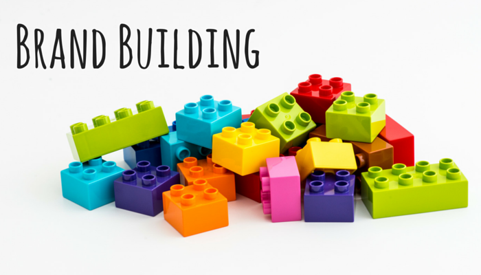
3 Ways Building a Brand is Like Working with Legos (Plus 1 Way it’s Not)
For almost 60 years, Lego bricks have been a favorite toy for millions of kids (and some adults) around the world. In fact, they have been named “Toy of the Century” two times – a feat that’s almost as impressive as the math is mind-blowing.
One of the toy’s most appealing characteristics is the ability it gives users to flex their creative and engineering muscles, creating something out of nothing and ending up with a finished product they can be proud of.
Building a brand can produce the same sense of accomplishment as placing the final brick on that perfect Lego creation, and the creation processes included in both are very similar. Here are three ways brand building and brand strategy creation are like working with Legos, plus one important difference:
- Expect (and Appreciate) the Unexpected. Often you find the correct pieces to complete the building in unexpected places – that random red brick that allows for the building to stand falls in line with the unexpected brand element that comes seemingly out of nowhere to fit right in line with the overall brand.
- It Takes a Village to Build the Castle. Brand building is an all-hands-on-deck experience, with vital perspectives necessary from a number of areas of the business. This ensures that all
 bases are covered and that the resulting brand is comprehensive and applicable across the board. Anyone who has opened a box of Legos for a pre-designed structure know that each piece, no matter how big or how small, is crucial to complete the overall build.
 - It’s OK to Go a Little Crazy. Each brand is different, and there is no blueprint for what makes a successful brand that fits with every situation, and therefore it’s encouraged to think outside the box. Sometimes these are the ideas that bring it all together, filling a space that would have gone overlooked if creativity was taken out of the equation, just as it would be if you only followed the printed instructions for Lego building – how much fun is that?

However, the link between these two activities does have one exception:
- Know Where the Build is Taking You. There are times when you just start grabbing Lego bricks and putting them together with no idea what the final result will be. While this is a great creative outlet, it is not a sound brand strategy. Knowing where you want your brand to end up and having at least a general idea of the finished product will drive each action and decision to a common point, eliminating the time (and money) wasting that could derive from an unstructured branding process.
Even with the one exclusion to the list, building a brand and building with Legos should have the same end result – a successful production of something great for you and those around you.
Addison Whitney is a global branding firm with a passion for building strong brands.
To learn more about Addison Whitney, visit our website at AddisonWhitney.com, or contact us here.
Why You Should Never Close the Story on Your Brand
"A great brand is a story that's never completely told." – Scott Bedbury
Adaptability. It’s a word that has been used on this very blog to describe how logo design needs to include versatile elements to adapt to a digitally-focused media world, but the same concept can (and should) be tied back to the entirety of a brand.
To me, there are few things more frustrating than hearing that the reasons something hasn’t changed is because “that’s the way it’s always been done.” Showing a deliberate avoidance of any sense of evolution without true reasoning is a first-class ticket to failure. Industries and marketplaces change constantly – and in order to stay relevant, so must your branding.
The above quote from Scott Bedbury perfectly in line with the concept of brand adaptability. A great brand is one who never really reaches the end of their story – they are an ongoing manuscript, ![]() adding new pages as the world around them moves forward, shifting their branding strategies not just to fit the new landscape, but to continuously find that area of differentiation that will set them apart from the competition and allow them to rise above the branding fray.
adding new pages as the world around them moves forward, shifting their branding strategies not just to fit the new landscape, but to continuously find that area of differentiation that will set them apart from the competition and allow them to rise above the branding fray.
These brands are self-aware about their place in the market and proactive in anticipating how that place can shift suddenly and without notice – they are the ones who always seem to be ahead of the curve, never caught flat-footed by the winds of change. That’s not an accident. That is the result of creating a brand that can evolve when needed without compromising the overall brand integrity.
But take note that an adaptive brand is not synonymous with multiple total rebrands. In fact, it falls more in line with brand shifts instead of brand refreshes. A rebrand or brand refresh takes time, money, effort both in the branding process and immediately following, when the new brand must be communicated and try to build brand equity.
The equity earned through time on the market can often be the most valuable commodity available to the brand, and to restart this process instead of using it to their advantage is a missed opportunity to ease the burden of adapting their strategy.
For instance, if there is a brand who has been on the market for 40 years with a logo that has become outdated, it would be unwise to group the rest of the brand elements in with an updated logo  – instead, find the most recognizable and timeless elements of the logo and adapt them to fit your new direction, much like the logos shown to the right. That way, the new logo and any associate branding assets can be bolstered by the foundation laid throughout the brand’s previous history while simultaneously adding to the story as needed.
The brands who have found success in this area don’t rewrite their story, they simply add a new chapter, one connects their past with the needs of their future, and leaves the door open for what comes next.
Addison Whitney is a global branding firm with a passion for building strong brands.
To learn more about Addison Whitney, visit our website at AddisonWhitney.com, or contact us here.
Getting the Thumbs Up: The Importance of Audience Buy-In for Your Brand
For as long as I can remember, my wife and I have a tradition when watching movie previews at the theater. It’s something that is almost an automatic response following each one – we turn into Siskel and Ebert, giving thumbs-up or thumbs-down judgments on whether we’d go see that particular movie based solely on the just-ended preview.
These previews don’t have the time or the ability to tell the whole story for the movie – they are there to tell you how they want you to feel about the movie in a way they think will convince you that it is worthy of your time and (exceedingly increasing amounts of) money. They condense all of the time, money and hard work spent to create the cinematic adventure into a summarized story, which must get you to believe in their brand (the movie) enough to give it the thumbs up.
This is in line with how many consumers interact with a brand – the immense amount of background behind a perfect brand strategy and brand implementation must be pared down into bite-sized pieces for consumption, with the hope that these “brand nuggets” will tell the brand story in a way that the audience buys into your brand as a whole.
But this is where it can get tricky. Just as those working on movie trailers don’t set out to create one that earns an immediate thumbs-down, your branding efforts won’t be created to cause potential branding missteps. The issue lies therein – what you say doesn’t have any impact unless it aligns with how it makes your audience feel.
We’ve all seen the advertisements making big promises and brand statements about a brand. But these can become empty messages if the intended audience doesn’t connect with in a way that allows for them to believe in the brand.
When creating a brand strategy, there must be significant time and effort spent on identifying the correct messaging tactics to carry the brand flag out to the marketplace, gaining that all-important emotional agreement by the audience.
But how is this done? Well, the entire process doesn’t lend itself too well for a blog post, but here are three main guidelines to keep in mind when creating a brand that correctly speaks and connects with your audience:
- Find out who your friends are. In the aforementioned movie trailer example, often a thumbs-up reaction is given to movies that may actually be very good, but that just don’t speak to us – most of the time, this is because we aren’t the intended audience. Every brand has a core market who will understand what the brand is saying, and be more inclined to buy-in.
- Stay true to yourself. What you say about your brand must be in line with who your brand really is. When branding efforts start to go the way of being who they aren’t, they are putting a roadblock in the middle of their path to success. Buy-in comes from the brand-nugget consumption, which must be a scaled down version of the true brand, not a false representation.
- Don’t forget the rest of your brand elements. A good brand isn’t just a strong strategy and on-target messaging. Both the visual branding and verbal branding aspects are important pieces of the brand puzzle, and have their own set of emotional connections that can be made. The all-around consistently great brand will far exceed the success of a brand who can only point to one area of its branding as above average.
Addison Whitney is a global branding firm with a passion for building strong brands.
To learn more about Addison Whitney, visit our website at AddisonWhitney.com, or contact us here.
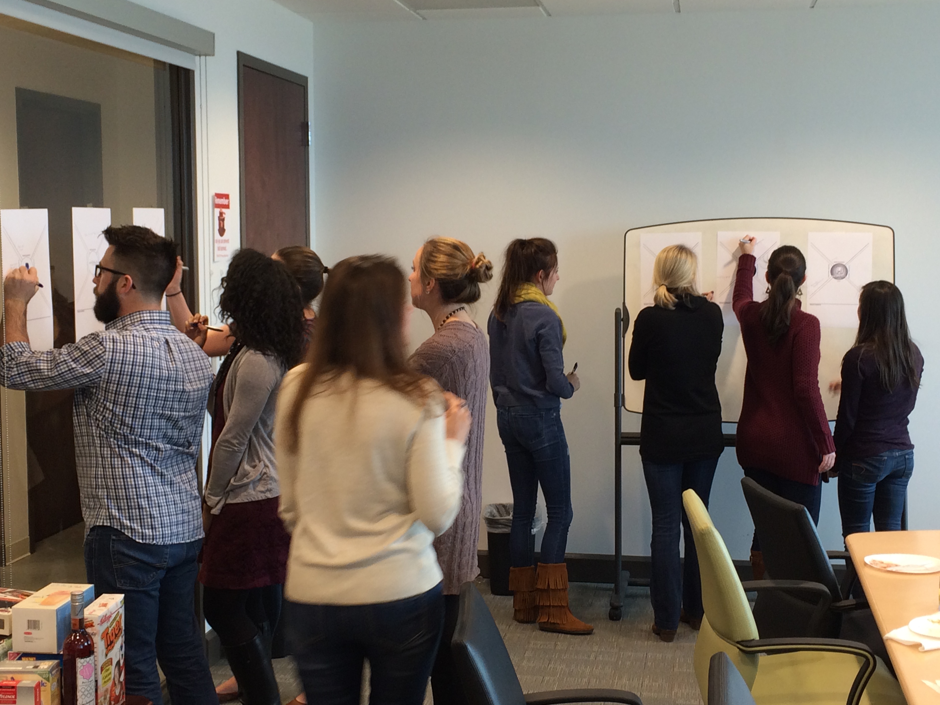
AW in Review - Addison Whitney Brand Salsa Recap 2.19.16
Welcome to the first February edition of the AW in Review! This is our roundup of our latest brand salsa and Addison Whitney news and posts!
Don’t forget, you can stay up-to-date with everything from Addison Whitney by joining the conversation with us on our social media channels – Twitter, Facebook, LinkedIn and Google+.
7 Tips for Making Your Logo the Crown Jewel of Your Brand
As the saying goes, you never get a second chance to make a first impression. For brands, that first impression often comes when the audience initially sees its logo. Without a strong visual brand 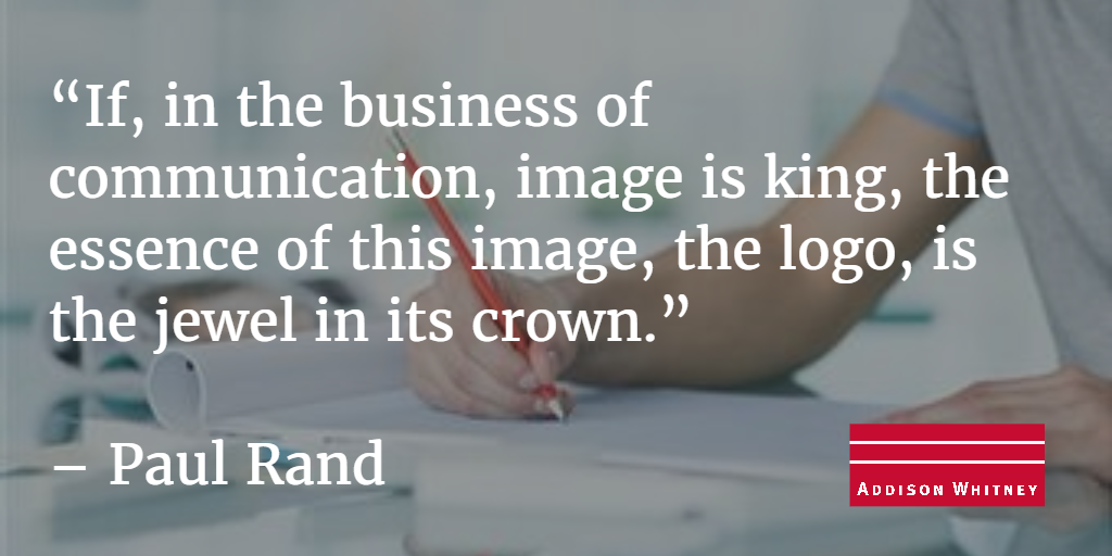 representation, any following movement toward branding success can be doomed to be an uphill climb.
So to help nail down a successful first impression, here are 7 tips to ensuring that your logo lives up to its place as the crown jewel of your brand’s image. Read More...
Addison Whitney Brand Fanatics Recap and Analyze Brand Impacts from Super Bowl Ads
The Super Bowl. Not only the biggest football game of the year, it’s also the biggest game in the advertising world. Many millions of dollars are spent on the annual event, which puts even more pressure on the created ads to push the needle for their brands.
And with a night full of high-profile brand decisions, we knew that time needed to be spent analyzing the commercials and the brands behind them – so on the Monday following the big game, our Addison Whitney brand fanatics gathered to do just that. Read More...
Long Term vs. Short Term Benefits of Rebranding
If the current visual brand is holding a company back from reaching its full potential, introducing a new direction (and absorbing the initial financial cost that comes with it) may be well worth it.
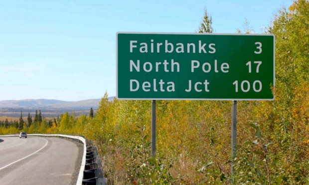
Regardless of the brand, consistency across the board is a vital component. Without it, much like the current state of highway signs, you may find yourself neither here nor there. Read More...
How to Keep Your Brand Update from Falling Short
A brand refresh or a complete rebrand are events in an organization’s life cycle that call for big investments and big planning, as they can shape an entire brand for many years to come. The real purpose of a brand refresh or rebrand can get lost without a strong change factor to back it up.
Your new brand elements and your brand story must align, or else it can seem like your big brand announcement is much ado about nothing. Read More...
Addison Whitney is a global branding firm with a passion for building strong brands.
To learn more about Addison Whitney, visit our website at AddisonWhitney.com, or contact us here.
7 Tips for Making Your Logo the Crown Jewel of Your Brand
“If, in the business of communication, image is king, the essence of this image, the logo, is the jewel in its crown”. – Paul Rand
As the saying goes, you never get a second chance to make a first impression. For brands, that first impression often comes when the audience initially sees its logo. Without a strong visual brand representation, any following movement toward branding success can be doomed to be an uphill climb. As Paul Rand points out, your brand’s image is a massive aspect of its brand, and your logo is the centerpiece.
So to help nail down a successful first impression, here are 7 tips to ensuring that your logo lives up to its place as the crown jewel of your brand’s image.
- Know who your logo will speak to and design to what you want it to say to them. Your design choices for a new soft drink logo should not also be your choices when creating a logo for an accounting firm. Your logo is often the first interaction an audience has with your brand, so their decisions about your brand will be largely based on the logo – make sure it speaks correctly of your overall brand.

- Connect the colors of your logo to what fits what emotions your brand represents. Simply put, color drives emotional responses. Certain colors are connected with specific emotions, and much like your overall design, color choices should fit with what your brand exemplifies. This is also another reason to begin the logo design process by identifying specific brand characteristics that will drive the ensuing branding decisions.
- Don’t let it become a one-trick pony. Keep in mind that logo versatility is vital. In today’s digitally-driven world, logos are called on to live on mediums that can vary from an embroidered shirt to a mobile app, and a great logo does so with equal success. Black and white, color, big, small, on a screen or in real life – these are just some of the boxes that good logos must check as areas in which they are compliant.
- Trends come and go. A good logo can last (close to) forever. There are some new design trends that provide a welcome update to traditional ways of thinking, and then there are some that are destined to be “blink and they’re gone” fads. Those logos that fall for the “next big thing” that turns out to be just the opposite are then left with an outdated-looking logo that is begging for a redesign, which can be costly and time consuming. Solid, quality, foundational design principles never go out of style, and those logos that can successfully walk the line between new and classic are destined to become timeless on their own.
- Confusion is never a good logo result – clarity in what your logo represents and how it ties back with your brand strategy can ensure long-term success. If a customer looks at your logo and doesn’t come away with at least a minimal understand of what the brand’s purpose is, then the logo is not doing its job. This is not to say that the logo has to scream out your brand’s offerings (no need to necessarily put food in a grocery store logo), but the link between the logo and the brand messaging shouldn’t look like a maze.
- It’s not what you say, it’s how you say it – your font choices speak almost as loud as the words themselves. Your font is a crucial piece of the overall logo design and can communicate your message just as much as any other visual element – take note of the variety of choices available and find one that can comfortably fit within your overall visual brand.
- Sometimes, simple is successful. In a recent study, it was discovered that 95% of the companies researched used only one or two colors total in their logos. Simplicity in color choices not only reinforces the aforementioned emotional connection with a color, but it also has become the trend as logos are being used in an increasing number of mediums and need to be easily reproduced.

Addison Whitney is a global branding firm with a passion for building strong brands.
To learn more about Addison Whitney, visit our website at AddisonWhitney.com, or contact us here.
Addison Whitney Brand Fanatics Recap and Analyze Brand Impacts from Super Bowl Ads
The Super Bowl. Not only the biggest football game of the year, it’s also the biggest game in the advertising world. Many millions of dollars are spent on the annual event, which puts even more pressure on the created ads to push the needle for their brands.
And with a night full of high-profile brand decisions, we knew that time needed to be spent analyzing the commercials and the brands behind them – so on the Monday following the big game, our Addison Whitney brand fanatics gathered to do just that.
Right off the bat, our brand fanatics examined what their pre-conceived notions are for the various brands – what do we feel about the brand prior to seeing the commercials? This brand conception exercise served as the foundation for discussions post-commercial, where we identified four areas of each brand’s perception – target audience, emotional benefits, functional benefits, brand elements and tone.
Once the commercials for the highlighted brands were watched one more time, the discussion switched to how they lined up with the aforementioned brand perspectives. Did they align with how our audience previously saw the brand? Or did they feature a departure, whether intentional or unintentional, that signals a change of how we see and think of the brand?
One of the themes that came out of this year’s Super Bowl advertising was the trend of brands to focus on specific sub-brand within their portfolio instead of the overarching brand story. The Honda commercials for the Ridgeline trucks were cited as a perfect of this, where the Ridgeline brand characteristics were highlighted, overriding previous Honda perceptions.
Those brands who stayed more on-target with their overall brand connotation seemed to show a strong sense of brand awareness and a strategy that has stood the test of time. Bud Light’s brand image has largely gone unchanged in past years, and their advertisements this time around looked to continue and strengthen these perceptions.
 They are the brands with a certain comfort level to what their brand perception is, and are using the Super Bowl platform to continue this brand instead of trying to break new ground with their strategy. Especially when their target audience is very well-defined and fits within what their brand represents, these organizations are more likely to use their ads to reinforce their traditional messaging for their audience.
Self-awareness is another desired characteristic when it comes to advertisement strategy and Super Bowl messaging – brands who are comfortable with where they stand in the market. With many advertisements focusing on brands taking a “new direction” with their strategy, those brands who stuck with who they are stood out among the crowd.
These brands were banking on their already established brand equity to carry some of the load in messaging, using their ad time to push a specific narrative that is buoyed by their brand equity that is assumed to be present.
Overall, it was another successful AW Super Bowl Ad recap – now we want to hear your thoughts! Leave a comment or reply to us on our social channels and let us know what your favorite ad was, and how you think the brands involved impacted their branding efforts!
Addison Whitney is a global branding firm with a passion for building strong brands.
To learn more about Addison Whitney, visit our website at AddisonWhitney.com, or contact us here.
Long Term vs. Short Term Benefits of Rebranding
Today we are excited to have a guest blog from Senior Graphic Designer Dave Dixon!
Studies like Logos Now, which we highlighted on brand salsa last October, have repeatedly shown that the strongest, most recognized brands are those of companies like Apple, Nike, and Coca-Cola. But that doesn’t mean those companies, or any companies in general, have a monopoly on branding, particularly when it comes to visual branding.
In fact, one of the most widely seen – yet often unnoticed – forms of visual branding comes from the government, in the form of highway traffic signs. While the purposely bland, utilitarian nature of traffic signs may seem like a form of anti-branding, the typography they employ offers several useful parallels to the efforts of corporate brands.
In 2004, the U.S. Federal Highways Administration (FHWA) approved the use of a new font for highway traffic signs. The font, called Clearview, was developed specifically to improve the legibility of highway signs. Tests showed that it was a success, with Clearview providing roughly 1.2 seconds of extra reading time over its typographic predecessor, Highway Gothic. However, on January 25, 2016, the FHWA announced that Clearview was no longer approved for use on American highways.
So after 12 years, why the change?
As it turns out, there are likely several factors at play, with the biggest being the fact that the FHWA never officially mandated the move from Highway Gothic to Clearview. Instead, they simply approved the new font for interim use, leaving it up to individual states to implement it (or not) as they saw fit.
One other factor that may have influenced the decision is cost. While Highway Gothic has been in use across the country for more than 60 years, state and local governments who adopt Clearview must purchase a font license, which can reach up to $795 for the full family of typefaces – for each individual user.
Unsurprisingly, implementation of the new font has been inconsistent. With no clear mandate and a financial obstacle in the way, only slightly more than half of U.S. states have adopted Clearview for their highways signs. Furthermore, inconsistencies remain even within individual states, as local governments have sometimes instituted the new font while the rest of the state officially
continues to use the old one.
It’s not difficult to see how consistency is an important characteristic for road signs. Regularly travelling at speeds as high as 70 or 80 miles per hour, drivers rely on being able to quickly and 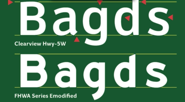 accurately gather information and make decisions. And while it may not be as readily apparent, this lesson applies equally to corporate branding. In a crowded marketplace, potential customers also rely on being able to easily find the information they need to make purchasing decisions. It becomes vital for companies to maintain a consistent look and feel not only for their typography, but also for their logo, color palette, and other visual signifiers that set their brand apart.
The FHWA’s decision also highlights another issue – the short-term vs. long-term benefits of rebranding. The cost for state and local governments to acquire Clearview may indeed be an immediate burden on already strained annual budgets. However, with the research indicating that the change provided drivers with valuable extra seconds, when does the benefit begin to outweigh that financial burden? A font license is, after all, a one-time cost.
In the same vein, corporate brand equity isn’t to be taken lightly or sacrificed on a whim. But if the current visual brand is holding a company back from reaching its full potential, introducing a new direction (and absorbing the initial financial cost that comes with it) may be well worth it. Regardless of the brand, consistency across the board is a vital component. Without it, much like the current state of highway signs, you may find yourself neither here nor there.
Image Sources:
https://www.citylab.com/commute/2016/01/official-united-states-highway-sign-font-clearview/427068/
https://qz.com/605695/font-designers-response-the-us-governments-has-decided-to-nix-clearview-from-all-highway-signs/
Addison Whitney is a global branding firm with a passion for building strong brands.
To learn more about Addison Whitney, visit our website at AddisonWhitney.com, or contact us here.
How to Keep your Brand Update from Falling Short
A brand refresh or a complete rebrand are events in an organization’s life cycle that call for big investments and big planning, as they can shape an entire brand for many years to come. Not to mention, the amount of money necessary for completing a full implementation of a new brand can greatly impact an organization’s budget, especially for the immediate launch.
The scale of a change like this requires an implementation plan. It is rare that a company has a whole team standing aside with their sole responsibility to implement a brand.
For instance, with the new Alaska Airlines rebranding efforts, the implementation included painting planes, sending out new credit cards to members, updating such brand touch points as signage in airports, plane interiors and uniforms, and much more. This doesn’t even take into account the time and money spent by their marketing and public relations teams in publicizing and notifying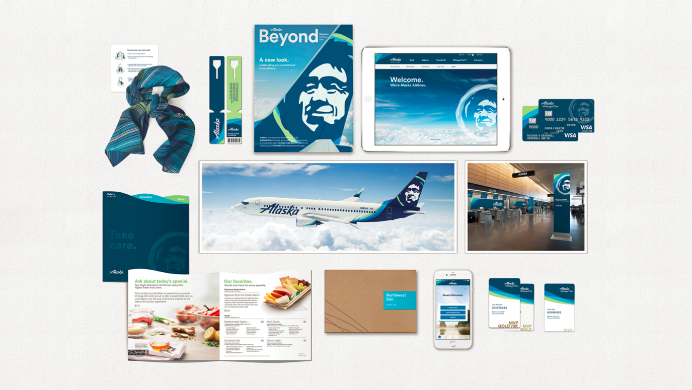 their audience about the changes.
This is one of the (many) reasons why a brand refresh or rebrand shouldn’t be taken lightly, and why it’s often best to leave much of the work to branding professionals, who can align the teams involved while creating a well-rounded strategy that successfully connects the new brand’s vision with the brand elements.
The real purpose of the rebrand can also get lost without a strong change factor to back it up. Alaska Airlines commented on the change by saying, “Our values stay the same, but it’s time for our brand to show up bigger.” They have long since expanded their reach outside of the Pacific Northwest, now reaching as far as Mexico and the east coast of the U.S. Their brand had such strong connotation to their original markets (which their brand name only helped to strengthen) that the organization felt a brand overhaul was necessary to break out of their market “bubble” and represent where they stand currently.
This is one of the most common reasons for a brand refresh or a rebrand – the old brand simply doesn’t accurately represent what the organization used to offer, and not what they offer now or what they want to stand for. Another brand following this strategy for a rebrand/brand refresh is Google, who created the Alphabet brand to better encompass the wider array of services outside of search that fall under the brand umbrella.
Evaluating Your Brand - Are You Due for a Refresh or a Rebrand?
However, with the Alaska Airlines brand update, the change was disproportional to the stated goal. In other words, the eskimo head did get bigger, but as for the brand itself… not much has really changed. Despite big statements about their brand “overhaul” and a new beginning for a new brand, when mostly the only rebranding that’s been done is kept the same brand image and added a splash of color, their audience may not be as inclined to believe 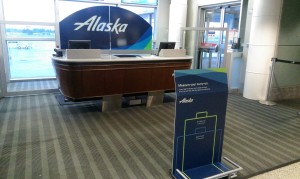 their rhetoric.
If the boxes are checked and the time is right, a brand refresh or rebrand could be just what your organization needs. However, the work doesn’t end when the new brand is rolled out. Your new brand elements and your brand story must align, or else it can seem like your big brand announcement is much ado about nothing.
Addison Whitney is a global branding firm with a passion for building strong brands.
To learn more about Addison Whitney, visit our website at AddisonWhitney.com, or contact us here.