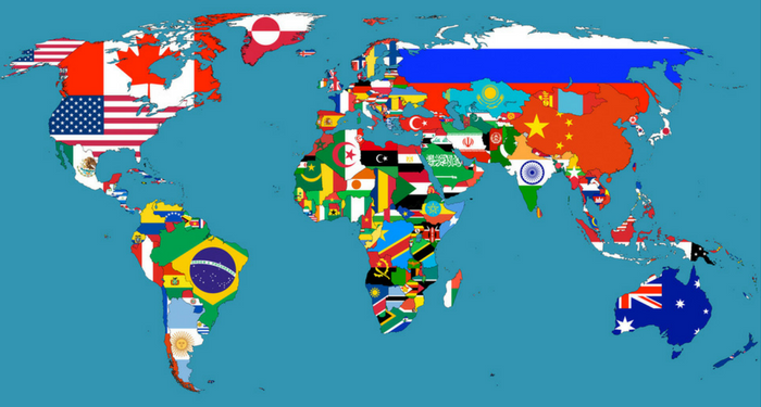
Iconic Logo Timeline Shows There's No One Way to Evolve
Logo evolution is a natural part of the branding process. In fact, the evolution of the overall brand is common, and often necessary, in order to keep up with the latest advancements in the marketplace and ever-changing consumer mindset. But how a logo "should" evolve is still up for debate.
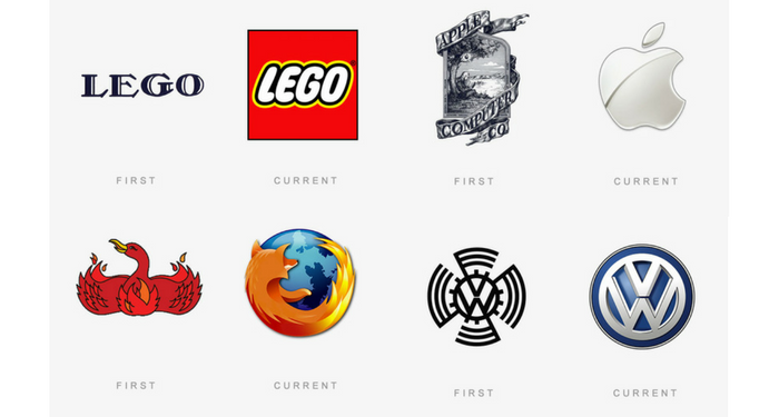
The below infographic by The Logo Company shows how a number of iconic brands have tweaked and shaped their logos over the years. And one thing is abundantly clear: the debate on whether there is a single definitive way to evolve a logo is over. The data overwhelmingly disputes the validity of one-size-fits-all logo evolution, driving home the point that each logo should keep the brand at top of mind and at the forefront of its evolution.
Dave Dixon, Senior Graphic Designer at Addison Whitney, sees a number of unique strategies within the logo evolution examples.
"A lot of these, like BMW, VW, and Shell, have really focused on using logo evolution to clean up and streamline their logos," he says. "To me, that indicates strong brand equity and a logo that illustrates the importance of brand building over communicating something extremely specific. The Shell logo, for example, doesn’t tell you that it’s a fuel/energy company or anything else about the business. But it’s unique and recognizable, so it does a better job than most other logos.
"The YMCA logo is probably the best example of an organization that felt they needed a new direction. The current logo is pretty clearly more youthful, energetic, and fun than the previous versions. It seems more friendly and accessible, which is a departure from the earlier logos."
He points out that the Windows logo is possibly the most interesting progression, mentioning how it has almost come full circle at this point - the current logo has far more in common with the original logo than with any of the iterations in between, speaking to the importance of simplicity and recognition over specificity and trendiness.
Full-circle logo design, new directions, specific communication vs. brand building efforts - the evolution of brands and logos has it all, and more. The one thing in common for them all is that they are all done within the premise of building a strong brand, and stressing the importance of continuity among the most recognizable brand elements. Whether it is a color scheme, a shape or a wordmark, a good logo evolution will build on the existing brand equity. Even if they all take use different blueprints in the building process.
AW in Review - Addison Whitney Brand Salsa Recap 9.23.16
Welcome to our fall-is-finally-here edition of the AW in Review, our roundup of our latest brand salsa and Addison Whitney news and posts!
Don’t forget, you can stay up-to-date with everything from Addison Whitney by joining the conversation with us on our social media channels – Twitter, Facebook, LinkedIn and Google+.
Function Or Feeling – How Will You Position Your Brand?
Successful brands have purpose. They have pre-determined areas of differentiation and a target audience. They have a brand position. With this sense of direction, they can focus their branding efforts in the same direction, allowing for the full effectiveness to shine through.
When creating your positioning strategy, there are two main aspects to use as starting points – function or feeling. But which one’s right for your brand? Read More...
Brand Loyalty – How Easy Is It To Achieve?
We all value loyalty – it’s one of the main reasons people get dogs as pets. It’s also why brand loyalty is such a prized accomplishment when brand building.
Fear not, brand creators. Achieving brand loyalty can be done. The first step is to believe that it can be done, and be done with the brand you will have – take the aforementioned reasons for dismissing and take them out of the equation. Read More...
When Less Is More In Logo Design And Visual Branding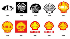
As brands and logos have evolved over the last several years, it’s become evident that simplicity and minimalistic design is a key new direction for modern brand marketing.
Even the most iconic brands and logos are following the mindset of “less is more” when it comes to their designs. From less detailed images to geometrically-inspired outlines, brands are embracing a clutter less existence. Read More...
Brand Engagement In An Ever-Connected Marketplace
In the not-so-distant past, brand engagement was, like most media and advertising efforts, easily calculated, tracked and controlled. This is no longer the case.
Today, brands are faced with both the ease and the issues that come with online brand engagement opportunities, where measurement is tracked via software programs and engagement rates are dependent on the consumer. Read More...
Function or Feeling - How Will You Position Your Brand?
Nobody wants a directionless brand. Wandering through the consumer world, aimlessly latching on to the newest flavor of the month trend, hoping to find where it truly belongs.
Successful brands have purpose. They have pre-determined areas of differentiation and a target audience. They have a brand position. With this sense of direction, they can focus their branding efforts in the same direction, allowing for the full effectiveness to shine through.
So we now understand that your brand needs a position. The next question is – what is that position going to look like? When creating your positioning strategy, there are two main aspects to use as starting points – function or feeling. But which one’s right for your brand?
FUNCTION:
These brands are built on the foundation of their product or service. With the goal of owning their competitive space, the brand elements all tie back to the points of differentiation between them and the competition.
For instance, Under Armour has built its brand on the strength of its product, specifically its unique athletic wear characteristics. It came into the market touting a product that was unprecedented in the athletic wear space, and Under Armour has taken that advantage as the centerpiece of its brand. Even as it has expanded into other product lines, the brand continues to harken back to itself as a solution to common athletic-related problems across the board.
In taking this course of action, a brand must plan not only for today, but for the future. Will your coming products and/or services be able to live up to the standard set by the brand? It’s not enough to have one revolutionary piece to the puzzle, but to position yourself as a functional brand, subsequent pieces much fit much the same way.
This is welcome news to brands that thrive in innovation. Under Armour, Apple, Google – these brands strive to be known for their breakthroughs, and have lived up to the challenge consistently, and as such they have built their brands around this fact. They want their brand to stand out as the leaders in creating products that provide solutions and outstanding experiences for their consumers, time and time again.
FEELING:
Connection. Happiness. Satisfaction. The brands who position themselves through feeling are searching for the necessary alignment with these reactions by their consumers. Their goal is to go beyond that initial interaction an establish an emotional connection that drives brand loyalty and builds brand equity.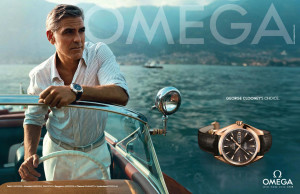
Some of these feelings are reactionary, and some are aspirational. Reactionary-focused brands will look to highlight the immediate feeling or emotional response that comes with brand interaction. Whether it is a beverage brand touting its great taste or a food brand highlighting its healthiness, how the consumer reacts (or hopefully reacts) is the centerpiece of the branding efforts.
Aspirational brands want to shape how the consumer feels, creating and driving home their intended emotional connotations. Luxury brands often lead the way in aspirational feeling branding, positioning themselves as the source of consumer pride – elegant, wealthy, high-class, etc. Their goal is to be the brand that makes the consumer hope to achieve some sort of unattained goal or feeling.
Image Sources
Image 1
Image 2
Header Image
Brand Loyalty - How Easy is it to Achieve?
We all value loyalty – it’s one of the main reasons people get dogs as pets. It’s also why brand loyalty is such a prized accomplishment when brand building.
When a brand achieves brand loyalty, it successfully builds a base of consumers who return, time and time again, to the same brand whenever they are looking for that product or service.
For many brands, however, loyalty as a goal is viewed as a far-off and low-probability achievement, something “that would be nice one day” or “we’d love to get to that place” and filed away as low priority due to its seemingly bumpy road to the finish line.
Why is this so often the case? Why do brands dismiss or doubt their ability to craft a brand that connects with their target audience in such a way? Those brands who have achieved the highest level of consumer loyalty are revered to a point where they are looked at more as myths than relatable situations. Framed as shooting stars within the branding world, these brands are disconnected by many observers from the path they took to reach that point. The struggles, the work, the behind-the-scenes brand development are forgotten by outsiders, and instead the story of overnight success comes to the top, which, for any brand builder, is a definite fantasy.
But fear not, brand creators. Achieving brand loyalty can be done. The first step is to believe that it can be done, and be done with the brand you will have – take the aforementioned reasons for dismissing and take them out of the equation. That is the first step, and the most important.
Once you have checked the box on believing in the brand, the next step is to incorporate this mindset into the brand building.
There are two main options to which a achieve brand loyalty – both of which start at the same place: choosing a distinct end point for the brand. That is, at the end of the day, decide where you want your brand to live in the minds of your consumers.
The first destination is to become the leading brand in your space. Determine the niche where your brand will live, and position it as the premier option. Consumers place high value in quality, and if they find a brand that they feel will give them not only the best experience, but also the sense of peace in consistently top quality, it will immediately jump to the top of the list. Being the leader doesn’t mean just having the best product, it also can be viewed from a customer experience standpoint – in fact, providing a best-in-class customer experience should be at the top of the list for brands. Not only can it elevate your retention and loyalty chances, but it can also bleed over and be a vital aspect of the next option to brand loyalty achievement.
Although harder to quantify, this option is one that will provide the most loyal of brand loyalists - set out with the goal of creating and securing a deep, emotional connection with your audience. These consumers will ride with the brand through the ups and the downs, and will be the most willing to give the benefit of the doubt when negative events occur. These brands make consumers feel a certain way – in addition to satisfaction with the product or service itself, this emotional connection resonates outside of the direct interaction.
Brands can be given a level of loyalty by consumers, where they can rest easy knowing their core base is secure. First, they must believe in the brand and its potential – then, they should set out to build a brand that stands out in the minds of its audience.
Achieving #brand loyalty can be done. The 1st step is to believe that it can be done, & with the brand you will have https://t.co/8rfEMzeDzD pic.twitter.com/R4M9EbLroc
— Addison Whitney (@AddisonWhitney) September 19, 2016
When Less is More in Logo Design and Visual Branding
As brands and logos have evolved over the last several years, it’s become evident that simplicity and minimalistic design is a key new direction for modern brand marketing. Even the most iconic brands and logos are following the mindset of “less is more” when it comes to their designs. From less detailed images to geometrically-inspired outlines, brands are embracing a clutter less existence.
One of the most prominent features of this trend involves tweaking, or in some cases, totally removing, the typographic element of the logo. In a recent article, author Kalle Oskari Mattila examined this shift, highlighted by MasterCard’s recent rebranding, in which their new logo was de-emphasized with the state goal to do away with the text altogether within the logo.
There are a number of good reasons to embrace “less is more” logo design. From a practical standpoint, cleaner and less-cluttered logos are more versatile and work much better on the myriad of platforms on which modern logos must perform. Logos are needed in smaller and smaller iterations, where the decrease in size must not impede the logo’s clarity or ability to represent the brand.
This is especially true when it comes to text – there is a reason why few app logos have any text – as the logo gets smaller, text can quickly turn into a jumbled blob that takes up space without providing real value.
Therefore, if you are a brand with a logo or a visual brand that has the equity to stand on its own and earns immediate recognition from consumers, the choice to “slim down” is a relatively easy one. Some of the biggest brands out there have gone this path – from the McDonald’s golden arches and Nike Swoosh to Starbucks and MasterCard with their own logos.
However, as a new or lesser-known brand, it would be advisable to proceed with caution in this aspect of brand development. It is logical that the removal of a brand name from a logo would decrease ease of recognition and connection between brand and logo, which is a step that is crucial in building a brand. Mattila deems the “debranding” strategy as one “based on paring down that can only be deployed by the most identifiable of brands.”
Additionally, Matilla explains that “Some marketers believe that debranding can make global brands appear ‘less corporate’ and ‘more personal to consumers.’” This personalized feel in corporations is a direct reflection of the way technology and new companies are headed. This is one way for larger, older brands to stay relevant and directly target younger generations with the goal of having them continue using products their grandparents and parents use.
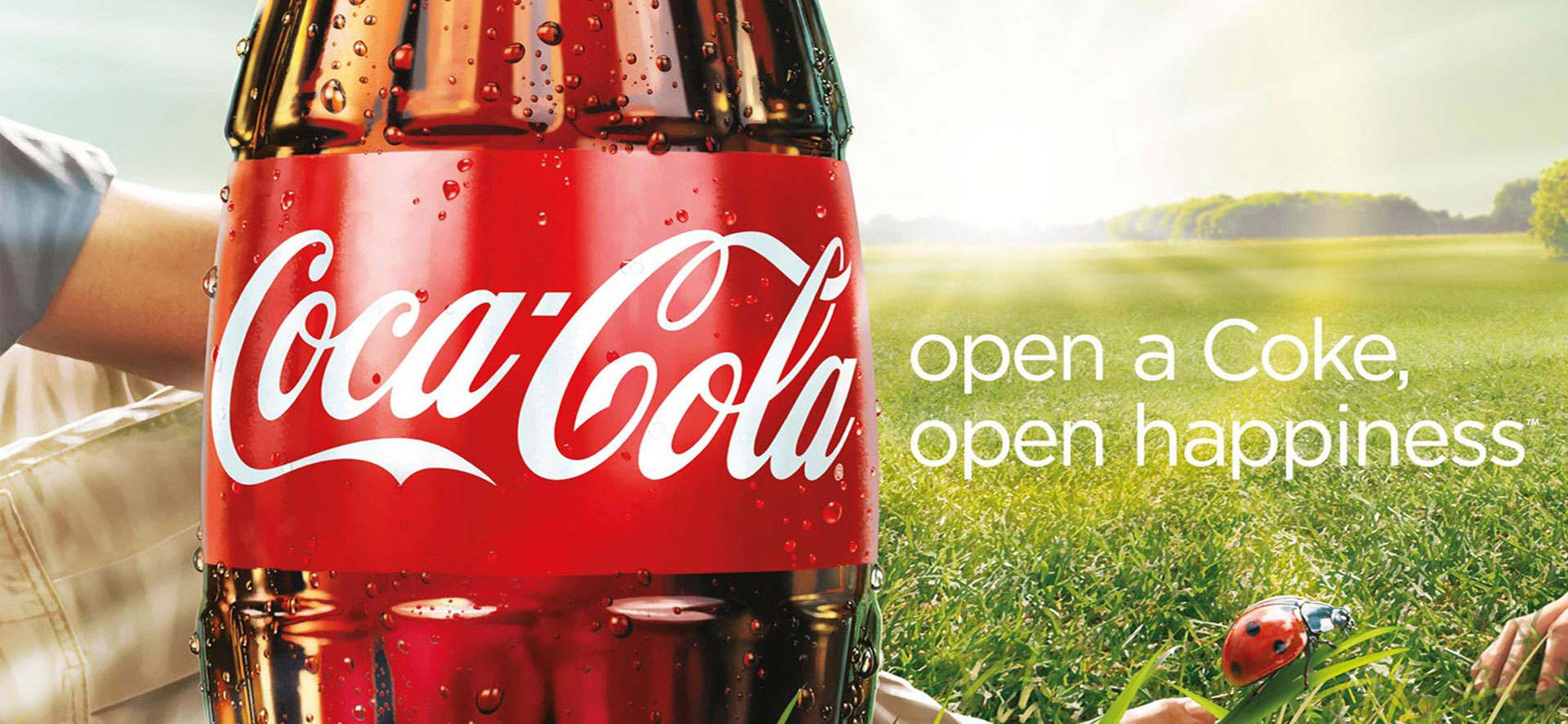
Coca-Cola’s early success with debranding is one of the most prominent examples, namely the “Share a Coke” promotion, where the brand replaced the Coca-Cola name on its bottles for a massive variety of people’s first names, in addition to nicknames and monikers. The campaign was a massive hit with consumers, who sought out bottles which featured their names or the names of loved ones, and provided Coca-Cola with a personalized stamp on each of their products, by simply backing away from the branded aspect and replacing it with an element that connected deeper.
Going with a simpler visual brand and separating text from logos signifies confidence in brand familiarity and its consumers. Debranding takes this a step further by not only showing the consumer that you feel your logo has the equity to stand on its own, but also allowing for an expansion of personalized and authentic branding efforts, designed to strengthen the connection between consumer and brand.
AW in Review - Addison Whitney Brand Salsa Recap 9.9.16
Welcome to our initial September edition of the AW in Review, our roundup of our latest brand salsa and Addison Whitney news and posts!
Don’t forget, you can stay up-to-date with everything from Addison Whitney by joining the conversation with us on our social media channels – Twitter, Facebook, LinkedIn and Google+.
A Cup Of Sugar And Branding Advice – Two Things You Can Get From Your Neighborhood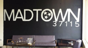
What if I told you that organizations and products across the marketplace could take branding advice from a collection of neighborhoods in Nashville?
In line with a recent trend in demographic identity, the residents are beginning to attach their neighborhood with their own personal brand. In doing so, they have hit a sweet spot in branding, achieving two foundational achievements in building a successful brand. Read More...
Patience Is A (Branding) Virtue
Simply put, brand development is a practice in patience and the ability to stay the course. When creating a brand, especially during the strategic development phase, the end goal may seem a million miles away.
Along those lines, there may be some bumps in the road on the way to success, which will undoubtedly cause some to begin wondering if and when the strategy should be abandoned. Read More...
How To Build Your Brand Portfolio Using A Flagship Brand Strategy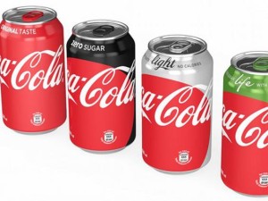
Some organizations are making a strategic brand decision to use elements of a flagship brand as “boosters” for its complementary branding.
For many brand portfolios, this strategy is a far-off dream, only available if and when their main brand achieves a level of notoriety and positive brand connotation where it can be enabled to carry over into the space of additional brands. So how can those without a global icon at the helm of the brand ship take advantage of whatever boost may come from its main brand? Read More...
Finding The Connection: How A Brand Name Can Help Tie Your Brand Together
Congratulations, you’re a parent! Bringing to life a pristine new entity created from scratch, it’s your brand. And like all things birthed into magnificence and destined to prosper, it needs a name.
But when namer’s block kicks in and you are staring at a trash can full of crumpled wads of fizzled ideas, it’s probably because you’re brainstorming too broadly. Read More...
When Unifying Brands, Simplicity and Consistency are Key
Today we are excited to have a guest blog from Senior Graphic Designer Dave Dixon!
What’s the difference between FedEx, FedEx Ground, and FedEx Freight? FedEx themselves just placed a big bet on the answer actually being “who cares?”
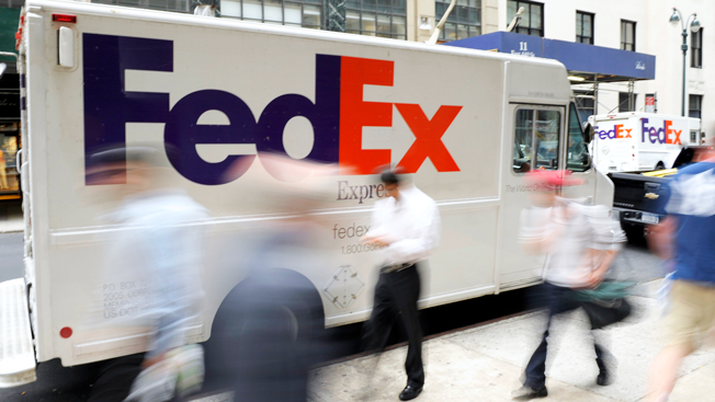
For the last 15 years or so, part of FedEx’s brand identity has included separate sub-brand identities for each of its independently operated companies. These initially included designations including FedEx Express and FedEx Ground, and subsequently came to include several more sub-brands, such as FedEx Freight and FedEx Office. From a customer point of view, one of the most recognizable differentiations between these sub-brands was color – think purple and orange for Express, purple and green for Ground, or purple and red for Freight.
Last week, however, FedEx announced that they would be doing away with those sub-brands (and all the fun color combinations) and moving towards one unified FedEx brand and logo. Unsurprisingly, they’ve opted for the purple and orange mark, which matches the company’s original color scheme and which internal research showed to be the most widely recognized among consumers.
So what does this mean for branding in general, if it means anything at all? The primary takeaway, as has been the case in other examples we’ve highlighted, is that simplicity is key.
For certain brands, differentiating between several sub-brands is key. Think car companies, such as General Motors with Cadillac, Buick and Chevrolet, or Microsoft Office with Word, Excel and PowerPoint. These sub-brands communicate something important to the consumer, whether it’s price point, quality, or function.
Additionally, creating distinct and differentiated brands within a portfolio can allow for an organization to maximize its market presence, without the risk of over-saturation or confusing brand messaging.
So what about FedEx? As long as they deliver your package on time and in one piece, does it really matter whether it flew in on a plane or stuck to the highways? The answer appears to be no. That promise of “on time and in one piece” is consistent across sub-brands.
And if the message is the same, what’s the point in having it delivered via different brands? In this case, differentiation becomes unnecessary at best, confusing and overcomplicated at worst.
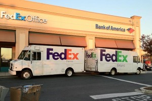 This is a crucial part of this type of brand decision process. Consistent color schemes, logos or other visual brand elements aren’t enough to truly bring brand simplicity to life. These brands must, to the most they can be, align from the top down. Otherwise, consumers will see not consistent and strong branding, but confusing branding that doesn’t seem to know what it wants to be.
For FedEx, this alignment is also boosted by an iconic brand at the top. The purple and orange colors, along with the instantly recognizable logo, give the sub brands instant brand credibility. As far as brand portfolio alignment strategies go, FedEx has followed the gameplan as they should, with the hope that they can leverage the main brand as their portfolio grows.
As a graphic designer, and as someone who loves categorization and organization, I get it – selecting different colors for your brand identity is fun and can be difficult to resist. And in the right situation, it can be an effective way to communicate and elevate your brand. But before you jump head first into the pool of sub-brands, take a step back and evaluate: Do each of those sub-brands truly have something unique to say? As FedEx recently decided, the answer may very well be “no.”
Learn more about building your best brand portfolio strategy by downloading this FREE webinar, "Identifying The Opportunities In Your Brand Portfolio - Are You Capitalizing On Every Potential Business Opportunity Your Portfolio Provides?"
How to Attach Your Brand to Moments in Consumers' Lives
A recent Adweek article discussed how brands are using non-traditional marketing and advertising strategies to target students going back to school, especially those in college.
One key takeaway from the article is how these brands are using their advertising efforts in part to align themselves with specific moments within a student’s time at college. As seen in the image below, such brands as Tide are looking to become the brand connection with moments like the first time a student does their laundry.
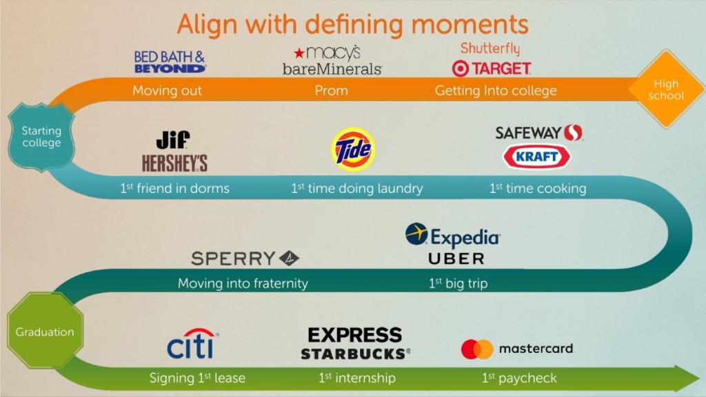 There have been many words written and discussed about the importance of emotional connection in branding, where brands set forth a goal to establish an emotional bond with a consumer over time. But these brands are going even bigger, looking to not only fill the space with a consumer in the moment, but also needing to create the inclination to connect a brand to that moment.
Most consumers don’t naturally have a specific brand in mind when they are performing normal, everyday tasks. You need to load the dishwasher? Your mindset is normally more on the task itself than what brand dishwasher soap you will need to buy.
This is where moment branding does the heavy lifting.
As previously mentioned, the first goal of successful moment branding is to establish the brand connection. Make your brand THE first thought of an individual in the moment, surpassing the general, task-focused mindset that naturally exists. For instance, the “defining moments” image connects “signing first lease” with Citi. For the majority of first-time home owners, their mind is full of thoughts of down payments, mortgage fees, interest rates, etc. In other words, far from thinking of what brand they can leverage.
By positioning themselves as the expert/top brand in the space, Citi can move themselves up the mindset pecking order, grabbing a portion of the thought process, and in turn raising the profile of their overall brand.
A level of emotional connection cannot be ignored, however. This is the bridge from moment to brand. It’s not enough to simply associate yourself with a task such as laundry, but you must become that moment’s iconic brand. Settling for second place only ensures that your competition will reap the benefits of the moment. It takes work to make the moment brand-worthy, there isn’t enough available to hope that the consumer considers all of the brand options.
We all remember our first time cooking in the dorms, and at the same time, can remember what our first requirement for deciding what to cook – ease. College students with limited culinary skills and equipment are less concerned with the intricacies of cooking; they want something easy and fast. Kraft, in their moment branding efforts, saw this as an opportunity to connect. Their “Easy Mac” and other dorm-friendly options were situated ideally for the audience and the moment. Therefore, Kraft positioned these brands as the go-to for college chefs.
Done successfully, moment branding can have long-lasting and wide-ranging impacts on a brand and on consumer mindsets. Our lives are full of both significant and mundane moments, each of which possesses the potential for brand connection. Once we begin associating specific brands with each moment, these brands will have one less person to try and market to, as they have become synonymous with our lives.
Learn more about building your best brand portfolio strategy by downloading this FREE webinar, "Identifying The Opportunities In Your Brand Portfolio - Are You Capitalizing On Every Potential Business Opportunity Your Portfolio Provides?"
Patience is a (Branding) Virtue
“He that can have patience can have what he will.”
While many don’t consider Benjamin Franklin, the source of this quote, to be a master in branding and brand strategy, but the inventor of bifocals touched on a very important brand lesson when he spoke these words.
Simply put, brand development is a practice in patience and the ability to stay the course. When creating a brand, especially during the strategic development phase, the end goal may seem a million miles away. Along those lines, there may be some bumps in the road on the way to success, which will undoubtedly cause some to begin wondering if and when the strategy should be abandoned.
That time should be the last thing on the mind of those working on the brand’s development, as they should instead be focused on staying the course, allowing the brand time to build and grow into the final draft that everyone is working toward.
And while it is marked with very specific, brand-boosting moments such as logo reveals and brand name launches, it is important to not get sucked in to the mindset that these momentary brand bumps are a long-lasting sign that the brand has reached is pinnacle.
In a recent article, Fred Moore touched on this very topic, discussing how, despite the normal expectation of short-term success, establishing a strong brand isn’t a quick fix:
“I tell clients that based on my experience, it takes about three years for a brand to become vested in the minds of the customer,” he says. “Clients tend to feel pressured to produce more short-term results. It is your job to keep the client ‘on strategy’ for the sake of their brand.”
Moore’s mention of consumer mindset is a key point in why brand patience is crucial. The marketplace is filled with similar brands to yours, and as such, it can be easy for consumers to blend them all together or get confused to which brand is which – at least at first. For those brands that have a solid foundation in place and have successfully created a brand that differentiates itself form the competition, finding a space in the consumer consciousness will be achieved quicker, albeit still not right away.
Touching on Franklin’s quote one more time, we see that he ends it with “can have what he will.” In other (branding) words, patience also allows for a brand development that shoots even higher than a short-term-focused brand. if you are in the mindset that time is your friend , not enemy, your brand will have more time to really expand its definition of success.
So when starting to develop a brand, be sure to always keep one eye toward the future, as that is where you will find true brand success.
Learn more about building your best brand portfolio strategy by downloading this FREE webinar, "Identifying The Opportunities In Your Brand Portfolio - Are You Capitalizing On Every Potential Business Opportunity Your Portfolio Provides?"
AW Spotlight - Visual Branding Team's Favorite National Flags
During the Opening Ceremonies of the 2016 Olympics, each nation represented in the Games matched into the stadium behind their flag, giving viewers a firsthand look at the amazing visual branding exhibited by the flags, many of which may have been previously unknown.
In this spirit, we asked two of our talented of the AW Visual Branding team members, Dave Dixon and Sarah Scott, to give their selections of which world flags they felt are the most visually appealing. Let's find out their selections:
Canada

Canada’s flag is a near-perfect combination of the classic and the modern. It offers a nod to the long-standing flag tradition of vertical bars, employs a simple, yet strong color palette, and then spices things up just the right amount with a clean, recognizable symbol to set it apart from all the other red-and-white flags of the world.
And as with any symbol worth its salt, the real beauty lies in the application opportunities it provides. With its aforementioned recognizability and simplicity, the red maple leaf can be incorporated into Olympics uniforms, federal agency logos, and any number of other Canada-related visuals.
All of Scandinavia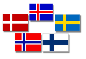
Scandinavia – what an example of brand architecture! One look at the off-center cross adorning the flags of Sweden, Norway, Denmark, Finland, and Iceland and you know you’re looking at a flag that belongs west of Russia and north of everything else in Europe.
Scandinavia could write a textbook on how to differentiate within a system of design.
Sri Lanka
Sure, Bhutan and  Wales have dragons on their flags. Albania and Montenegro have two-headed eagles on theirs. Papau New Guines has…a bird of paradise. But are any of those animals holding swords? I don’t think so.
Not only does Sri Lanka’s flag feature a fierce-looking lion (?), but he’s holding a sword! You’re not messing with Sri Lanka if you know what’s good for you.
Kazakhstan
This flag stood out to me for its shade of vibrant blue and contrasting yellow ornate pattern on the left hand side of the flag. The pattern identities the traditions of Kazakhstan but I love the detail with each piece weaving within the other to create a solidified design.
Also, I love the boldness of the sun, which according the the flags history stands for life and energy, while the eagles rests below in subtle outline to reflect power of the state.
Scotland
The Scottish flag is very simple in nature with the white cross bars, over blue. However, I love the simplistic nature of it.
It’s not busy and because of that to me it makes a bold statement. The design itself signifies the blue and white cross of St Andrew.
Image Sources:
Flags
Scandinavian Flags
Header Image

