One Brand Family, Two Brands, How Many Brand Messages?
As we all know, advertising during the Super Bowl is the biggest decision for a brand’s marketing strategy of the year. It regularly ranks among the most-watched television events in history (this year’s edition actually broke the record for most TV viewers for any program ever), and as such the money and spotlight on the commercials has grown just as big.
Audiences wait all year to see what ideas the participating brands come up with, and these choices are discussed, analyzed and critiqued almost as much as the game.
The pressure is enough for just those who were marketing just one brand at the game. For some, it was doubled, as they had two separate brands, which lived under the same brand umbrella, with advertisements running during this time.
The trick for brand managers in this situation is to decide whether to combine the two brands to support one brand message, or to establish dual messages and ensure that both are well-received and successful in their goals.
Popular opinion seems to fall on the side of dual messaging, in order to provide clarity from a larger brand strategy and brand equity standpoint. A well-defined branding message is some of the most valuable currency for advertisers and marketers, and brand-specific messaging is a shortcut to success in the area.
For instance, the Super Bowl commercials for Budweiser and Bud Light struck almost polar opposite messages from each other. These are two products that share numerous similarities, but when it comes to their brand strategies, they havechosen to take paths that best represent who they are and who they want to become.
Budweiser’s Clydesdales made their annual appearance, and helped to tell a heartwarming story of redemption and coming home with a puppy and his owner. On the other hand, Bug Light continued its “Up for Anything” campaign featuring a group of young partygoers and a life-sized Pac-Man game.
These two spots could not have hit on more different levels emotionally, which was the goal. A consumer will rarely confuse who each brand is, and who their ads were targeting.
One factor that plays into the target of the ad is the audience for the brand. In the Budweiser/Bud Light example, they are targeting different audiences, and therefore the brand strategy  and messaging reflects this.
It is a foundational aspect of branding – decide who you are, decide who you are speaking to, and adjust accordingly. For Bud Light to attempt and copy Budweiser’s Super Bowl commercial messaging of relationships, emotional connections and loyalty would completely change how the brand is viewed and would have the potential to do more harm than good.
When a consumer decides what a brand’s image is, changing can be a risky endeavor. For two brands that fall in the same family, both should have already carved out their niche and decided who would live where in the brand space. Crossing over would be seen as unauthentic and an attempt to grab an audience with whom the brand has no equity.
When faced with (possibly enviable) problem of having a pair of brands to showcase on branding’s biggest night, band managers and strategists can’t get can’t and forget the brand’s long-term future and direction. Having brand-specific messaging can build to a larger strategy, which will give more weight to the ads themselves, and provide a bigger bang for your buck.
Image Sources:
Addison Whitney Brand Fanatics Put a Twist on Super Bowl Ad Discussion
As brand fanatics, the Monday after the Super Bowl is an event on its own for us here at Addison Whitney. We love branding, and the Super Bowl commercials are the biggest stage for brands to get their message out, and give them an opportunity to make a lasting brand impact.
Since we knew that there would be countless conversations reacting to how well the brands accomplished this feat, we decided to provide a forum for these discussions to take place, as well as give the participants a chance to look at the ads from a branding perspective, something Addison Whitney specializes in.
In the first of what is expected to be many lunchtime discussion sessions, a group of Addison Whitney brand fanatics gathered to discuss how Super Bowl commercials had impact on branding.
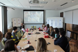 Six specific brands were identified as good representatives of the types of brand who have the potential to have the most impact from a Super Bowl ad, and their commercials from this year’s game were used as the ad reference.
Our first step was to identify how we feel about the brands prior to viewing the ads – as in, if we were to be asked about these brands last week, what would we say?
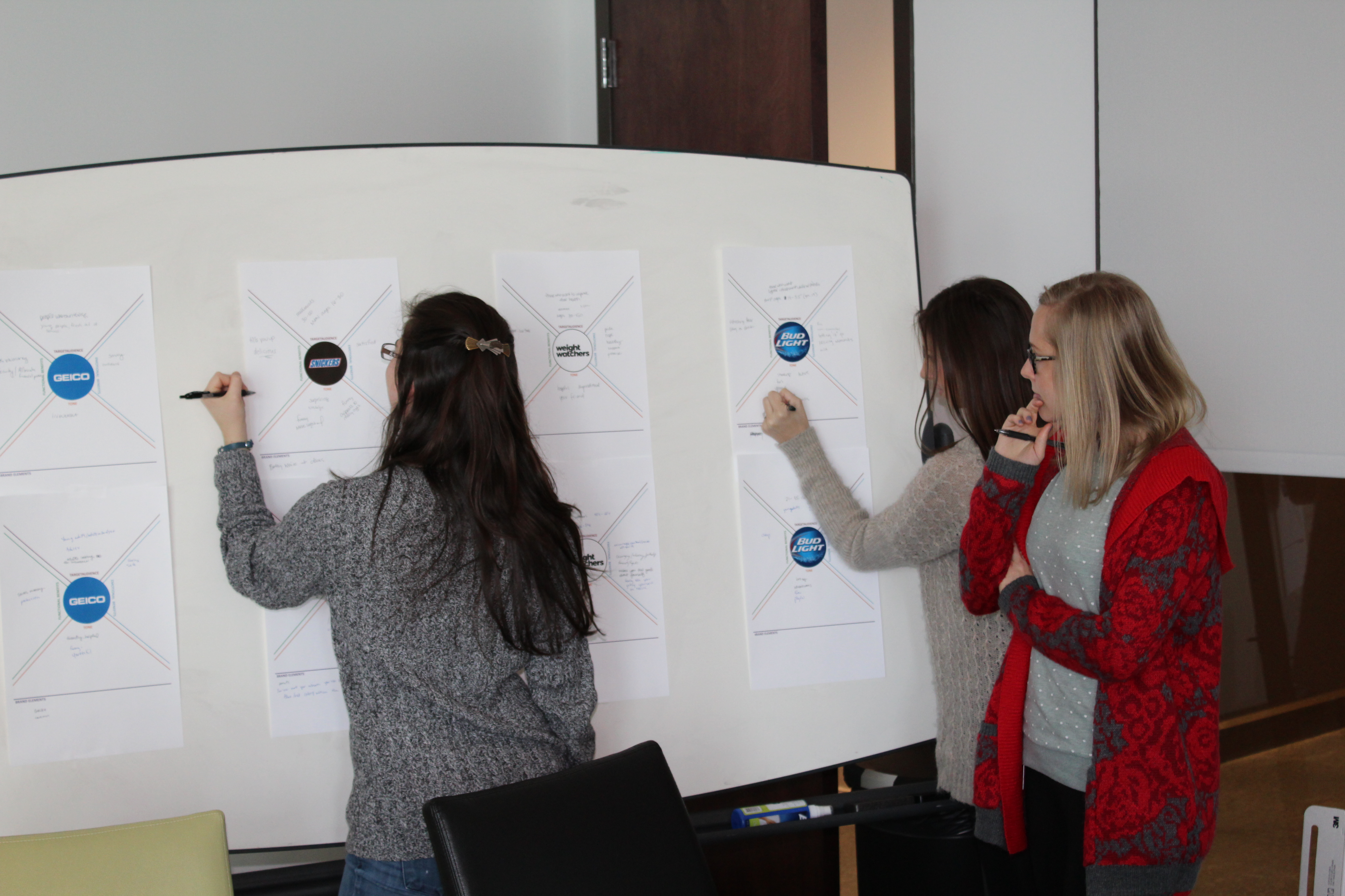
For each brand, five brand characteristics were identified – Target Audience, Functional Benefits, Emotional Benefits, Tone and Brand Elements. Each section gave a deeper picture into who the brands are to us, and where were see them fitting into the brand landscape.
Participants filled out what came to mind for each of the targeted brands when they were asked to identify these characteristics, giving a foundational look at where the brands stood in the minds of most consumers, and where the starting point was for each of their Super Bowl commercials.
Of the characteristics, Target Audience and Emotional Benefits were singled out as the two that seemed to drive most Super Bowl advertising, and the two that had the largest potential brand impact.
Following this pre-ad discussion, the commercials from each of the brands were viewed to provide reference for the next stage of the discussion.
In a new twist to the normal commercial reaction discussion, in addition to discussing the commercial themselves, we looked at how the commercials tied back into the brands and if they effected any of the characteristics that were  identified pre-viewing.
It is often an overlooked aspect of Super Bowl advertising, where much of the attention is paid to what ads performed the best on that one night in a vacuum where they were only competing against the next 30-second spot, is how the ads are part of a larger branding strategy for the companies.
For instance, our brand discussion examined how the Weight Watchers commercial signaled a new direction in their branding, moving away from the normal and established strategy to a strategy that was more direct and targeted at a new audience set.
Stay tuned in the next couple of weeks for a number of in-depth perspectives and analysis on these questions and more on how brands use such a high-profile platform and how those actions impact brand strategy!
Addison Whitney is a global branding firm with a passion for building strong brands. We specialize in verbal and visual branding, brand strategy and market research.
To learn more about Addison Whitney, visit our website at www.AddisonWhitney.com, or contact us here.
AW Rewind: The Addison Whitney Week in Review - 1.17.15
AW Rewind:
The Addison Whitney
Week in Review - 1.17.15
 Welcome to another edition of "AW in Review", our weekly roundup of our latest brandsalsa and Addison Whitney news and posts!
Don’t forget, you can stay up-to-date with everything from Addison Whitney by joining the conversation with us on our social media channels – Twitter, Facebook, LinkedIn and Google+
A Thermostat to Rule Them All
A year ago, would anybody have thought that the product development we saw this year at CES would be inspired by an innovation to, of all things, a thermostat? Yes, a thermostat.
This thermostat was introduced by a brand called Nest, of which I am a big fan. I don’t own one, but I do look at them longingly on my trips to Home Depot. The brand’s first blog entry clearly explains why thermostats were the choice for innovation: heating and cooling costs make up about 50% of an energy bill, and therefore were a logical place to try and find solutions for homeowners. Read more...
Wisdom Wednesday:
"Knowledge has to be improved, challenged, and increased constantly, or it vanishes." –Peter Drucker
Case Study Wednesday: Motorola
Addison Whitney has been a key naming and strategy resource to Motorola for years. We fully understand that some of our clients have unique branding needs and processes to follow of their own, which is why we know the importance of having flexibility. Through a customized process, we’ve continually delivered dynamic and creative results to Motorola for brand name development, brand architecture development, and nomenclature strategies.
Highlights from our work with Motorola include the Roadster, Finiti and Oasis Bluetooth devices. Read more...
A Thermostat to Rule Them All
A year ago, would anybody have thought that the product development we saw this year at CES would be inspired by an innovation to, of all things, a thermostat? Yes, a thermostat.
This thermostat was introduced by a brand called Nest, of which I am a big fan. I don’t own one, but I do look at them longingly on my trips to Home Depot. The brand’s first blog entry clearly explains why thermostats were the choice for innovation: heating and cooling costs make up about 50% of an energy bill, and therefore were a logical place to try and find solutions for homeowners. Also, it’s pretty.
At this year’s CES, there were a number of new innovations introduced that were related to the Nest thermostat idea. The Aurora Sleep System will tell your thermostat when you go to sleep and when you wake up, allowing the thermostat  to customize the temperature to fit your needs. Whirlpool introduced a dryer that can help keep your clothes fresh and wrinkle-free while you’re away, or even delay cycles during peak energy times. The Kevo Smart Lock can tell Nest who is entering the home and what temperature they like.
This is amazing. Think about it. A thermostat. Something that is present in nearly every consumer’s home, but often not given a second thought until it doesn't work. But Nest truly is more than just that. It is bringing the thermostat into the list of must-have for the latest and greatest technology, along the lines of the TV and computer industries. Additionally, it really was the first major entrant into the “smart home” accessible at the consumer level.
The smart home concept is a brand of the “Internet of Things” concept, focusing on how a variety of devices can increase connectivity of the “things.” A number of keynote speeches at this year’s CES  focused on Internet of Things-related topics, much like a few keynotes did last year. And while general consumers may still be learning this term, they do understand the value of connection. And a consumer understands the benefit of energy efficiency, especially when it affects monthly budgets. It will be interesting to see what other innovations come to market that work specifically with Nest, or whether there are other brands who take the lead in the space.
An interesting aspect of the Internet of Things perspective is that, in reality, it doesn't qualify as an innovative idea. It’s not a thought that is brand new, the cause of light-bulb moments for companies around the world.
In fact, from a B2B standpoint, the Internet of Things has impacted innovation leading to more efficient ways to gather data, and then leverage and use this data to make better decisions. Amazing case  studies about the London Underground or GE’s Industrial Internet used with locomotives can be found across the Web. From a consumer standpoint, the market has been trending toward the connectivity of devices big and small, from those for whom a connection seems obvious to devices you never thought should or would be connected (i.e., a bedside table light you can turn on with your smartphone – even when there is a chance you would be reaching PAST the light to grab your phone to turn on said light).
But connectivity is quickly shedding its “trend” status and showing that it will be a leading factor for a long time in product development. The consumer is becoming more and more reliant on a few products that will control their lives, whether it be a smartphone, tablet, or yes, a thermostat.
I do have one more question – How will Dads around the world react to this loss of control of the thermostat?!
Sources:
https://nest.com/blog/2011/10/25/thermostats-yes-thermostats/
https://www.fastcolabs.com/3030367/the-london-underground-has-its-own-internet-of-things
https://www.fastcompany.com/3031272/can-jeff-immelt-really-make-the-world-1-better
https://www.youtube.com/watch?v=1Pwwx1cF8NQ
Follow us on Twitter @AddisonWhitney or join the conversation on Facebook and Google+
Case Study Wednesday: Motorola
As one of the leading global branding firms, Addison Whitney is behind some of the world’s strongest and most iconic brands. We’re proud of the work we do for all of our clients and love sharing our stories.
That's why we've launched "Case Study Wednesday", where we highlight one of our amazing clients and the work we have done with them. To learn more about our work, click here.
This week, we will be featuring our work with Motorola:
 Addison Whitney has been a key naming and strategy resource to Motorola for years. We fully understand that some of our clients have unique branding needs and processes to follow of their own, which is why we know the importance of having flexibility. Through a customized process, we've continually delivered dynamic and creative results to Motorola for brand name development, brand architecture development, and nomenclature strategies.
Highlights from our work with Motorola include the Roadster, Finiti and Oasis Bluetooth devices.
Finiti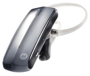
Motorola created a Bluetooth headset that would provide superior audible performance in the most extreme conditions. The name Finiti was inspired by the limitless potential of the headset and instantly branded the new device as extremely versatile.
Roadster
This Bluetooth mobile device is used as a car speakerphone and promotes a safer, hands-free way to talk. We created the name Roadster for the new device. The name evokes images of a road-ready device that forms a seamless connection with any car.
Oasis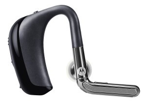
The name for the last Bluetooth model needed to communicate a number of characteristics: comfort, clarity and the ability to multitask. We chose the name Oasis to represent an ideal device that would meet even a casual user's communication needs.
Teams Involved:
Follow us on Twitter @AddisonWhitney or join the conversation on Facebook and Google+
AW Rewind: The Addison Whitney Week in Review - 1.10.15
AW Rewind:
The Addison Whitney
Week in Review - 1.10.15
 Welcome to another edition of "AW in Review", our weekly roundup of our latest brandsalsa and Addison Whitney news and posts!
Don’t forget, you can stay up-to-date with everything from Addison Whitney by joining the conversation with us on our social media channels – Twitter, Facebook, LinkedIn and Google+
Chubbies - A Brand That's Not Short on Excellence
A special guest post from our very own Kelsey! "Chubbies is a men’s online clothing retailer that I, a female customer, look forward to perusing when shopping for the men in my life. The Chubbies brand has reinvigorated shorts for men. Their aesthetic is unique – slightly tailored and boldly patterned, complete with their signature short inseam. As my brother famously says, 'They don’t call them longs!'" Read more...
Wisdom Wednesday:
"We are what we repeatedly do. Excellence, therefore, is not an act but a habit." –Aristotle
Four Trends That Will Shape Branding in 2015
 With each new year comes a wave of trends and ideas that will define that year in branding and will shape how branding evolves. While some of these ideas showcase new ways of thinking about branding, others show the circular nature of the industry and how sometimes, you have to look back in order to move forward. We've put together a look at four trends that will drive branding strategy in 2015. Read more...
These 40 local ad agencies will push the Charlotte creative scene in 2015
Addison Whitney was chosen as one of the top local agencies to watch in 2015! Read more...
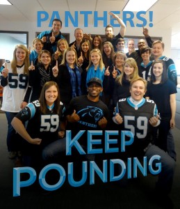 It's #BlackFriday at Addison Whitney as we get ready to cheer on the Carolina Panthers this weekend!
Four Trends That Will Help Shape Branding in 2015
With each new year comes a wave of trends and ideas that will define that year in branding and will shape how branding evolves. While some of these ideas showcase new ways of thinking about branding, others show the circular nature  of the industry and how sometimes, you have to look back in order to move forward.
Below is a look at four trends that will drive branding strategy in 2015:
- Cross-Platform Branding Becomes a Must-Have
Gone are the days when branding meant creating a name and a static logo for the brand. In today’s mobile, online, constantly-shifting platform-driven world, your visual needs to be adaptable to all areas in which you will be present.
Logos need to transfer from a magazine ad to a tablet, from a business card to a phone. Small, intricate details or trying to put a lot of information into one logo may look good when rendered on a large scale, but get lost when it is shrunk down for another use. This will contribute to an increase in logos that embrace simplicity, with companies considering eliminating aspects of their logos deemed detrimental to cross-platform adaptability.
Additionally, names need to be easily remembered and stand out in a way that they can be conjured for quick searches. In 2015, this trend will continue to move up the scale of importance, especially for newer brands that don’t have already-established brand equity.
- Brands will Re-Focus on Basics
With such a crowded consumer space and so many brands clamoring for a piece of the attention, brands will begin to look inward at what truly makes them unique. There will be less brand strategy based on reaction and mimicking what other brands are doing and more focus on characteristics that make up the foundation of the brands.
This brand characteristic shift will lend itself to a new wave of branding, getting back to the essential elements that make a strong brand. This is the key – the brands who thrive in 2015 and beyond won’t be the ones who are the most unique all of the time, but the ones who can show the consumer that they are stable and will be around for the long run.
- Brands will See the Positive Impact of Transparency
Today’s consumers can and will learn everything about a brand that they want to. If there is a skeleton hiding in the closet, it will come to light. Brands will shift their thinking to the idea that instead of hiding, their brand perception can be enhanced by being transparent about the not-so-pretty aspects of the brand that may be exposed.
Consumers are much quicker to defend and forgive when they don’t feel as if the brand was hiding something from them. Transparency can go a long way into both crisis management and solid brand management.
- Developing an Internal Brand will Help Retain Talent
Today’s generation of employees is decidedly different than their predecessors when it comes to staying in one job for an extended amount of time. They have a tendency to bounce around repeatedly, especially early in their careers, meaning many times brands must impress their employees as much as the employees need to impress their brands.
This is why more companies are turning their attention to internal branding – ensuring that their inward brand is as strong as their external, giving them a head start in retaining their top talent. Employees gravitate toward brands that have a strong sense of who they are and who treat their employees right, which starts with establishing what kind of brand they present internally.
Follow us on Twitter @AddisonWhitney or join the conversation on Facebook and Google+
Chubbies is a men’s online clothing retailer that I, a female customer, look forward to perusing when shopping for the men in my life. The Chubbies brand has reinvigorated shorts for men.![]() Their aesthetic is unique - slightly tailored and boldly patterned, complete with their signature short inseam. As my brother famously says, “They don’t call them longs!”
Their aesthetic is unique - slightly tailored and boldly patterned, complete with their signature short inseam. As my brother famously says, “They don’t call them longs!”
One of the goals of the brand is to outfit men in shorts for every occasion; they have shorts for summer, winter, tailgate and formal occasions. And though the style of the shorts is notable, the lifestyle that Chubbies promotes is really what we’re all really buying into.
Chubbies has clearly defined what it is to be a “bro” in a world filled with nine-to-fivers and squares - and if you fit that description, Chubbies shorts allow you to live a double life. As they promise their customers, “When you put on your Chubbies, you know it's time to relax, crack open an ice cold beer, and have some fun.”
This "bro"  mentality is promoted through witty website copy that feels more like friendly banter among friends than standard fare copy for a website. Chubbies shorts have names like “The Khakmeisters,” “The Clubmander in Chiefs,” and “The Victory Bells.” Their tagline, “sky’s out, thighs out,” clearly illustrates when they feel is the most appropriate time to wear Chubbies shorts- always.
Not a big reader? Chubbies has you covered on their website, www.chubbiesshorts.com, with humorously epic photos. Picture a shirtless fellow on the ridge of a ski slope: his phy
sique is average, his stance is confident and comically determined, his Chubbies have an 1980s-inspired ski motif. Or, imagine a clean-cut patriotic gent running down the beach, proverbial guns blazing, in American Flag print shorts. A flag in on hand, a beer in the other, ‘Merica.
Customer communications also follow suit. If you decide to give the company a call, a real-live guy picks right up and says “Hey dude, what’s up?” No automatic, robot-voice activated customer service shenanigans. Chubbies email order confirmations flaunt phrases like “You done did it!”
Even their FAQ page is packed with branded gems such as, “Men of genius are admired, men of wealth are envied, men of power are feared; men wearing Chubbies are all of the above.”
The Chubbies brand is a success because they don’t just dabble in this “bro” persona, they embrace if from all angles.
In short (pun intended), the Chubbies experience is unexpectedly inspiring. Though they’re selling men’s clothing, the Chubbies concept is gender-less and timeless - fearlessly seize the day in shorts and a smile. It’s enough to make anyone want to crack open a cold one and set sail on the next schooner to YOLOland.
All images via chubbiesshorts.com
January 6, 2015
AW Rewind: The Addison Whitney Week in Review - 1.3.15
AW Rewind:
The Addison Whitney
Week in Review - 1.3.15
 Welcome to the final 2014 edition of "AW in Review", our weekly roundup of our latest brandsalsa and Addison Whitney news and posts!
Don’t forget, you can stay up-to-date with everything from Addison Whitney by joining the conversation with us on our social media channels – Twitter, Facebook, LinkedIn and Google+
Case Study Wednesday: Pilgrim's
Pilgrim’s Pride Corporation is a Fortune 500 company and one of the largest chicken producers in the United States and Mexico.
Even though the company has a long tradition of producing healthy, high-quality food products, there was a disconnect between the visual identity and the company’s goal to redefine its retail brand to be more consumer-focused. Read more...
Wisdom Wednesday:
"Everything you can imagine is real." -Pablo Picasso
Flashback Friday: Charlotte's Got a Lot
 In 2008 when I moved to Charlotte, NC I had no idea I was taking up residence in the “next big thing” city. I was fresh-out of college and not sure what to expect out of my new city that I more or less randomly chose to move to.
But I unknowingly stepped right into what I consider the early stages of Charlotte’s coming out party to the world, and now just four years later this city is about to be put on its biggest stage with the DNC coming to town in September. It’s 2012 and it’s Charlotte’s year, so let’s take a look at how we got here and why. Read more...
Case Study Wednesday: Pilgrim's
As one of the leading global branding firms, Addison Whitney is behind some of the world’s strongest and most iconic brands. We’re proud of the work we do for all of our clients and love sharing our stories.
That's why we've launched "Case Study Wednesday", where we highlight one of our amazing clients and the work we have done with them. To learn more about our work, click here.
This week, we will be featuring our work with the Pilgrim's Pride Corporation:
Pilgrim's Pride Corporation is a Fortune 500 company and one of the largest chicken producers in the United States and Mexico. Even though the company has a long tradition of producing healthy, high-quality food products, there was a disconnect between the visual identity and the company's goal to redefine its retail brand to be more consumer-focused.
Before work on the visual side could begin, our brand strategy team took the lead and initiated an external assessment of the Pilgrim's Pride perceptions relative to competitors. We surveyed consumers to identify which factors were important to them when purchasing chicken and how well Pilgrim's Pride delivered on those attributes. These findings drove the brand strategy and positioning development 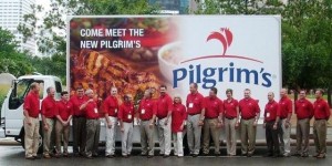 and laid the foundation for the visual components of the project.
The Pilgrim's Pride brand received a complete visual overhaul that included: a new corporate logo, a logo exclusive to packaging applications, a new corporate stationary system, and an updated brand packaging design. To ensure the visual identity direction resonated with Pilgrim's Pride's target audiences, a validation study was done for both the logo and package designs following development.
Teams Involved:
Brand Strategy
Visual Branding
Follow us on Twitter @AddisonWhitney or join the conversation on Facebook and Google+

