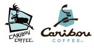
Caribou Coffee is undergoing a makeover! Moving away from the ski lodge atmosphere, the new look will be less regional and more contemporary, “a fresh variation of the same elements” according to the company’s website. The new brand look includes a new logo, color palette and design elements. The caribou has been reworked and now features “C” shaped antlers and a coffee bean body. In addition, the caribou in the previous logo was leaping left, whereas the caribou now leaps right, signifying the company as it heads into the future. The shield element from the original logo has been updated to a new shape, which resembles national park signage, in honor of their founders’ hike in Alaska’s Denali National Park that inspired the company’s foundation. The more stylized, upscale logo contains two different typefaces and the caribou is a coffee brown color. The logotype treatment includes a separation between the words “Caribou” and “Coffee,” demonstrating the abbreviation that loyal customers often use to refer to their favorite coffee shop (simply “Caribou”).
The company considered more than 500 concepts for a new tag line but ultimately retained the existing one: Life is short. Stay awake for it. Their quirky tone remains, as evidenced by their new cup and napkin designs, and clever “higher state of bean” slogan. Caribou aired its first TV advertisement last fall and will have more on-air spots coming soon, as they continue to seek mass appeal.
The new look was unveiled March 1st on cups, napkins, cardboard sleeves and signage and the website is soon-to-follow in early April along with the full roll-out.
As consumers, we get very attached to logos and change is often treated with skepticism. Caribou is receiving mixed reviews in regards to their recent changes and the fact remains that logos are very subjective. What are your thoughts on the new look?
Contributed by: Ashley Popham