Destination Branding: A Look at States and Countries around the World (Part One)

Two weeks ago, we started a series on destination branding by looking at cities where we have offices worldwide (Charlotte, Munich, NYC, San Francisco, Seattle and Tokyo). A quick recap – Last year, more than one billion tourists travelled the world and five to six billion more were expected to have travelled within their own countries. With stats like that, a successful tourism brand could mean millions (or even billions) of dollars for a destination.
Now, let’s jump into state and country branding…
Part One: North Carolina, Germany and New York
Last month, the North Carolina Division of Tourism, Film and Sports Development launched a new look and feel to its travel-planning website, VisitNC.com. The overhaul was the first time the destination refreshed its identify since 2009.
The previous look was a simple typographic font treatment that referenced the website and the travel destination’s 800 number.
![]()
The new identity is much more visual and showcases the state’s natural resources along with a new tagline, “beauty amplified.” Two different applications are below.
![]()
![]()
The new website pays precise attention to the natural beauty of North Carolina and showcases it in a way that draws the potential visitor in. It’s easy to navigate and really delivers on the “beauty amplified” positioning.

Germany is up next. For more than 60 years, the German National Tourist Board has been promoting the country as a travel destination. Germany is a nation rich in history and culture, but the logo doesn’t seem to reflect much of that life. Sure, the colors connect to the country, but overall, the icon doesn’t tell a story.
![]()
The website feels a little dated. It’s nice that the destination chose to exhibit larger photos from around Germany, but they’re muddled by the center navigation. With images like these, you would imagine a site rich in visuals that easily and cleanly tells the story of Germany’s most well-known cities and lesser-known jewels.

To round out today’s state and country branding post, we’ll focus on the state of New York. New York’s logo is probably one of the most well recognized in the U.S. and it works. Two different executions of the logo are below.
![]()
![]()
Of course, New York has a lot to offer as a travel destination. That said, it feels like it’s trying too hard to fit all of that information on the home page. I guess I wish it told more of a story about the state of New York, especially since so many immediately think of Manhattan first.

So, that’s part one of our look at state and country branding. On Thursday, we’ll round out our observations by highlighting California, Washington and Japan. Stay tuned!
# # #
Disclaimer: This post is purely subjective. My background is in brand strategy (positioning, messaging and portfolio organization), not design. Good visual branding can be challenging to achieve, and I whole-heartedly respect designers at Addison Whitney and beyond.
Source
“UNWTO: Annual Report, 2012.” UNWTO.org, https://goo.gl/pp5a7g
Branding The Hunger Games
Branding the Hunger Games

Harry Potter set the stage… The Twilight franchise built on Warner Bros.’ foundation… And now, it’s The Hunger Games’ time to shine.
We’ve touched on movie branding in the past, but as Lionsgate ramps up to the premiere of the latest Hunger Games movie, its branding efforts are, in a word, remarkable.
I’ll admit, I was not an early adopter of the Hunger Games series. Initially, the idea of a book/movie series based on a post-apocalyptic America and an annual, televised event where children fought to the death did not appeal to me. That said, after watching the first movie (several times), I’ve been sufficiently sucked in. So, in my excitement for the second movie, Catching Fire (due in theaters November 22), I’ve started to follow the film’s branding and marketing efforts.
Somehow, in my daily news trolling last week, I stumbled across this website:
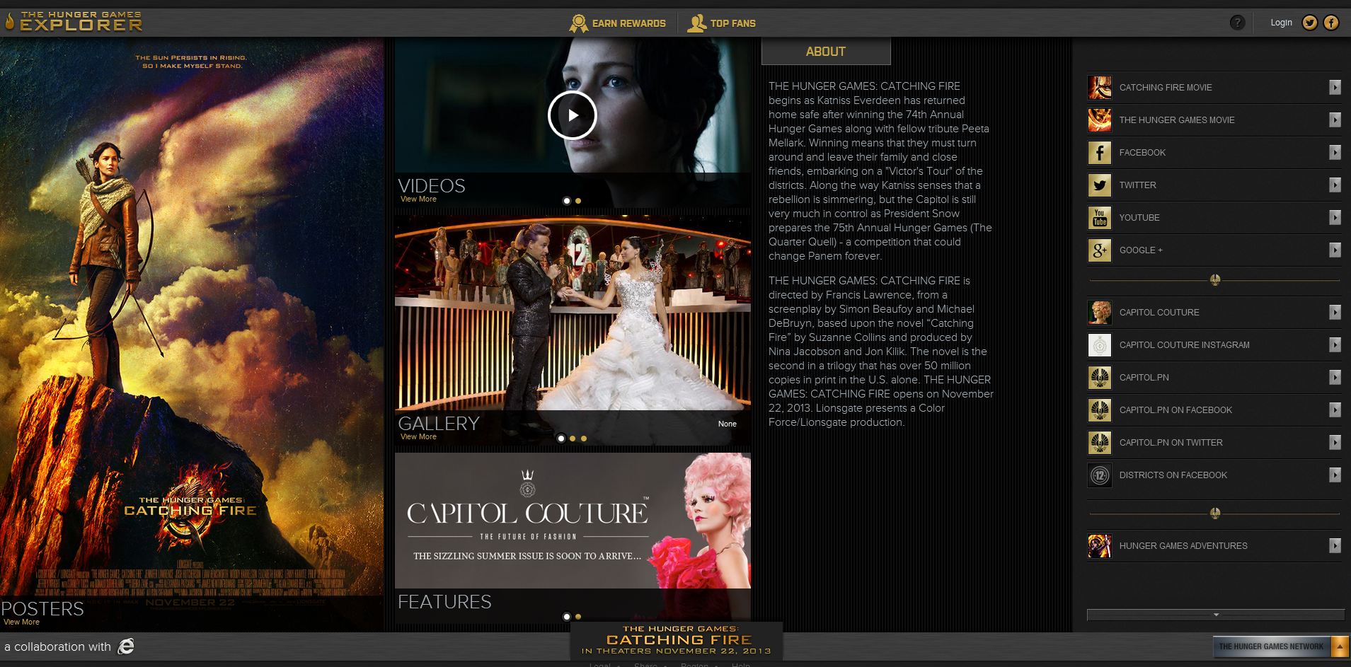
Apparently, it was started to promote the first movie, but re-launched this past May with a ton more content (for non-fans: The Capitol is the opulent metropolis and governing body of Panem, a nation in post-apocalyptic America [and the setting for the book]). This site has a Vogue-esque feel, complete with editorials and character profiles. Moreover, Lionsgate released couture images of cast members to further promote the movie’s heightened focus on costume design.
From there, I visited all the normal haunts for movie releases (websites, social media, etc.) and found an extensive network of storytelling and branding. The website is clean and beautiful, with easy navigation and just the right amount of content to get fans excited (even with the premiere still more than three months away).
Facebook features a whopping 14 individual pages, each with customized content: one for the movie franchise, one for The Capitol and one for each district within Panem (a total of 12 more pages). The Twitter campaign seems a bit more focused, with official Hunger Games and Capitol accounts. That said, two Capitol Couture journalists can also be found tweeting, @AthenClaithCC and @VelvetVeritas. The YouTube account builds on The Hunger Games series as a whole and the Google+ account seems to be an extension of the Facebook and Twitter efforts.
Also announced this past May is a partnership with COVERGIRL, marking the makeup corporation’s first movie partnership ever. Print and TV ads will help launch and promote the partnership this fall, but here’s a sneak peek.

Given the rise of smart movie and branding partnerships like The Great Gatsby and Tiffany & Co., I’m excited to see what else comes out of the woodwork in the months ahead.
“May the odds be ever in your favor…”
Sources
“‘The Hunger Games: Catching Fire’ Capitol Couture Portraits,” Hollywood.com, Michael Arbeiter, https://goo.gl/2R12yf
“CoverGirl Announces ‘The Hunger Games: Catching Fire’ Makeup Collection and Campaign!,” MTV.com, Liza Darwin, https://goo.gl/KWVeOe
“The Hunger Games: Catching Fire – Official Trailer,” YouTube.com, https://goo.gl/QsGGLb
Destination Branding: A Spotlight on Cities Around The World (Part Two)

On Tuesday, we started a series on destination branding by looking at Charlotte, Munich and New York. Let’s recap – Last year, more than one billion tourists travelled the world and five to six billion more were expected to have travelled within their own countries. With stats like that, a successful tourism brand could mean millions (or even billions) of dollars for a destination.
Now, let’s finish up our look at city branding…
Part Two: San Francisco, Seattle and Tokyo
First up: San Francisco, the City by the Bay. The San Francisco Travel Association promotes and maintains its tourism brand. In 2012, San Fran hosted more than 16.5 million visitors who spent more than $8.93 billion during their stay – that's more than $24.46 million a day. Needless to say, tourism is one of the city’s most important industries.
So, what about the brand?
![]()
I’ve never been to San Francisco, but it’s definitely on my bucket list. Having said that, I expected a lot from this tourism brand and I think there is definitely room for some tweaking. This destination seems incredibly diverse with such a unique personality and its tourism brand feels a little…vanilla.

Last year, Seattle welcomed more than 10 million visitors who spent $5.9 billion in the area. Visit Seattle has served as Seattle and King County’s official Destination Marketing Organization (DMO) for more than 50 years.
Seattle’s tourism brand (and its tagline) have certainly evolved over the years. Three decades ago, Seattle was dubbed the Emerald City via a public contest to come up with a new city nickname. Then, in the late ‘90s, the brand became a rebus that included the @ symbol, a nod to Microsoft’s headquarters in the area.
![]()
In 2006, Seattle became the “Metronatural” city. The firm who developed the slogan defined it as “…the fusion of city and nature. It is what makes Seattle unique.” The city went so far as to paint the logo on the roof of the Space Needle.
![]()

Earlier this year, Seattle’s DMO evolved from the Seattle-King County Convention and Visitors Bureau to simply, Visit Seattle. The upward slope of the logo evokes both the Space Needle and a mountain slope.
![]()
After each brand evolution, simple might be the smartest way to go for Seattle. The new tourism brand feels clean and modern and still manages to include some of Seattle’s personality. And, the website feels the same way.

Last but certainly not least is Tokyo, Japan. The Tokyo Convention & Visitors Bureau oversees its tourism brand. Tokyo has faced significant challenges over the past few years that greatly affected its tourism industry. In 2011, the area suffered a major earthquake and tsunami, followed by a nuclear disaster 160 miles outside of the city.
Despite an unthinkable series of events, Japan’s overall tourism numbers rebounded in 2012 and the hope is the trend continues into this year (specific statistics for Tokyo could not be found).
From looking at just its tourism website, Tokyo’s logo is pretty literal.
![]()
But, when browsing for this logo, I stumbled across two treatments for Olympic bids that offer a little more insight and flair into Tokyo’s culture.
![]()
![]()
Tokyo’s tourism site is pretty standard and does a decent job of highlight aspects of Tokyo people might not immediately think of.

Obviously, I looked at both Tokyo and Munich’s (featured Tuesday) tourism brands from a very western, U.S.-centric perspective. I’d be curious to speak with a native from each city to see what they think of each tourism brand.
That completes our spotlight on city branding. In the coming weeks, we’ll look at state and country branding and national tourism branding. Stay tuned!
# # #
Disclaimer: This post is purely subjective. My background is in brand strategy (positioning, messaging and portfolio organization), not design. Good visual branding can be challenging to achieve, and I whole-heartedly respect designers at Addison Whitney and beyond.
Sources
“UNWTO: Annual Report, 2012.” UNWTO.org, https://goo.gl/pp5a7g
“About the San Francisco Travel Association.” SanFrancisco.Travel, https://goo.gl/ZhCB1
“We’re Metronatural no more – but will “Visit Seattle” trip off your tongue?” Seattle Times, Brian J. Cantwell, https://goo.gl/oVtZox
“Seattle’s Convention and Visitors Bureau changes name to ‘Visit Seattle.’” Puget Sound Business Journal, Steven Goldsmith, https://goo.gl/t2WVUw
“Metronatural.” Wikipedia, https://goo.gl/uTTqrK
“Japan Tourism Rebounds in 2012: Hopefully 2013 will Witness a Further Increase.” Modern Tokyo Times, Tomoko Hara and Joachim de Villiers, https://goo.gl/S1AqgM
Destination Branding: A Spotlight on Cities Around The World

Confession: I absolutely love to travel. When I discover a new place and am able to soak in its secrets and beauty, something in me awakens. Because of this, I’ve always been drawn to travel and tourism branding/marketing/PR. Studying how destinations differentiate themselves fascinates me.
2012 was a milestone year for tourism – For the first time in history, more than one billion tourists travelled the world and five to six billion more were expected to have travelled within their own countries. Those are staggering numbers when you consider that 60 years ago, the number of international tourists was a mere 25 million.
With stats like that, it’s no wonder cities, states and countries are doing everything they can to attract visitors. A successful brand could mean millions (or even billions) of dollars for a destination.
So, because of my love of travel, this will be the first post in a series on destination branding (all based on our global office locations). We’ll start off looking at city tourism brands, then state and country brands and finally national and international brands. To reign in this comparison a bit, we’ll focus primarily on each city’s tourism identity and the positioning we find on its website.
Let’s get started…
Part One: Charlotte, Munich and New York
The Charlotte Regional Visitors Authority (CRVA) is the area’s umbrella organization for six tourism entities: Visit Charlotte (Charlotte’s Destination Marketing Organization [DMO]), the Charlotte Convention Center, the NASCAR Hall of Fame museum, Ovens Auditorium, Bojangles Coliseum and Time Warner Cable Arena.

From a brand perspective, Visit Charlotte has several identities or presentations. The first, only a few of us have seen before.
![]()
The second was a campaign launched in 2008 that is still used today. The messaging is pretty straightforward: Charlotte has a lot to offer both business visitors and casual tourists.
![]()

And, in the past year or so, Visit Charlotte has redesigned its website to better visually depict the area’s tourism diversity.

Interestingly enough, Visit Charlotte doesn’t really have a standalone brand. The focus is on CRVA and its six area attractions (Visit Charlotte even uses a CRV-focused boilerplate in its news releases). With Charlotte’s impressive growth over the past decade (both in economic development and tourism), it could be really interesting to see a stronger city brand emerge – we’ll definitely keep our eyes peeled.
Alphabetically, Munich is up next. From what I could find, Munich’s tourism information is located on its larger city website – it doesn’t appear to have a standalone website for tourism. That said, here is its city brand (which obviously plays a huge part in its tourism branding):
![]()
And, after some serious digging, I was able to find its tourism logo.
![]()
There are two areas of the city’s website that seem to have tourism landing pages (below), so this particular destination’s branding feels a little disconnected.


So, Munich doesn’t seem to have a particularly prominent tourism brand, but with more than five million visitors a year and a huge emphasis on its annual (and infamous) Oktoberfest celebration, it’s interesting that the destination still manages to feel like somewhat of a secret. And, judging by the images I found while perusing the website, a gorgeous secret at that. I’d almost argue that a big, flashy tourism brand might even do the charm of Munich a disservice, so for that reason, I’m okay with its simplistic presentation.
What do you even say about New York?
NYC & Company is New York City’s official marketing, tourism and partnership organization. Last year, the Big Apple welcomed a staggering 52 million visitors. It’s almost unfair, as this city doesn’t really need strong tourism branding. But it does – and it’s bright, flashy and everything that makes NYC unique.
The primary logo has two prominent executions, horizontal and stacked.
![]()
![]()
The travel destination uses the horizontal execution to superimpose images from around NYC. Here are two examples:


With so many stories to tell, NYC & Company has its work cut out for it. It does its best to give visitors easy access to the information they want and need. That said, it is still a bit overwhelming – but in so many ways, so is the city itself, so it kind of works.

On Thursday, we’ll round out our look at city destination branding by focusing on San Francisco, Seattle and Tokyo. Stay tuned!
# # #
Disclaimer: This post is purely subjective. My background is in brand strategy (positioning, messaging and portfolio organization), not design. Good visual branding can be challenging to achieve, and I whole-heartedly respect designers at Addison Whitney and beyond.
Sources
“UNWTO: Annual Report, 2012.” UNWTO.org, https://goo.gl/pp5a7g
“Charlotte’s Got A Lot: New Ad Campaign Visuals Show Just How Much.” CharlottesGotALot.com, https://goo.gl/jUI6G8
“Munich Statistics.” MUNICHfound.com, https://goo.gl/mbVaIA.
“New York City Tourism: A Model for Success.” NYCGo.com, https://goo.gl/L4pYUF
Visual Branding 101: Terminology

Last month, we started a series of posts relating to branding terminology. Here’s the next installment in our series – this time, we’re defining visual branding terms we use most often.
Area of Isolation/Clearspace/Clearance Area
The required space around a logo to ensure proper readability and integrity
Ascender
The part of lowercase letters (such as k, b and d) that ascends above the x-height of the other lowercase letters in a typeface
Baseline
The imaginary line on which characters in a typeface rest
Bleed
Full ink coverage extending beyond the edge of the paper
Brand Identity
A brand identity is made up of one or more of these elements: brand name, typeface (logotype), color or graphic (logo)
Brand Elements
Brand elements are used to express and differentiate the brand. The brand name, logo, tagline, packaging and tone of voice are all examples of brand elements.
Cap Height
The height from the baseline to the top of the uppercase letters in a font. This may or may not be the same as the height of ascenders. Cap height is used in some systems to measure the type size.
CMYK
The abbreviation for cyan, magenta, yellow and black, which are the inks used in process printing. They represent the subtractive color model, where a combination of 100% of each component yields black and 0% of each yields white. Also referred to as four-color process.
Color Palette
A set of approved colors used throughout communications. This applies to color fields and type, not to photographic imagery.
Condensed Type
A typeface with a narrow, elongated appearance
Configuration
The arrangement of graphic elements. The size and position relationships of elements within an approved logo configuration are fixed, and must not be altered.
Contrast
The degree of difference between light and dark areas in an image
Crop
To trim outer portions of a photograph or illustration in order to focus on one portion of the image
Custom Type/Hand-Drawn Type
Describes text elements within a logo or design concept that have been created by hand or customized to have a distinct style
Logotype/Type Treatment
A designed word, and/or mark, not available in type. It’s always used as a complete unit and never altered in any form. The Coca-Cola logo is a logotype.
Monochromatic
The use of one color or shades of that color
Offset Lithography
A widely used printing method where the inked image is transferred from a plate to a rubber blanket, then to the printing surface
Pantone Matching System®
The worldwide color language for the selection, specification, communication and control of color
Point
Measurement commonly used in printing; approximately 72 points equal one inch
Positive
A term used to describe the appearance of a logotype, a mark or copy when it appears in a dark color on a light background
RAL
An internationally accepted color system used primarily for describing paint colors and coatings
Reverse/Negative/“Drop-Out”
A term opposite in meaning to “positive,” where the logotype, mark or copy appears light against a dark background
Resolution
The quality of an image based on the amount of pixel detail on screen and when printed (high resolution - 300 dpi; low resolution - 72 dpi)
RGB
Red, green and blue; the primary colors mixed to display the color of pixels on a computer monitor. Every color of emitted light can be created by combining these three colors in varying levels.
Sans Serif
A letter or typeface with no small projecting features, called serifs, at the end of the strokes. Arial is a sans serif typeface.
Separate Icon
A design element within a logo that can be pulled away from the type and used alone in certain applications; the Apple logo is a separate icon.
Serif
A short counterstroke stemming from a letterform’s main stroke; Times New Roman is a serif typeface.
Trim Marks
A guide for trimming the sheet during finishing or as register marks during printing
Typeface
A specific set of characters, numbers, punctuation and symbols having the same design and weight. A typeface family would include all the various weights and styles available for a particular design.
Typesetting
The process of converting text into a recognized font and producing it in a form suitable for printing
Typography
The method of displaying text; it covers font styles, sizes and colors
Visual Branding
Any design element or communication piece that relates to branding companies, products, services, technologies, places and experiences including but not limited to: logos, stationery, marketing materials, packaging, website design, brand standards, imagery and typography
And last, but not least…
Wordmark
The text within a logo design that may or may not be customized
So, that’s today’s vocabulary class. Hopefully, this has cleared up some of the nuances of visual branding terminology. We’ll continue these types of posts with each of our departments in the coming months!
On Target: New 'Simply Balanced' Brand
![]()
While wandering around Target this weekend, I stumbled across a shiny, new brand, ‘Simply Balanced.’ Intrigued by the clean packaging, I wondered out loud, “What is this? I haven’t seen this brand before.” A Target employee was working in the same aisle and gave me a quick history lesson- the cleaner, fresh brand was replacing Archer Farms Simply Balanced line. (Confession: In all of my Target shopping, I never noticed an Archer Farms sub-brand product line, so I immediately felt the introduction of a stand-alone brand, separate from Archer Farms, was a good idea.)
When I came into work this morning, I did some digging on the new line. It looks like the brand was officially launched last month “…in response to the growing popularity of organic foods.”
The products include wholesome ingredients, and more than 40 percent of the assortment is organic. There are no products with hydrogenated or partially hydrogenated oils, high-fructose corn syrup, synthetic colors, artificial preservatives, artificial flavors or artificial sweeteners. And, the majority of Simply Balanced items are made without genetically modified organisms (GMOs).
From a brand perspective, this reflects a broader push by supermarkets and big-box retailers to improve the image of their store brands. Consumers have become increasingly accepting of store brands not merely as good values, but as just plain good. And they’re willing to pay more, at least compared with the old no-name brands of the past.
So, why did this brand catch my eye? At the simplest glance, the packaging has gotten a complete overhaul.
From old…

…to new…

And of course, one look at the ingredients made me quite happy to see Target committing to healthier food options.
To ensure understanding, Target has gone a step further and created frequently asked questions about the Simply Balanced brand. The positioning statement is clear and concise: The heart of the Simply Balanced brand is that it’s great-tasting, wholesome food with simple and recognizable ingredients.
And, Target’s site has a section dedicated to Simply Balanced. There are recipes using Simply Balanced products, as well as money-saving coupons.
We’ve written about private label brands several times on this blog, and I think this is a bit of a peek into the future. The bland, lower quality, boring store brands are history, and new, swankier, smarter brands are becoming a reality.
Sources
“Simply Balanced: Target’s wellness grocery brand,” Corporate.Target.com, https://goo.gl/15VNL
“Target To Launch Organic 'Simply Balanced' Brand,” HuffingtonPost.com, AP, https://goo.gl/FXBUf
“The Rise of the Swanky No-Name Brand,” Business.Time.com, Brad Tuttle, https://goo.gl/KLT9R
“Simply Balanced: Frequently Asked Questions,” Target.com, https://goo.gl/HGQR9
“Introducing Simply Balanced,” Target.com, https://goo.gl/0NjMf
Brand Strategy 101: Terminology
Brand Strategy 101: Terminology
We’re starting a series of posts dedicated to terminology. Why? Well, because our clients always ask how we define or approach certain challenges. And it can be tough; especially because different branding firms define words in different ways.
And, brand strategy terms seem to be the most puzzling and sometimes, overwhelming. So, here are a few words we use (and hear) the most – with a little insight into how we define them.
Brand
More than just a name or logo, a brand is…your reputation. It’s the sum of all of the experiences people have with you, what makes you different, a promise to and the place you own in the hearts and minds of your customers and your internal (employee) mantra.
Brand Strategy
Brand strategy is a long-term plan for the development of a brand within its market. Brand strategy is the foundation for and creates consistency across all marketing programs. Strong brands have a well-developed brand strategy that complements the business strategy and drives everything from communication to brand alignment within a portfolio.
Brand Strategy at Addison Whitney
We think of brand strategy as the evaluation and definition of long-term strategy to position brands for success. A client could be looking to define who it is, how its brands relate to one another, how to name its products or how to communicate about its brand, and we approach it all with a passion to find the right solution. We know each client faces its own unique challenges and a strong brand strategy outlines a clear path to guide the client through long-term success.
Brand Equity
Brand equity is the current value and goodwill that a brand has earned in its market. Equity can be measured by:
- Awareness: recall and familiarity of the brand
- Associations: images current and potential customers associate with the brand
- Loyalty: willingness of customers to repurchase and recommend
Brand Positioning
Positioning is a brand’s one big idea, what it can rally around. It’s important and believable to audience members, differentiated from competitors and sustainable in the long-term.
Brand Messaging
Brand messaging organizes and prioritizes the most relevant information and outlines how internal audiences should communicate the brand positioning to key audience groups.
Brand Architecture
The overarching strategy that outlines the role and relationship of brands in the portfolio is brand architecture. When companies acquire other brands or organizations, architecture can become muddled and confusing. A clear brand architecture builds a company’s brand from the inside, out.
Last, but not least…
Nomenclature Strategy
Nomenclature is a way of describing the strategy and guidelines for how to extend brand names within a portfolio. This strategy ensures product or service naming is consistent and makes sense to target audiences. It also provides clear direction for future naming decisions.
Apple’s iPod reflects a somewhat easy-to-understand example of nomenclature strategy. The nomenclature is the extension of the iPod name, so currently, the portfolio includes the iPod shuffle, iPod nano, iPod touch and iPod classic.
So, that’s our vocabulary class for today. Hopefully, we’ve been able to clear up a little of the confusion relating to brand strategy terminology. We’ll continue these types of posts with each of our departments in the coming months!
Brands We Love: Chipotle

I. love. Chipotle. There, I said it. And no, I’m not referring to the pepper, but the mouth-wateringly delicious Mexican grill.
The best part is, it goes beyond the food. I love the cheekiness of Chipotle’s brand, but the fact that it’s mixed with a “Food With Integrity” mission, I have become the most loyal of brand advocates.
But first, a little history: In 1993, Chipotle was founded by Steve Ellis in Colorado. Ells and his father calculated that the store would need to sell 107 burritos per day to be profitable. After one month, the original restaurant was selling over 1,000 burritos a day.
Chipotle’s menu consists of four simple options: burritos, burrito bowls, tacos and salads. And, four types of protein: chicken, pork carnitas, barbacoa (spicy, shredded beef) or steak (and of course, customers have the ability to make a vegetarian option as well).
Why such a limited menu? Steve Ells has said, “[I]t's important to keep the menu focused, because if you just do a few things, you can ensure that you do them better than anybody else.”
Well put. So, what about the brand?
First and foremost, a little more info on Chipotle’s “Food With Integrity” mission.
Food With Integrity is our commitment to finding the very best ingredients raised with respect for the animals, the environment and the farmers. It means serving the very best sustainably raised food possible with an eye to great taste, great nutrition and great value.
It means that we support and sustain family farmers who respect the land and the animals in their care. It means that whenever possible we use meat from animals raised without the use of antibiotics or added hormones. And it means that we source organic and local produce when practical. And that we use dairy from cows raised without the use of synthetic hormones.
Food With Integrity is a journey that started more than a decade ago and one that will never end.
Quite a bold statement for a fast,casual dining chain.
And then there’s the physical branding. The packaging is irreverent and hilarious. The cups and bags tell a story, providing a little entertainment while you nosh on your burrito.

And, for the design nerds out there, you’ll find “Lorem ipsum” placeholder text on the larger carryout bags. (Huge props go out to Sequence, the creative development agency responsible for Chipotle’s quirky brand executions.)

In 2011, Chipotle released a short film entitled, “Back to the Start.” The film, by film-maker Johnny Kelly, depicts the life of a farmer as he slowly turns his family farm into an industrial animal factory before seeing the errors of his ways and opting for a more sustainable future. Both the film and the soundtrack were commissioned by Chipotle to emphasize the importance of developing a sustainable food system.
The video reached more than four million views on YouTube when it aired, in its entirety (2 minutes and 20 seconds), during the 2012 Grammy Awards. At present, the video has a whopping 7.3 million views.
Chipotle has even launched a free, all-day food and music festival called Cultivate. Last year’s event in Chicago, paired chefs such as Amanda Freitag and Jonathan Waxman with local farmers for cooking demos, while CAA Marketing helped line up bands like Calexico to headline. As festivalgoers roamed through the entertainment, they discovered tents that informed them about shocking but common industrial-farming practices. This year, Cultivate will return to Chicago, but is also expanding, with events in San Francisco and Denver.
And the momentum continues…Last year, Chipotle ranked 34th on Fast Company’s list of The World’s 50 Most Innovative Companies. Why? “For exploding all the rules of fast food.” So, thank you, Chipotle, for continuing to innovate and push us out of our fast food comfort zone. I am genuinely excited to see what’s in store (and am now, of course, craving a burrito bowl with chips and guac).
Sources
“Feeding frenzy,” Rocky Mountain News, Janet Forgrieve, Feb. 18, 2006
“Chipotle: Fast Food with Integrity,” Businessweek, https://goo.gl/l73fN
“Food With Integrity,” Chipotle.com, https://goo.gl/5SP20
“The World’s 50 Most Innovative Companies,” Fast Company, Danielle Saks, https://goo.gl/7H771
The Latest Apple Buzz

WWDC.
Worldwide Developers Conference.
Why in the world would I care about a developer’s conference if I’m not a developer?
Well, did I mention that it’s Apple’s Worldwide Developers Conference? And that the keynote address was yesterday? And they unveiled yet another major operating system improvement (among other things)?
Okay, I've gotten ahead of myself: first, a little background on the WWDC. The Apple Worldwide Developers Conference (WWDC) gives developers an in-depth look at the latest in iOS and OS X. Developers can learn from and be inspired by more than 100 sessions led by Apple engineers, get help from Apple experts through an extensive set of hands-on labs, and connect with fellow developers from around the world, giving them the opportunity to create the best apps ever. The first WWDC is debatable – some say it was in 1983, others say it was later – but regardless of its origins, the WWDC has evolved into a buzz-worthy, tech-focused event.
And, you don’t have to be an Apple fanboy to appreciate it. A coworker and I tuned in to yesterday’s keynote while working on a project- we were most curious about the latest iOS, and what it would mean for our iPhones and iPads. Sure enough, and hour or so into the keynote, iOS 7 was unveiled.
Talk about building Apple’s brand.
At first, we were frustrated; after all, it took 76 minutes and 13 seconds to talk about an operating system used by so many more than Apple’s laptops and desktops. And, to be honest, we had our preconceptions. Both of us had done a little background research before watching. Rumors swirled around Apple’s iconography and color palette and we both were skeptical. No one likes change, and what we were reading was putting us off.
But, in true Apple fashion, we were wooed. The videos, the demos, the absolutely unbelievable attention to detail. By the end of the keynote, we were dying to know what devices would be able to upgrade, and most importantly, when.
There’s absolutely no doubt that the world misses Steve Jobs. There was something so poetic about him being on that stage- his passion, his excitement, his intellect, his charisma. And, there are some noticeable differences in Apple since his death – inconsistencies, a few branding missteps and a little less mojo.
But, most of us are still fascinated- curious about what’s to come and ready to be awed. Sure, we might notice the missteps and of course, we miss Steve, but also we know that Apple was and is his heart and soul, and the brand is strong because of the legacy of his passion.
In the end, Apple is a fantastic example of a brand that continues to evolve and grow, despite naysayers and challenges. The company captures our collective imagination and builds a technological world that pushes us forward.
So, just because I’m feeling nostalgic, the essence of Apple can still be best summed up in a famous narration from an old ad:
“Here's to the crazy ones. The misfits. The rebels. The troublemakers. The round pegs in the square holes. The ones who see things differently. They're not fond of rules and they have no respect for the status quo. You can quote them, disagree with them, glorify or vilify them. About the only thing you can't do is ignore them, because they change things. They push the human race forward, and while some may see them as the crazy ones, we see genius. Because the people who are crazy enough to think that they can change the world, are the ones who do.”
[Listen to Steve narrate the ad here. Fun fact: the original narration was Richard Dreyfuss.]
Anyway, I’m giddy about updating my iPhone to iOS 7 in the fall, and even more so, I can’t wait to see what’s next. Feel like watching yesterday’s keynote? Check it out here.
Sources
“WWDC in detail.” Developer.Apple.com, https://goo.gl/MpJbe.
Netflix vs. Hulu vs. Amazon- A Streaming Showdown
Remember when you were limited to watching what was live on television? And the most you could record was on your VCR? Forget on-demand; you had to be home at a certain time if you wanted to catch a favorite show. Renting movies meant driving to your local Blockbuster or Hollywood Video, and even then, they didn’t always have what you were looking for.
Enter, Netflix: the first on the block to revolutionize the movie rental industry, followed years later by the likes of Hulu and Amazon Instant Video. These services have changed the game in both the movie and television industries, and watching their brands as they grow and evolve continues to be an interesting study in brand strategy.
Let’s take a closer look at each service, from its brand to the nitty-gritty details.
Netflix
Netflix was established in 1997 and started its subscription-based digital distribution service in 1999. By February 2007, Netflix announced its billionth DVD delivery and, as of April 2013, has 36.3 million subscribers worldwide, including 29.2 million U.S. subscribers. Subscriptions start at $7.99/month.
Netflix has built a strong brand history, with one infamous exception of Qwikster. In 2011, Netflix announced it was basically splitting in two: the new brand, Qwikster, would be the DVD-by-mail service, and the Netflix brand would be dedicated to streaming services only. Two brands, two bills, two websites = big headache. And the reaction from Netflix subscribers was acute. A few months later, they abandoned the Qwikster plan.
But, Netflix learned from its mistake and has spent the past two years growing its business for customers around the world, including the introduction of original programming.
Amazon Instant Video
This service started in 2006 as Amazon Unbox, became Amazon Video on Demand in 2008, and has since evolved into Amazon Instant Video with an estimated 10 million subscribers. What’s unique about this service is, it’s a perk of an Amazon Prime membership. For $79/year, customers get free two-day shipping on Amazon.com orders, access to Amazon Instant Video and a free Kindle book to borrow each month from a lending library.
There is an obvious amount of equity in the Amazon name, and it seems like Amazon’s strategy is to continue to build on its master brand.
Hulu Plus
Hulu was founded in 2007 as a subscription service offering TV shows, movies, webisodes and other new media from NBC, Fox, ABC, TBS and other networks and studios. As of April 2013, Hulu has an estimated 4 million users and subscriptions are $7.99/month.
The name and brand are very intentional, as Jason Kilar, Hulu’s CEO explains:
“In Mandarin, Hulu has two interesting meanings, each highly relevant to our mission. The primary meaning interested us because it is used in an ancient Chinese proverb that describes the Hulu as the holder of precious things. It literally translates to “gourd,” and in ancient times, the Hulu was hollowed out and used to hold precious things. The secondary meaning is “interactive recording.” We saw both definitions as appropriate bookends and highly relevant to the mission of Hulu.”
So, Who Wins?
There’s no short answer to this as each offers something a little different from the other.
Netflix wins for its massive library of movies and TV. But, it also wins for original content. House of Cards, featuring Kevin Spacey, and the return of Arrested Development have pushed Netflix ahead in this space.
Hulu wins from a TV perspective offering the most recent episodes of shows the fastest.
And Amazon wins for price and perks. It’s the least expensive of the three and who doesn’t love two-day shipping?
But who wins from a branding perspective? Netflix. Hands down. While we commend Hulu’s efforts, it’s got a long way to go, and Amazon Instant Video feels more like a perk of Prime than a stand-alone service.
That said, consumers ultimately win because all three offer a wide variety of viewing options and each service’s extensive device support satisfies our need for on-the-go options. Happy viewing!
Sources
“5 of the Best Streaming Media Services Compared,” Mashable.com, Christina Warren, https://goo.gl/FU4pp
“By The Numbers: Netflix subscribers,” Yahoo! News, AP, https://goo.gl/UV2EY
“Hulu Says Number of Paid Subscribers Has Doubled,” NewYorkTimes.com, Brian Stelter, https://goo.gl/YJJJF
“Amazon Has An Estimated 10 Million Members For Its Surprisingly Profitable Prime Club,” BusinessInsider.com, Owen Thomas, https://goo.gl/dXRNM
“What’s in a name?,” Hulu.com, Jason Kilar, https://goo.gl/g0phQ