Amelie's Bakery, Ah Oui!
There is little to assume from an ordinary brick warehouse in NoDa, but upon entering Amelie’s French bakery & cafe, one is immediately transported into an artfully eclectic atmosphere with Parisian flair. Not only does the bakery keep its doors open 24/7, but the owners also pay careful attention to supporting the city’s resources. The Amelie brand is tied specifically to Charlotte, a refreshing distinction from the mainstream coffeeshops. They brew locally roasted Dilworth coffee, and employ pastry chefs from Johnson & Wales University, the culinary school in downtown Charlotte. It doesn’t hurt that one of the owners is a native of France, adding an authentic French vibe to the brand.
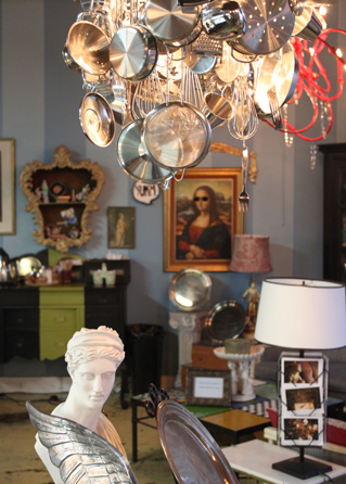
The cafe offers an atmosphere like no other in the area. The “shabby-chic” interior with handmade chandeliers, maps of old Paris, French music, and bejeweled statues inspire a world of imagination. The quaint ambience draws a diverse crowd for friendly conversation, study, relaxation, and refreshment. It's a place where you could spend hours and not realize it. Amelie's sets itself apart by creating a unique brand experience that satisfies the senses of sound (music), sight (decor), and taste (cuisine). As a result, the hustle & bustle is a testament to the cafe's popularity and brand loyalty among locals.
The food and drink constitutes an array of handmade pastries, sandwiches, soups, drinks and espresso made in the European tradition. In February they offered “éclair your love,” an opportunity to personalize an éclair for that special someone. In a nutshell, Amelie’s is kind of like Starbuck’s foreign exchange student. It's a brand that embodies French culture, and emits an unassuming amount of charm.
In my opinion, this is one of the best places to hit the Queen City- great food and atmosphere with a successful brand presence. I vote Amelie’s as my favorite spot in Charlotte. Don’t miss out on this gem of a bakery! Located on the corner of 28th St. in NoDa, or a mini-version on Tryon St in uptown. https://www.ameliesfrenchbakery.com/
Amelie’s French Bakery & Café
2424 N. Davidson St.
Charlotte, NC 28205
Contributed by: Emily Hassell
Does sex sell… at the cost of a brand?
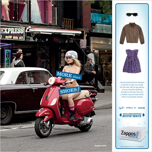
Ever seen a naked woman riding a Vespa?
You will this summer, if you read Cosmopolitan, Lucky, or InStyle magazines. It was revealed in the New York Times this week that Zappos will launch an ad campaign in August featuring nearly naked models doing everything from hailing a cab to playing Frisbee. The campaign touts Zappos apparel alongside its shoe collection, as evidenced by models that need to be clothed.
This venture is just another example of one of the marketing world's favorite mantras: sex sells. The question is do brands end up suffering because of it?
A brand's established image often determines whether sexual advertising succeeds or flops. Brands that already deal in sex appeal can get away with raunchy advertisements because the public understands that their brand embodies that kind of lifestyle. Brands recognized as innocent and unrelated to sexuality, however, can come under fire for a departure from their namesake image.
Take Calvin Klein. The clothing giant has garnered an edgy reputation since the 1980s, and has capitalized on this by releasing several controversial advertisements. Most of them featured teenagers in highly sexualized contexts, and some even depicted violence and rape.
However, criticism hasn't seemed to diminish its presence in the fashion world. In fact, it almost compliments the image that Calvin Klein wants consumers to associate with its apparel: sexy, dangerous, and unhindered by public conventions. When all was said and done, the Calvin Klein brand survived.
Burger King, on the other hand, fared much worse when they tried a similar approach. Its raunchy advertisement from 2009 depicted a phallic-shaped sandwich aimed at the mouth of a woman, with the words "It'll blow your mind away" in huge block-letters. Burger King's brand of cheap, char-grilled hamburgers has virtually no connection to sex appeal, and so the ad got extremely poor reception.
Zappos may not have the street cred to ride the criticism wave like Calvin Klein, but should fare better than Burger King simply by nature of its product offerings. Many are under the impression that Zappos will succeed with the campaign because of its quirky, unconventional fashion brand.
Nathalie Binda, the marketing vice president for Lolë (a women's active wear brand sold on Zappos), praised the campaign in the New York Times article as being "gutsy" and "very Zapposesque." "If there was one brand out there that can do it, it's them," she said.
Contributed by Allison Meeks
Cracking the Code on Package Design

From color scheme to font, companies place great importance on compelling package design for their brands. Now, one of the most overlooked parts of a package—the barcode—is getting an artful makeover.
Consumers are influenced by the entire experience of a product. That experience begins with packaging. A package is more than just a container. It is an asset that can motivate a purchase, making the outside just as important as what’s inside.
"Little clever barcodes seem to be all the rage across a variety of products in the consumer packaging world,” said Nick Irwin, Senior Graphic Designer at Addison Whitney. “Although, I do see it as a superfluous and trendy, it’s good to see these quaint design elements because each barcode is individualistic and can really fortify a brand message if done right."
Form meets function as traditional black and white lines and numbers are taking the shape of famous buildings, blades of wheat and bubbles. According to the Wall Street Journal, the trend is popular with smaller companies, but one of the world's largest food companies, Nestle SA, is even trying out vanity barcodes on some of its brands. For example, Nestle's Juicy Juice Sparkling Fruit Juice Beverage has bubbles rising up from its barcodes, and its Skinny Cow low-calorie dessert line features barcodes shaped like a cow's spot. Consumer-goods companies hope these vanity barcodes will better connect with customers and help their product stand out in a crowded marketplace.
Blogger, Picasa succumb to Google's rebranding
The media world has yet to stop buzzing about Google's intriguing new social network, named the Google+ project. It only seems right to follow up on our last post with recent news about some of Google's most valuable website possessions — and how Google+ plays into the equation.
Mashable.com announced this week that Google has plans to retire its Blogger and Picasa brands in order to rename them as Google products. The popular blogging and photo-sharing websites, respectively, are being rebranded under Google's initiative to integrate all of its brands for the launch of Google+.
Blogger will be renamed "Google Blogs," and Picasa will instead become "Google Photos." The changes will be implemented as soon as mid to late August, which many believe is when Google+ will be released for public use.
These initiatives are part of a slowly evolving rebranding process on Google's part that has been in effect since at least 2008, when Google renamed the newly acquired JotSpot as Google Sites. This time, however, the newly rebranded sites will be implemented as features of Google+, although the details of exactly how aren't clear yet.
Google's rebranding endeavor certainly has the potential for greater brand recognition and prestige. If you visit the current Blogger site, one of the top ten most visited sites in the world, it's not very clear that it's owned by Google (Picasa is a little more obvious, with the word "google" in its domain name). Rebranding each site under the Google umbrella not only eliminates any doubt about the site's brand, but also strengthens Google's image of versatility in the online world.
Of course, the payoff may not be worth the integration in the long run. Users may not utilize the new brands through Google+ at all, and Blogger and Picasa loyalists might be upset enough with the obvious commercialization of their favorite sites to choose different blogging or photo-sharing options. Additionally, although consistency is important for the Google brand (Google Maps, Google Images, Google News, etc.), it could erase the unique, image-conjuring identities formerly held by names like Blogger and Picasa.
Whatever the outcome, it will be interesting to see how the shelf lives of these popular sites fare when they are rebranded with the Google name. Do you think the initiative is a clever strategy or a step in the wrong direction?
Contributed by Allison Meeks
Google+: social networking suicide?

Google is a big part of many people's daily Internet routines. They check their e-mails on Gmail, find directions on Google Maps, and use its namesake search engine multiple times a day.
But there is one digital arena that Google has failed to succeed in, and that is social networking. After Google's 2010 flop with Google Buzz, it is still Facebook that dominates the scene. The social networking giant touts around 750 million active users, and is an Internet staple for many. These successes are due to Facebook's strong brand, which conveys social connectivity that is easily accessible by anyone.
Last Tuesday Google announced its new try at social networking — the Google+ Project. The network is very similar to Facebook — users can share status updates, photos, videos and links with their friends. However, one of Google+'s most unique features is their "circles," where users can place their friends in categories ("friends," "family," etc.) and decide which information they want to share with each group.
This venture shows that Google wants a social networking brand position that is distinct from Facebook. Google wants to be associated with something that more closely imitates the connections you have with peers in the real world, where there is secure and personal control over who gets to know what information.
“In real life, we have walls and windows and I can speak to you knowing who’s in the room, but in the online world… you share with the whole world,” Google product management Vice President Bradley Horowitz told the New York Times. “We have a different model.”
A problem with Google's brand strategy, however, is the network's striking similarity to Facebook, in content and in layout. Some users won't want to add a new social network to their repertoire if it has the same look and feel of what they're already using. Google, as a leading web innovator, could have brought more to the plate here.
Regardless, the launch of Google+ shows the world that Google wants to continue positioning itself as a multifaceted and technologically relevant brand. The corporation has been largely successful thus far in its developments from a simple search engine into a go-to resource for news, images, and even as the owner of Youtube. Now it's looking for a way to maintain its image of simplified versatility, and social networking is the next frontier.
Do you think Google+ will chip away at Facebook's hold on the social networking market?
Contributed by Allison Meeks
Tobacco Gets Graphic

If you plan to purchase cigarette packs after September 2012 you may be surprised, or even disturbed by what you see. The Food and Drug Administration is requiring graphic warning labels with images ranging from a man exhaling smoke through a tracheotomy hole in his neck to a diseased lung to be placed prominently on cigarette packs. Cigarette marketers also will be required to place 1-800-QUIT-NOW numbers on new packaging.
The vivid images are the biggest change to cigarette warning labels since the mid 1980s, when the government began requiring tobacco companies to put health warnings on cigarette packs and tobacco ads. Targeting the cigarette packages themselves shows that the FDA understands the importance of compelling package design. Consumers are influenced by the entire experience of a product. The design of the outside of a package is just as important as what’s inside. A package is more than just a container; it is an asset that can motivate a purchase. Having an effective package design in a crowded marketplace is essential to making a product stand out.
So where does a tobacco company go from here? How does one market a product with packaging designed to shock consumers and discourage them from using the product? “The cigarette companies are in an environment where their product is seen as dangerous,” Brannon Cashion, president of Addison Whitney, told USA TODAY. He points out that tobacco marketers have done a good job dealing with growing anti-smoking efforts. What they need to do is stress innovation, such as developing low nicotine and electronic cigarettes.
“In order to continue to manufacture the product, they have to continue to put innovations in place that can do everything possible to make as safe an environment as possible for those who smoke and the people most affected with their smoking.”
For more information on the new FDA cigarette health warnings, click here.
Fast-Food, Version 2.0
Places like McDonald's and Burger King are generally considered classic fast-food giants. The die-hard Big Mac or Whopper fans will always keep them in business, but a new slew of pseudo-fast-food restaurants are giving them a run for their money – even forcing them to reconsider their branding strategies.
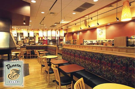
These days, Panera Bread has free wi-fi. Noodles and Co. has healthy pasta dishes for around $5. Even Starbucks sells prepackaged deli sandwiches alongside its specialty drinks. But food isn't the only allure of these new fast-food restaurants: their interiors are decorated with fresh, modern art, their staffs are comprised of enthusiastic young adults, and their customers often treat the establishments more as relaxing hang-out spots than eateries.
These brands accomplish what places like McDonald's and Burger King fall short of —associating themselves with a growing class of individuals that will pay a little more for an atmospheric, modern meal. They are able to exude sophistication that is affordable, healthy, wholesome, and accessible — and who doesn’t want to be a part of that?
Lately, the previous kings of fast-food are taking a hint from their newer competition's branding techniques and moving away from the catch-all, fast-food brand of cheap and greasy. McDonald's, for instance, has recently been implementing new restaurant designs with relaxing color palettes and flowing fonts, along with menu items like fruit smoothies and oatmeal. Burger King is said to be revamping its entire restaurant feel, getting rid of the king mascot as well as adding a new Asian chicken salad to their menu.
But ditching the burger brand that the two chains almost single-handedly created could be hard to do, and regular customers might not embrace the changes. These restaurants take a risky gamble on a new trend that might not outlive their own established brands.
Will McDonald's or Burger King reach the new standard of fast-food prestige? Share your thoughts!
Contributed by Allison Meeks
To Infinity, and Beyond... Your Average Branding
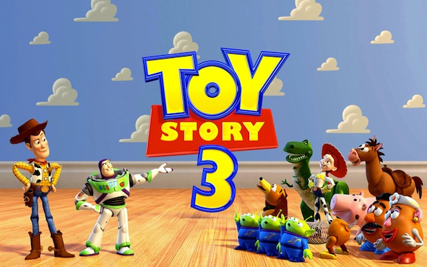
It's been almost a year since virtually every college kid wept openly at the conclusion of Toy Story 3 (myself included – I have no shame here). However, Disney doesn't plan on letting you forget Toy Story 3 anytime soon, because the loveable gang of toys is making a comeback — on the big screen.
Disney is trying a new method of brand strategy for the Toy Story franchise. Just when people — especially children — might be forgetting about Toy Story 3 a year after its release, Disney is bringing it to the public's attention again, in the hopes that Toy Story merchandise will enjoy an increase in sales.
Cars 2 hits theaters on June 24, and careful viewers might recognize something different about Pixar's animated short that debuts before the feature film. Instead of being the usual random, hilarious cartoon that has no connection to the actual film's story, movie-goers will be treated with Toy Story: Hawaiian Vacation, a short featuring several characters from Toy Story 3.
"Showing those shorts is a super-smart strategy for Disney," former president of Nickelodeon Film & Television Entertainment and founder of Worldwide Biggies Albie Hecht said in an interview with Businessweek. "It's a way to extend the characters and the brand without its fans waiting two or three years for a new movie."
The Toy Story franchise has much to be profited from. In 2010, the merchandise franchise ranked fourth-largest of all of Disney's merchandise lines, just behind Mickey Mouse, Winnie the Pooh, and the Princess doll collection. Given the comparative novelty of Toy Story alongside the decades-old frontrunners, it's an impressive feat.
Woody and Buzz Lightyear toys will no doubt sell for a long time, but for a quick jolt of energy to the merchandise sales, the brand consultants at Disney are making the right move. They've identified a problem — how can we enhance the Toy Story brand to maintain merchandise sales? — and they've implemented a solution in a unique way that won't be seen as an off-putting, generic commercial, but as Pixar fulfilling its animation duties. Without even realizing it, audiences of Cars 2 will endorse the Toy Story brand simply by choosing to see a film produced by the same animation studio.
But what Disney and Pixar will always have going for them is their own namesake brand. The Toy Story franchise is a compelling and heartwarming adventure, but would not have had the same lasting power if produced by a different company. Few can rival the powerful duo's filmmaking abilities, and that's where the true power of their branding lies.
Contributed by Allison Meeks
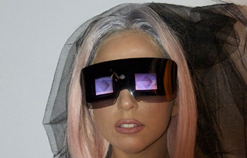
Polaroid gone Gaga!
Looks like Polaroid has been re-branded by none other than Lady Gaga. The pop-culture icon has a new vision for Polaroid—literally. Since January 2010, the Fame Monster has taken on the role as creative director for Polaroid, designing and branding their latest round of camera products. There is still Polaroid brand equity for Gaga to reclaim and reinvent as the "camera" evolves.
The new line, Polaroid Grey Label, will maintain the brand’s core values of simplicity, authenticity, and sharing, while targeting a new generation with the futuristic style of Lady Gaga. The Grey Label is coined from “greige goods” a fashion term for fabric in its purest form. The name expresses the simplicity of Polaroid and the style of Gaga.
The most intriguing product presented is the Polaroid GL20 Camera Sunglasses. The product was inspired by the idea to fuse the icon of instant photography, with the queen of fashionable eyewear. These glasses not only allow eye protection from the sun, but also have a built-in camera that takes pictures and video. The camera fits on the bridge of the nose and the display screens are just below eye level, not to interfere with one’s line of vision. Not only can you take pictures with these glasses, you can also play them back to the world as you live it.
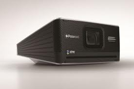
Another Grey Label item is the Polaroid GL10 Instant Digital Camera. Don’t be deceived by the boxy, old-fashioned look. This camera prints digital images right into your hands! It comes with a modern LCD screen display, and brings back instant image printing, defining the Polaroid picture of the new age.
The final product is called the GL10 Instant Mobile Printer. It’s a mini machine for printing photos instantly from your phone or camera anywhere-- at a party, in the office, in the car—and it’s small enough to put in a purse. It acts as a functional tool as well as a fashion accessory. According to Lady Gaga, "This product will revolutionize how we see photos. Your images will no longer die a death on your cell phone or digital camera."
The Instant Mobile Printer, Instant Digital Camera and the Camera Glasses are a unique “look” at how to turn images into a fashion statement. The products are coming out this summer 2011, and there’s no question they will require a large chunk of change. However the price of a Polaroid in it's heyday of the 90s did not detract from the allure of the brand. Hopefully the Grey Label will provide the same appeal.
Contributed by: Emily Hassell
Broadway, Rebranded
What's the first thing you think of when you hear the word "Broadway"? New York City, musicals, The Phantom of the Opera, theater, and Fred Astaire might come to mind. These associations most likely exist because of the way in which Broadway has traditionally been branded for years – as expensive, prestigious entertainment.
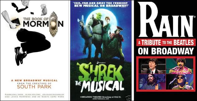
Lately, as seen at the Tony Awards last night, Broadway has been undergoing a branding transformation. Dramas and white-bread musical comedies make way for new shows that target children, minorities, and even those who enjoy raunchy religious mockery (look up The Book of Mormon, winner of Best Musical from the creators of South Park).
Even so, Broadway walks a thin line between experimental target audiences and the musical purists of days gone. Many newer consumers are often reluctant to see shows because of the limited availability and expense of tickets. That's why revivals of classics, like South Pacific and Gypsy, do well the second time around as older audiences remain steadfast in their support.
This puts Broadway at a complicated branding juncture. How can shows attract younger audiences with smaller wallets while still maintaining a reputation that's made them star attractions for years?
For one thing, the quality of shows remains relatively unchanged. Performers are still top-notch, often putting commercial pop-stars to shame (sorry, Justin Bieber). These actors, plus costume designers, technician crews, and so many others, go into the making of one high-quality product — much in the way that a designer handbag à la Gucci is created — instead of cheaply manufacturing several low-quality items at a time.
Instead, what seems to matter most in Broadway's rebranding is making shows accessible to everyone. Productions want the college undergraduate student or working suburban mom to see the latest show on tour in their hometown, not be intimidated by it. Maybe that's why newer shows are increasingly turning to audience interaction; The 25th Annual Putnam County Spelling Bee used audience members as spelling bee participants alongside cast members, and the revival of Hair invited audience members to dance onstage in a psychedelic encore of "Let the Sun Shine In." These experiences catapult audience members into the grandeur of the theater world, but in a way that is both comfortable and accepting for the participants.
Broadway is making progress on the road to rebranding; shows in the vein of Shrek the Musical and Rain: A Tribute to the Beatles are becoming more common, and overall show grosses have increased in recent years. In fact, Broadway theaters earned a cumulative $943 million between 2008 and 2009, the most ever in a single season. However, there's still a long way to go before seeing a show is as common as going to the movies.
Which leaves the question: could a rebranding of Broadway ever really make it accessible to broader audiences? And, more importantly, is that what's best for Broadway?
Contributed by Allison Meeks