Giving Back
Each year Addison Whitney participates in GRACE (Giving Relief and Care to our Elderly), a charitable initiative funded entirely by donations from employees. Donations help support senior citizens in our local community.
We recently visited Sardis Oaks Nursing Home to see the newly updated beauty salon our donation helped fund. The salon was given a fresh coat of paint and new cabinets and mirrors were put in.
[portfolio_slideshow trans=scrollHorz]
Made in Detroit
......................................................................................................................................................................
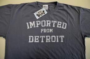
An article in Thursday’s (3/17, 2011) Wall Street Journal by Jeff Bennett, said Chrysler Group filed suit Tuesday to keep a local group from using “Imported from Detroit” on clothing. They want to stop Moda Group LLC from selling T-shirts and other clothing “branded with the words: Imported From Detroit” in their Pure Detroit store chain. The use of “branded with the words” is an interesting choice of words. A quick trademark search shows the phrase is currently Published for Opposition, or pending a final trademark. The mark is filed in multiple product categories covering everything from key chains to eye glasses. No doubt they plan on using the mark on all kinds of chotchki.
Is something like Imported From Detroit trademarkable? There are all kinds of problems with letting a private firm own a public property like a city’s name. The issue has even boiled over into international legal rights to use product descriptors like Champagne and Parmesan, because they do refer to a specific geographical location. So, is "Imported From Detroit" unique enough to be trademarked? Certainly Made In Detroit would not be. It’s a common usage phrase that is mandatory labeling for many products. But since Imported From Detroit is a turn of words based an import not coming from a foreign country, perhaps it is. It is a phrase that would not come about in ordinary language, unless you’re in another country.
Should Chrysler protect their mark from some little tourist store in Detroit or should they promote its use? Surely, they don’t expect proceeds from Imported From Detroit key chains, hats, and coffee mugs to be a real income machine? By simply allowing its use, they give up ownership, so they’ve got to make the effort. But would they be better off allowing its wide-spread use, as it promotes their products indirectly? You would think so – more awareness they do not have to pay for. Brand building is about building awareness and a set of specific associations. Perhaps the T-shirts are Made In China? Maybe the fashion associations of Chrysler and the Pure Detroit store chain clash. But, free publicity for your brand and your ideas? It seems like a no-brainer. Maybe the real problem was the ad agency seeing the free publicity as a threat to THEIR income stream.
There is no doubt that trademarks are an important part of our world of commerce, especially in an Information Economy where we are competing against low cost labor from other parts of the world. On the other hand, Imported From Detroit seems like something we all should have a right to use, if we have a product made in Detroit. Perhaps that’s a big IF? Regardless, it’s just another example of our ever more branded world.
Contributed by Bill Lippincott, Vice President
Insperity | Marketing Material
Once the final Insperity logo was decided, the next initiative was designing and creating the marketing materials. Luckily there wasn’t a strong visual tie to this element of the project as there was to the logo. A wide range of options was presented, but the option that resonated most with the project team was one that continued the story told by the logo.
The bracket (or speech bubble, depending on which way you look at it) subtly hints toward the wide range of offerings that the new Insperity provides, as well as suggesting the beginning of a new conversation. This element spans across a wide variety of materials, ranging from the business card to pocket folders. Its flexibility allows the bracket to be utilized both vertically and horizontally. Paired well with a italic slab serif and modern sans serif, the predominant use of the contemporary, approachable primary and secondary color palettes allows the Insperity team to tell a welcoming story without overwhelming the viewer.
Contributed by Nick Irwin
Insperity | Sparking a New Visual Design

Administaff loved their octagon icon, from the shape of their receptionist desk to the rings made for the founders, the octagon was literally everywhere. This presented a huge challenge, not only logistically, but also in the ingrained passion behind the icon. Therefore, Addison Whitney's initial goal in the early stages of the visual branding development process was to show a wide range of options that presented several opportunities for the new Insperity brand to have an ode to the previous logo at some level. Throughout a couple of rounds, one concept kept on rising to the top and seemed to be a perfect transition from the previous Administaff logo.
The new logo features a web/spark/compass icon that highlights the idea of alignment. The different segments signify how the company offers several business performance solutions for a wide range of companies. The design branches outward to show continued growth and confidence. The color palette was perceived as refreshing and eye-catching. To balance out the more modern colors is a stable, traditional typeface that has several curves that match that of the icon. Overall, the new identity lays a foundation for a fresh, energetic visual brand that truly matches the devotion and passion for prospering businesses and communities found within each Insperity employee.
Contributed by Nick Irwin
Be a Light to the Village
For our December Helping Hands event, AW chose to sponsor the Christmas Village Toy Store at the request of one of our visual designers. It is a suggestion that many AW employees embraced, as the excitement of children at Christmas far outweighs our own as adults.
The inspiration came in 2006 for The Christmas Village Toy Store, a collaborative effort among several area churches that is designed to empower and develop at-risk urban communities in Charlotte. The store itself preserves and promotes joy and dignity at Christmas by engaging a free market system, allowing shoppers to pay a discounted price for desired items rather than be forced to accept “charity.”
Both those who donate toys or volunteer their time and shoppers who purchase toys contribute to store profits that are reinvested into the local community through educational grants and scholarships. Because of this, even the shoppers at the Toy Store are “paying it forward” into their own communities.
Addison Whitney was able to donate several boxes and bags full of toys for children ranging in age from infant to teenager. There were dolls, mp3 players, blocks, books, bath accessories and much more. In addition to donating toys, several employees, along with their friends or spouses, volunteered their time to helping the Toy Store prepare and run the shopping events. We were represented as toy pricers and parking lot attendants.
We would like to say thank you to Warehouse 242 and the other Charlotte-area churches who are part of the Christmas Village Toy Store for allowing us the opportunity to give to such an amazing organization. We look forward to being part of the initiative in the future, whether as individuals or as a company.
Know & Love
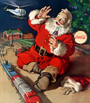 ......................................................................................................................................................................
Is there any Christmas character more iconic than Santa Claus? The belly o’ jelly, the tress-dressed face and the bright red suit with snowy fur all wrap up to create the jolliest man we know.
While you can buy Coke anytime and almost anywhere, my favorite holiday brand is Santa himself. We can thank Coca-Cola for Mr. Claus as we know and love him today. In 1931, artist Haddon Sundblom introduced us, via The Saturday Evening Post, to who has become our quintessential image of St. Nick.
Coke’s website explains, "For inspiration, Sundblom turned to Clement Clark Moore's 1822 poem "A Visit from St. Nicholas" (commonly called "'Twas the Night Before Christmas"). Moore's description of St. Nick led to an image of Santa that was warm, friendly, pleasantly plump and human. For the next 33 years, Sundblom painted portraits of Santa that helped to create the modern image of Santa -- an interpretation that today lives on in the minds of people of all ages, all over the world.”
So this year, instead of leaving milk out with your cookies this Friday night, you might leave a bottle of Coca-Cola. Santa is sure to appreciate the caffeine kick; he’s got a lot of houses to hit, you know.
You can read all about Santa’s image and other Coke lore on Coca-Cola's website.
Merry Christmas, y'all!
A Fresh Start
Sarah is a Charlotte-area junior who has been a Girl Scout for ten years.
She is now in the final stage of earning her Gold Award.
Much like the Eagle Award is to the Boy Scouts of America, the Gold Award is the highest achievement within the Girl Scouts of the USA. Only about 5% of eligible Scouts successfully earn the prestigious award. The Scout must complete 30 hours of leadership work, 40 hours of career exploration, and the 4Bs Challenge during which the scout identifies key needs in her community. After those steps have been taken, she must complete a service project. This service project must extend beyond GSUSA and provide a lasting benefit. It requires a minimum of 65 hours of work.
Sarah says that the homelessness crisis in Charlotte has been a passion of hers for many years, primarily due to her mother’s involvement with the Urban Ministry Center for almost half of Sarah’s life. Because of this, it was an easy decision for Sarah to determine her Gold Award project, as she has grown up working with homeless people.
For her project, called “A Fresh Start,” she is compiling 85 laundry baskets full of basic household items, including dish detergent, washcloths, hangers and sponges, to be donated to the upcoming residents of Charlotte’s newly constructed Moore Place, a housing facility built by the Urban Ministry Center. Moore Place will be Charlotte’s first permanent supportive home built to give a roof to chronically homeless men and women. Sarah’s aim is to provide these baskets as a house warming gift and starter pack.
As a Helping Hands event for November, Addison Whitney collected enough goods to fill two laundry baskets with the household items. These items will benefit two new residents of Moore Place and will make a dramatic impact in getting these new residents settled in their new homes.
Sarah plans to help the residents move in and hopes to continue working with them long after their first bottle of laundry detergent runs out.
If you’d like to put together a basket for Sarah’s project, please visit her website.
You can read more about Moore Place here.
Just Say Mo
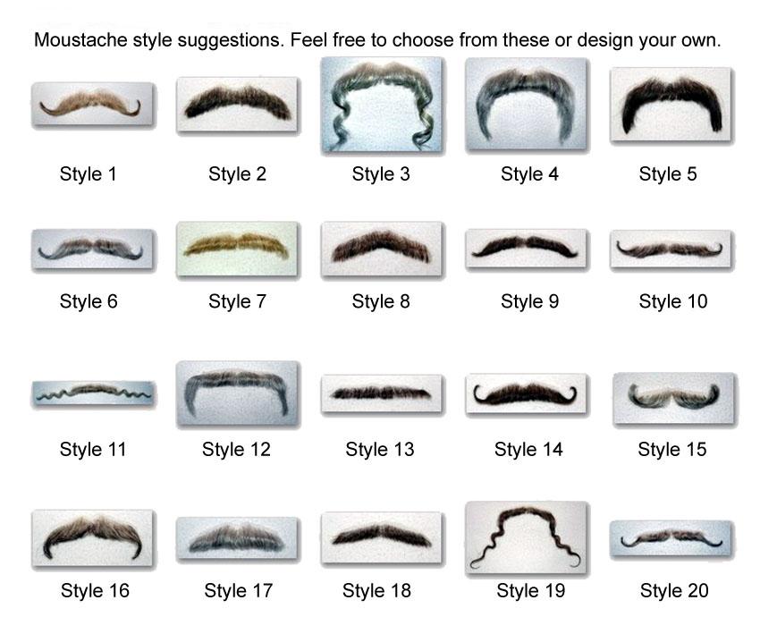
Breast cancer has the pink ribbon, heart disease has the red ribbon and prostate cancer has…the mustache? In effort to raise awareness—and money—for the fight against prostate cancer, men around the world will grow mustaches throughout the month of November Movember.
The Movember (sometimes referred to as No Shave November) rules are as follows: start Movember 1st clean-shaven and then grow a mustache (Mo’s, in Australia) for the entire month. According to the Movember website, the mustache is the ribbon for men’s health. Participants can raise awareness and funds for cancers that affect men by sacrificing their faces.
Started by a group of friends in 2003 in Melbourne, Australia, the movement has evolved and expanded to become a world-wide effort that raises millions of dollars for organizations such as Livestrong and the Prostate Cancer Foundation.
New York Yankee Nick Swisher is growing one, even the Flip Camera is sporting a ‘stache. No word on Tom Selleck, although suffice it to say he serves as inspiration to “Mo Bros” everywhere.
While Movember generates a lot of buzz and is certainly a fun way to raise awareness for men’s health, it’s tough to predict if the mustache will ever achieve the recognition level of the pink ribbon. For now, all I can do is hope to spot a Yosemite Sam-esque mustache sometime this month.
The Ugliest Thing at Urban Outfitters

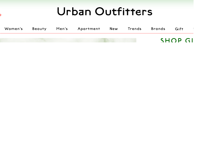
No, it's not a faded shirt or a floppy hat that looks like it came from my grandmother's attic. The ugliest thing you'll find at Urban Outfitters is the new logo/look of the website. In a surprising move, Urban Outfitters has changed the color palette of its website and debuted a new logo that looks like it was created with Word Art.
Though the store is in good company--Gap and Belk have also unveiled new logos this year--the move doesn't fit the Urban Outfitters brand. Urban Outfitters is all about being hip, cool and ahead of the curve. Refreshing its logo after so many "mainstream" stores have already done so makes Urban Outfitters look like a crowd follower, rather than a trendsetter. There is also nothing particularly unique, edgy or very cool about the new design or website. The font and color palette are fairly generic looking, even boring.
On the other hand, the new logo is pretty fitting for a store full of retro styles. It looks just like the cover my fourth grade book report.
UPDATE: Urban Outfitters changed the look of their site to something more streamlined less ridiculous.
Paint AW Pink
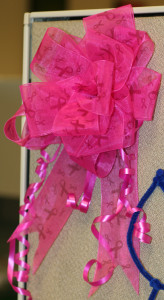
Part of Addison Whitney culture includes active support of philanthropic endeavors. Breast cancer is an illness that has affected all of us in some way, and we are part of a much larger initiative dedicated to finding a cure.
In honor of Breast Cancer Awareness Month, we here at AW made donations to BCC Rally and Susan G. Komen for the Cure. As a gift, in return for our donations, we each received a 7-inch hot pink ribbon to be displayed on our desks, cubes or doors. Excitingly, we collected enough money to receive 35 bows. They went up on Friday, October 1, the first day of Breast Cancer Awareness Month.
To coincide with day one, we encouraged everyone to wear pink to the office and help to Paint AW Pink. Friday was definitely a pink day as the bows glowed brightly throughout the office, and many of us showed off our pink shirts and dresses.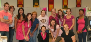
The bows stayed up through October, but we will always be part of the fight for a cure.

