
Three Questions to Ask When Determining Your Pharma Brand Name Strategy
Today we are excited to have a guest blog from Joshira Maduro, Verbal Branding Associate at Addison Whitney!
By understanding the general buckets of naming strategies and the scenarios in which these types of names thrive, pharmaceutical companies can hone their naming strategy. At the same time, these teams can hedge their risk by including options from different strategies, specifically blank canvas, to avoid the need to start over.
When looking into a naming strategy for your product here are a few questions to consider:
- Is this drug being marketed to patients or doctors?
The answer to this question can help you hone in on your naming direction. Is this drug going to air on TV with commercials that say “ask your doctors about __.”? If so, then creating a marketable story through the name will be vital. In that case, an aspirational “risky” name could be a big payoff if it became memorable enough to stay at the top of the patient’s mind. It will be easier to building a remarkable story behind an emotional name than to try to build brand recognition behind a very scientific, functional name.
Blank canvas options can also work well for patient-facing drugs because they can stand out more: blank canvas names will be unlike anything the patient has heard before, which gives marketers the opportunity to build the story behind the name to be memorable. While the drug itself needs to be effective with proven results, a memorable name and story can cause patients to seek it out proactively. 
On the other hand, if doctors are the primary audience, then a scientific name would tend to yield the best result: the doctor can quickly identify the drug and its indication which will lessen the possibility of confusion. Doctors will not be as interested in a memorable story; they are more concerned about knowing that the drug will work for their patient and that they are prescribing the right medication for them.
- Is this a first-in-class or a “me too” drug?
Often the naming strategy for a drug will depend on the other drugs that are already in the market to treat the same indication. A “first-in-class” drug uses a mechanism of action (MOA) that currently does not exist. For drugs that are first in class, a scientific/functional name can be an excellent way to stand out while also being a safe name. First, in class would mean that there are no competitors in the same space so look alike and sound alike would not present a significant issue.
On the other hand, when the drug has nothing unique regarding MOA, an aspirational name may be the best route to go. By working with a key emotional benefit, the name can find a way to stand out in a crowded space.
- What if my first choice name gets denied by the FDA?
The process of getting the marketing team, product team, and senior level management to agree on a top choice name is already hard enough. But even when they can all agree on the same name, there is still the hurdle of FDA approval to overcome. A thorough screening process can significantly minimize the risk of FDA denial, but there is always the chance that the first choice name gets denied regardless.
To hedge your risk, you need to make sure that there are options for each type on the name in the top 5 list of name candidates: functional, emotional, and blank canvas. In the end, the blank canvas will always be the safest route to go, because it is meant to look like nothing else, but it can be hard to get an entire team on board to adopt a meaningless name.
Risk vs. Reward in Pharmaceutical Brand Naming
Today we are excited to have a guest blog from Joshira Maduro, Verbal Branding Associate at Addison Whitney!
Getting a drug from the lab to the market is an incredibly time consuming and resource consuming task. There are several rounds of clinical trials the drug needs to pass, which only occurs after pre-clinical research. Then there is the approval process, where the regulatory agencies not only check all the related data about the drug to ensure its efficacy and safety for approval, but also review the proposed brand name to ensure it is sufficiently unique from names of drugs already on the market.
In the pharma world there are two factors that regulatory agencies consider “risky”: if looks or sounds too much like a drug already on the market and if the name gives too much of a claim or over-promise.

For instance, a name with the word “cure” in it, or a name that shares its first five letters with another drug already in the market would have a difficult time gaining approval. Companies avoid these risks by going through a rigorous screening process before submitting their final name candidates. The screening and approval process can easily take months, if not a full year, so it’s important to make sure the naming process provides more than enough “safe” options to keep up with launch timelines.
However, sometimes it pays off to take a riskier route, going outside the norm and developing a name that would stand out in a saturated marketplace. These names, if approved, have a high opportunity for easy name recognition, which greatly benefits future marketing efforts.
Generally speaking, brand names fall into three strategic categories – Blank Canvas, Scientific/Functional and Aspirational. They are each defined by the rationale behind the brand name and how it ties back to the product and the overall brand strategy. Additionally, they each carry “safe” and “risky” name characteristics, which must be balanced when creating a name that fits into the category. Here are three main types of brand names, and where they fall in the “safe name” spectrum:
- Blank Canvas: These names tend to have no inherent meaning but aim to sound nice and look intuitive to say. The biggest risk these names face are the lookalike/soundalike comparisons to competitor drugs. In my opinion, these would be the “safest” option in naming.
- Scientific or Functional: A name that leverages letter strings from its generic name or Mechanism of Action would fall into this category. These names can face more risk than blank canvas because there will likely be another competitor already leveraging similar concepts in their name. There is also a danger of having a name that shares too many letters with its generic.
- Aspirational: These are the names that truly look to tell an emotional story. Telling an emotionally impactful story can make the name stand out more to patients, especially if it is a drug in a very crowded space. However, since these types of names have the risk of looking/sounding like a competitor and being a claim, the fall on the riskiest end of the spectrum.
So which of these types of names is the best for your drug? Well, there is no clear-cut answer. Each of these kinds of names has their risk, so there is no truly “safe” option. However, it would take more effort to get a more aspirational name to pass screens and gain FDA approval compared to a blank canvas name. On the flipside, an aspirational name can yield more differentiation in a saturated market compared to a scientific/functional name so that it could be worth the effort.
In the end, where you brand name falls in the spectrum is a case-by-case decision, which is a statement that isn’t as obvious as it sounds. Yes, of course each name development process is different, but often we fall into the trap of looking around and allowing trends or patterns to weigh more heavily on the decisions than they should. Deciding what factors are most important in the long run and sticking to those decisions can give your drug name the best chance of success, both in the approval process and on the market.
How to Use Brand Positioning to Start your Brand Development
Today we are excited to have a guest blog from Lisa Overman, Director, Brand Strategy!
As a seasoned branding and marketing pro, I have been developing positioning statements for brands and companies for longer than I care to admit. Though if asked, I honestly could not have told you how “positioning statements” came to be so well-known and one of the most important marketing tools used today; that is until I read the article by Rance Crain, How Al Ries Positioned the Positioning Statement.
 Remember your high school pep rallies and games? The excitement of the competition, the players focused on the win and the fans uniting behind the team to cheer them to victory. That is what a positioning statement - it is a company’s mantra, rally chant, cheer to gather the teams and get everyone fired up. In short, it is the chance for a brand to shout to the world that it is the best in the business. Every brand, business owner, brand developer and marketer wants to have a positioning statement that serves this purpose, in addition to uniting all of the teams that support the brand behind a common goal.
Ries alludes to companies needing an aligned-team approach when he describes the differences between the creative team and the marketing team, and who owns the foundation of kicking off that next big idea. Internally, your team has to be rowing in the same direction with consensus agreement that this is the best direction for the brand. If you can’t rally a sense of belief from your own team, how can you expect consumers to do the same?
That is why creating a strong positioning statement is such an important starting point. It will lay out some of the key aspects of the brand building process, pointing out the end goal, the basic characteristics or big idea, and some of the steps to get the brand to the top.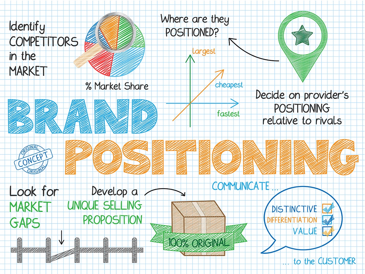
So how does a positioning statement come to fruition? Ries provides a great example when discussing working with Uniroyal on their first pass at a positioning statement. In his example, he discusses how the team made the unified choice to position the brand as the “technology leader in the rubber industry.” He then points out how the brand needed to convince the consumer of the validity of this statement, answering questions such as how does Uniroyal back up its claim as the leader in the space and how is leadership measured, while imploring the team to provide concrete reasoning to support the statement.
The goal of what Ries was doing was to let the Uniroyal brand team know that on its own, the statement wasn’t strong enough or believable enough to be the “rock” of the brand.. The concept was there, but it needed something credible, unique and stronger than what every other competitor was saying. Using facts to support their next positioning statement, Uniroyal showed their differentiation and outlined how they stood apart from the competition: “Uniroyal holds more patents than any other rubber company.” Simple, concise and clear, and allowing for the consumer to connect the dots between their “best of” statement and their leadership claim.
So the next time you are searching for that perfect, solid positioning statement and feel like you are hitting your head on a rock, focus on finding the words and statements that sum up that big idea. Then, explain what that big idea has to offer and what makes it different from the competition. In doing so, you can ensure that your positioning statement is the cornerstone for your next big idea that turns into your brand, and then ultimately become the center for all your sales and marketing efforts.
Image Sources:
Image 1
Image 2
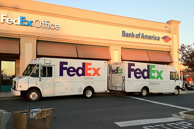
When Unifying Brands, Simplicity and Consistency are Key
Today we are excited to have a guest blog from Senior Graphic Designer Dave Dixon!
What’s the difference between FedEx, FedEx Ground, and FedEx Freight? FedEx themselves just placed a big bet on the answer actually being “who cares?”
For the last 15 years or so, part of FedEx’s brand identity has included separate sub-brand identities for each of its independently operated companies. These initially included designations including FedEx Express and FedEx Ground, and subsequently came to include several more sub-brands, such as FedEx Freight and FedEx Office. From a customer point of view, one of the most recognizable differentiations between these sub-brands was color – think purple and orange for Express, purple and green for Ground, or purple and red for Freight.
Last week, however, FedEx announced that they would be doing away with those sub-brands (and all the fun color combinations) and moving towards one unified FedEx brand and logo. Unsurprisingly, they’ve opted for the purple and orange mark, which matches the company’s original color scheme and which internal research showed to be the most widely recognized among consumers.
So what does this mean for branding in general, if it means anything at all? The primary takeaway, as has been the case in other examples we’ve highlighted, is that simplicity is key.
For certain brands, differentiating between several sub-brands is key. Think car companies, such as General Motors with Cadillac, Buick and Chevrolet, or Microsoft Office with Word, Excel and PowerPoint. These sub-brands communicate something important to the consumer, whether it’s price point, quality, or function.
Additionally, creating distinct and differentiated brands within a portfolio can allow for an organization to maximize its market presence, without the risk of over-saturation or confusing brand messaging.
So what about FedEx? As long as they deliver your package on time and in one piece, does it really matter whether it flew in on a plane or stuck to the highways? The answer appears to be no. That promise of “on time and in one piece” is consistent across sub-brands.
And if the message is the same, what’s the point in having it delivered via different brands? In this case, differentiation becomes unnecessary at best, confusing and overcomplicated at worst.
 This is a crucial part of this type of brand decision process. Consistent color schemes, logos or other visual brand elements aren’t enough to truly bring brand simplicity to life. These brands must, to the most they can be, align from the top down. Otherwise, consumers will see not consistent and strong branding, but confusing branding that doesn’t seem to know what it wants to be.
For FedEx, this alignment is also boosted by an iconic brand at the top. The purple and orange colors, along with the instantly recognizable logo, give the sub brands instant brand credibility. As far as brand portfolio alignment strategies go, FedEx has followed the gameplan as they should, with the hope that they can leverage the main brand as their portfolio grows.
As a graphic designer, and as someone who loves categorization and organization, I get it – selecting different colors for your brand identity is fun and can be difficult to resist. And in the right situation, it can be an effective way to communicate and elevate your brand. But before you jump head first into the pool of sub-brands, take a step back and evaluate: Do each of those sub-brands truly have something unique to say? As FedEx recently decided, the answer may very well be “no.”
Learn more about building your best brand portfolio strategy by downloading this FREE webinar, "Identifying The Opportunities In Your Brand Portfolio - Are You Capitalizing On Every Potential Business Opportunity Your Portfolio Provides?"
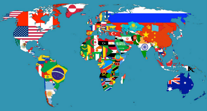
AW Spotlight - Visual Branding Team's Favorite National Flags
During the Opening Ceremonies of the 2016 Olympics, each nation represented in the Games matched into the stadium behind their flag, giving viewers a firsthand look at the amazing visual branding exhibited by the flags, many of which may have been previously unknown.
In this spirit, we asked two of our talented of the AW Visual Branding team members, Dave Dixon and Sarah Scott, to give their selections of which world flags they felt are the most visually appealing. Let's find out their selections:
Canada
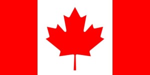
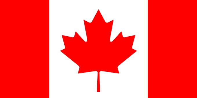
Canada’s flag is a near-perfect combination of the classic and the modern. It offers a nod to the long-standing flag tradition of vertical bars, employs a simple, yet strong color palette, and then spices things up just the right amount with a clean, recognizable symbol to set it apart from all the other red-and-white flags of the world.
And as with any symbol worth its salt, the real beauty lies in the application opportunities it provides. With its aforementioned recognizability and simplicity, the red maple leaf can be incorporated into Olympics uniforms, federal agency logos, and any number of other Canada-related visuals.
All of Scandinavia
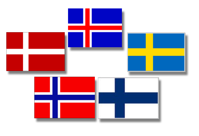
Scandinavia – what an example of brand architecture! One look at the off-center cross adorning the flags of Sweden, Norway, Denmark, Finland, and Iceland and you know you’re looking at a flag that belongs west of Russia and north of everything else in Europe.
Scandinavia could write a textbook on how to differentiate within a system of design.
Sri Lanka
Sure, Bhutan and 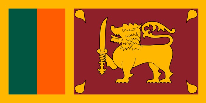 Wales have dragons on their flags. Albania and Montenegro have two-headed eagles on theirs. Papau New Guines has…a bird of paradise. But are any of those animals holding swords? I don’t think so.
Not only does Sri Lanka’s flag feature a fierce-looking lion (?), but he’s holding a sword! You’re not messing with Sri Lanka if you know what’s good for you.
Kazakhstan
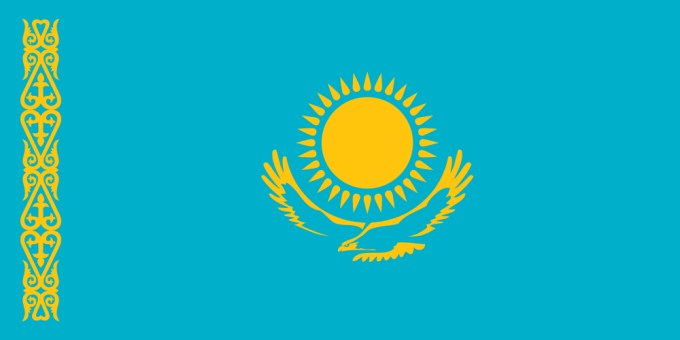
This flag stood out to me for its shade of vibrant blue and contrasting yellow ornate pattern on the left hand side of the flag. The pattern identities the traditions of Kazakhstan but I love the detail with each piece weaving within the other to create a solidified design.
Also, I love the boldness of the sun, which according the the flags history stands for life and energy, while the eagles rests below in subtle outline to reflect power of the state.
Scotland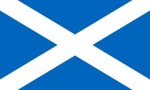
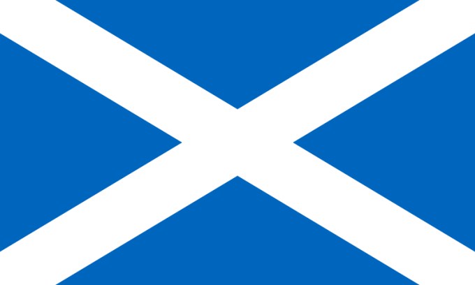
The Scottish flag is very simple in nature with the white cross bars, over blue. However, I love the simplistic nature of it.
It’s not busy and because of that to me it makes a bold statement. The design itself signifies the blue and white cross of St Andrew.
Image Sources:
Flags
Scandinavian Flags
Header Image
The Science of Logo Design: How Much Can a Logo Impact A Brand?
Today we are excited to have a guest blog from Senior Graphic Designer Dave Dixon!
Logos are inherently subjective. On the art-science spectrum, they seem to reside rather comfortably within the realm of art. However, the pursuit to discover the science of logo design is alive and well, with the latest effort coming from researchers at the University of California, Davis.
A series of social psychology experiments illustrated that logos (as well as flags and other group symbols) communicate unity and effectiveness, regardless of the group they represent. On the flip side, logos were also found to make groups seem more intimidating and less inclusive, whereas organizations without a logo came across as more friendly and welcoming.
While certain luxury or niche brands may embrace the concept of exclusivity, where does that leave companies and organizations that pride themselves on being open, helpful and friendly? The idea of forgoing a logo isn’t realistic, particularly when standing out in a crowded marketplace is a basic requirement for success. At the same time, coming across as intimidating or impersonal could be detrimental to the brand.
Is it possible to convey both competence and warmth in a logo? Unity and inclusion? Strength and kindness?
The answer to all of the above is yes and no. It’s certainly possible for a logo to convey any or all of those things – just not on its own. Logos, and the ![]() brands they’re part of, are living, growing things; they’re inseparable from the products, services, employees and other aspects of what they represent. Even the most recognizable logos (and by extension, the most recognizable brands) have evolved considerably throughout their lifespans. You only need look as far as Apple to find an example of noticeable logo evolution. More recent examples, such as Hillary Clinton’s presidential campaign logo, prove that perception of a logo can change in as little as a few months.
brands they’re part of, are living, growing things; they’re inseparable from the products, services, employees and other aspects of what they represent. Even the most recognizable logos (and by extension, the most recognizable brands) have evolved considerably throughout their lifespans. You only need look as far as Apple to find an example of noticeable logo evolution. More recent examples, such as Hillary Clinton’s presidential campaign logo, prove that perception of a logo can change in as little as a few months.
Perhaps even more importantly, logos are part of a larger brand system. Left to fend for itself, a logo would quickly cease to stand for anything - or, more accurately, never come to stand for anything in the first place. And while the best asset for any brand is customer loyalty, additional visual branding elements can help bridge the gap between a newborn logo and a mature, fully realized brand.
Marketing and communication collateral can play an important role, as well. PowerPoint presentations, newsletters, website graphics – these elements provide an opportunity to create a strong visual impression in the hearts and minds of customers that connects the logo with more specific brand messaging, filling in the blanks and completing the brand picture.
More subtle visual brand elements, such as color, can play a significant role, as well. Think Home Depot orange or Coca-Cola red – reinforcing the brand color palette across a range of visual components will serve to cement the logo-to-color-to-brand connection in customers’ minds, and 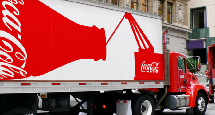 potentially make that set of colors uniquely identifiable. Working either in conjunction with or as a replacement for color, typography can serve the same function. FedEx, for example, uses a variety of secondary colors across its service lines, but its distinctive typography and primary purple color scheme are instantly recognizable.
A logo is the central focus of visual branding, and rightly so – it’s the building block that provides a solid foundation for everything to come. But it’s important to remember that a logo is just the beginning, and that visual brand elements such as stationery, marketing collateral, color palette and typography breathe life into the logo, as well as providing additional touch points for your target audience to meet, get to know and, ultimately, fall in love with your brand.
Long Term vs. Short Term Benefits of Rebranding
Today we are excited to have a guest blog from Senior Graphic Designer Dave Dixon!
Studies like Logos Now, which we highlighted on brand salsa last October, have repeatedly shown that the strongest, most recognized brands are those of companies like Apple, Nike, and Coca-Cola. But that doesn’t mean those companies, or any companies in general, have a monopoly on branding, particularly when it comes to visual branding.
In fact, one of the most widely seen – yet often unnoticed – forms of visual branding comes from the government, in the form of highway traffic signs. While the purposely bland, utilitarian nature of traffic signs may seem like a form of anti-branding, the typography they employ offers several useful parallels to the efforts of corporate brands.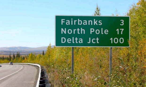
In 2004, the U.S. Federal Highways Administration (FHWA) approved the use of a new font for highway traffic signs. The font, called Clearview, was developed specifically to improve the legibility of highway signs. Tests showed that it was a success, with Clearview providing roughly 1.2 seconds of extra reading time over its typographic predecessor, Highway Gothic. However, on January 25, 2016, the FHWA announced that Clearview was no longer approved for use on American highways.
So after 12 years, why the change?
As it turns out, there are likely several factors at play, with the biggest being the fact that the FHWA never officially mandated the move from Highway Gothic to Clearview. Instead, they simply approved the new font for interim use, leaving it up to individual states to implement it (or not) as they saw fit.
One other factor that may have influenced the decision is cost. While Highway Gothic has been in use across the country for more than 60 years, state and local governments who adopt Clearview must purchase a font license, which can reach up to $795 for the full family of typefaces – for each individual user.
Unsurprisingly, implementation of the new font has been inconsistent. With no clear mandate and a financial obstacle in the way, only slightly more than half of U.S. states have adopted Clearview for their highways signs. Furthermore, inconsistencies remain even within individual states, as local governments have sometimes instituted the new font while the rest of the state officially
continues to use the old one.
It’s not difficult to see how consistency is an important characteristic for road signs. Regularly travelling at speeds as high as 70 or 80 miles per hour, drivers rely on being able to quickly and 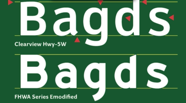 accurately gather information and make decisions. And while it may not be as readily apparent, this lesson applies equally to corporate branding. In a crowded marketplace, potential customers also rely on being able to easily find the information they need to make purchasing decisions. It becomes vital for companies to maintain a consistent look and feel not only for their typography, but also for their logo, color palette, and other visual signifiers that set their brand apart.
The FHWA’s decision also highlights another issue – the short-term vs. long-term benefits of rebranding. The cost for state and local governments to acquire Clearview may indeed be an immediate burden on already strained annual budgets. However, with the research indicating that the change provided drivers with valuable extra seconds, when does the benefit begin to outweigh that financial burden? A font license is, after all, a one-time cost.
In the same vein, corporate brand equity isn’t to be taken lightly or sacrificed on a whim. But if the current visual brand is holding a company back from reaching its full potential, introducing a new direction (and absorbing the initial financial cost that comes with it) may be well worth it. Regardless of the brand, consistency across the board is a vital component. Without it, much like the current state of highway signs, you may find yourself neither here nor there.
Image Sources:
https://www.citylab.com/commute/2016/01/official-united-states-highway-sign-font-clearview/427068/
https://qz.com/605695/font-designers-response-the-us-governments-has-decided-to-nix-clearview-from-all-highway-signs/
Addison Whitney is a global branding firm with a passion for building strong brands.
To learn more about Addison Whitney, visit our website at AddisonWhitney.com, or contact us here.
Can New Visual Branding Strategies Make McDonald’s a “Modern, Progressive Burger Company”?
Today we are excited to have a guest blog from Senior Graphic Designer Dave Dixon!
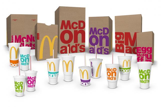
“Modern” and “progressive” may not be the first words you would associate with fast food titan McDonald’s, but company leadership is working to change that. Enter the latest packaging revamp, which will roll out during the course of 2016 and is intended to work hand-in-hand with restaurant design, digital marketing and other brand conduits to establish McDonald’s as “a modern, progressive burger company,” as CEO Steve Easterbrook described it.
Specifically, the new packaging introduces a bright, vibrant secondary color palette to pair with the traditional red and gold so closely associated with McDonald’s, in addition to simplifying and de-cluttering the overall look of the various bags, cups and containers.
However, in tandem with the iconic golden arches, it’s the typography that really takes center stage in this design. Whether it’s the “McDonald’s” name or specific menu items (Big Mac, Egg McMuffin, Chicken McNuggets, etc.), type is the focal point of the design, using a bold font and stacked composition to noticeably break from previous packaging styles.
Time (and, perhaps more importantly, updates to the actual food on the menu) will tell whether this new packaging and visual branding strategy can achieve the stated goal of looking modern and progressive, but for me it misses the mark. While I can’t disagree that it’s more modern than the previous packaging, I also can’t shake the feeling that this is 2010’s idea of progressive, like your parents throwing their first Ugly Sweater Party this past December.
Feedback indicated that consumers “wanted McDonald’s to be McDonald’s,” according to Matt Biespiel, McDonald’s Senior Director of Global Brand Development, and the new packaging clearly reflects an attempt at balancing that with the push towards something more forward-thinking. Ultimately, that balance just isn’t quite right.
I love the oversize, bleeding-off-the-edge golden arches, and the iconic yellow is a vibrant contrast against the brown bags, but with both the traditional yellow and red present, the new secondary 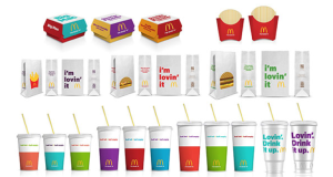 palette clashes instead of complements. And the secondary color palette itself seems to be trying too hard, especially when you read the names McDonald’s has assigned to them ¬– Magical Magenta, Ocean Fresh Blue, Optimistic Orange, Passionate Purple, and Zesty Lime. Consumers will likely never hear those names, but they (unfortunately, in my opinion) do match up with the colors themselves.
The typography, which as I mentioned is the focal point of the new design, also leaves a lot to be desired. The stacked configurations could have been interesting, but by using the established, corporate font found in the McDonald’s logo, they never really had a chance of looking truly progressive. Product names also seem to adapt to this style more easily than the company name, where the “on” in “McDonald’s” is overpowering and distracting.
Perhaps a more limited color palette and a purposeful juxtaposition between the big, bold golden arches and a more restrained, refined type treatment on the opposite side would have been more effective. It’s certainly understandable that companies like McDonald’s need to capitalize on their existing brand equity, but there has to be a better way to carry out the specifics.
Perhaps the most interesting aspect of this redesign from an industry insider’s perspective is the process that led to the new designs. Rather than working with one specific agency, McDonald’s brought together a team that included designers from each of its seven lead agency partners from across the globe. The team had just a week to brainstorm, and after receiving mid-week consumer feedback, narrowed things down to three finalists.
It’s impossible to say how McDonald’s new packaging would have looked had it been designed by a single agency, but in this case, the result seems to reflect the unorthodox process used to create it. In isolation, certain elements might have worked, but the whole ends up seeming somewhat less than the sum of its parts. In fact, by trying to be everything to everyone, McDonald’s just may end up being nothing to anyone.
Addison Whitney is a global branding firm with a passion for building strong brands.
To learn more about Addison Whitney, visit our website at AddisonWhitney.com, or contact us here.
Rebranding Job Titles: An Innovative Approach or a Goofy Gimmick?
Today we have a great guest post from Verbal Branding Associate Rachel Loucks!
Say you’re at a cocktail party and you introduce yourself to a fellow invitee. After a few minutes of pleasant conversation, you ask what he does for a living. He replies that he is the “Ambassador of Buzz” at his firm. What do you think in that moment?
Taylor Aldredge, who holds that very job title at a virtual phone company Grasshopper, says people are often intrigued.
“Just telling people my title gets a conversation going about Grasshopper and what we do,” he says.
And Grasshopper isn’t the only company cashing in on the intrigue generated. Job titles like these seem to be cropping up more and more, and not just in the tech startups that initiated the trend; more traditionally run organizations are now increasingly using titles such as Media Gurus, Sales Ninjas, Officers of First Impressions, Copy Crunchers, Directors of Spark, Marketing Rockstars 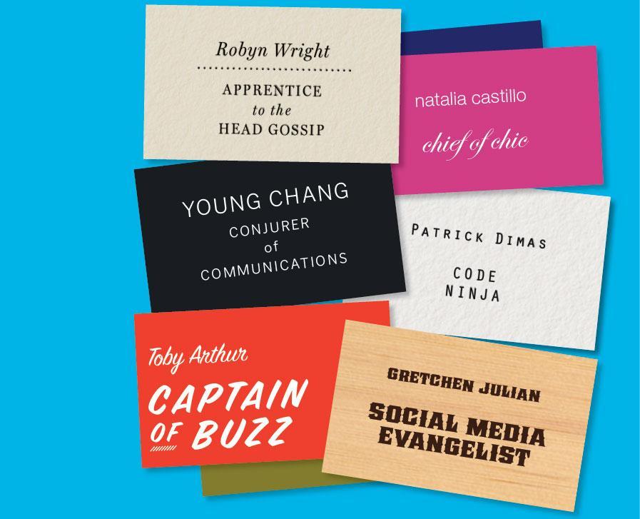 and Problem Wranglers.
From a branding perspective, a distinctive job label can be a fun way to make employees and their companies stand out, and give outsiders a snapshot of the organization’s values and sense of identity.
As Carlos Jimenez, President of the marketing solutions firm The Zella Company, asserts, "Funky job titles can serve as an extension of a company's brand and indicate that you are a company with a fun culture that doesn't take itself too seriously."
And who doesn’t want to be the fun, cool company?
Well, call me the Bearer of Bad News (ha!), but rebranding job titles is probably not the best move for your organization. Why, you ask? Here are a few reasons:
1. Whimsical job titles are often confusing and vague.
What does a Director of Spark actually do? How are the responsibilities of a Word Herder different from a Copy Cruncher? These are valid questions that are made all the more concerning when one remembers what a job title’s number one purpose is; to clearly and succinctly communicate the role’s function within the organization.
If we think of a company as the master brand, and job titles as sub brands, then it follows that there should be some sort of systematic brand architecture that denotes various positions and levels within the organization. Wacky job labels muddy up this branding architecture by obscuring the title’s place in the overall corporate structure. Monster.com’s Kathy O’Reilly cleverly muses, “Folks love trendy titles, but does it create a career path? Where do you go from ninja? To samurai? Not likely.”
2. They have the potential to limit, rather than enhance, your audience.
It’s true that an off-the-wall job label can help you stand out, but it can also make you hard to find. If applicants are searching for positions within your organization, they might not know to look up “Social Media Butler” instead of Communications Manager.
In the same vein, if the resume of your ideal employee has “Sales Rockstar” on it, but the position you’re looking to fill is a “Business Development Dynamo” the likelihood that your HR’s applicant tracking software will find it are much slimmer. Having fanciful titles may require a company to do more compensatory legwork via search engine optimization, recruiting, and marketing efforts, in order to maintain visibility. Moreover, a company should consider its client/customer base before moving to zany monikers.
Brand consultant Lisa Merriam points out, “Your team might think you're hip and edgy. Potential clients might think you are lame.” If the people or companies you’re trying to do business with won’t understand or appreciate the change, you may only succeed in alienating them.
3. They likely don’t fit with your company’s overall image.
There is a reason why job labels like Apple Genius, Starbucks Barista, and Best Buy Geek Squad member are compelling—they are both pertinent and intimately tied to their company’s persona. But not all company personas lend themselves to imaginative titling.
If your organization’s image is all about being serious, established, and professional, an eccentric job title will not only fail to convey that, but could undermine it. Another big mistake that companies make regarding trendy job titles is that they don’t actually create something new or unique to their brand. By having multiple organizations adopt the titles “Media Guru” or 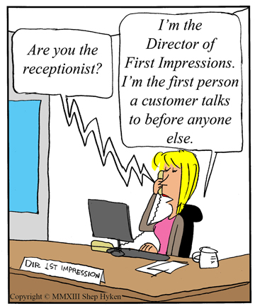
“Problem Wrangler,” for example, something that was innovative and fitting for one organization becomes trite and out-of-place for others. And while they may think they’re being cool or staying relevant, copycat companies are simply finding new ways to be cliché.
4. Rebranding job titles won’t magically rebrand your company.
Corporations in need of a brand makeover may think that handing out fun, fresh job titles is an easy way to become more progressive and cutting-edge, and to boost office creativity and morale. But these companies often fail to realize that unique job titles are often a symptom of a progressive corporate environment, rather than a catalyst for one. Even the most creative job titles will not solve the deeper, underlying issues a corporate brand might be struggling with, and slapping on a funky label will certainly not change an inherently bad company climate.
Business author Shep Hyken wisely states, “While these different and whimsical titles or labels are fun, they can’t change the culture. Sure, they can create a feeling, but there has to be a management style and system to support it. Otherwise, it’s just lip service.”
A company’s brand is so much more than the sum of its parts, and if the company wants to step up its job-title bark, it needs to have the bite to back it up.
So here’s the moral of the story: pulling off quirky job titles is difficult to do well, and for many of us, it simply may not be in our company’s DNA. And that’s okay! It’s more important to stay true to your corporate brand than join in on a trend that just doesn’t work for you.
Still convinced that your workplace would be better if everyone had a catchy title? Then just remember to be strategically creative. Craft job titles that are still descriptive and fit in with a larger brand architecture; make sure they widen rather than diminish your audience; and work to ensure that the designations are unique to your company and its ethos.
Would I have more fun telling fellow cocktail party-goers that I was a Strategic Neologist? Perhaps. But Verbal Branding Associate will work just fine.
Image Sources:
https://www.bostonglobe.com/lifestyle/style/2013/02/06/creative-job-titles-start-pop-traditional-companies-not-just-tech/BeCSRnSmOK8wPoq9bGHBdL/story.html
https://www.hyken.com/customer-experience-2/creative-job-titles-help-create-and-define-corporate-culture/
Addison Whitney is a global branding firm with a passion for building strong brands.
To learn more about Addison Whitney, visit our website at AddisonWhitney.com, or contact us here.

Keep It Simple: Timeless Advice for Great Logo Design
Today we are excited to have a guest blog from Senior Graphic Designer Dave Dixon!
Trusted. Reliable. Quality. Attributes that every company in the world would like to have consumers ascribe to their products and services. Or better yet, attributes that could be directly communicated to consumers via the company’s logo. But is it actually possible for a logo to convince the target audience of those things?
According to Logos Now, a report recently released by branding firm Siegel+Gale, the answer is almost certainly “no."
During the course of their research, the firm found that logos are significantly more likely to be described as “trusted,” “respected,” and “reliable” if the consumer is already familiar with the logo. On the other hand, unfamiliar logos received a higher rate of negative feedback, even in cases where a survey respondent wasn’t familiar with a logo that would otherwise be considered well-known.
So what exactly can a logo communicate to consumers?
Logos Now found that certain types of logos were more strongly associated with certain brand characteristics, such as “powerful,” “friendly,” or “sophisticated.” However, these descriptors can depend largely on current cultural factors and other outside influences; this is especially true for adjectives like “trendy” or “cool”. Other characteristics, like “traditional,” might be a bit easier to pin down – but that only works if a company wants to be seen as, well, traditional.
Perhaps not surprisingly, there is no easy shortcut on the road to positive public brand perception.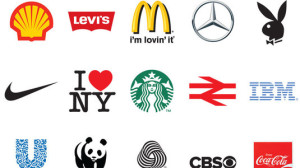
A company has to earn desirable associations, whether it be “trusted” and “reliable” or something more specific like “approachable” or “innovative.” When you boil it down, a logo is simply an identifier – a marker that successfully connects a company and its products with the (hopefully positive) attributes consumers have already assigned them. The more recognizable, the better.
Certain logos are undoubtedly better than others at creating a memorable and easily recognizable visual branding link in the minds of consumers. But what is it that makes them better at it?
Logos Now tells us the answer is, quite literally, to make them simple. That word was repeatedly and universally cited as an attribute of the logos that were also the most memorable. And while certain simple logos, like those for Apple and Nike, also represent some of the biggest and most well-known companies in the world, the formula of “simple = memorable” held true even among logos previously unfamiliar to survey respondents.
In turn, memorable logos were more likely to grab consumers’ attention, more likely to be described as unique in its category, and, perhaps most importantly, more likely to make consumers want to learn more about the brand.
All of that information may seem overwhelming, but it can ultimately be boiled down to a few straightforward points.
In fact, if this blog post had followed the advice laid out in the report, it might have dispensed with the previous 474 words, and instead just read: “Keep it simple."
Image Source:
https://www.creativebloq.com/50bestlogos
Addison Whitney is a global branding firm with a passion for building strong brands.
To learn more about Addison Whitney, visit our website at AddisonWhitney.com, or contact us here.