Brands Find Ways to Reinvent Themselves for Foreign Markets
There’s always been a mystery associated with foreign brands, but some have found ways to use their homegrown origins to give themselves a completely different brand image in foreign countries.
When Americans think of a nice beer, a wide range of local craft beers or major brands may come to mind, but one that is rarely considered is Pabst Blue Ribbon. This beer may be an American icon, but, ranking as one of the cheapest beers in the country, it is certainly not an American luxury.
However, this is not the case in China. Pabst Blue Ribbon has taken its authentic reputation as an American Icon and repositioned itself in Asian markets as a luxury beer. To an American who ha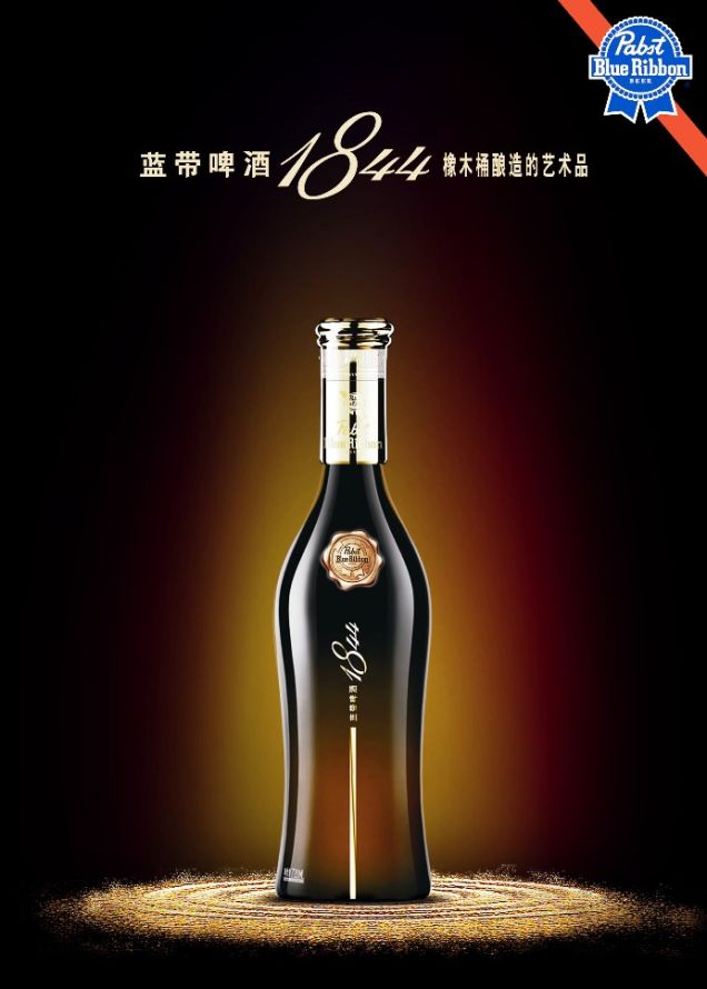 s never paid more than a dollar for a can of PBR, this may seem ridiculous. However, American exports often already connote luxury and high price point, so by emphasizing its American roots, PBR was able to ride on the wave of other authentically luxury exports from the United States.
Pabst Blue Ribbon in China is sold in glass bottles, and the ribbon icon, while still maintained, is emblazoned on the bottle in gold rather than the standard blue. Pabst Blue Ribbon in Asian markets is also branded as “1844,” the year that is printed in small type on the traditional blue ribbon in the U.S.
Pabst Blue Ribbon isn’t the only company that has made a deliberate decision to change their brand image and positioning abroad, however.
General Motors has been met with massive success in Asian markets by branding their cars as the epitome of sturdy American dependability. This is another example of a 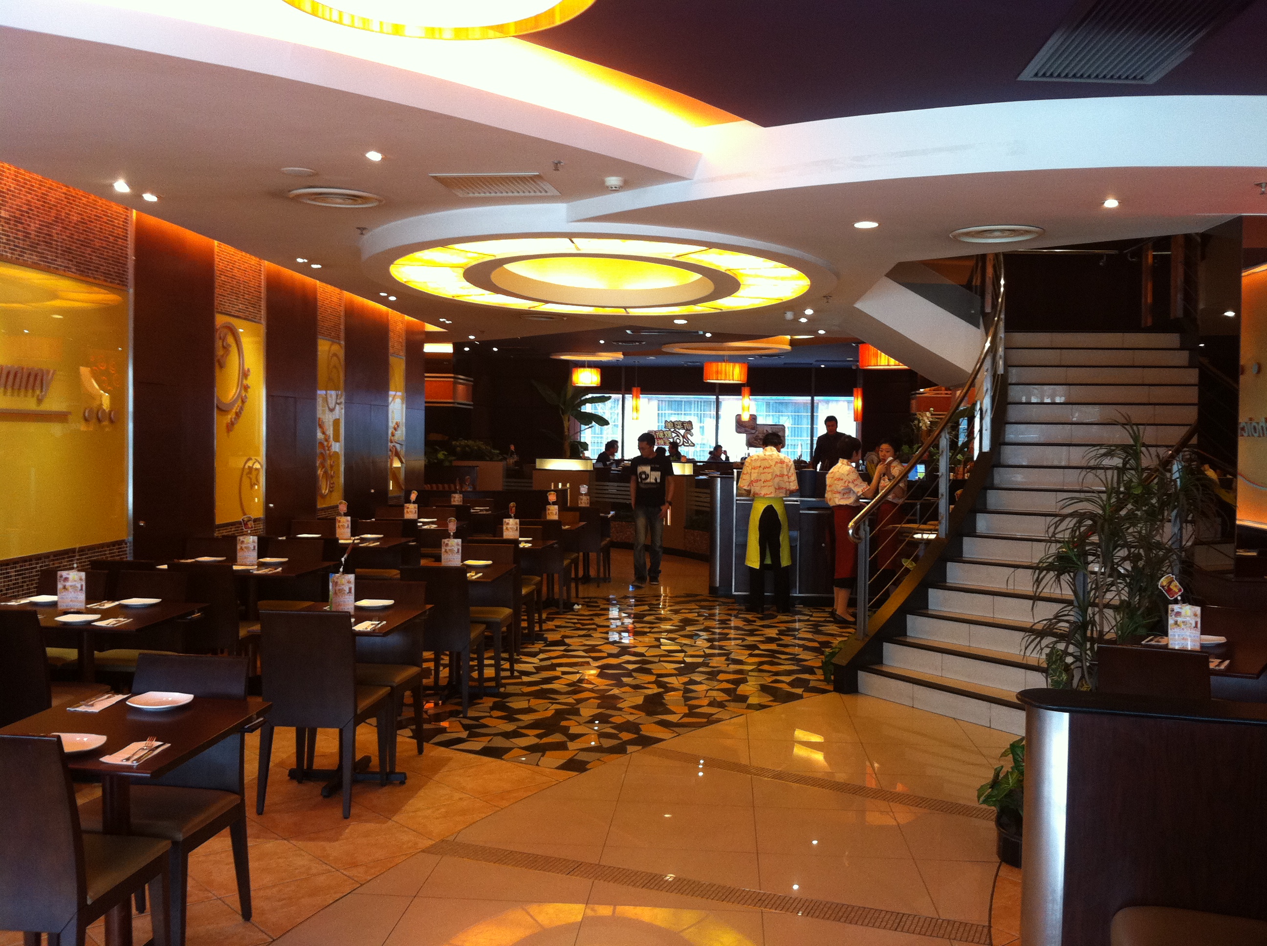 company modeling the image of their brand around values and characteristics already associated with America such as dependability and strength. Also, Pizza Hut, the quintessential American pizza joint, is a luxury dinner destination in China. The picture to the left shows the interior of a Pizza Hut in China. The Pizza Huts of China serve pizzas in cast iron skillets and offer elaborate fruit towers for dessert.
Branding Pizza Hut, PBR, and General Motors as quality, luxurious American exports may seem like a interesting practice to Americans, but American brands are not the only companies who deploy different brand images based on country. Heineken, for example, is the equivalent of PBR in the Netherlands, its country of origin. In the United States, however, Heineken is viewed as a quality beer.
This demonstrates that no domestic market is immune to the allure and mystique that are often attached to foreign brands, aspects which can help companies a with poor, or cheap, brand image at home reinvent themselves abroad.
Image Sources:
https://www.newyorker.com/news/letter-from-china/pardon-me-would-you-have-any-pabst-blue-ribbon
https://www.globalpartnersmba.com/real-chinese-food/
Addison Whitney is a global branding firm with a passion for building strong brands.
To learn more about Addison Whitney, visit our website at AddisonWhitney.com, or contact us here.

Find Your Trench Coat: Branding Success and Focusing on What You Do Best
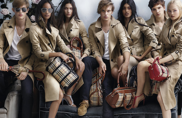
When Burberry appointed Angela Ahrendts, an American from the Midwest, as their CEO in 2006 many scoffed at the choice. With production facilities in different countries, no two shops with the same mix of merchandise, and trench coats that varied in price not just from country to country but from store to store, Burberry was in the midst of a brand crisis.
The diversified merchandise, much of it small, random goods such as hats, key chains, and even kilts made the brand not only less cohesive but much more accessible to a broad audience. Angela pointed out the brand’s main issue in an interview with Harvard Business Review when she said, “a luxury brand turned ubiquitous is anything but luxurious.” But while she had successfully identified the problem, many were worried that she wasn’t the right person to solve it.
They were wrong.
Ahrendts’ strategy was very simple: focus on trench coats. This may seem obvious, but it is a concept many brands fail to grasp.
A great brand usually begins with one thing it does very well. Louis Vuitton’s specialty is luggage. Christian Louboutin’s is shoes. Burberry’s had been the trench coat. However, often when a company achieves success, it begins to feel as if it can do anything and forgets what had made it so successful in the first place.
 Ahrendts wanted to reverse this trend and return to Burberry’s roots. When a brand’s strategy is to focus on what they do best, it creates an instant framework for each subsequent decision made about the brand. In addition to this, basing a rebrand or a marketing campaign on an attribute of the brand that has already been proven successful, desirable, or iconic leaves less room for potential disaster. Finally, a singular focus, especially one that harkens back to the roots of a company, clarifies the brand for consumers, and a clear, intelligible brand is always more desirable to the customer.
Burberry was able to return to their original brand position of premium outerwear supplier by making sure each strategic move of the company, whether it be in supply chain management, design, advertising, or social media was primarily focused on the trench coat. Burberry launched a social media movement promoting their new website, www.ArtOfTheTrench.com, which not only featured the many new styles of trench coat they had available but a look at the elite history that surrounded this most prestigious of coats.
As a result, they were the first luxury brand to reach ten million likes on Facebook. Burberry then chose Emma Watson as the face of its new advertising campaign. Emma Watson, authentically English yet still relevant internationally, wore a trench coat in every ad.
Since this massive overhaul, Burberry was named by Interbrand as the fastest growing brand and no longer will you see every person (and their dog) walking down the street in a random assortment of brown checkered products. Burberry is once more a luxury, and it should be a lesson to the many once-luxury brands that seem to be slipping down the path to overdiversifiction and ubiquity.
Every company needs to find their own trench coat and stick to it.
Image Source:
https://my.asiatatler.com/fashion-beauty/fashion/100-years-of-burberry-trench-coats-world-war-i-casablanca-art-of-the-trench
Addison Whitney is a global branding firm with a passion for building strong brands.
To learn more about Addison Whitney, visit our website at AddisonWhitney.com, or contact us here.

Brands with Long Histories Opt for Short Names
In recent years large and well-established brands that have long been able to rely on their long-standing history as the primary source of their brand equity have realized that, in a changing world, their past reputation may not be enough to propel them forward. In some cases, it is their impressive past which is the very thing holding them back. Companies which date back to the 1800s and early 1900s run the risk of seeming outdated and/or stuffy, especially among millennials.
Several large brands in industries as varied as banking, real estate, and even phone books, have made it their goal to change this perception through branding.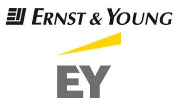
Ernst & Young, a financial institution which specializes in accounting, began in 1903. The name Ernst & Young probably brings to mind the phrase “Big Four Accounting Firms.” Thus, Ernst & Young’s 2013 rebrand accomplished the two-fold goal of both revitalizing an entrenched brand, while also redefining what their company can offer the customer beyond accounting services.
Ernst & Young rebranded themselves as EY, incorporated a new logo, website, and slogan -“Building a Better Working World,”- into their comprehensive rebranding strategy. Their previous logo and motto, “Quality in Everything We Do,” had been vague, reflecting the average consumer’s vague understanding of what exactly an accounting firm does. Now, with a yellow icon signifying upward progress and a motto that is a concise definition of their function, EY has positioned their brand better for the new generation.
Sometimes, the changes don’t have to involve an entire rebrand, but can include tweaks to the current branding elements that help bring the brand and company up to speed in the current market environment.
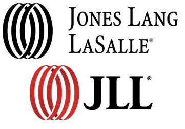 Jones Lang LaSalle is a great example of this “tweaking” strategy. Begun in 1773, this commercial real estate firm was struggling to adapt their brand to the increasingly international real estate market of today. However, in 2014 they rebranded as JLL. This rebrand was accompanied by the same icon as their original logo but with a change towards a new, brighter red. JLL announced that this new name was intended to increase pronunciation and recognition ease in international markets.
Both EY and JLL used visual and verbal branding changes to re-position their brand for the new generation, but, in some instances, companies may find it necessary to extend their rebrand even beyond those two categories and make larger brand strategy changes that physically change the way the company acts, not just how it looks or sounds.
Yellow Pages, a company which was born in 1886, and had used the “walking fingers” logo since 1962, was perhaps even more in need of a brand resuscitation than either EY or JLL; not only was The Yellow Pages brand perceived as antiquated but their entire business concept was quickly becoming obsolete.
Thus, rebranding Yellow Pages to YP involved not just creating a new name, but ensuring that the functioning of the company reflected the modern, convenient connotations of that 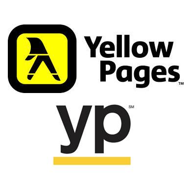 name. Yellow Pages thus focused on the creation of a new app with GPS features that allow easy access to Nearby Coupons, Popular Business Listing, and more. YP is no longer an unwieldy book of largely unhelpful information but, in fact, the complete opposite; YP is, as their slogan says, “the shortest path from to-do…to done.”
The demands of convenience, simplicity, and innovation are not new, but with each new generation, it is important for brands to reevaluate what those words mean to the consumer, because the definitions are ever-changing.
Addison Whitney is a global branding firm with a passion for building strong brands.
To learn more about Addison Whitney, visit our website at AddisonWhitney.com, or contact us here.
AW Intern Chronicles: One Month In!
Every summer, Addison Whitney welcomes an outstanding group of college students into the office as our summer interns. This year, our class consists of four interns representing three schools from around the area – these four will be working in the marketing, brand strategy, market research and verbal branding departments, and we are excited to have them on board this summer!
Today, we have a post from Caroline Beuley, who is interning in the marketing department, giving us a look inside her first month at AW!
Not only is this my first month as an intern at Addison Whitney, but this past month has been my first month as an intern ever. Everyone has heard the horror stories; in fact, many of my friends have experienced the making copies, answering calls, running errands and fetching coffee-brand of internships that lie in wait for the employment-desperate college student.
On the other hand, Addison Whitney’s webpage proclaimed that at their internship, “The only coffee you’ll get is your own.” This seemed like a good sign, but I knew I wouldn’t know until the internship really began.
After my first month at AW, I have gotten a lot of caffeinated beverages, but they have all been for myself, and they have been Diet Coke (because coffee is gross).
What I mean to say is that working at Addison Whitney has required self-sufficiency and a constant alertness, hence the caffeine. While I have some responsibilities that don’t change week to week, such as compiling a comprehensive list of Addison Whitney’s past projects or writing a blog post for brand salsa, the company blog site, my daily routine is always changing and evolving as I become more knowledgeable and experienced.
In the first two weeks of my internship, I presented a brand audit to Addison Whitney team members comparing the branding strategies of a pair of yogurt brands. Two weeks later, I presented a competitive audit of ten different branding firms with a fellow intern to six Addison Whitney employees, a task which I would not have believed myself capable of at the onset of my internship.
Something that I would have believed even less at the start of my internship was that my bosses would not only want to teach me but to learn from me. In this presentation, however, I watched as the people who had interviewed me a few months ago took notes, asked questions, and genuinely listened to my responses as I described the techniques and strategies of other branding agencies.
My favorite part about my internship so far is that Addison Whitney has made me feel valued, and, consequently, I have learned to value it. My second favorite part is the free candy, Diet Coke, ice cream, and sometimes, if you’re very lucky, popcorn chicken.
Addison Whitney is a global branding firm with a passion for building strong brands.
To learn more about Addison Whitney, visit our website at AddisonWhitney.com, or contact us here.
Diet Coke: A Case for Individualized Branding
Recently The Coca-Cola Company has revealed their plans to market all of their Coca-Cola related brands - Coca-Cola, Coca-Cola Life, Coca-Cola Zero, and Diet Coke - as a cohesive team of products, rather than individually.
Market research has shown that there is some confusion about what differentiates these four products, and the Coca-Cola Company hopes that marketing them as variations of one larger product, Coca-Cola, will help not only to clear up this confusion, but also to strengthen the overall brand to the great benefit of each individual product.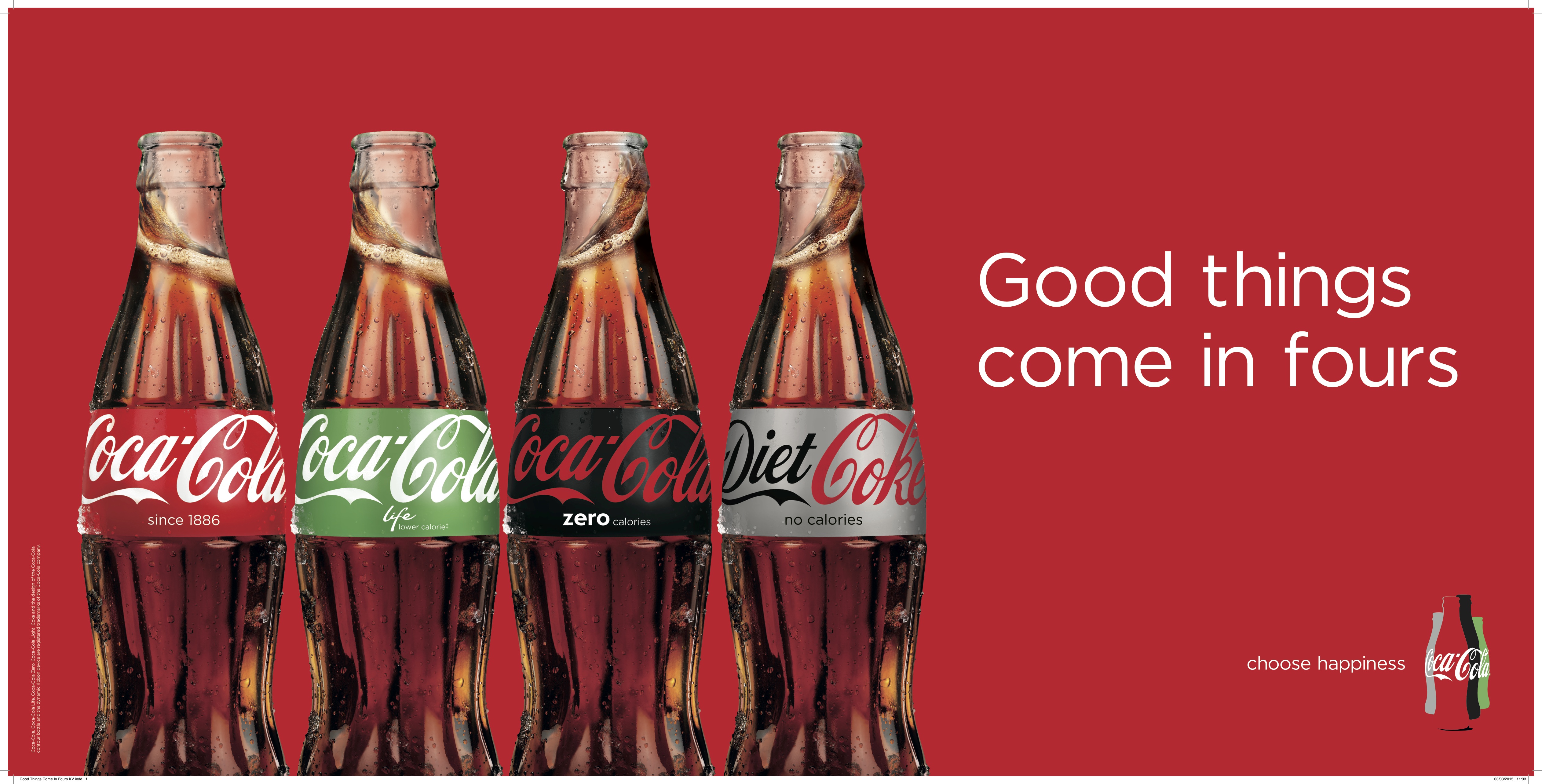
As seen to the right, an associated magazine ad emblazoned with the slogan “Good things come in fours,” shows a clear example of what the company’s new strategy will entail. I think bringing brands closer to a larger corporate brand, especially one as powerful and recognizable as Coca-Cola, is great strategy for three of these four brands.
However, Diet Coke, a soda which doesn’t even share the Coca-Cola name like the other three drinks in this branding strategy, has developed such a strong brand identity unique from its corporate company that this homogenization will, in my opinion, fundamentally change Diet Coke.
So what it is that makes Diet Coke so different from other Coca-Cola brands? A Diet Coke, like the Starbucks Cup, has become the handheld beverage accessory of the fashionable, endorsed by celebrities like Ariana Grande and Lady Gaga.
Most recently Diet Coke has launched an extensive and emblematic ad campaign featuring the fashionable and famous Taylor Swift. The red words spelled out on a Diet Coke can coordinate perfectly with Taylor’s well-known red lips. Even beyond this, Taylor aligns perfectly with the brand image of Diet Coke because she has recently become a fashion icon, not just in elite circles of Hollywood, but to the average young woman, a group which Diet Coke has always prioritized 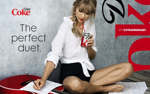 in their marketing. Recently, Taylor’s fashion choices have become very bold, without sacrificing the stylish class she has always been known for. Thus, Diet Coke, a classic but still immensely popular and always innovating, is Taylor’s beverage equivalent.
Diet Coke’s brand isn’t just approved and endorsed by fashionable celebrities. It has even earned the backing of fashion designers themselves. Over the past decade Diet Coke has rolled out a tremendous number of limited edition designer bottles and cans. Comm De Garcons, Diane Von Furstenberg, and Marc Jacobs are just a few of the many designers who have jumped at the chance to have their designs featured on a Diet Coke bottle.
Diet Coke even hosts an annual “Red” fashion show to support women’s heart health and also to remind the world of their preeminence as a stylish soda. Diet Coke, when it was created thirty three years ago, was made with an entirely different recipe than Coca-Cola.
Unlike Coca-Cola Zero, Diet Coke isn’t just Coca-Cola without the calories; it is its own uniquely flavored drink, and just as Diet Coke’s physical ingredients are different from Coca-Cola, so too are the ingredients that make up their branding and marketing strategy.
The day after Labor Day, Diet Coke tweeted “you shouldn’t wear white after Labor Day, but no one said anything about silver and red.” Rather than just wishing its followers a happy Labor Day, the Diet Coke brand took the opportunity of using the day after this holiday to remind the Twitter world of their brand’s role as a versatile fashion accessory.
In my opinion, this really sums up the image of Diet Coke. Not only is it deliciously addicting, but it carries connotations of style that no other soda can match, connotations which risk being lost if Diet Coke becomes only another option in the homogenous Coca-Cola lineup.
Image sources:
https://www.marketingweek.com/2015/03/06/5-things-you-need-to-know-this-week-5/
https://blog.acmebrooklyn.com/post/62999727300/acme-taylor-swift-and-a-diet-coke
Addison Whitney is a global branding firm with a passion for building strong brands.
To learn more about Addison Whitney, visit our website at AddisonWhitney.com, or contact us here.
Branding with Emotion
It is well known that people often buy based on emotions, and justify with facts. PsychologyToday.com cites a study which showed “when evaluating brands, consumers primarily use emotions [such as] personal feelings and experiences rather than information.”
Though offering very different products, two relatively new brands, Packed Party Gift Boxes and S’well Water Bottles have used this unique, human tendency to turn their brands from one-woman shows to nationwide phenomenon in a matter of years. Each company has taken advantage of the ability of social media, and especially Instagram, to appeal to the emotions of a large group of followers. These companies’ social media accounts are undeniably cool, quirky, 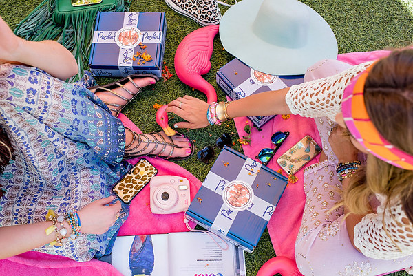 interesting, and stylish, suggesting to their many followers that their brands not only possess all of these characteristics but that, in fact, the brands might be able to confer these traits in part upon those who use them.
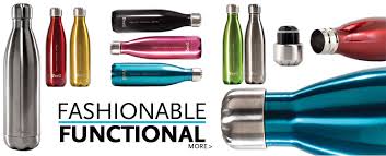
Sarah Kauss, a Harvard grad and founder of S’well water bottles, has cleverly created a water bottle brand that has both a fashionable appearance, initially speaking to the emotions of the consumer, and functionality that then captures his or her loyalty. For many water bottle companies, functionality is their branding strategy. For other companies, style is the chosen focus of their brand. However, S’well has created a distinct brand centered around the concept of fashionable functionality, using the stylish elements of the bottle to appeal emotionally to the consumer, while also supporting the style with usefulness.
S’well’s Instagram is full of fashionable people, their outfits, and sometimes even their nails, coordinated to their water bottles. Thus, the brand has been able to gain reputability as a fashion item, a reputation which has helped them gain partnerships with even larger fashion influencers like J. Crew, Nordstrom, and Vogue. Now, with 34,800 Instagram followers, revenues exceeding 10 million in recent years, and celebrities toting them everywhere, I think it’s fair to say that S’well bottles have become the most stylish sip for sale.
 Packed Party, with 37,700 Instagram followers, also began from one woman armed with an idea and an ability to cater to the emotional desires and impulses of consumers. Jordan Jones, the founder of this quirky, fun, and utterly Instagrammable brand says that the company’s entire brand strategy revolves around her hope that “each time you send or receive one of our navy packages you smile…knowing someone else cares about you or you care enough about yourself to know you need to start the party.”
This statement of purpose is centrally focused on the emotional effect her brand has on consumers. Through social media marketing, Jordan Jones has shown herself, her employees, and the people who celebrate with a Packed Party to be confident, kind, and just downright fun. She has branded her company as people who I would trust implicitly to plan a party for me, and from Packed Party’s large Instagram and blog following, it’s evident that many others feel the same way. Jordan has demonstrated a unique ability to further the success of her brand by making sure her customers not only trust Packed Party, but also have a girl crush on the women responsible for creating those little navy boxes.
Unless you’re a robot, chances are you feel emotions; so, while both of these companies are selling products that are certainly not a practical necessity to anyone, they have been successful because they have branded their products as emotional necessities. Packed Party looks like the most fun, cool product, so I need it. S’well looks like the most fashionable, coveted water bottle, so I need it. Emotions blur the lines between need and want, and each of these branding campaigns has successfully moved S’well and Packed Party into that blurry, grey area.
Addison Whitney is a global branding firm with a passion for building strong brands.
To learn more about Addison Whitney, visit our website at AddisonWhitney.com, or contact us here.