………………………………………………………………………………………………………………………………………………….
Out with the old, in with the new.
In order to keep up with our fast-paced marketplace, companies, products, and services are constantly exploring fresh ideas and new identities. Many of these rebranding efforts result from a number of needs including, but not limited to: ridding a company of negative connotations, entering a product into a new market segment, merging companies, or simple updating. Many notable entities have succeeded in rebranding efforts focused on the company itself (utilizing new logos, mottos, taglines, names, etc.), and have retained unwavering brand loyalty. And now, to turn the spotlight on one such company …
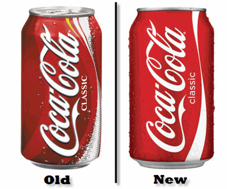
Coca-Cola. This exemplary brand has undergone a makeover to add a fresh new twist to their bottles and cans. Coke cans and Sprite cans are now donning new looks with clean and fresh features. Not to say the old cans were in desperate need of a change, but it is nice to keep consumers on their toes in order to truly appreciate the value of the brands they patronize.
On the Coke Classic can, the excess clutter of bubbles, stripe of yellow, and plentiful swirls have been eliminated to allow full attention to be focused on the red and white logo of Coca-Cola. In my opinion, this rebranding effort was a brilliant move for such an iconic company. Coca-Cola has established itself as a powerful brand and has earned its claim in the soft drink industry. This rebranding effort acknowledges the bold, confident, and trusted name of Coca-Cola that so many people worldwide know and love.
Sprite, a Coca-Cola product, has also received a can makeover. The new cans appear to be somewhat edgy and revolutionized. The colors are vibrant, edges are jagged, and logo is somewhat futuristic. The same basic color schemes and font have been incorporated into this updated new look. This rebranding effort reveals careful positioning and planning on behalf of Coca-Cola. With all the new soft drink variations entering the industry, something had to be done in order to keep Sprite on the leader board. The new look connects with the target market using a fresh, inventive, and confident approach.
These two examples of rebranding show the important impacts of staying one step ahead of the industry. With more creativity than ever before, companies are constantly competing for top-of-mind awareness amongst consumers. Researching, experimenting, updating, reinventing, and connecting; these terms are becoming the common vernacular of today’s companies.
As the saying goes, the only constant in the universe is change.
Don’t get left behind.
Contributed by Carrie Friedrich
